

If you want to learn how to photograph artwork for prints, it all starts with your gear. Getting this right isn't about having the most expensive equipment, but the right equipment. We're aiming for a setup that gives you complete control, eliminates distortion, and guarantees every shot is perfectly sharp.
These three elements—a good camera, the right lens, and a solid tripod—are the foundation for creating professional, print-ready digital files of your art.
Your Essential Artwork Photography Toolkit
Let's be clear: your smartphone isn't going to cut it for this. Capturing a digital file that's a perfect twin of your physical artwork requires a level of control that only dedicated photography gear can provide.
Think of it this way: each piece of equipment is a tool to solve a specific problem, from wonky colors to blurry details. Building a reliable setup is the first step toward photos that are sharp, clear, and absolutely true to your original vision.
The Non-Negotiable Camera
You'll need a DSLR or a mirrorless camera. Period.
The single most important reason is the ability to use full manual control. When you set your camera to "Auto," you're letting it guess what your art looks like. It often guesses wrong, washing out subtle colors or losing delicate textures. Manual mode puts you in the driver's seat, letting you dial in the aperture, shutter speed, and ISO for a perfect exposure.
These cameras also shoot in RAW format. A RAW file is like a digital negative—it's an uncompressed file that holds all the data the camera's sensor captured. This gives you a massive amount of flexibility when you get to the editing stage, which is essential for matching colors perfectly.
Choosing the Right Lens
Your lens is arguably more important than your camera body. For photographing flat artwork, a 50mm prime lens is the gold standard for a reason. It's often called a "nifty fifty," and it's a favorite among artists and photographers alike.
Because prime lenses have a fixed focal length (meaning they don't zoom), they are engineered to do one thing incredibly well. The result is exceptionally sharp images with almost zero distortion. A standard zoom lens, on the other hand, can introduce subtle "barrel" or "pincushion" distortion, which makes the straight edges of your canvas look slightly curved. A 50mm lens captures the world much like the human eye does, so your art looks natural and accurate.
Key Takeaway: Steer clear of wide-angle or all-in-one zoom lenses. Their built-in distortion can warp your artwork's proportions, a flaw that's painfully obvious once you frame a print. Stick to a prime lens for results you can trust.
To make things even clearer, here’s a quick breakdown of what you absolutely need versus what will take your photos to the next level.
Essential vs. Recommended Gear for Artwork Photography
| Gear Category | Essential Item | Why It's Essential | Recommended Upgrade |
|---|---|---|---|
| Camera | DSLR or Mirrorless | Provides manual control and RAW format for maximum detail and editing flexibility. | Full-frame camera for higher resolution and better low-light performance. |
| Lens | 50mm Prime Lens | Delivers sharp images with minimal distortion, keeping artwork true-to-form. | 100mm Macro Lens to capture incredibly fine details and textures. |
| Stability | Sturdy Tripod | Eliminates camera shake, ensuring every part of the image is perfectly sharp. | Geared tripod head for making precise, minute adjustments. |
| Trigger | 2-Second Timer | A built-in camera feature that prevents shake from pressing the shutter button. | Remote shutter release (wired or wireless) for zero camera contact. |
| Lighting | Two identical lights | Provides even, consistent light across the artwork, removing shadows. | Studio strobes with softboxes for professional, diffused lighting. |
Even with just the "Essential" column, you'll be well on your way to producing stunning, high-quality images of your artwork.
Must-Have Accessories for Stability and Clarity
Beyond the camera and lens, a few extra pieces of gear will make a huge difference in the quality of your final shots. These aren't just nice-to-haves; they're vital for getting clean, professional results.
-
A Sturdy Tripod: This is non-negotiable. A tripod is your best friend in the fight against blur. Even the steadiest hands will produce a tiny bit of shake, which can soften the fine details in your work. A tripod locks the camera in place, so your images are tack-sharp from corner to corner.
-
Remote Shutter Release: Ever notice how even pressing the shutter button can cause a tiny jiggle? That jiggle can ruin a shot. A remote shutter release, whether it’s a simple cable or a wireless remote, lets you fire the camera without touching it at all. If you don't have one, the 2-second timer on your camera is a great free alternative.
-
Circular Polarizing Filter: This little piece of glass is a lifesaver if your artwork has any kind of gloss, varnish, or metallic paint. It screws onto the front of your lens, and as you rotate it, you can literally watch glare and reflections disappear. This lets you capture the true colors and textures underneath without any distracting hotspots.
Of course, a great photo starts with a great surface. For artists working on canvas, knowing how to stretch a painted canvas correctly ensures it's perfectly flat and taut, which makes it much easier to light and photograph evenly.
Creating a Flawless Lighting Environment
Once your gear is ready, it's time to focus on what I believe is the single most important part of this whole process: lighting. If you get the lighting wrong, nothing else matters. Bad lighting creates weird color casts, ugly shadows, and distracting glare, completely torpedoing your chances of getting a faithful reproduction.
The goal here is simple: create a soft, even, and consistent wash of light across the entire surface of your art. The good news? You don't need a massive, expensive studio. The classic two-light setup is the industry standard for a reason—it just works. It's the best way I've found to kill shadows and capture the true color and texture of a piece.
This infographic breaks down the core toolkit you should have assembled before you even start thinking about flipping on a light switch.
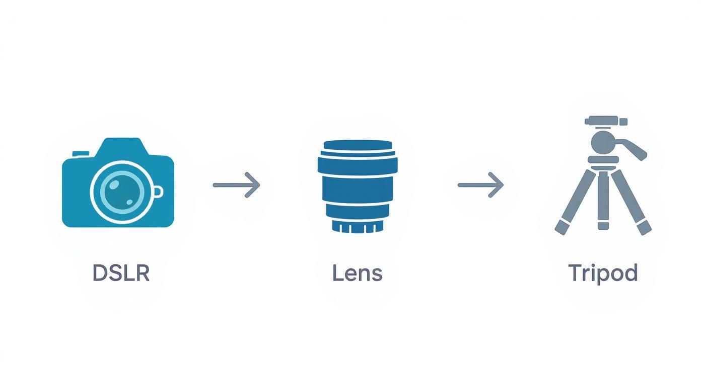
Think of this as your foundation. A solid camera, lens, and tripod are the non-negotiables for capturing professional-quality images.
The Ideal Two-Light Setup
The gold standard for this kind of work involves placing two identical lights on either side of your artwork. You'll want to position each light at a 45-degree angle to the surface of the piece. This specific angle is the secret sauce—it ensures light hits the artwork evenly from both sides, which effectively cancels out the shadows that a single light source would create.
Picture it like a clock face. If your camera is at 6 o'clock and the artwork is at 12, your lights should be sitting at roughly 10 and 2. Make sure they're the same distance away from the art, too.
Pro Tip: I always use a tape measure. Seriously. Make sure the distance from each light to the center of the artwork is exactly the same. Even a few inches of difference can create an imbalance, making one side of your final photo look brighter than the other.
Diffuse Light Is Your Best Friend
Whatever you do, never point a bare bulb directly at your art. All you'll get are "specular highlights"—those blindingly bright spots of glare that completely wash out all the detail underneath. The real secret to beautiful, gallery-quality light is diffusion.
This is why photographers use softboxes. A softbox is just a fabric box that fits over your light, scattering its output and turning a small, harsh source into a large, soft one. This diffused light gently wraps around the textures of your piece, revealing every subtle brushstroke or the weave of a canvas without creating nasty reflections. For more great ideas, check out these photography lighting techniques.
The Natural Light Alternative
No studio lights? No problem. You can still get fantastic results with natural light, but you have to be smart about it. The absolute best-case scenario is a large, north-facing window on an overcast day.
Here’s the breakdown of why this specific setup is so effective:
- North-facing light is always indirect and stays consistent, so you won't have to chase the sun or deal with harsh shadows moving across your art.
- An overcast sky is nature’s perfect softbox. The clouds diffuse the sunlight beautifully, creating that soft, even illumination we're after.
When using a window, place your artwork on a wall next to it, not directly opposite. This lets the light skim across the surface from the side, mimicking that 45-degree angle we talked about. You'll probably want a large white foam board on the other side of the art to act as a reflector, bouncing a little light back to fill in any gentle shadows. It’s this attention to detail that contributes to the value of the global photographic services industry, which was worth about $55.6 billion in 2023.
Choosing the Right Camera Settings
https://www.youtube.com/embed/vu5ohljtB-A
Alright, you've got your gear and lighting all set up and looking professional. Now it’s time to get into the heart of the matter—the camera itself. The single most important thing you can do to get gallery-quality images is to turn that dial away from "Auto."
Think of your camera's manual mode as your cockpit. It’s where you take control and tell the camera exactly how you want the final image to look, instead of letting its internal computer make creative guesses for you. This is how you nail the shot every time.
We're going to focus on three critical settings that will make or break your final image: file format, ISO, and aperture.
Shoot in RAW for Maximum Flexibility
Before you do anything else, change your file format. You absolutely have to shoot in RAW format, not JPEG. I can't stress this enough.
A JPEG is a compressed file. The camera essentially "develops" the photo for you, making its own decisions on color, contrast, and sharpening. To save space, it then throws away any data it thinks is unnecessary. A RAW file, on the other hand, is the pure, unprocessed data captured directly by your camera's sensor.
- RAW files hold vastly more color information and a much wider dynamic range.
- This gives you incredible flexibility in the editing room, letting you tweak white balance and exposure without destroying image quality.
- I like to think of it as a digital negative. All the original information is right there, waiting for you to develop it just the way you want.
This non-destructive editing power is a true game-changer. Trying to fix slightly off colors in a JPEG can quickly lead to ugly, blotchy artifacts. With a RAW file, you can make those same adjustments cleanly and precisely.
Master ISO and Aperture for Ultimate Sharpness
Next up are the two settings that directly control the sharpness and clarity of your image: ISO and aperture.
Your ISO determines how sensitive the camera's sensor is to light. A high ISO can be a lifesaver in dark situations, but it comes with a serious downside: digital noise, which looks like ugly grain or speckles. For artwork, we want the absolute cleanest, purest image possible.
Set your ISO to its lowest native setting, which is almost always ISO 100. Since your camera is locked down on a tripod, you don't need any extra light sensitivity. A low ISO guarantees a smooth, noise-free shot where every tiny detail shines through.
Your aperture (also called the f-stop) controls your depth of field—basically, how much of the image is in sharp focus from front to back. A wide-open aperture like f/1.8 gives you that blurry background effect, which is beautiful for portraits but a disaster for photographing artwork. We need every single corner of your piece to be tack-sharp.
To achieve this, you'll want to use a narrower aperture, somewhere in the range of f/8 to f/11. This is the "sweet spot" for most lenses, where they produce the sharpest results across the entire frame. This ensures that a brushstroke in the top-left corner is just as crisp as the artist's signature in the bottom-right.
Once your ISO and aperture are locked in, all you have to do is adjust your shutter speed until the light meter in your camera indicates a perfect exposure.
Getting Your Camera and Artwork Perfectly Aligned
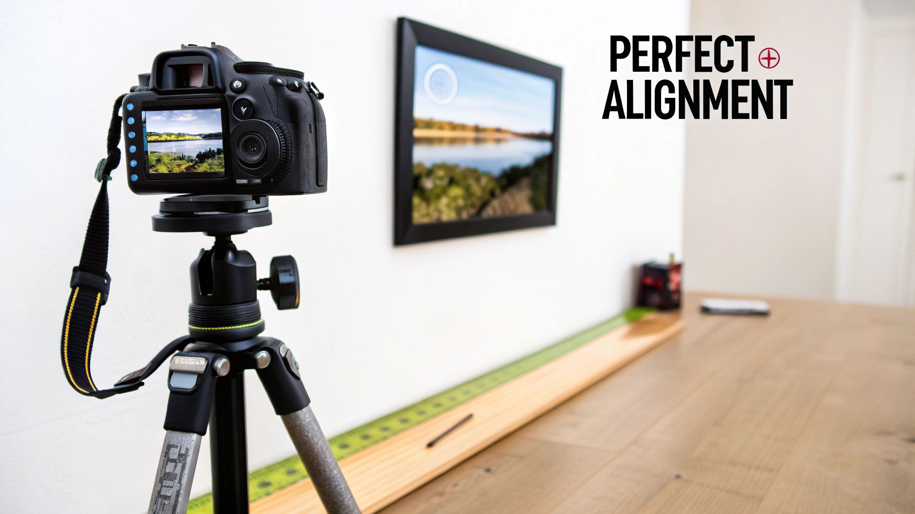
Once you've got your settings dialed in, the next part is all physical. It’s also where many people go wrong. To capture a distortion-free photo, your camera's sensor has to be perfectly parallel to your artwork. If you’re off by even a single degree, you’ll get what's known as keystoning.
Keystoning is that annoying effect where a perfect rectangle looks like a trapezoid in your photo—wider on one side and narrower on the other. Sure, you can try to fix minor issues in post-production, but a severe distortion forces you to crop in, losing the precious edges of your work.
Trust me, getting this right from the start saves a massive headache later.
Secure the Artwork
First things first, get your artwork perfectly flat and vertical. The simplest way is to hang it on a wall. If the piece is unframed, you might need some clips or pins, but just make sure it isn't sagging or bowing in the middle.
Grab a small bubble level (a phone app works in a pinch) and rest it on the top edge of the artwork. Nudge the piece until that bubble is dead center. This gives you a true vertical plane to work from.
Achieve a Parallel Setup
Now, bring in your tripod and place it directly in front of the art. The goal here is to point the lens at the exact center of the piece. You can eyeball it, but a tape measure makes it foolproof.
Measure from the floor to the center of your artwork. Then, adjust your tripod's height so the center of your lens is at that exact same measurement.
With the height locked in, it's time to make sure the camera is perfectly square to the art. This is where your bubble level becomes your best friend again.
- Level the Camera: Pop a small hot-shoe bubble level onto your camera. Tweak your tripod head until the camera is level both side-to-side and front-to-back.
- Do a Final Check: Grab that tape measure one last time. Measure the distance from the front of your lens to the top-left corner of the art. Now, measure the distance to the top-right corner.
If those two numbers are identical, congratulations—you're perfectly parallel. This methodical little process is the secret to capturing images that are a true, accurate representation of your work.
A Pro's Alignment Trick: Switch on your camera's live view and zoom in on one of the vertical edges of your artwork. As you pan the camera up and down along that edge, it should stay perfectly parallel with the side of your LCD screen. If the edge seems to drift closer or further away from the side of the screen, you still have some fine-tuning to do.
Editing Your Photos for Print Perfection
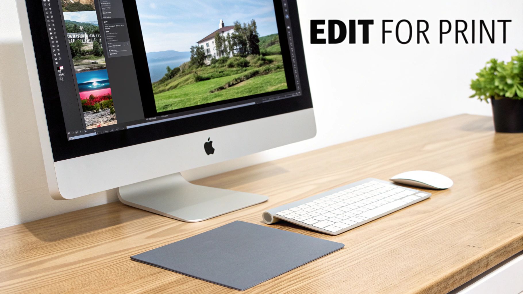
Alright, the camera work is done. Now for the last mile of the journey: post-processing. This is where you bring the digital image into perfect alignment with your original artwork, and it all happens on your computer.
The goal here isn't to get creative or slap on a filter. It's about faithful representation. You're making a digital twin of your physical piece, and for that, you'll want a professional tool like Adobe Lightroom or Capture One.
Calibrating Your Color and Tone
Remember that gray card and color checker you shot earlier? It's time to put it to work. In your editing software, find the white balance dropper (it usually looks like an eyedropper tool) and click it directly on the neutral gray patch from your reference photo. Just like that, any color cast from your lights is gone.
With the color neutralized, you can start dialing in the tones.
- Exposure: Nudge the brightness up or down just enough to match the feeling of the original.
- Contrast: A slight boost here can add some pop, making your darks feel rich and your whites clean. Be careful not to crush the shadows or blow out the highlights—you want to retain all that beautiful detail.
These are subtle moves, but they make all the difference in giving the digital file the same presence as the artwork itself.
Here's my go-to final check: I put my laptop with the edited image right next to the original painting, under the exact same lighting I used to shoot it. Do the colors look identical? Is the vibrancy there? This is your moment of truth.
It's also worth noting why this level of quality matters. The photography auction market has seen sales values stay relatively flat, moving from $113.4 million in 2005 to just $116.9 million in 2024. To stand out in a crowded market, your prints need to be exceptional.
Final Touches for a Flawless File
Once you’re happy with the color and tone, a few quick clean-up steps will get the file ready for the printer.
Start by cropping out anything that isn’t the artwork—the easel, the clips, the wall behind it. Next, apply the lens correction profile for your lens. Most software like Lightroom can detect your lens automatically and fix any subtle distortion with one click. It’s a simple step that really professionalizes the final image.
Finally, add a touch of sharpening. You don't need much. The goal is just to restore any slight softness that can happen when capturing a physical object digitally. Thinking about your final print dimensions at this stage is also a good idea. Knowing your options for a https://paint-by-number.com/blogs/learn-about-paint-by-numbers/custom-canvas-size can inform your final crop and composition.
Once you’ve put in this work, understanding the key steps to ensuring the perfect print every time is the final piece of the puzzle. These careful edits are what transform a good photograph into a print-ready file that truly honors your original work.
Common Questions About Photographing Artwork
Even when you follow a guide to the letter, photographing your art can throw some curveballs. Let's walk through some of the most common questions and roadblocks I see artists run into. Getting these right will help you capture professional, print-ready images every single time.
Can I Just Use My Smartphone?
Look, for a quick Instagram post or a small image on your website, your phone can definitely get the job done. But if you’re planning to sell high-quality prints, a DSLR or mirrorless camera is non-negotiable.
The tiny sensors in phones just can't capture the same level of detail as a dedicated camera. They rely on a lot of software processing, which can mess with your colors and smudge the fine textures you worked so hard to create. You might not notice it on a small screen, but when you blow that image up for a print, those flaws become glaringly obvious.
What Resolution Do I Need For Printing?
The magic number for high-quality printing is 300 pixels per inch (PPI). It's the industry standard for a reason—it produces sharp, crisp results.
To figure out what you need, just do a little math. Multiply the dimensions of your desired print by 300.
- For an 8x10 inch print: You'll need a file that's at least 2400 x 3000 pixels.
- For a 16x20 inch print: You're looking at a minimum of 4800 x 6000 pixels.
My advice? Always shoot at the highest resolution your camera allows. It gives you so much more freedom to crop and resize for different print options down the road.
Key Takeaway: You can always shrink a big, high-resolution file without losing quality, but you can’t make a small file bigger without it looking terrible. Start big.
How Do I Avoid Glare On Glossy Paintings?
Glare is the absolute worst, especially on varnished paintings or pieces with a glossy finish. It completely kills the texture and color you want to showcase. Your secret weapon here is a circular polarizing filter that screws right onto your lens.
When you rotate the filter, you can literally watch the reflections and hotspots vanish before your eyes. It’s like magic.
For the best results, pair that filter with a solid two-light setup. Place your lights at 45-degree angles to your artwork. This angle bounces the light away from your camera, and the filter cleans up any stubborn glare that remains.
Once you have that perfect shot, the next step is presentation. If you need some ideas, our guide on how to frame canvas paintings has some excellent advice.
At Custom Paint By Numbers, we believe everyone can be an artist. Turn your favorite memories into beautiful works of art with our easy-to-use custom kits, perfect for a relaxing project or a heartfelt gift. Create your personalized masterpiece today at https://paint-by-number.com.


