

Ever wished you could turn a favorite photo into a real painting? It’s actually a pretty magical and straightforward process. You take a digital picture you love, convert it into a numbered outline on a canvas, and then match those numbers to your paints.
This guide will show you exactly how to do it, step-by-step.
Turn Your Favorite Photo Into a Work of Art
Think about that one photo you always come back to—a candid shot of your pet, a beautiful wedding moment, or that perfect sunset from a vacation. Now, imagine bringing it to life on canvas with your own hands. That’s what creating a custom paint-by-number is all about.
It's an incredibly personal and rewarding project that doesn't require any artistic background. Seriously. You don't need to be a pro to create something you’re proud of. The numbered guide does the heavy lifting, letting you relax and enjoy the simple, meditative act of painting.
The Magic of Guided Art
This idea of guided art has been around for a while. Paint-by-number kits exploded in popularity back in 1951 when the Craft Master brand debuted at the New York Toy Show. The concept was a massive hit. By 1954, an astounding twelve million kits had been sold, showing just how much people craved a creative outlet that felt accessible.
The DIY method we're talking about here uses that same core idea but makes it deeply personal. Instead of a pre-selected image, you're painting a memory that truly means something to you.
The real joy comes from watching a familiar photo gradually reappear on the canvas, brushstroke by brushstroke. It’s a connection to your memories in a completely new and artistic way.
What You Will Learn
This guide breaks down the entire process from start to finish, so you'll know exactly what to do. No guesswork involved.
Here’s what we’ll cover:
- Picking the Right Photo: I’ll share some tips on what makes an image great for a paint-by-number project.
- Creating Your Numbered Canvas: We’ll look at how to transform your digital picture into a paintable outline.
- Setting Up Your Supplies: You'll get a simple checklist for prepping your canvas, paints, and workspace for a smooth start.
- Painting Like a Pro: I'll give you a few simple techniques to help you get a polished, impressive finish.
And for anyone who wants to avoid complicated software, you can check out our other tutorial on how to turn a photo into a paint by number without Photoshop.
Choosing the Right Photo for Your Project
This is probably the most important part of the entire process. Honestly, the success of your custom paint-by-number really boils down to the photo you start with. It's so tempting to pick your absolute favorite picture, but I've learned from experience that not every photo is destined to become a great painting.
The trick is to start thinking like a painter. Look for photos with a strong, obvious subject and plenty of contrast. A well-lit picture of your dog sitting on a plain-colored rug? Perfect. A photo where your subject pops against the background makes it so much easier to create those clean lines and shapes you need.
What Makes a Photo Work Well?
When you’re just figuring out how to make a paint-by-number, simplicity is your friend. Trust me on this. Photos with a ton of shadows, tricky color shifts, or super busy backgrounds can turn into a headache fast. You'll end up with a canvas full of tiny, confusing specks of color.
Think about it this way: a hazy landscape with fifty shades of green might be a beautiful photograph, but it's a nightmare to map out and paint. On the other hand, a close-up of a bright yellow sunflower against a clear blue sky is an ideal candidate.
The best images almost always share a few key traits:
- A Clear Focal Point: You know exactly what the main subject is at first glance.
- Good Lighting: Try to avoid photos with deep, dark shadows or areas that are so bright they look washed out.
- Defined Edges: The subject should stand out crisply from whatever is behind it.
- A Manageable Color Palette: Fewer distinct colors are much easier to work with than dozens of very similar shades.
If you’re interested in turning your pictures into unique keepsakes, you might find more inspiration by looking into other custom photo products. The same core idea applies—a strong, clear image always yields the best results.
Remember, you're not trying to clone the photo pixel by pixel. The goal is to capture the feeling and shape of your subject in a simplified, artistic way. Pick a photo that sets you up for success.
Photo Selection Cheat Sheet
I put together this little cheat sheet to help you quickly sort through your photo options. If you stick to the "Ideal" column, you're giving yourself the best shot at a project that's both fun to create and beautiful to display.
| Characteristic | Ideal for Paint by Number | What to Avoid |
|---|---|---|
| Subject | A single, clear subject (e.g., one person, a pet, a car) | Multiple, overlapping subjects or group shots |
| Background | Simple, solid, or out-of-focus | Busy, detailed, or cluttered backgrounds |
| Contrast | High contrast between subject and background | Low contrast, with similar colors blending together |
| Details | Large, simple shapes and clear lines | Tiny, intricate details like complex patterns or text |
| Color | Bold, distinct colors | Subtle gradients, muted tones, and lots of shadows |
Ultimately, choosing a photo with these ideal qualities will make mapping your canvas, mixing your paints, and the actual painting process so much more enjoyable.
Bringing Your Custom Canvas and Palette to Life
Alright, you've picked out the perfect photo. Now for the fun part: turning that digital image into something you can actually paint. This is where the magic really happens, as we'll create a numbered outline and a custom color palette to go with it. It sounds a bit technical, but I promise, with today's tools, it's a breeze.
You don't need fancy, expensive software for this. There are plenty of free online generators out there made just for this purpose. You simply upload your picture, and the tool does the heavy lifting, spitting out a simplified, outlined version.
Another great trick I've used is a basic photo editor. Just look for a feature called "posterize" or "posterization." This filter is fantastic because it reduces the number of colors in your photo, which automatically creates those clean, blocky shapes that are ideal for a paint-by-number project.
Dialing in the Right Level of Detail
One of the best things about making your own kit from scratch is that you're in complete control of the difficulty. When you use an online generator or that posterize filter, you’ll almost always have a slider or setting to adjust the number of colors. This is your complexity knob.
- Fewer Colors (think 12-16): This gives you a simpler painting with bigger, easier-to-fill sections. It's perfect if you're just starting out, if your photo has a single bold subject, or if you're going for a more graphic, pop-art style.
- More Colors (maybe 24-36): This will create a much more detailed and realistic painting. The sections will be smaller and more intricate, which is great for seasoned painters or photos with a lot of fine detail, like a complex landscape.
Honestly, my advice is to start simple on your first go. You can always tackle a more complex piece next time. The whole point is to relax and enjoy the process, not to get bogged down with hundreds of tiny specks of color that strain your eyes.
Building Your Custom Color Palette
Once you have your numbered outline, it’s time to create its partner: the color palette. The generator or photo editor will show you the exact simplified colors it used. Your job is to assign a number to each of those colors. Then comes the satisfying task of finding real acrylic paints to match.
The secret to a piece you'll be proud to hang on your wall is a well-matched palette. I can't stress this enough: take your time here. Don't just grab the first red or blue you see. Try to find shades that really capture the mood and feeling of your original photo.
This very process is what made paint-by-number kits a massive cultural hit back in the 1950s. They opened up the world of art to everyone, offering a therapeutic outlet for adults and a fun way for kids to learn. That same spirit of accessibility is what makes this DIY project so rewarding. You can actually dive into the fascinating history of this creative pastime on LorisPaint.com if you're curious.
From Digital Hues to Physical Paints
This next part feels a bit like a treasure hunt. You need to translate your on-screen colors into real-world acrylic paints. The straightforward way is to take a screenshot of your digital palette, bring it to your local craft store, and hold your phone up to the paint tubes to find the closest match.
A more hands-on method, and one that gives you more control, is mixing your own colors. You might only need a basic set of primary colors—red, yellow, and blue—plus black and white. With those five tubes, you can mix just about any shade imaginable. For instance, that deep, moody purple in your photo is just a bit of red and blue mixed together, with a tiny dab of black to deepen it.
This image gives a great visual on preparing your paints, which is especially helpful if you're mixing your own shades or need to thin them out.
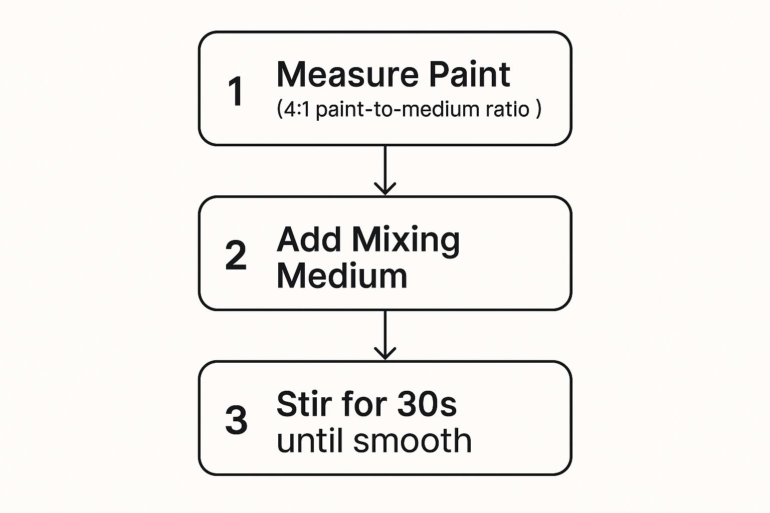
The main goal here is consistency. Whether you're using paint straight from the tube or a custom-mixed color, getting it to a smooth, creamy texture is what will give you that beautiful, even finish on the canvas.
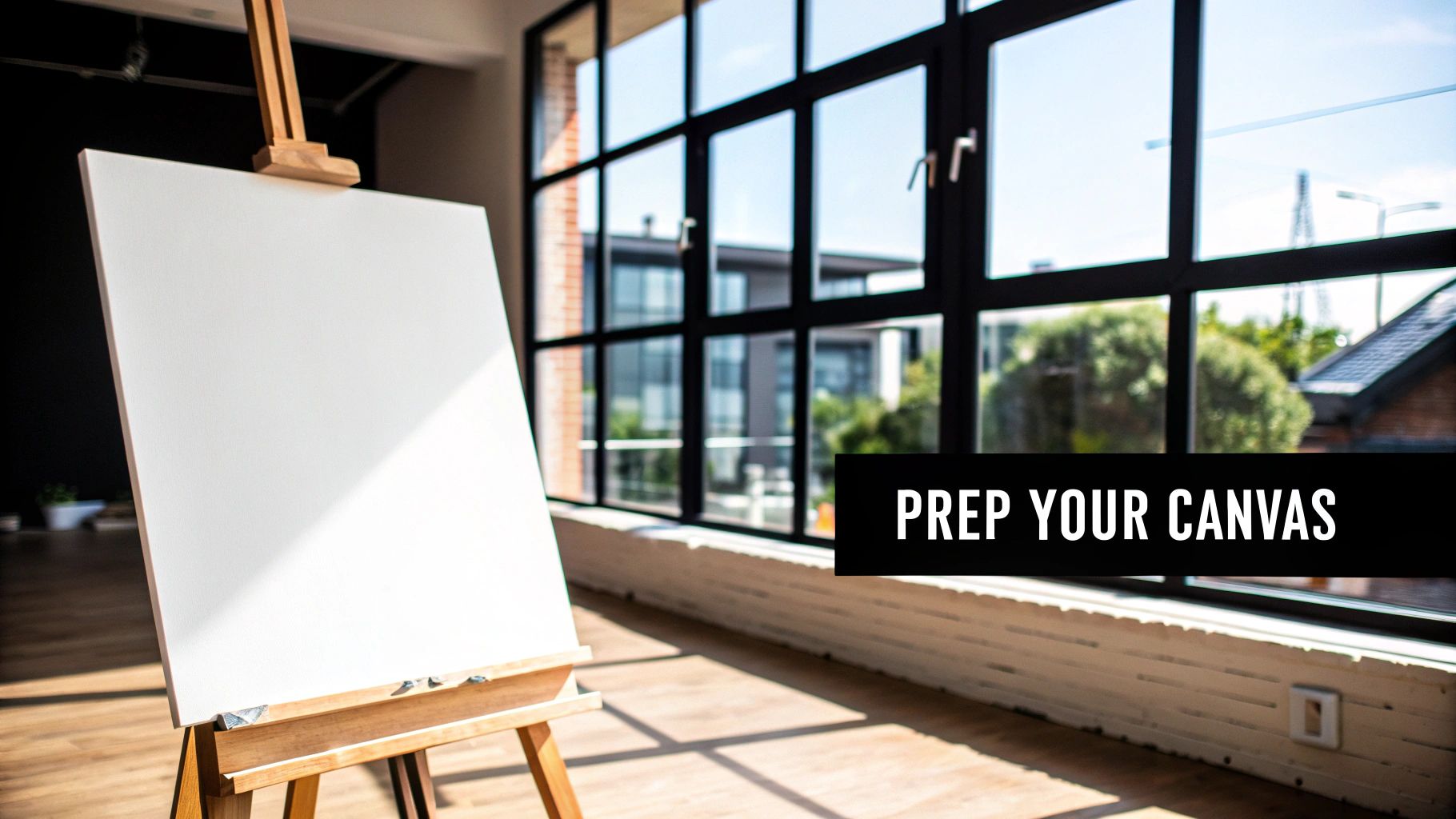
Getting Your Painting Station Ready
Okay, you’ve got your custom outline and you know which colors you’re using. Now comes the fun part: setting up your creative space. A little prep work here makes a world of difference later, trust me. The idea is to build a little sanctuary where you can tune everything out and just get lost in your painting.
First up, we need to get that design from the paper (or screen) onto your canvas. This is probably the most critical part of making a paint-by-number from scratch, but don't stress. You don't need a perfectly steady hand or years of art school to nail it.
Getting Your Outline onto the Canvas
The old-school method is still one of the best: carbon transfer paper. It’s super straightforward. Just lay the transfer paper on your canvas with the graphite side facing down. Then, place your printed outline on top of it. All you have to do is trace the lines with a ballpoint pen or a hard pencil, and the pressure will leave a clean, faint outline on the canvas. It's that simple.
If you want to feel a bit more high-tech, or if you're working on a bigger canvas, a small digital projector is an amazing shortcut. You can shine your design directly onto the canvas and lightly trace the lines with a pencil—I find a 2H pencil works perfectly because it's light enough not to show through the paint. This technique is incredibly precise and means zero risk of smudging.
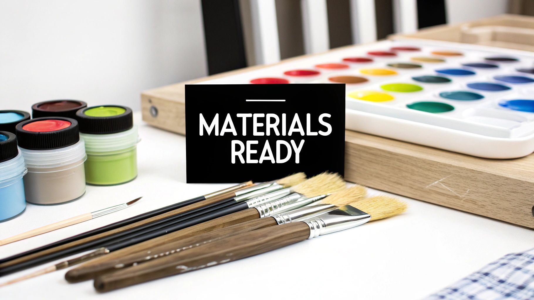
Assembling Your Painting Toolkit
With your outline ready to go, it's time to gather your supplies. Having everything you need within arm's reach is non-negotiable. There's nothing worse than having to jump up and search for a paper towel while a blob of paint is slowly dripping where it shouldn't be.
Here’s a quick rundown of the must-haves:
- Acrylic Paints: Get your chosen colors ready. A little trick I’ve learned is to line them up in numerical order. It seems small, but it saves so much time hunting for the right pot.
- Brushes: A few different sizes are all you need. Grab a very fine-tipped brush for the tiny, detailed spots, and a small flat brush to cover the larger sections more efficiently.
- Water Cups: Always use two! One cup is for rinsing brushes when you switch colors, and the second should have clean water just in case you need to thin out your paint a little.
- Paper Towels: Keep a roll nearby for dabbing excess water off your brush after rinsing and for wiping up any little mistakes.
An organized workspace isn't just about being tidy—it's about getting into the right headspace. When your tools are ready and waiting, your mind can fully relax into the meditative rhythm of painting. It transforms the whole experience.
Now that your canvas is prepped and your station is organized, you're all set to bring your picture to life. All this careful setup pays off right now, making the actual painting process as smooth and enjoyable as it should be. You've done the prep work; let the fun begin.
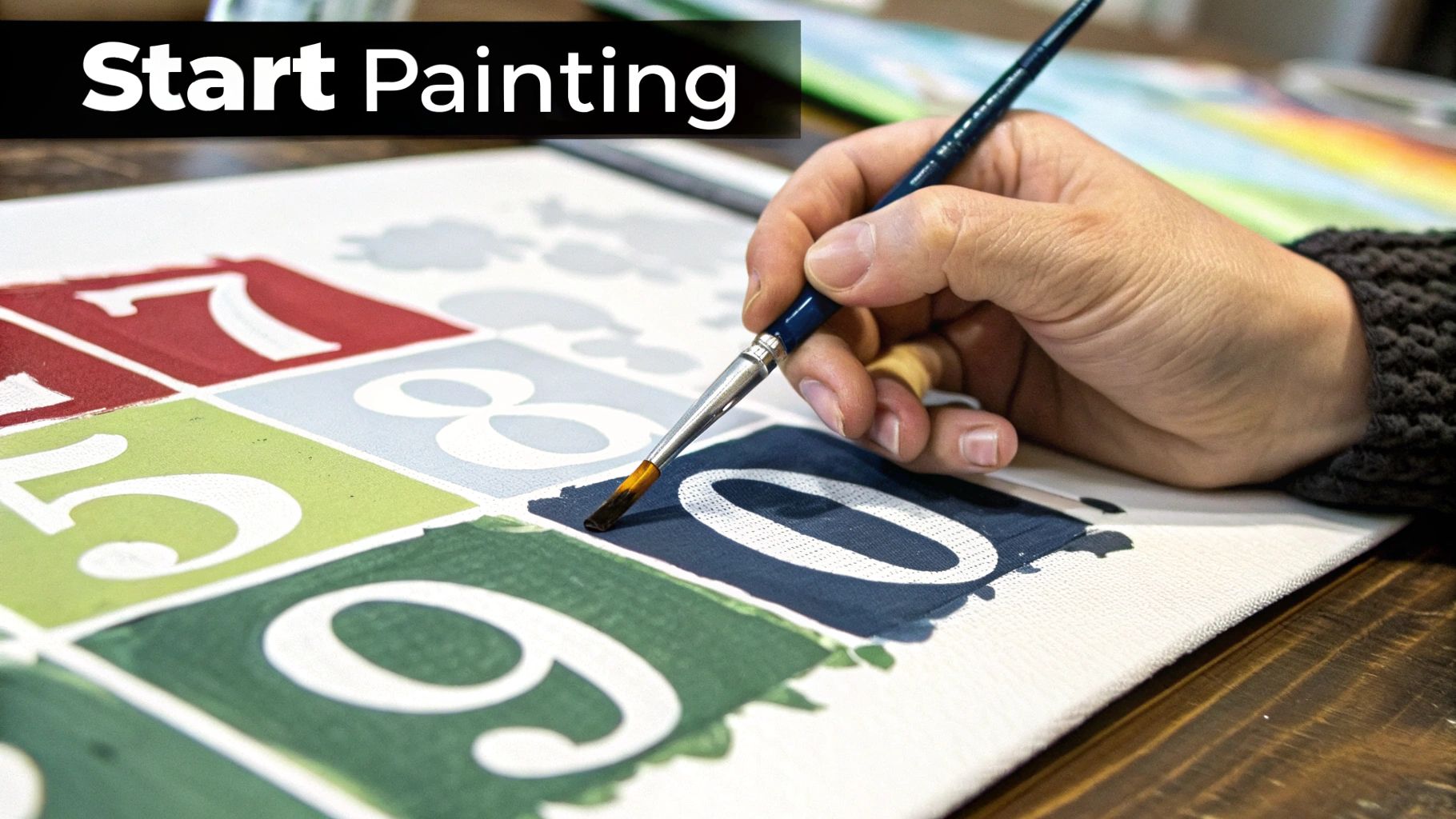
Painting Techniques for a Professional Finish
Alright, this is the fun part. Your canvas is ready, your paints are laid out, and now you get to bring your photo back to life, one patch of color at a time. The techniques you use here are what will really make the difference, taking your project from a simple craft to a piece of art you’ll be proud to display.
There’s no single “right” way to begin, but a couple of strategies have worked well for me and many other painters.
A lot of people prefer to work from the top of the canvas down to the bottom. It’s just practical. This method keeps your hand and wrist from dragging across wet paint and smudging your hard work.
Another great approach is to tackle one color at a time, starting with the darkest shades. This helps to quickly establish the main shapes and structure of your image. It also makes cleanup a breeze—it's much easier to paint over a light color that bled into a dark section than it is to cover up a dark splotch with a light pigment.
Achieving Clean Lines and Smooth Coverage
The secret to a fantastic paint-by-number painting is often in the details—specifically, the clean, crisp lines between each color. This takes a bit of patience and a steady hand, but it's totally achievable.
Try not to load up your brush with too much paint. Overloading is what causes drips and blobs that spill over the lines. You want just enough on the bristles for the paint to flow smoothly.
For a smooth, professional look, apply your paint evenly and try to brush in the same direction within each segment. If you find that the printed numbers or lines are still peeking through lighter colors after the first coat, don't sweat it. That’s completely normal. Just let that section dry completely, then go back and apply a second, thin coat. That extra layer will make the colors vibrant and hide the guides perfectly.
Key Takeaway: Don't just fill in the spaces—apply the paint with intention. Smooth, even coats and clean lines are what will elevate your project into something you'll want to hang on the wall.
Handling Tiny Details Without Frustration
Those tiny, intricate areas can look a little daunting, but they’re often what makes the final painting pop. The trick is simply using the right tool for the job. Grab your finest-tipped detail brush for these spots. To keep your hand from shaking, try resting your painting hand on your other hand for extra stability.
And if you do paint outside the lines? It happens to everyone. The best fix is to just let the mistake dry completely. Once it’s dry, you can easily paint over it with the correct color. Resist the urge to wipe away wet acrylic paint—that usually just creates a bigger, messier smear.
The massive appeal of this guided art form has a fascinating backstory. The original paint-by-number kits from the 1950s weren't just a niche hobby; they were a cultural phenomenon. By 1954, the Craft Master brand alone was pulling in about $20 million in sales. It's a real testament to how many people were excited to create their own art.
If you want to take your skills to the next level, there are a bunch of simple tricks you can use. Check out our guide on 10 tips to improve your paint by numbers skills for more advanced techniques. Mastering these little details is a huge part of learning how to make a paint by number that looks truly amazing.
Answering Your DIY Paint-by-Number Questions
Even with the best instructions, you're bound to run into a few head-scratchers when you first learn how to make your own paint-by-number. That’s just part of the creative process! Getting these little details sorted out ahead of time can make all the difference, turning a potentially frustrating moment into a smooth, relaxing painting session.
Let's dive into some of the questions I hear most often.
What’s the Right Kind of Paint?
When it comes to a DIY paint-by-number, acrylic paint is your best friend. I always recommend it, and for a few very practical reasons. Its biggest advantage is how quickly it dries. This is a lifesaver, as it really cuts down on the risk of accidentally smudging your work as you reach across the canvas.
Plus, acrylics are water-based, so cleanup is a breeze—just a little soap and water will do the trick. They're also wonderfully opaque, which is exactly what you need to cover up those printed numbers and lines. You can find them in small, individual pots, making it easy to build a custom color palette without splurging on big, expensive sets.
A Quick Tip from Experience: I’d steer clear of oil paints for this. They take forever to dry and require chemical solvents for cleanup, which makes them way too fussy for the structured, section-by-section process of a paint-by-number.
Oh No, I Messed Up! How Do I Fix It?
It's not a question of if, but when you'll paint the wrong color in a section. It happens to everyone, so don't panic! Fixing mistakes with acrylics is surprisingly straightforward.
The most important thing to remember is to let the wrong color dry completely. I can't stress this enough. If you try to wipe wet acrylic paint, you'll just create a muddy mess that's much more difficult to fix.
Once it's dry, just paint right over it with the correct color. Since acrylics are so opaque, one or two thin layers will usually hide the mistake perfectly. If you're trying to cover a dark color with a much lighter one, just apply a thin layer of white paint first to act as a primer. Let that dry, then apply your intended light color on top. Easy peasy.
How Can I Make My Finished Painting Look Better?
A few simple tricks after you've filled in all the numbers can really take your custom piece to the next level.
First, think about adding a second coat of paint to every section. This is especially useful for lighter colors, as it ensures none of the underlying lines or numbers peek through.
If you want a softer, more blended look, you can gently blur the hard edges between colors. Just use a fine-tipped brush that's slightly damp to "feather" the lines where two colors meet.
Finally, after your painting has had at least 24 hours to dry completely, apply a clear varnish or sealant. This is a total game-changer. It not only protects your work from dust and fading but also gives the entire piece a beautiful, uniform finish—either gloss or matte—that makes the colors truly pop.
For a deeper dive into what makes these kits so enjoyable in the first place, check out our guide that answers the simple question: what is paint by numbers?
Ready to turn your favorite memory into a masterpiece? With Custom Paint By Numbers, you can upload your photo and receive a complete, high-quality kit with everything you need to start painting. Create your personalized art today at https://paint-by-number.com.


