

The secret to a fantastic painting session? It all starts before you even dip a brush in the paint. Getting your workspace set up properly is probably the single most important thing you can do to ensure a relaxing, fun experience. A little prep work goes a long way in preventing stress so you can just focus on your art.
Your Essential Pre-Painting Setup
Think of this as your pre-flight checklist for creativity. The whole point is to create a space where you can lose yourself in the process without annoying interruptions or preventable mistakes. I've learned the hard way that rushing this step just leads to frustration later.
First things first, find a comfortable spot with great lighting. Natural daylight is the absolute best because it shows colors true to life—no more accidentally grabbing a dark grey when you meant to use black. If you're a night owl painter like me, a bright, neutral-toned lamp is your best friend. It'll keep your canvas from taking on a weird yellow hue.
Organize Your Tools for Success
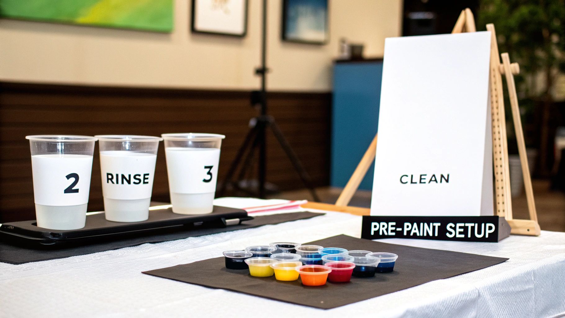
You’ll want to protect your table with some old newspaper or a drop cloth. Trust me, acrylic paint spills happen to everyone. A simple trick I swear by is arranging your little paint pots in numerical order before you begin. It sounds basic, but it saves you from frantically digging for the right color mid-stroke.
While the brushes in your kit will work, investing in a set of high-quality paint brushes can be a total game-changer for control and smooth application.
Here’s a great little pro tip: use two cups of water. One is for rinsing your brushes when you switch colors, and the second is for clean water to thin your paint if it gets a bit thick. This system is the key to keeping your colors from getting muddy and ensuring your painting looks crisp and vibrant.
If you're curious about other tools that can take your art to the next level, our guide on beginner acrylic painting supplies has some fantastic ideas.
Pro Tip for Canvas Prep: Want to really elevate your painting surface? Apply a thin layer of clear gesso to the canvas before you start. It’s an old artist's secret that helps the acrylic paint stick better, glide on smoothly, and makes your colors pop with brilliant saturation.
To make it even easier, here's a quick checklist to help you gather everything you need.
Your Workspace Checklist
This little table is your quick reference for getting everything in place before you unleash your inner artist.
| Item | Why You Need It | Pro Tip |
|---|---|---|
| Good Lighting | Shows true colors and reduces eye strain. | A desk lamp with a "daylight" bulb is a great alternative to natural light. |
| Surface Cover | Protects your furniture from inevitable paint spills. | An old vinyl tablecloth is reusable and easy to wipe clean. |
| Two Water Cups | One for rinsing (dirty) and one for thinning paint (clean). | Label them with a marker so you don't mix them up! |
| Paper Towels | For blotting excess water/paint from brushes. | Keep a small stack right next to your water cups for easy access. |
| Upgraded Brushes | Provides better control and smoother paint application. | Have at least 3 sizes: a fine tip for detail, a medium flat, and a larger one for big areas. |
Having these items ready to go will make your painting session flow so much better from start to finish.
Mastering Your Brushwork and Paint Flow
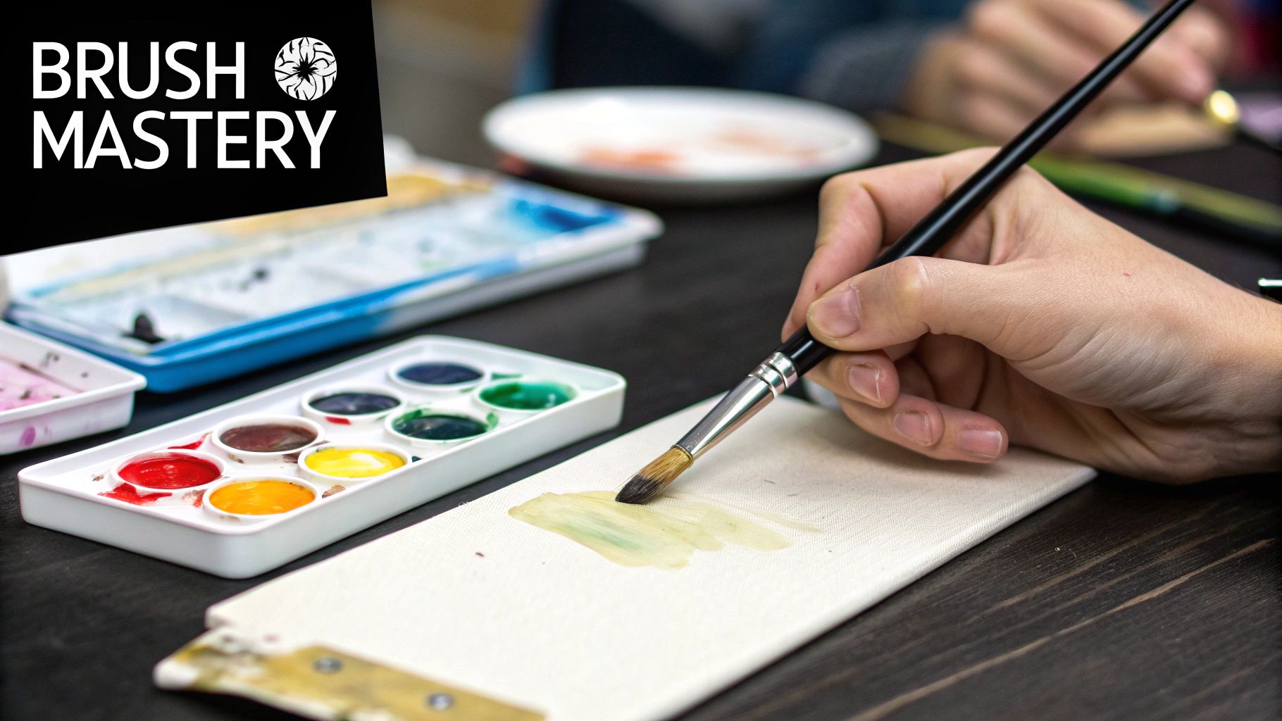
This is where you move beyond just filling in the lines and start making real art. Getting a handle on your brush and the paint itself is the single best way to elevate your project from a simple craft kit into something you’ll be proud to hang on your wall.
The secret weapon here? Perfect paint consistency. You're looking for a texture that's smooth and creamy, almost like melted ice cream. It shouldn't be watery, but it also shouldn't be thick and pasty. Don't panic if you open a pot and the paint seems a bit clumpy—that’s a pretty common quirk with acrylics.
Getting the Perfect Paint Consistency
Fixing thick paint is easier than you think. Just add a single drop of water and mix it in thoroughly with a toothpick. A little goes a long way.
For those who want to get a bit more technical, an acrylic flow improver is a game-changer. This handy medium thins the paint without weakening the color pigment, so you get a beautiful, smooth flow while keeping your colors bold and vibrant. If you're curious about different techniques, there are great guides on how to thin acrylic paint that cover all sorts of applications.
Here's a pro tip: never dip your brush into your water cup and then straight into the paint pot. You'll end up with a runny, watery mess. Always add water one drop at a time directly to the paint.
Using the right tool for the job is just as important. Your kit came with different brushes for a reason! Grab the smallest, pointiest brush for those tiny, intricate spots to get super crisp lines. For the bigger, open areas, switch to a wider, flatter brush. This will help you get smooth, even coverage and avoid those pesky brushstrokes.
If you're ready to expand your toolkit, our guide on the best brushes for paint by numbers has some fantastic recommendations.
A Smarter Painting Strategy
To keep your work clean and avoid accidental smudges, try working from dark to light. That means you should tackle all the sections for your darkest color first, then move on to the next-darkest, and so on.
This "dark-to-light" method is a smart approach for a few reasons:
- It defines the edges. The dark colors create strong boundaries, making it much easier to paint the lighter colors next to them without going over the lines.
- Mistakes are easy to fix. It’s simple to paint a light color over a dark smudge, but trying to cover a light mistake with more light paint is a headache.
- It builds depth. By putting down the shadows and dark areas first, you immediately start to give your painting a sense of dimension.
Working this way is just a more organized process. It prevents you from smearing wet paint and helps you see how the colors work together, giving you a much more polished and professional-looking final piece.
Advanced Techniques for a Polished Finish
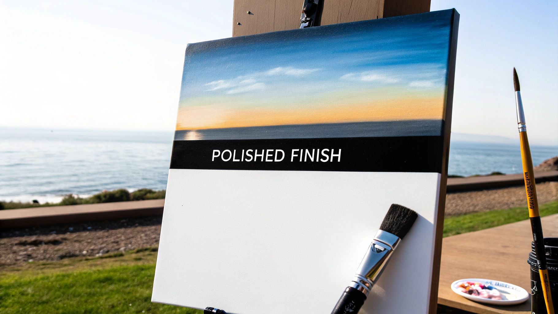
So, you've finished filling in all the numbers, but you're looking to take your painting from a fun project to a real piece of art. I get it. A few simple tricks can make a world of difference, adding depth and a personal touch that elevates the final piece. This is how you can soften those hard, "paint-by-number" lines and give your artwork a more professional, hand-painted look.
One of the most impactful techniques I've learned is blending. It's perfect for creating those smooth, beautiful transitions you see in skies, water, or a sunset, and it completely gets rid of the sharp borders between colors.
Creating Seamless Color Transitions
The secret to a great blend is working while the paint is still wet. Start by painting two neighboring sections with their assigned colors, working fairly quickly. Before they dry, take a clean, slightly damp brush and gently sweep it back and forth where the two colors touch. This classic "wet-on-wet" method melts the edges together, creating a soft, natural gradient.
This approach is my go-to tip for making landscapes feel more realistic and less like a puzzle. For a more detailed walkthrough, we have a complete guide on how to blend paint colors that breaks it down even further.
Key Takeaway: Blending isn't as intimidating as it sounds. By simply working while adjacent colors are still wet, you can easily soften the hard edges and create an organic, painterly effect that instantly elevates your work.
Taking the time to add these personal touches is a growing trend. The paint-by-numbers world is changing, and some reports show that personalized kits are on track to make up 40% of the adult market. People want unique results, and techniques like blending are how you get there. You can find more interesting stats about paint by numbers trends on Accio.com.
Protecting Your Finished Masterpiece
Once you've put in all that creative effort, the last thing you want is for your painting to get damaged. Applying a finishing varnish is a crucial final step to make sure your art lasts for years.
A quality varnish does a couple of really important things:
- It protects your art from the everyday enemies: dust, dirt, and UV light that can make your beautiful colors fade.
- It enhances the finish and gives your painting a consistent, even sheen. You can choose a glossy varnish for a vibrant, reflective look or a matte varnish for a more modern, glare-free finish.
Applying it is easy. Just grab a wide, flat brush and sweep a thin, even layer across your completely dry canvas. Let it cure in a dust-free spot, and your masterpiece will be ready to hang with pride.
What to Do When Painting Goes Wrong
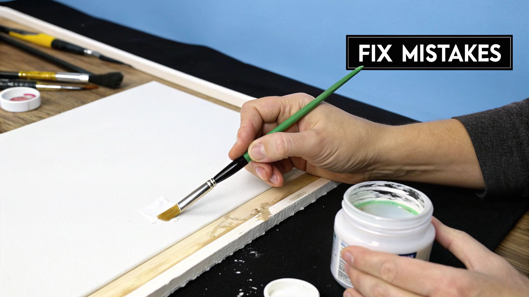
It happens to everyone. No matter how careful you are, you'll eventually have a little "oops" moment. The great news is that almost every paint-by-number mistake is surprisingly easy to fix. Knowing how to deal with these small hiccups will keep your project fun and relaxing.
One of the classic blunders is painting outside the lines or using the wrong color in a section. Whatever you do, don't panic and try to wipe away wet paint. That's a surefire way to make a smeary mess that's much harder to deal with.
Instead, just let it be. The best trick is patience. Let the incorrect paint dry completely, which usually only takes about 15-20 minutes for a normal layer of acrylic. Once it's dry to the touch, you can paint right over it with the correct color. If you're covering a dark mistake with a light color, you might need a second coat to hide it completely.
Reviving Paint and Managing Your Colors
Another common headache is opening a paint pot to find it thick, clumpy, or totally dried out. Since the acrylic paints in these kits are water-based, you can often bring them back to life.
- For thick paint: Just add one drop of warm water and stir it in with a toothpick. If it's still too thick, add one more drop. You want a smooth, creamy texture.
- For very dry paint: If the paint is almost solid, a few drops of acrylic flow improver or paint thinner can do wonders. Break up the hardened paint and stir until it rehydrates.
My Go-To Fix: I once ran out of a specific shade of sky blue with about ten sections left to fill. I took the closest blue I had, mixed in a tiny bit of white from another pot, and created a near-perfect match. You'd never know the difference looking at the finished piece.
But what if you're just running low on a color you desperately need? This is where you get to be resourceful. Start by applying thinner coats in areas that are less of a focal point. If you run out completely, don't be afraid to mix a similar shade using other colors from your kit. It's a fantastic way to learn about color theory and put your own personal stamp on the artwork.
So, Why Are We All Painting by Numbers?
Ever wonder why paint-by-numbers kits have suddenly exploded in popularity? It’s not just you. Your kit is part of a massive movement of people searching for a genuine break from their screens. We're all looking for something real, something hands-on to bring a little calm back into our busy lives.
This shared desire for a mindful escape is what’s driving the incredible growth in creative hobbies. That’s why every little paint by numbers tip you pick up is more than just advice—it’s a connection to a whole community of people doing the exact same thing.
And the numbers back it up. The art supplies market is booming. In the US alone, it was a $3.7 billion industry in 2024, and it's expected to hit $4.9 billion by 2030. If you're curious, you can dig into the data in the US art supplies market report from psmarketresearch.com.
When you sit down to paint, you're not just starting a project. You're joining a huge, vibrant community of creators who are all finding joy, busting stress, and getting that amazing feeling of accomplishment one numbered section at a time.
Knowing this "why" adds so much more meaning to your finished piece. It’s not just a painting; it’s proof that you carved out some much-needed time for yourself.
Common Paint By Numbers Questions Answered
When you're first starting out with paint by numbers, it's natural to have a few questions. Trust me, we've all been there! Getting these little details sorted out early means you can relax and enjoy the painting process without getting tripped up. Here are the answers to some of the most common things people ask.
Do I Really Have to Clean My Brush Every Single Time?
Yes, absolutely. This is one of those non-negotiable habits that separates a good result from a great one.
Every single time you switch colors, give your brush a thorough rinse in water and gently pat it dry. Even a tiny speck of leftover paint can muddy up the next color you dip into, and you'll see it on the canvas. A clean brush is your best friend for keeping your colors crisp and true.
Help! The Numbers Are Showing Through My Paint!
This is a classic issue, especially with lighter colors like yellows, whites, and pale blues. Those dark printed numbers can be stubborn.
A simple trick I've learned is to cover the number with a white colored pencil or a quick dab of white paint first. Let that dry completely, and then go over it with your intended color. You can also just apply a second coat of the light color once the first one is dry. Either way works wonders.
Pro Tip: If your paint seems a little thick or dry, don't panic. Just add one or two drops of water and stir it with a toothpick. For a more professional solution, look for something called an 'acrylic flow improver.' It thins the paint perfectly without weakening the pigment.
Should I Tackle the Big Areas or Small Details First?
Most painters find it best to work with one color at a time, starting with the largest areas first and then moving to the smallest.
Working this way is just more efficient. It also means you're not constantly opening and closing all those tiny paint pots, which is a great way to keep them from drying out before you're finished.
Ready to turn one of your own photos into a work of art? We can create a personalized kit from any image you love. Start your custom project today at Custom Paint By Numbers and create something truly unique.


