
To really get the hang of mixing colors, you have to start with the three non-negotiables: red, yellow, and blue. These are your primary colors, and you can't create them by mixing other paints. They are the true building blocks. From these three, you can mix pretty much any color you can imagine, giving you total control over your palette.
Your Foundation: The 3 Primary Colors
Welcome to the world of color mixing! This is where you become the master of every hue, shade, and tone on your canvas. Before you can tackle a fiery sunset or a detailed portrait, you need to get comfortable with the simple, powerful relationships between red, yellow, and blue. Think of them as the three main ingredients in a recipe—from them, every other color is made.
This idea isn't just an old artist's tale; it's grounded in science. Back in 1704, Sir Isaac Newton's work, Opticks, showed how white light splits into a full spectrum of colors. His discovery laid the foundation for what we call subtractive color mixing, which is just a fancy way of saying that pigments absorb certain light wavelengths to create the colors we see. It’s the same principle that powers everything from masterpieces in a museum to the simple joy of a paint-by-number kit.
What Makes Primaries So Special?
The magic of these three colors comes from their purity. You can’t mix anything to get a true red, a vibrant yellow, or a deep blue. They are the starting points for your entire color journey. Everything else—your greens, oranges, purples, and even browns—is a direct result of how you combine them. Getting this down is the first real step toward mixing colors with confidence instead of just guessing.
To dive deeper into the fundamentals, you might find this complete guide on mixing acrylic paint colors really helpful. It breaks down the essentials of color theory.
A classic beginner mistake is to rush out and buy dozens of pre-mixed paint tubes. While it seems easier, you end up relying on them. Learning to create your own secondary and tertiary colors from a limited palette is a core skill that will make you a more resourceful artist and save you money in the long run.
Your First Mixing Exercise
Let's get our hands dirty with a quick and simple exercise. You don't even need a canvas for this—a paper plate or a palette will work just fine.
- Squeeze out a small dab of red and a dab of yellow, leaving some space between them.
- Now, slowly pull a tiny bit of the red into the yellow. Watch how quickly it transforms into orange.
- Play around with the ratios. What happens when you add more yellow? You'll get a lighter, golden orange. Add more red, and it becomes a deep, fiery shade.
Do the same thing with yellow and blue to make green, and then with blue and red to create purple. The goal here isn't to paint something perfect. It's about developing an intuitive feel for how these foundational colors interact with each other. For a closer look at this process, check out our guide on the relationship between https://paint-by-number.com/blogs/learn-about-paint-by-numbers/what-are-primary-and-secondary-colors.
Navigating the Color Wheel Like a Pro
Think of the color wheel as your secret weapon for mixing colors. It's not just a pretty circle of hues; it's a practical map that shows you exactly how colors will behave when you mix them. Once you get the hang of it, you stop guessing and start making confident, intentional choices.
Beyond the basic primary colors, the wheel unlocks a whole universe of sophisticated relationships. For example, when you mix a primary color like red with a secondary color right next to it, like orange, you get a tertiary color: red-orange. These are the subtle, in-between shades that give paintings depth—perfect for capturing the soft glow of a sunset or the rich, earthy tones of autumn leaves. They're the essential bridge between your bold primaries and vibrant secondaries.
Understanding Complementary Colors
One of the most powerful tricks the color wheel teaches you is how to use complementary colors. These are colors that sit directly opposite each other on the wheel. The classic pairs are red and green, blue and orange, and yellow and purple.
Put them side-by-side in a painting, and they create an electric effect. Each color makes the other look more intense and vibrant. It’s the strongest contrast you can get.
This isn't just some abstract theory; artists have been using it for centuries. The idea really took off in 1841 when a chemist named Michel Eugène Chevreul published his findings on color harmony, proving how colors placed next to each other could intensify one another. His work had a massive influence on the Impressionists, who used this knowledge to make their canvases practically buzz with energy. You can dig deeper into the history of these materials on marketresearch.com.
So, if you’re painting a calm blue sea, a few touches of a brilliant orange in a sunset reflection will make both colors sing. It’s a fantastic way to create a focal point and draw the viewer's eye exactly where you want it.
This simple diagram shows how two primary colors come together to create a secondary one.
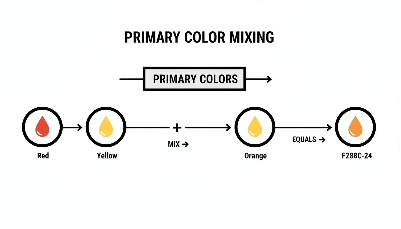
As you can see, a pure red and a pure yellow blend to create a clean, bright orange—a mix every painter needs to have in their back pocket.
Using Analogous Colors for Harmony
Where complementary colors create drama and excitement, analogous colors do the opposite—they create a feeling of calm and unity. These are groups of three colors that sit right next to each other on the color wheel, like yellow, yellow-green, and green.
Because they all share a common base color, they naturally go together and feel very pleasing to the eye. This is the perfect color scheme for creating serene landscapes or any composition where you want a smooth, cohesive look.
Pro Tip: When painting with an analogous scheme, pick one color to dominate, a second to support it, and use the third as a small accent. This little trick keeps the composition balanced and interesting without ever feeling chaotic.
Once you really understand these key relationships on the color wheel, you're no longer just slapping paint around. You're composing with color, giving you the power to control the mood, focus, and entire feeling of your artwork.
Creating Depth with Tints, Shades, and Tones
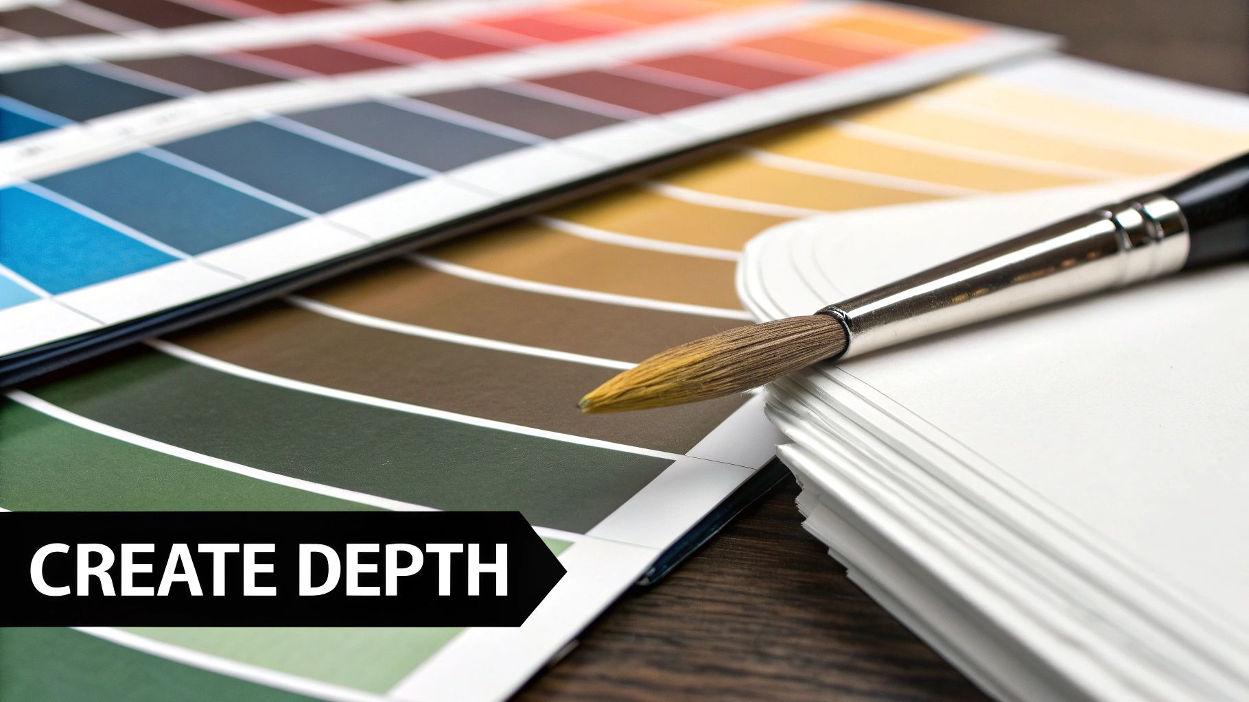
Once you’ve got a handle on the color wheel, it's time to give your work some real dimension. The secret to realism, mood, and depth in a painting lies in what happens when you introduce white, black, or grey to your pure colors. This is where the magic of mixing colours in painting truly begins.
Moving beyond the basic colors of the rainbow is how your art develops a personal, sophisticated feel. By learning to create tints, shades, and tones, a single tube of red paint can become a delicate rose pink, a deep and dramatic burgundy, or a muted, earthy terracotta. You're no longer just painting objects; you're painting light and shadow.
Lighten Up with Tints
Simply put, a tint is any color that has white added to it. Think of soft pastels, the pale blush on a cheek, or a bright highlight catching a shiny apple. Tints are what you'll use to capture light and create a gentle, airy atmosphere.
Mixing them is pretty straightforward. Start with your main color and slowly add tiny dabs of white. Trust me, it’s far easier to gradually lighten a color than it is to darken it back down after adding too much white.
- For a soft sky blue: Start with your Ultramarine Blue and add Titanium White, bit by bit, until you get that perfect pale hue.
- To create a delicate pink: Use a touch of Cadmium Red and blend in white. The more white you add, the softer that pink will become.
Tints are also crucial for showing distance in landscapes. Objects that are farther away almost always look lighter and less intense.
Introduce Drama with Shades
A shade is just any color with black mixed in. This is your tool for creating shadows, adding punchy contrast, and giving objects a sense of weight and form. Using shades effectively is what turns a flat circle into a three-dimensional sphere.
A quick word of warning, though: black pigment is incredibly strong. It can easily overpower a color and turn it into a muddy mess. Always start with your base color and add the tiniest speck of black on the tip of your palette knife.
My number one rule: Never add your color to black; always add black to your color. This will save you from countless muddy mixes and give you far more control, preventing wasted paint.
For instance, to mix a deep forest green, you’d start with your vibrant green and carefully work in a minuscule amount of black. This deepens the color without completely killing its life.
Create Sophistication with Tones
Finally, we have tones. A tone is created by adding grey (a mix of black and white) to any color. This might be the most powerful and useful technique for creating realistic and harmonious paintings. Adding grey mutes a color's intensity, making it less saturated and much more natural.
Look around you—most colors in the real world are tones, not pure, straight-from-the-tube hues. Think of the complex colors of a stormy sea, the subtle grey-greens of eucalyptus leaves, or the muted purples of distant mountains.
To mix a tone, you can create a neutral grey first and then blend that into your color. This gives you great control over the final value (its lightness or darkness). For a deeper dive with more examples, check out this guide on how to mix acrylic paint colors.
By mastering tints, shades, and tones, you unlock an infinite spectrum of possibilities from just a handful of paints, bringing your work to life with nuance and realism.
Mixing Believable Neutrals And Skin Tones
Moving beyond bright, pure colors into the world of neutrals and skin tones can feel like a huge leap. So many artists I've seen get frustrated, ending up with dull, lifeless mud instead of rich, believable hues. But the secret isn't in buying a special tube of beige paint; it's all about knowing how to mix it yourself.
First, forget reaching for black or brown paint right away. The most dynamic and natural-looking neutrals—like warm grays, deep browns, and soft tans—come from mixing complementary colors. This approach to the mixing of colours in painting adds a subtle vibrancy that pre-mixed colors just can't match. For instance, mixing a deep red with a rich green creates this beautiful, earthy brown that feels so much more alive than anything you can squeeze from a tube.
Crafting Nuanced Neutrals
Let's put this into practice. Grab a complementary pair from your color wheel, like blue and orange. On your palette, put a dab of each color separately. Now, slowly drag a tiny amount of the blue into your orange. Watch what happens—it instantly knocks back the orange's brightness, creating a much more sophisticated, muted tone. The more blue you add, the closer you get to a cool, deep brown or even gray.
This simple technique works for any complementary pair:
- Red + Green: This combo is my go-to for a huge range of earthy browns. A little more red gives you a warmer, terracotta-like brown, while leaning into the green pushes it toward a deep, mossy shade.
- Yellow + Purple: Mixing these produces some fascinating, complex grays and tans. It's a fantastic recipe for capturing the subtle colors you'd find in stone or an overcast sky.
If you want to dive deeper into specific recipes for brown, you might find our guide on making brown colour really useful.
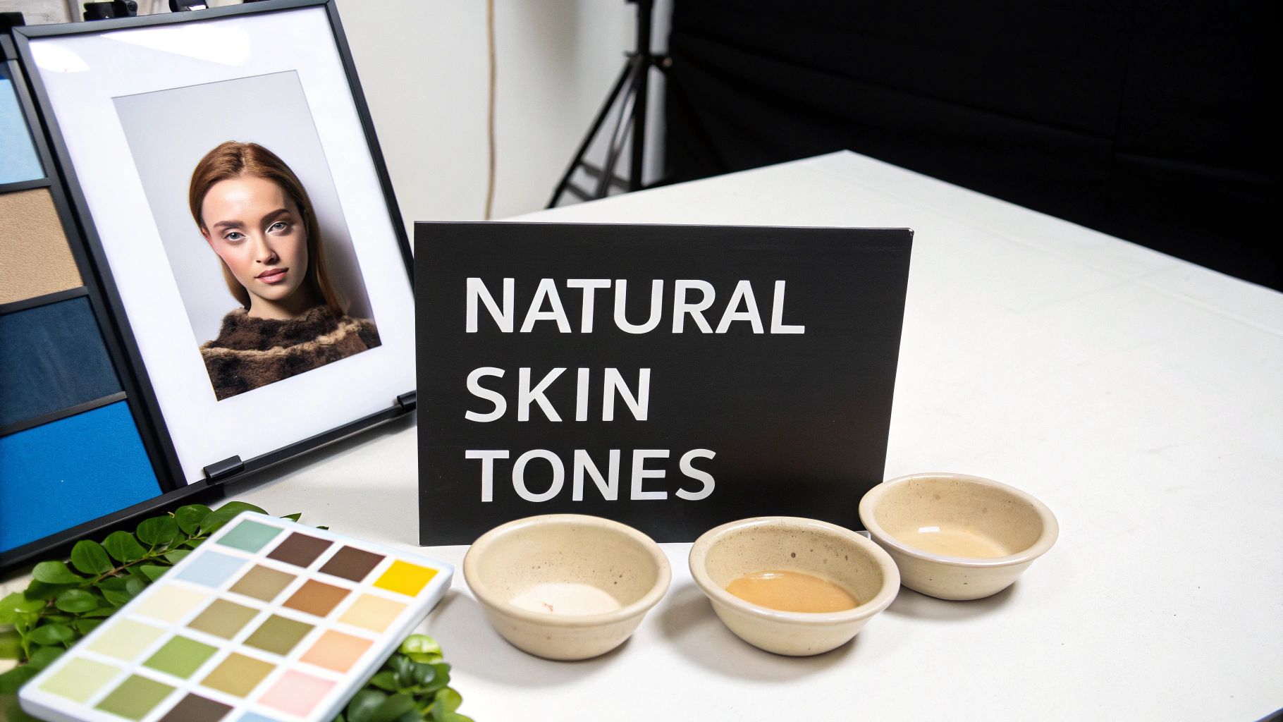
Mixing Lifelike Skin Tones
Mixing skin tones follows a similar logic, but you'll start with a simple, foundational base. You can create almost any skin tone on the planet with just the three primary colors, plus white. A great starting point is a base of yellow and red, with a tiny touch of blue to dial back the intensity.
Start by squeezing out a generous amount of white on your palette to act as your base. Add a bit of yellow and a smaller amount of red to create a warm, orange-pink hue. From here, it's all about subtle adjustments.
The biggest mistake I see artists make when mixing skin tones is forgetting the "life" color. Skin isn't one flat color; it's full of undertones. Adding a minuscule speck of blue or green can neutralize that pinkish base just enough to create a more realistic and complex complexion, preventing that "plastic doll" look.
To capture the vast diversity of human skin, you'll need to adjust this base formula. Here’s a quick guide to modifying your mixture:
- For fairer skin: Use a lot more white in your base and keep the red and yellow additions minimal. A tiny hint of blue can introduce a cooler, pale undertone.
- For medium or olive tones: Start with your base mix, then add a bit more yellow and a touch of green (or blue). This creates those beautiful warm, earthy tones often seen in Mediterranean or Latinx complexions.
- For darker skin: Use less white and increase the amount of red and yellow. To achieve those rich, deep browns, carefully introduce more blue or even a touch of purple. This adds incredible depth and keeps the color from looking like a flat "chocolate" brown.
Always test your mixes on a scrap piece of paper as you go. One last tip: remember that acrylics often dry a shade darker, so try to mix your color a little lighter than your target. This back-and-forth process of mixing, testing, and adjusting is where the real magic happens.
How to Fix Common Color Mixing Mistakes
We’ve all been there. You’re mixing what should be a beautiful, vibrant color, and somehow it just collapses into a disappointing, muddy brown. It’s a frustrating moment, but trust me, it’s a rite of passage for every painter. The good news is that most of these mixing mishaps are easy to fix once you know what to look for.
The most common culprit is creating "mud." This usually happens when you throw too many colors into the mix, especially when you start adding complementary colors without a specific goal in mind.
To keep your hues crisp and clean, stick to a simple rule: work with just two or three colors at a time. This one little habit can stop a beautiful mixture from becoming overworked and dull.
Salvaging Overpowered Colors
Another classic mistake is letting a powerful color completely take over. We've all done it. You add a touch of black or Phthalo Blue, and poof—your entire mix is dominated. Those highly saturated pigments are bullies on the palette.
Here's how you stay in control: always add the darker, more intense color to the lighter one, never the other way around. Add a tiny speck of black to your big pile of yellow, not a drop of yellow into your black. It gives you so much more precision.
If you've already added too much, resist the urge to "fix" it by dumping in a mountain of white or yellow. You'll just end up with a huge pile of the wrong color and a lot of wasted paint. It's almost always better to scrape that attempt off your palette and start over.
Remember this mantra: You can always add more, but you can’t take it away. This idea is the cornerstone of good color mixing and will save you a ton of paint and frustration in the long run.
Keeping Your Palette Clean
A messy palette is a surefire way to get muddy colors. The second a stray fleck of blue wanders into your beautiful yellow, you’re on your way to a sickly green instead of a bright, clean lemon. This kind of cross-contamination is sneaky but it can ruin your colors.
A few good habits will make all the difference:
- Create Zones: Give your primary colors their own space on the palette, far away from each other.
- Wipe Your Tools: Get in the habit of wiping your palette knife or brush on a paper towel after every single mix.
- Use Two Water Jars: If you're using acrylics, have one jar for the initial dirty rinse and a second, clean one for thinning your paints.
Learning the mixing of colours in painting is less about some innate talent and more about building these smart, consistent habits. By sidestepping these common blunders, you’ll find your colors stay vibrant, clean, and exactly how you pictured them.
Your Color Mixing Questions, Answered
Every painter, from beginner to pro, runs into questions when mixing colors. It's just part of the process. Let's tackle some of the most common hurdles I see artists face—clearing these up will give you a huge confidence boost at the easel.
What Are the Three Most Important Colors to Start With for Painting?
If you're just starting out, keep it simple. All you really need are the three primaries: a solid red, a vibrant yellow, and a deep blue. I always recommend starting with versatile workhorses like Cadmium Red, Cadmium Yellow, and Ultramarine Blue.
Grab those three and a tube of Titanium White, and you've unlocked almost the entire color spectrum. Seriously. This limited palette forces you to learn the relationships between colors firsthand. You'll get your hands dirty figuring out how to mix your own oranges, greens, and purples, which is probably the most valuable skill you can develop as a painter.
A funny thing happens when you limit your palette: your creativity actually expands. Constraints make you experiment and discover unique color combinations you'd never find with 20 pre-mixed tubes.
How Do I Stop My Mixed Colors from Looking Muddy?
Ah, the dreaded "mud." It happens to everyone, but it's usually caused by one of two things: either you've been stirring your paint into oblivion, or you've thrown too many pigments into the mix.
The best way to keep your colors crisp and vibrant is to mix only two or three colors at a time. If you're trying to neutralize a color, be deliberate. Use its direct complement (like adding a touch of green to red) instead of just tossing in a bit of everything.
And here's a simple habit that makes a world of difference: keep your tools clean. Always wipe your palette knife or brush before you dip it into a new blob of paint. This one tiny step is your best defense against contamination and is crucial for keeping your hues pure.
Do the Same Color Mixing Rules Apply to Different Kinds of Paint?
Yes, absolutely. The fundamental rules of color theory are universal. Red and yellow will always make orange, no matter if you're working with acrylics, oils, or watercolors.
The difference isn't in the what, but in the how. Each medium has its own personality, and you have to adjust your technique accordingly.
- Acrylics dry fast, so you have to work quickly to blend colors smoothly before they set up.
- Oils take forever to dry, which is great because it gives you tons of time to blend and create subtle, soft effects.
- Watercolors are transparent, so mixing often happens right on the paper by layering thin washes of color, a technique called glazing.
So, while the color wheel doesn't change, your approach will. Learning to adapt your mixing style to the paint you're using is the key to getting the results you want.
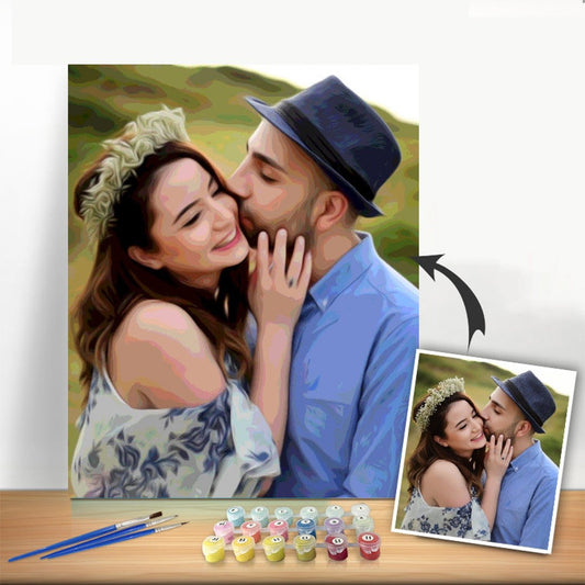
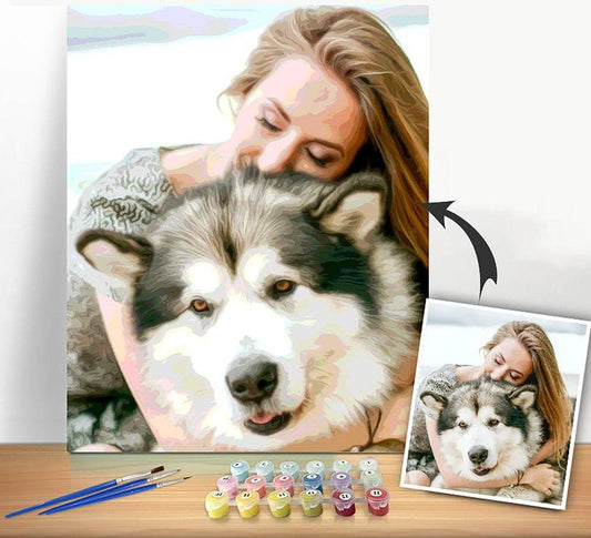
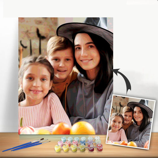
Ready to turn a favorite photo into a masterpiece? With Custom Paint By Numbers, you can create a personalized kit from any picture you love. Start your next creative adventure today at https://paint-by-number.com.