Orange ist eine helle und lebendige Farbe, die häufig mit Aufregung, Energie und Wärme assoziiert wird. Es wird oft mit Glücksgefühlen in Verbindung gebracht und ist aufgrund seiner aufmerksamkeitserregenden Wirkung eine beliebte Wahl für Branding und Design. Die Farbe Orange hat ihren Namen von der gleichnamigen Frucht, die für ihren hellen Zitruston bekannt ist.
Blau hingegen ist eine beruhigende und gelassene Farbe, die oft mit Stabilität, Vertrauen und Tiefe assoziiert wird. Es ist eine Primärfarbe, die seit Jahrhunderten in Kunst und Design verwendet wird. Blau ist die Farbe des Himmels und des Ozeans und ruft Gefühle von Frieden und Ruhe hervor.
Lackfarben vs. RGB-Farben
Beim Mischen von Farben wie Orange und Blau gibt es einen Unterschied zwischen herkömmlichen Lackfarben und digitalen RGB-Farben. Beim Farbmischen sind Orange und Blau Komplementärfarben, das heißt, sie stehen sich im Farbkreis direkt gegenüber. Zusammengemischt ergeben sie je nach Mengenverhältnis eine neutrale Farbe wie Braun oder Grau.
Im digitalen Design und in der Fotografie werden Farben jedoch häufig mithilfe des RGB-Farbmodells dargestellt. Bei diesem Modell ist Orange eine Mischung aus rotem und grünem Licht, während Blau eine Mischung aus blauem Licht ist. Wenn diese Farben in RGB kombiniert werden, entsteht ein Braun- oder Grauton, ähnlich wie beim Farbmischen.
Welche Farbe ergeben Orange und Blau?
Welche Farbe ergibt die Kombination aus Orange und Blau? Wie bereits erwähnt, entsteht beim Mischen von Orange und Blau ein neutraler Ton wie Braun oder Grau. Dies liegt daran, dass sich die orangen und blauen Pigmente gegenseitig aufheben, was zu einer weniger gesättigten Farbe führt.
Bei Verwendung des RGB-Farbmodells führt die Kombination von orangefarbenem und blauem Licht je nach Intensität der einzelnen Farben auch zu einem Braun- oder Grauton. Diese Farbmischung wird im digitalen Design häufig verwendet, um Schatten, Glanzlichter und Tiefe in Bildern und Grafiken zu erzeugen.
Zusammenfassend lässt sich sagen, dass Orange und Blau lebendige und kontrastierende Farben sind, die beim Mischen einen gedämpfteren Ton erzeugen. Ob beim traditionellen Mischen von Farben oder bei digitalen RGB-Farben: Die Kombination von Orange und Blau kann zu einer Reihe neutraler Farbtöne führen, die jedem Design Tiefe und Raffinesse verleihen.
Welcome to the world of Huggy Wuggy coloring pages! Whether you're a young fan or a seasoned enthusiast, these free printable coloring pages featuring Huggy Wuggy are sure to bring...
Welcome to the world of Huggy Wuggy coloring pages! Whether you're a young fan or a seasoned enthusiast, these free printable coloring pages featuring Huggy Wuggy are sure to bring...
Welcome to the world of super coloring pages! Whether you're a young fan or a seasoned enthusiast, these free printable super coloring pages are sure to bring a smile to...
Welcome to the world of super coloring pages! Whether you're a young fan or a seasoned enthusiast, these free printable super coloring pages are sure to bring a smile to...
Welcome to the underwater world of dolphin coloring pages! Whether you're a young adventurer or a seasoned artist, these free printable dolphin coloring pages are sure to spark your creativity...
Welcome to the underwater world of dolphin coloring pages! Whether you're a young adventurer or a seasoned artist, these free printable dolphin coloring pages are sure to spark your creativity...
Welcome to the wonderful world of snake coloring pages! Whether you're a budding artist or a coloring aficionado, these free printable snake coloring pages are guaranteed to unleash your creativity....
Welcome to the wonderful world of snake coloring pages! Whether you're a budding artist or a coloring aficionado, these free printable snake coloring pages are guaranteed to unleash your creativity....
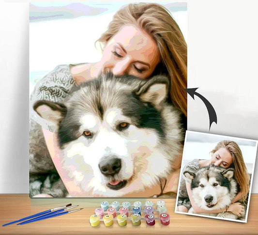
Totally addictive, loved doing this photograph of my dog, it looks fabulous on my wall and everyone comments on it. Will definitely be ordering more as it is the most relaxing thing I have done. Fantastic.
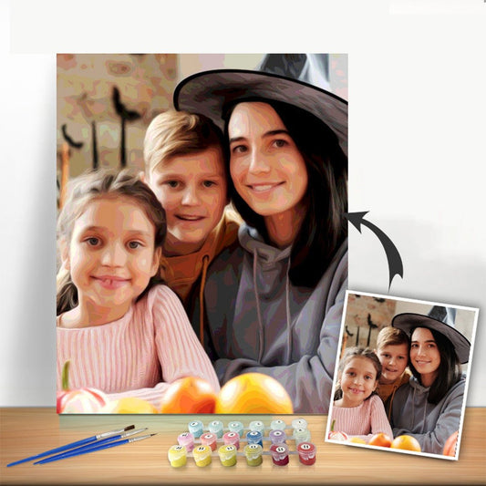
Very good quality. I have to say I didn't expect it to take so long to complete because the sections are very small, but the final result is wonderful and the people in the photo look remarkably alike. It has a wide variety of colors, and the skin tones look very natural. It also comes with a generous amount of each paint color, with more than enough included to finish the painting.
I love the idea of choosing my own pictures to paint by numbers, and I really like that the canvas comes with paint, brushes, and guides. I noticed on the canvas, there were a few duplicates of numbers beside each other, so I either needed to expand the use of one paint color, or select a different number to paint of one of the repeated numbers.
My Custom Paint By Numbers kit IS AMAZING! The 28 color kit has VERY DETAILED numbered areas to paint with some of the areas on the canvas so small that you think you need a brush with ONE hair. But, with such small areas comes wonderful detail that I’m sure my final work will have! I highly recommend this paint by numbers kit to memorialize any happy memory!
Loving my newest PBN project. We’ve had freezing and below zero temps up here in Michigan for two weeks so I was especially grateful to have this to secure my focus!
As before, I had to trust that all would work out. Sitting so close, even sometimes with a magnifying glass, you find it hard to imagine that this painting will look even barely good … but I finished all the dark colors, stood back and OMG! They did it again!
WOW do they do it?
Not only did I get a full set of the paints that I ordered, but I even got a set of complementary brushes, including two very fine brushes for detail work that I really needed and didn't have from the first set. Excellent and gratefully received.
Two of my most recent paintings. I've enjoyed each project I've completed and have started working on my 6th Paint by Number. The paints, frame and canvas provided are all high quality and the results are now hanging in my home.
This is my first. Enjoyed the fact that I'm painting one of my favorite pictures of my friend. Not yet complete have to work on the black it was a Stiff paint used blending gel which really helped tho see shrinkage I'd like to fix. Friend suggested using Gesso as mat prep. Did not order a frame. Learning. Did order another off a photo. Used the 30+ paints very satisified. Barb
Work still in progress, but nearly there. Colours are good and make the painting more interesting to do.
If you look carefully you will see I modified the colours to the right of pheasants head, felt the brown was to dark and did not show off the pheasant colours.
All who have seen it are impressed with the picture.
Have decided to paint the canvas prior to fixing it to the stretcher as it’s easier to turn round when working on it.
Overall good quality and paints cover well and hide the numbers.
Regards
Keith Davies
Absolutely loved doing this, the quality was great and I will definitely be ordering again!
Only downside I would say is that part of the picture I uploaded was cut off.. I assumed the photo would be sized to the canvas.
This is my second Paint by Number project.
I decided to paint a photograph I had taken and after finishing 3/4 of the painting, I am definitely hooked on this activity.
It'e been so enjoyable and relaxing I am in the process of deciding which photo to paint next.
I prefer submitting my own photos vs. painting something preset. It's very satisfying once the project is finished and for this one I can't wait to hang it on my wall.
This was my first time trying a Paint by Number project after a few times painting at a local Paint and Sip facility.
I might have chosen a photo with too much detail as a first project and painting people/faces is definitely a challenge.
Overall I think it turned out well. The brushes and paint provided worked well.
The biggest challenge was painting areas connected by narrow sections and making sure I was still using the right number/color in that section. It would be nice if the number could be repeated but guessing that might cause different confusion.
Will definitely be trying this again. I found it very relaxing, especially this time of year with holiday music in the background.
Really good brushes and quality paint. The instructions were missing so I just dove in and started painting. It was fun and the result was nice. The colors weren’t perfect but I was happy with the final canvas.
Having completed one of my three daughters, which was a Christmas present from my wife, I wanted to do a second one. It is a very relaxing activity and creates a feeling of self-satisfaction. Already planning a third!
Easy to order. Good turn around time. Very happy with the amount of paint and brushes included. I am a little disappointed in the actual paint colors. They do not quite match the colors in the photo provided. They are off from the original photo uploaded.
Wow!! I absolutely loved doing this! I purchased as my husband's 1st wedding anniversary gift, and it didn't disappoint!
It was super therapeutic, I loved it so much, even when it got to the fiddly bits!!
Thank you so much! Will definitely be purchasing again in the future :D!
Chloe
Love it, getting there slowly there is a lot of detail in it so it keeps me busy. Paint and brushes are good quality. Only negative is I bought the frame and it didn't arrive with the painting, was told it on the way but 3 weeks later no sign. It's hard to paint when your relying on the frame as a base
We absolutely love it! It took me quite some time to complete as the detail was very high but extremely happy with the results overall! I wish I would have opted for the maximum colours possible (I went for 36 paints) but I know for next time. I will have to buy and complete another one for a different room now
I’m 15 hours into my paint by numbers and loving it! It’s my second one and is a gift. It’s a hobby for me and a gift for a friend. The detail is fantastic with 36 colours and to me, worth every penny
Tea Rose Color: Meaning, and History When it comes to the Tea Rose color, one might imagine a delicate and soft hue resembling the petals of the Tea Rose flower....
Tea Rose Color: Meaning, and History When it comes to the Tea Rose color, one might imagine a delicate and soft hue resembling the petals of the Tea Rose flower....
Tea Green is a soothing and refreshing color that radiates a sense of calmness and tranquility. Its delicate hue falls within the green spectrum, symbolizing growth, harmony, and nature. In...
Tea Green is a soothing and refreshing color that radiates a sense of calmness and tranquility. Its delicate hue falls within the green spectrum, symbolizing growth, harmony, and nature. In...
Taupe Gray Color, Meaning, and History Taupe Gray Color: Meaning and History Taupe gray is a color that falls in between taupe and gray, hence the name. It is a...
Taupe Gray Color, Meaning, and History Taupe Gray Color: Meaning and History Taupe gray is a color that falls in between taupe and gray, hence the name. It is a...
The color taupe is a versatile and elegant neutral color that has gained popularity in both fashion and interior design. In this blog post, we will explore the meaning, history,...
The color taupe is a versatile and elegant neutral color that has gained popularity in both fashion and interior design. In this blog post, we will explore the meaning, history,...