

Ready to move past just filling in the lines? This is where the real fun begins. Advanced color-by-number is all about using artist-level techniques—like blending, shading, and glazing—to transform a standard kit into something with genuine depth and realism. You'll be working with more complex kits, maybe even custom photo-based projects, to create what I like to call a truly painterly effect.
Taking Your Painting Beyond the Basic Kit
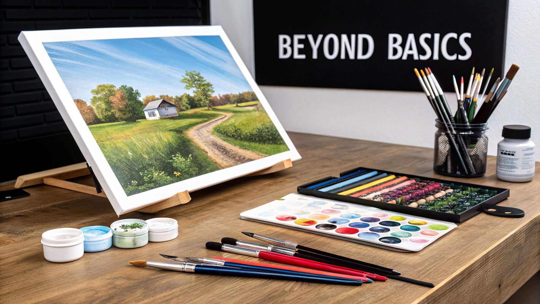
If you've got a few paintings under your belt and feel that itch for a bigger challenge, you're in the perfect spot. This guide is for hobbyists like you who want to add their own personal flair and turn a simple kit into something you'd be proud to hang on your wall.
We’ll dig into the practical methods that make all the difference, from choosing the right advanced kit to prepping your canvas like a pro. These small shifts in your approach set the stage for a truly elevated final piece.
The Rise of Personalized Art
It’s no surprise that these more intricate kits have become so popular. They're a huge part of the booming art reproduction market, where people all over the world are turning their favorite photos into numbered masterpieces. This market, valued at USD 50.62 billion in 2025, is projected to hit a staggering USD 89.78 billion by 2034. That just goes to show you how much people love having a creative, structured outlet.
What Sets Advanced Kits Apart
So, what exactly makes a kit "advanced"? It’s not just about a pretty picture on the box. A few key differences set these projects apart from the ones you might have started with. Knowing what to look for will help you pick a kit that pushes your skills without feeling overwhelming.
Here’s a quick rundown of what makes advanced kits a different beast altogether:
Key Differences Between Basic and Advanced Kits
| Feature | Beginner Kit | Advanced Kit |
|---|---|---|
| Paint Count | Typically 12-24 colors. | Often 36, 48, or even more for greater nuance. |
| Section Size | Larger, simpler shapes. | Tiny, intricate sections requiring fine control. |
| Composition | Simple subjects, clear lines. | Complex scenes with subtle shadows and textures. |
| Technique Focus | Basic color-blocking. | Encourages blending, shading, and glazing. |
Ultimately, an advanced kit gives you the framework for something much more detailed and realistic. It’s the perfect foundation for applying the more sophisticated techniques we’re about to cover.
The real magic happens when you stop seeing the numbers as rigid rules and start seeing them as a guide. An advanced approach means you are the artist in control, using the kit as a foundation for your own creative expression.
Ready to turn your own memories into a work of art? You can find out everything you need to know in our guide on creating custom paint by numbers for adults.
Getting Your Canvas and Tools Ready for a Flawless Finish
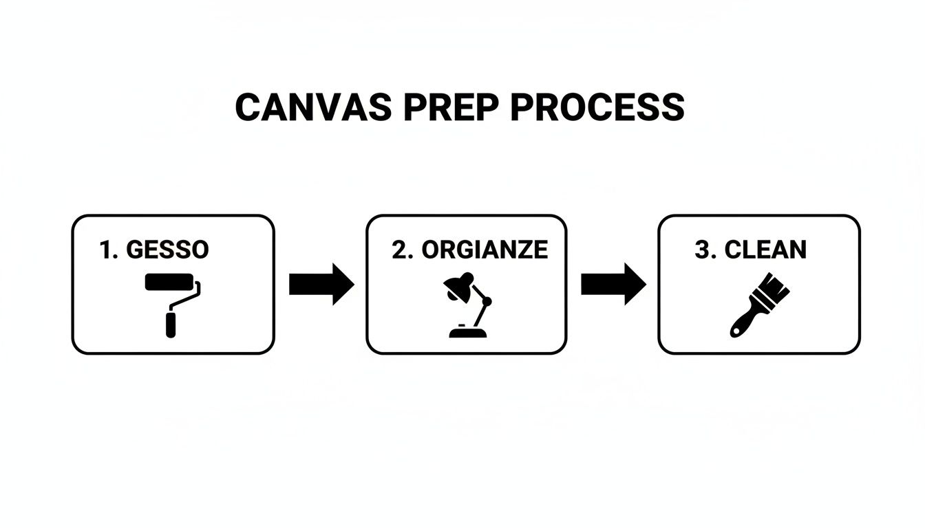
A stunning result starts way before the first drop of paint hits the canvas. Honestly, the prep work is the secret sauce that takes a project from a fun pastime to something you’d be proud to hang on your wall. It all begins with setting up a clean, organized space where you can get in the zone.
Think of your painting spot as your personal studio. You'll need great lighting—natural light is king, but a decent desk lamp works too—so you can see the colors accurately and avoid squinting at tiny numbers. I always lay out my numbered paint pots in order before I start. It's a simple trick, but it saves you from hunting for the right color and keeps you in that creative flow.
A Pro-Level Canvas Upgrade
Most kits come with a perfectly usable pre-printed canvas, but one little step can make a world of difference, especially for those more ambitious color by number advanced paintings. Get yourself some clear acrylic gesso. Trust me, it’s a game-changer.
Gesso acts as a primer, creating a slightly textured surface that the paint just loves to grab onto. This means your colors go on smoother, look richer, and you'll often need fewer coats to get that opaque, vibrant finish. Just brush on one thin, even layer with a wide, soft brush and let it dry completely.
A prepped canvas is like a perfectly tuned guitar. It won’t write the song for you, but it makes creating something beautiful so much easier. Every brushstroke will land exactly how you want it to.
Your Brushes Are Everything
Let's be real: the little brushes that come in most kits are... okay. But if you’re serious about leveling up your skills, upgrading your tools is non-negotiable. It’s no surprise the global market for painting tools is projected to jump from USD 12 billion in 2026 to USD 15.8 billion by 2035. That growth comes from people just like us who want to create gallery-worthy art at home. You can actually explore the data behind these market trends and see how the hobbyist boom is pushing the industry.
Investing in a small set of fine-detail brushes will give you the control you need for those tiny, tricky sections that make or break an advanced piece. You don't need a lot, just a few key sizes:
- A fine-point round brush (Size 0 or 00): This is your best friend for the smallest, most detailed spots that require super crisp lines.
- A small flat brush (Size 2 or 4): Ideal for filling in slightly larger areas with clean, even coverage.
- An angled brush: Gives you amazing control for getting into sharp corners and painting clean edges.
Finally, you have to take care of your brushes. It’s not optional. Clean them right away with lukewarm water after you finish painting, and gently use your fingers to reshape the bristles. To store them, just pop them in a jar or holder with the bristles pointing up. This keeps them from getting bent and ruined. Good tools, well cared for, are the foundation of any great painting.
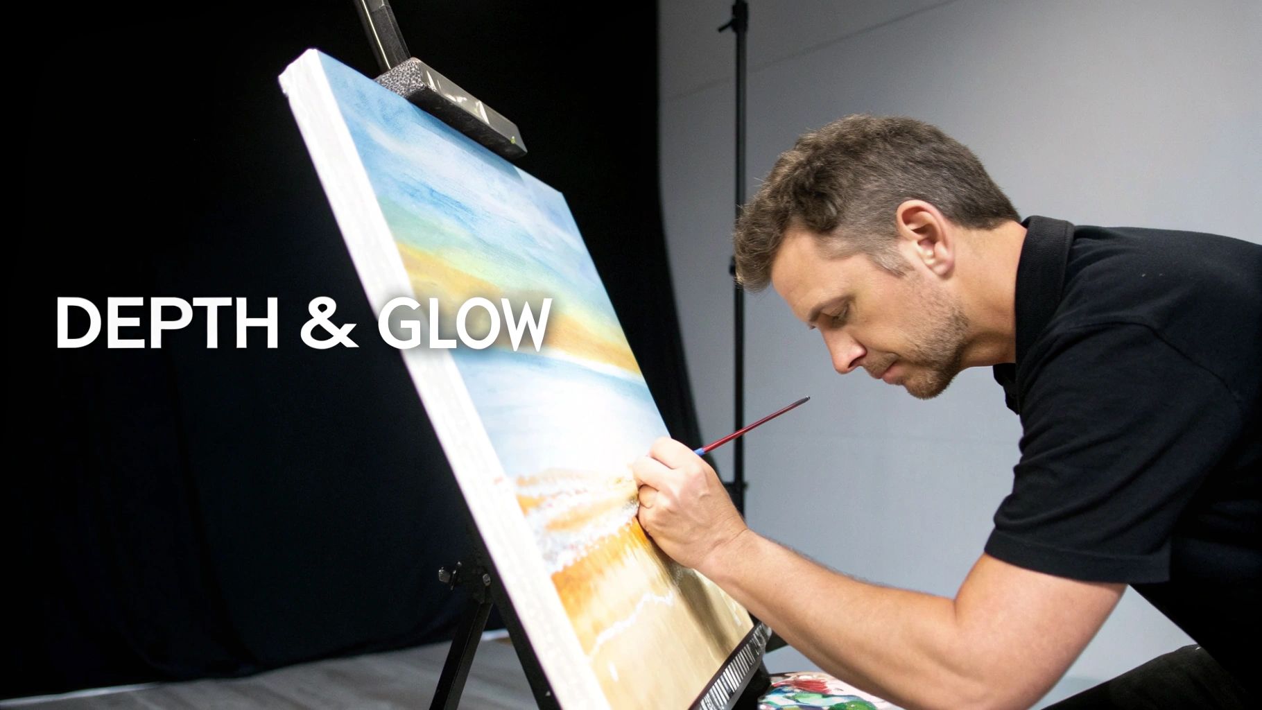
Mastering Advanced Brushwork and Blending
Ready to make your painting look less like a color-by-number and more like a genuine piece of art? This is where the magic happens. We're going to move beyond just filling in the lines and start creating the soft, natural transitions that bring a painting to life.
The secret is to soften those hard edges where two colors meet. One of the best ways I’ve found to do this is a technique called feathering. Just take a clean, slightly damp brush and gently work the line between two colors. You're basically pulling a tiny bit of one color into the other, blurring the boundary for a much softer, almost hazy look.
Another go-to method is stippling. Instead of painting with smooth strokes, you’ll use the tip of your brush to apply little dots of paint. It's perfect for adding texture to things like trees, clouds, or rocky terrain. By dabbing two different colors along their shared border, you get a cool, pointillist-style blend that looks incredibly sophisticated.
But before you dive into these techniques, remember that good prep work is the foundation for a great result.
As this shows, having a clean, prepped canvas and organized tools makes all the difference when you get to the detailed, advanced work.
Creating Smooth Gradients
Creating a believable gradient is a game-changer, especially for scenes with sunsets, open skies, or water. The goal is to make one color flow seamlessly into another, with no harsh lines. Imagine blending a rich orange into a pale yellow for a perfect sunset.
First, paint the two color blocks right next to each other, just as the kit directs. The trick is to work while the paint is still wet. Grab a clean, dry brush and gently sweep it back and forth across the border. The dry bristles will pick up and mix the wet paints right on the canvas, creating that beautiful, smooth transition you're looking for.
Blending isn't about perfectly mixing two colors into a third; it's about creating an optical illusion where the eye perceives a smooth change. Your brush is the magic wand that makes the hard lines disappear.
Adding Texture with Dry Brushing
Not everything in a painting should be perfectly smooth. The dry brush technique is a fantastic way to add texture and make your work feel more dynamic. This method is brilliant for suggesting the grain of old wood, the fluffiness of clouds, or the sparkle of light on water.
Here’s how you do it: dip just the tip of a stiff-bristled brush into your paint, then wipe most of it off on a paper towel until the brush is almost dry. Now, lightly drag it over your canvas.
- For highlights: Use a light color over a darker, already-dry section. The paint will only catch the raised texture of the canvas, giving it a shimmering effect.
- For texture: Apply a slightly darker shade over a base color. This is how you can create the look of wood grain or the rough surface of a stone.
This simple effect adds a layer of realism that you just can’t get by painting flat blocks of color. These skills are what a color by number advanced project is all about, and they’ll truly set your paintings apart. If you want to explore this further, you can learn more about blending acrylic paints in our dedicated guide.
Adding Depth and Realism with Shading and Glazing
If blending softens the hard lines, shading and glazing are what breathe life into your painting. These two techniques are your secret weapons for creating genuine three-dimensional form and playing with light. This is where flat, colored shapes transform into objects that have weight, depth, and a truly professional finish.
Shading is simply the art of painting shadows. It’s what convinces the eye it’s looking at a round apple, not just a red circle. While your kit provides a decent range of colors, you'll want to mix your own shadow tones to really elevate your work. The biggest rookie mistake? Using pure black for shadows, which almost always looks jarring and unnatural.
A much better approach is to mix a tiny bit of black—or better yet, a complementary color—into your base paint. For that red apple, stirring in a hint of dark green will create a much more believable shadow than straight black ever could.
Mastering Shadow Tones
Creating great shadows is all about subtlety and knowing where to place them. You really don't need much paint; a little goes a long way.
- Try Complementary Colors: Got a bright yellow sunflower? Mix a tiny dab of its opposite on the color wheel (purple) into the yellow to create your shadow color. This keeps the color from looking muddy.
- Think Cool vs. Warm: You can also mix in a touch of a cool color like blue or a warm one like brown. This lets you create different shadow effects depending on where the light is coming from in your scene.
- Apply Strategically: Use your mixed shadow color where shade would naturally fall—underneath an object, on the side facing away from your light source, or in the deep folds of fabric.
This is a core technique for any color by number advanced painter, and it gives your work an immediate boost in realism.
Shading isn’t just about making things darker; it’s about revealing form. Each shadow tells a story about the object's shape and its place in the world. It’s the difference between a picture and a portrait.
The Luminous Art of Glazing
While shading carves out form, glazing builds up a beautiful glow. This technique is all about applying a very thin, transparent layer of paint over a section that is completely dry. A glaze can tie different areas of your painting together, deepen a color's intensity, or just slightly shift its hue.
To make a glaze, just mix a tiny amount of your acrylic paint with a good bit of water or a dedicated glazing medium. You're aiming for a thin, translucent consistency. For example, brushing a thin yellow glaze over a dry blue sky near the horizon can create a stunning, warm glow that mimics a real sunset.
The growing interest in these techniques is part of a larger trend. The global art paint market, which makes all this possible, is projected to grow from USD 3.09 billion to USD 5.31 billion by 2035. This boom is fueled by the popularity of accessible art forms like paint-by-number, with acrylics leading the way because of their fantastic color retention. You can read the full analysis on the art paint market for more on these trends.
Ultimately, using glazes and shades is what turns your canvas from a collection of colored shapes into a cohesive, believable scene. It’s how you add that richness and depth that truly makes your work stand out.
Finishing and Protecting Your Masterpiece
So, you’ve placed that final, satisfying brushstroke. The painting is done. But your work isn't quite over yet.
A few final steps are all that stand between you and a truly finished piece of art. Taking the time to protect your painting will give it that polished, professional look it deserves and ensure it lasts a lifetime.
The most critical step by far is applying a varnish. For any serious color by number advanced artist, this is non-negotiable. Think of it as a shield, guarding your acrylic paints against dust, moisture, and the inevitable fading from UV light. Varnish keeps your vibrant colors looking just as bright as the day you painted them.
But varnish does more than just protect; it's also a creative choice that has a huge impact on the final look of your piece.
Choosing the Right Varnish
The finish you choose can completely change the mood of your painting. There's no single "best" option—it all comes down to the style you're going for. Your main choices are glossy, satin, and matte, and each one offers something different.
-
Glossy Varnish: This finish gives you a wet, reflective look that makes colors feel deeper and more saturated. It's a fantastic choice for paintings with rich, vibrant palettes where you really want the colors to jump off the canvas.
-
Satin Varnish: This is the perfect middle ground. Satin offers a subtle, low-level sheen that enhances color without the intense reflection of a gloss finish. It’s a versatile and incredibly popular choice for a reason.
-
Matte Varnish: If you want a modern, non-reflective finish, matte is the way to go. It’s ideal for paintings that will hang in brightly lit rooms because it completely eliminates glare, giving your art a soft, contemporary feel.
Think of varnish as the final lens through which your art is viewed. A glossy finish is like looking at a scene on a bright, sunny day, while a matte finish is like viewing it under the soft, diffused light of an overcast sky.
Applying Varnish Like a Pro
Applying varnish might feel a bit nerve-wracking, but with a steady hand, it's a straightforward process. The trick is to work in a clean, dust-free space and use a wide, soft-bristled brush that you keep just for varnishing.
Pour a little bit of varnish into a clean container. Then, apply it in long, even strokes, working from the top of the canvas to the bottom.
Overlap your strokes just slightly to avoid leaving streaks, but don't go back and forth over the same area too much. Once you have a thin, even coat, let it dry completely. Always follow the manufacturer's instructions, but you can usually expect a drying time of at least 24 hours.
For a more detailed walkthrough, you can learn how to seal acrylic paint on canvas with our in-depth tutorial. Proper sealing is what turns your project into a lasting masterpiece, ready to be framed and admired.
Got Questions About Next-Level Painting by Numbers?
Once you start getting into more advanced paint-by-number projects, you're bound to have some questions. Tackling the bigger, more detailed kits opens up a whole new world of techniques—and a few new challenges. Let's walk through some of the most common hurdles and how to clear them.
How Can I Fix a Mistake on My Canvas?
Don't panic! The beauty of acrylic paint is that it's incredibly forgiving. If you've colored a little outside the lines, just let that spot dry completely. Then, go right over it with the correct color. Acrylics are opaque, so a second coat is usually all you need to hide a small slip-up.
But what if you used the wrong color for a whole section? It happens. Again, let it dry. Then, cover the area with a thin layer of white paint or gesso to create a blank slate. Once that's dry, you're ready to go back in with the correct paint.
What's the Right Paint Count for a Custom Photo Kit?
This really comes down to the photo you're using. The more complex your image is—with lots of subtle color changes and fine details—the more paints you'll want to capture it accurately.
- Complex portraits or landscapes: I'd strongly suggest going with a higher paint count, like 36 or even 48 colors. This range is crucial for rendering smooth skin tones or the gentle gradients of a sky.
- Simpler, more graphic photos: If your picture has large, solid areas of color (think a pet against a simple backdrop), 24 colors will probably do the job beautifully.
A higher paint count gives you more tools to work with. It's what allows you to create a painting with real depth and nuance, turning a great photo into a true work of art.
Is It Okay to Mix the Numbered Paints?
Yes, and you absolutely should! This is one of my favorite advanced techniques for getting rid of that "paint-by-number" look. Mixing your own shades is the secret to creating seamless transitions between two different colored areas.
Let's say you have a light blue (#8) right next to a medium blue (#9). Dab a tiny amount of each onto a palette and mix them. You've just created a brand-new color that perfectly bridges the gap. Use this custom shade right on the border between the two sections, and watch that hard line just melt away.
How Do I Make the Numbers and Lines Completely Vanish?
This is the big one, isn't it? Getting those printed guides to disappear is the final step to a professional-looking piece. Lighter colors like yellows, pale pinks, and whites are the main culprits here, as the black ink can often show through.
The easiest fix is to simply apply a second or third coat of paint, making sure each layer is totally dry before adding the next.
For a more targeted approach, try this: before you start painting a light-colored section, use a white acrylic paint pen or a super-fine brush with a dab of white paint to trace over the lines and number. This basically "whites out" the guide, so it has no chance of peeking through your final coat.
Ready to turn your favorite memories into a work of art? Create your own masterpiece with Custom Paint By Numbers. Start your custom painting journey today!


