

Think about the warm glow of a crackling fire—all those reds, oranges, and yellows. That’s the essence of warm colors. Now, imagine a calm, deep ocean filled with blues, greens, and purples. You've just pictured cool colors. This simple split on the color wheel is one of the most powerful secrets artists use to create mood and depth in their work.
Understanding the Color Wheel's Two Halves
The whole idea of warm and cool colors starts with cutting the traditional color wheel right down the middle. This isn't just some abstract theory; it's a hands-on tool that guides artists, designers, and even paint-by-number hobbyists in making choices that truly resonate. The line divides colors we instinctively connect with different temperatures and emotions.
The Warm Side of the Spectrum
Warm colors are the lively, energetic shades that bring to mind sunlight, heat, and passion. They feel exciting, happy, and vibrant. Picture a brilliant sunset or the fiery colors of autumn leaves—that's the warm side in action.
These colors include:
- Reds: From a bright, fiery scarlet to a deep, rich burgundy.
- Oranges: Spanning from zesty tangerine to a more earthy terracotta.
- Yellows: Covering everything from a sunny lemon to a warm, glowing gold.
Because they’re so full of energy, warm colors have a fascinating visual trick up their sleeve: they seem to advance, or "pop," toward the viewer. This makes them perfect for grabbing attention and pulling the main subject of a painting into focus.
At its simplest, warm colors are stimulating and cool colors are calming. Once you get that, you can start guiding how someone feels when they look at your art, whether it's a complex original or your very first custom paint-by-number kit.
The Cool Side of the Spectrum
On the other side of the wheel, cool colors bring a sense of calm, peace, and wide-open space. These are the colors of water, the sky, and shady forests, and we often link them with tranquility and quiet moments. Think of a peaceful forest clearing or a vast, starry night sky.
Cool colors are generally more relaxed and subdued. They include:
- Blues: From a pale, airy sky blue to a deep, mysterious navy.
- Greens: Ranging from a light, fresh mint to a dark, moody forest green.
- Purples: Such as soft lavender or a rich, royal violet.
Visually, cool colors do the opposite of warm ones—they tend to recede, or move away from the eye. This effect is incredibly handy for creating the illusion of depth, making backgrounds feel like they're stretching far into the distance. Getting a handle on this is a huge step in learning composition and is a key part of basic color theory for beginners.
2. Navigating the Color Wheel
The color wheel is every artist's best friend—a visual map that shows you exactly how colors relate to each other. The easiest way to think about it is to slice it right down the middle. One half is the warm side, and the other is the cool side. This dividing line splits the wheel into two distinct personalities: one fiery and energetic, the other calm and serene.
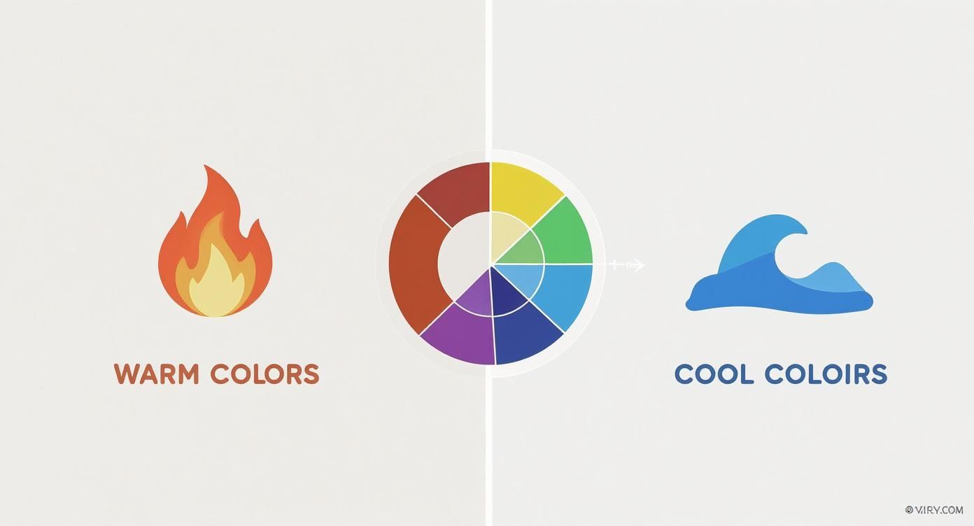
This simple diagram makes it instantly clear. You can see how all the reds, oranges, and yellows hang out together, while the blues, greens, and purples form the opposing family.
This isn't just a modern idea. Artists have been using the power of warm and cool colors for centuries. While the concept of "color temperature" has been around since the mid-17th century, it was Charles Hayter’s 1813 color wheel that really cemented the division for artists. He laid it all out visually, creating a tool that painters could use to master things like depth and mood.
A Deeper Look: Color Temperature Bias
Now, here’s where things get really interesting. Not all primary colors are what they seem at first glance. Every color has a natural temperature bias, meaning it leans slightly warmer or cooler depending on its undertones. It’s a subtle detail, but it’s the secret to mixing colors that truly sing.
Take red, for example. A tube of Cadmium Red is bursting with sunny orange and yellow undertones, making it a very warm, in-your-face red. On the other hand, Alizarin Crimson has a hint of purple in it, giving it a much cooler, more reserved personality.
Understanding this bias is what separates a good painter from a great one. It’s about seeing that a color isn't just "blue," but a specific blue—one that leans a little toward green (making it cooler) or a little toward purple (making it warmer). This gives you incredible control over your painting's entire mood.
Why does this matter? Well, if you want to mix a bright, punchy orange, you’ll get the best result by mixing a warm yellow with a warm red. If you tried mixing a cool yellow (with a green bias) and a cool red (with a purple bias), you'd end up with a dull, muddy orange. That’s because you’re accidentally mixing a tiny bit of all three primary colors together.
Putting It All Together on Your Palette
So, how can you use this in your own painting? To create a truly versatile palette, it’s a smart move to have both a warm and a cool version of each primary color. This opens up a whole new world of mixing possibilities.
- For your warm primaries: Think a reddish-orange, a yellow-orange, and a purplish-blue.
- For your cool primaries: Look for a purplish-red, a greenish-yellow, and a greenish-blue.
With just these six tubes of paint, you can mix an incredible range of clean, vibrant secondary colors without any of the frustrating muddiness. This concept works hand-in-hand with another key art principle, which you can read about in our guide on what are complementary colors in art.
How Color Temperature Shapes Our Feelings
Ever notice how walking into a sunny yellow room can instantly lift your spirits, while a deep blue space feels quiet and introspective? That’s not just a coincidence. It's the powerful, unspoken language of color at work, directly influencing our mood, energy, and even our thoughts.
Warm colors like reds, oranges, and yellows practically buzz with energy. They're the colors of a crackling fire, a vibrant sunset, or a field of sunflowers. Our brains are hardwired to connect these hues with warmth, activity, and passion, often sparking feelings of comfort and happiness.
This isn't just about psychology, though. The science behind it is fascinating. Warm colors are dominated by longer light wavelengths (the reds and yellows), while cool colors are defined by shorter ones (the blues and greens). This means our eyes and brains physically process them differently, creating distinct physiological responses.
The Soothing Power of Cool Tones
On the other side of the wheel, cool colors like blues, greens, and purples offer a sense of calm and stability. They bring to mind vast, open spaces—a clear sky, a deep ocean, or a quiet, shady forest. It’s no wonder these colors can make a room feel more spacious and serene.
Because of these natural associations, designers often use cool tones to create environments for rest, relaxation, and focus. Think about the muted green walls in a library or the soft blues of a spa; those choices are deliberate. They help dial down our energy and promote a feeling of peace and clarity.
This is a powerful tool in any setting. For example, understanding the impact of specific paint colors on mood and productivity can completely change a workspace.
By choosing a dominant color temperature for your painting, you're essentially setting the emotional stage. A piece dominated by warm colors tells a story of excitement and joy. One led by cool colors can convey introspection, mystery, or peace.
Using Emotional Color in Art and Design
Artists and designers have been mastering this emotional language for centuries. A filmmaker might flood a scene with golden light to evoke nostalgia and happiness, or use cold, blue-tinted light to signal danger and isolation.
You can use these same principles when creating your own art, especially when turning a personal photo into a custom paint-by-numbers kit.
- To capture energy and excitement: Lean into the warm tones. If you’re painting a photo from a lively family barbecue, amplifying the reds and yellows will make the final piece feel even more joyful.
- To evoke a sense of calm: Highlight the cool colors. For a landscape of a quiet mountain lake, emphasizing the blues and greens will enhance its peaceful, expansive mood.
Once you understand the difference between warm and cool colors, you gain a superpower. You can go beyond simply replicating a scene and start infusing it with the exact feeling you want your viewers to experience.
Creating Depth and Focus in Your Art
Knowing the difference between warm and cool colors is one thing. Using them to make a flat canvas feel like a living, breathing world? That’s where the real fun begins. It's how you can lead someone's eye through your painting and create a powerful illusion of space.
One of the oldest tricks in the artist's handbook is called atmospheric perspective. It’s a beautifully simple idea: warm colors feel like they're jumping right off the canvas toward you, while cool colors seem to drift away into the distance.
Just picture a classic landscape. The fiery red and orange flowers in the foreground feel so close you could almost smell them. Meanwhile, those hazy, blue-tinted mountains in the back feel miles away.
This isn't just an artistic convention; it's rooted in how our eyes process light. The longer wavelengths of warm colors (reds, oranges) hit our eyes differently than the shorter wavelengths of cool colors (blues, purples). You can use this natural visual trick to your advantage to build a sense of depth.
Putting Depth into Practice
So, how do you actually do it? It all comes down to being strategic with where you place your colors. You're essentially creating a map for the viewer's eye, telling them what's up close and what's far away.
A great way to start is by thinking of your painting in layers or planes:
- Foreground: This is where you put your warmest, boldest, and most saturated colors. We’re talking about those brilliant reds, punchy oranges, and vibrant yellows. These colors scream "look at me first" and pull this part of the scene right up to the viewer.
- Midground: As you move back, start to dial down the intensity. The colors here can still be warm, but they should be a bit more muted or neutral than what's in the foreground. This creates a natural, believable transition.
- Background: Now it’s time for the cool colors to shine. Use softer blues, gentle purples, and misty greens for things like distant hills, the sky, or trees on the horizon. Mixing a little white or gray into these colors will help push them even further back.
If you're interested in digging deeper into how artists and designers create that feeling of space, there's a comprehensive guide to depth in design that explores these concepts more broadly.
Directing the Viewer's Eye
Beyond just creating distance, color temperature is your best tool for creating a focal point—the star of your show. When you place your most vibrant warm color on your main subject, it acts like a magnet for the eyes.
Think about a portrait where the person is wearing a bright red scarf against a muted, cool-toned background. No matter what else is going on in the painting, your eyes will land on that scarf first. It's an instant attention-grabber.
This technique works for anything, whether it’s a single apple in a still life or the main figure in a crowded market scene. By choosing exactly where to place that pop of warmth, you take control. You're not just painting a picture; you're telling a story and guiding your viewer through it, one color at a time.
Mastering Light and Shadow with Color
One of the biggest breakthroughs you can have as an artist is realizing that you don't need black paint to make a shadow. It seems like the obvious choice, but just adding black often makes your paintings look flat and muddy.
The real secret to creating depth that feels truly alive is learning how to play with warm and cool colors for light and shadow.

Take a look around you. The temperature of the light source—whether it's the warm sun or a cool fluorescent bulb—directly impacts the color of the shadows it creates. This creates a beautiful, dynamic relationship that can add incredible realism and vibrancy to your art.
It all comes down to a simple rule of opposites that can completely transform your work.
The Light and Shadow Dance
This push-and-pull between light and shadow is surprisingly consistent. Once you start looking for it, you'll see it everywhere. It's a fundamental principle that adds depth and believability to any scene you paint.
Here’s the basic concept you'll want to lock in:
- Warm Light Creates Cool Shadows: Picture a bright, sunny day. The sunlight is warm and yellow, right? This warm light makes the shadows appear cool, often with hints of blue or purple. This is exactly why a shadow on a white wall on a sunny afternoon looks bluish, not just a dull gray.
- Cool Light Creates Warm Shadows: Now, think about an overcast day. The light is scattered and cool. That cool light will actually make shadows that lean warmer, with reddish or yellowish undertones. It’s a subtle shift, but it has a powerful effect.
Whenever you're painting, ask yourself this one question: "What color is the light?" The answer will tell you what color your shadows should be. A warm light source means you should reach for cooler colors for your shadows, and vice versa.
Painting a Three-Dimensional Object
Let's put this into practice by painting a simple red apple. A beginner's first instinct might be to just paint the apple red and then mix in some black for the shadowy side. The result? A flat, dull-looking apple.
A more experienced artist uses color temperature to create a convincing, three-dimensional form. If our apple is sitting under warm, direct sunlight, here’s how we’d approach it.
- The Highlight: The spot where the sun hits the apple directly will be the warmest and brightest. You might use a light, warm yellow or even a vibrant orange-red right there.
- The Mid-Tones: This is the apple's "true" color—a rich, warm red. This area is where the apple's form starts to turn away from the direct light.
- The Core Shadow: As the apple curves completely away from the sun, the shadow area isn't going to be black. Because the light is warm, the shadow will be cool. You would mix a cooler, darker red, maybe by adding a tiny bit of its complementary color, green, or a touch of a dark, cool blue. This cools the red down and darkens it without killing the color.
By pairing a cool shadow with a warm-lit object, the apple instantly looks rounder, more solid, and more real. That temperature shift is what tricks the eye into seeing form.
Mastering these subtle shifts is a huge part of learning how to blend paint colors effectively. This technique is what makes your subjects pop off the canvas instead of just sitting on it.
Bringing Your Custom Paint by Numbers to Life
So, you're turning a favorite photo into a custom paint-by-numbers kit. That's a great start. But what if you could do more than just replicate the image? By using what you now know about warm and cool colors, you can step beyond just copying and start making real artistic choices. This is where you get to be the art director for your own memories.
The first step is to look at your photo differently. Don't just see "a picture from our beach trip." Instead, notice the conversation happening between the warm, golden sand and the cool, deep blue of the water. Once you identify the warm and cool tones in your own image, you can start to enhance its natural mood.
Practical Tips for Custom Kits
As you prepare your photo or select the final paint palette for your kit, ask yourself: what story am I trying to tell? You have the ability to subtly shift the entire emotional feel of the finished painting.
Here are a couple of ideas you can use right away:
- Boost a Portrait's Warmth: Making a kit from a portrait of someone you love? Try nudging up the warm tones in their skin and the environment. Pushing those reds, yellows, and oranges just a little can make the person feel more vibrant, present, and alive.
- Deepen a Landscape's Space: For that amazing landscape shot, think about pushing the background elements cooler. If you make those distant mountains or the far-off sky a slightly cooler blue or purple, you're using a classic artist's trick called atmospheric perspective. It will make the background feel further away, giving your painting a more dramatic and believable sense of depth.
Think of it this way: your original photo is the script, but you're the director. You get to decide whether to turn up the warmth for a cozy, intimate scene or dial up the cool tones for something more calm and expansive.
Making Intentional Color Choices
Let's imagine you have a photo of a forest. The original picture probably has a mix of warm sunlight dappling through cool green leaves. You get to decide which of those elements gets the spotlight.
Want to capture the feeling of a crisp, quiet morning walk? You could choose a palette that leans into the cool greens and even adds some cool, blue-tinted shadows. On the other hand, to get that warm, late-afternoon glow, you’d want to emphasize the golden light and maybe even mix some warmer, reddish tones into the shadows on the tree trunks.
These small, deliberate choices are what will elevate your project from a simple craft to a piece of art that truly feels like yours. You're not just painting by numbers anymore; you're using color theory to bring your personal photos to life with an artist's touch.
Your Questions About Color Temperature, Answered
Once you start thinking about warm and cool colors, a lot of questions pop up. It’s a rabbit hole that every artist goes down at some point! Let’s tackle a few of the most common ones I hear.
Are Black and White Warm or Cool?
This is a great question. On their own, black, white, and gray are considered neutral—they don't have a built-in temperature. But here's the thing: they almost never stay neutral in a painting.
They're easily pushed one way or the other. Mix a tiny bit of yellow into white, and you get a warm, creamy off-white. Add a touch of blue, and it becomes a crisp, cool white. The same goes for black; artists often mix "warm" blacks (with a bit of brown) and "cool" blacks (with a hint of blue) to give their shadows incredible richness and depth.
Can a Cool Color Like Blue Actually Be Warm?
Absolutely, and this is where things get really interesting. Think of it as color bias or relative temperature. No color exists in a vacuum. Every color on your palette leans a little bit toward its neighbors on the color wheel.
For example, Ultramarine Blue has a tiny bit of violet in it, which pulls it toward the red side of the wheel, making it a relatively "warm" blue. Compare that to Cerulean Blue, which leans toward green, making it a distinctly "cool" blue. Spotting these subtle differences is a game-changer for mixing clean, vibrant colors.
Understanding color bias is what separates good color mixers from great ones. It’s the secret to avoiding muddy, dull tones. Knowing if your red leans orange or violet changes everything.
How Can I Create Contrast If I Only Use Warm (or Cool) Colors?
You don't always need to jump across the color wheel to create drama. You can build powerful contrast by playing with two other properties of color: value (how light or dark it is) and saturation (how bright or dull it is).
Imagine you're working with a warm palette. You could place a brilliant, light-filled yellow right next to a deep, dark crimson. In a cool-toned piece, you could contrast a pale, icy blue with a dark, muted indigo. This creates a ton of visual interest while keeping the overall mood beautifully consistent.
Ready to put all this color theory into practice? The best way to learn is by doing. Turn one of your favorite photos into a masterpiece with a Custom Paint By Numbers kit. You can create your own personalized set today and bring your memories to life, one brushstroke at a time. Get started at paint-by-number.com.


