Color theory is basically a practical guide for color mixing. Think of it as a set of simple "recipes" that show you how to combine colors to get a specific look or feeling. For anyone just starting out, it’s the key to moving past guesswork and starting to make deliberate, beautiful choices in your creative projects.
Your Journey Into Color Starts Here
Ever wonder why some color combinations just feel right? Why a splash of yellow can feel energetic and exciting, while a deep blue feels calm and serene? The secret is color theory. It's not some stuffy, academic rulebook; it's more like learning the basic grammar of a new language—the language of color.
Once you get the hang of these fundamentals, it's like unlocking a creative superpower. You gain the confidence to set a mood, guide someone's eye exactly where you want it, and tell a powerful story without a single word. It's the magic behind every great brand logo, stunning painting, and perfectly decorated room. This guide is all about making color theory for beginners easy and practical.
What You Will Learn
We’re going to break this all down into simple, bite-sized pieces. Forget dry definitions; we'll use straightforward analogies to make the big ideas stick. You'll get real-world insights you can use right away, whether you're tackling a paint-by-number kit, picking out new throw pillows, or putting together a presentation.
Here’s a peek at what we'll cover:
- The Color Wheel: Think of this as your map for navigating how colors relate to each other.
- Color Temperature: We'll explore how warm and cool tones can completely change the mood.
- The Three Dimensions: Getting a handle on hue, saturation, and value gives you total control.
- Color Harmony: These are the simple, time-tested formulas for creating palettes that just plain work.
By the end of this guide, you won't just see color—you'll understand it. You'll know how to build palettes that are not only beautiful but also effective and full of meaning.
The whole point here is to take an intimidating subject and turn it into a fun, accessible tool you can use every day. We'll dig into the "why" behind color choices, helping you build a strong intuition for what works. This all starts with understanding the core properties of color, which are like the main ingredients in a recipe. Once you know your ingredients, you can start cooking up any flavor you want.
Let's dive in and explore the three fundamental components that define every single color you see.
Decoding the Color Wheel: Your Creative Compass
Forget complex scientific charts. Think of the color wheel as your creative compass—a beautifully simple tool that maps out every color imaginable and shows you exactly how they all relate. Getting a feel for its structure is the first big step in mastering color theory for beginners, and trust me, it’s a lot easier than it looks.

The idea of arranging colors in a circle isn't new. It all started back in 1666 with Isaac Newton and his famous experiments with light and prisms. About a century later, in 1776, an entomologist named Moses Harris refined this idea, creating a system that also included tints (colors mixed with white) and shades (colors mixed with black). This laid the foundation for the modern wheel we use today.
At its heart, the color wheel is basically a family tree for colors. Every single hue you can think of traces its roots back to just three "ancestors." Let's meet the family.
The Primary Colors: The Foundation
Primary colors are the parents of all other colors. You can’t create them by mixing other pigments together—they are the pure, foundational building blocks. In the world of paint, these three champions are:
- Red: Powerful, bold, and always grabs your attention.
- Yellow: Bright, energetic, and full of cheer.
- Blue: Calm, stable, and often brings a sense of trust.
You simply cannot make these colors from a mix. They are the original sources from which every other color on your paint-by-number canvas is born. From these three, an entire world of color unfolds.
The Secondary Colors: The First Offspring
Now for the fun part. When you mix equal parts of any two primary colors, you get a secondary color. Think of them as the direct children in our color family. They sit right between their two "parent" colors on the wheel.
- Red + Yellow = Orange
- Yellow + Blue = Green
- Blue + Red = Violet (Purple)
These three—orange, green, and violet—are the next essential tier. You can already see how the wheel isn't just a random assortment of colors; it’s a logical map showing how each one is created.
Key Takeaway: A color’s position on the wheel tells you its story. It's a visual map of its DNA, showing you exactly which primaries were mixed to create it. This relationship is the secret to building beautiful color schemes.
The Tertiary Colors: The Grandchildren
The color family expands one more generation with tertiary colors. These are what you get when you mix a primary color with one of its neighboring secondary colors. The result is a gorgeous and subtle set of six "in-between" shades that add real depth to any palette.
Their names often reflect their heritage, like blue-green or red-violet. They fill in the gaps on the color wheel, creating a smooth, seamless flow from one hue to the next. For instance, mixing yellow (primary) with green (secondary) gives you that vibrant, zesty shade of yellow-green.
Here’s a quick look at how these fundamental tiers stack up.
The Building Blocks of the Color Wheel
This table breaks down the three core categories that form the basis of every color you'll ever use.
| Color Category | Definition | Examples |
|---|---|---|
| Primary | The three original colors that cannot be created by mixing. | Red, Yellow, Blue |
| Secondary | Created by mixing two primary colors together. | Orange, Green, Violet |
| Tertiary | Created by mixing a primary color with a secondary color. | Red-Orange, Yellow-Green, Blue-Violet |
Once you grasp this simple three-tiered structure, you're no longer just staring at a circle of colors. You're reading a map that tells you how every color came to be and how it relates to its neighbors. This knowledge is the foundation for everything that comes next.
Understanding Color Temperature and Mood
Color isn't just something we see; it's something we feel. Once you've got the basics of the color wheel down, there's another layer to explore that really brings your art to life: color temperature.
Think about the color wheel for a second. Now, imagine drawing a line right down the middle, from yellow-green to red-violet. You’ve just divided all the colors in the world into two big families: the warm and the cool.
This split isn't just a random art school exercise. It taps into deep, instinctual feelings we all have. One side feels like a sunny day, a cozy fire, or pure energy. The other side feels like a shady forest, a deep ocean, or a quiet, overcast sky. Learning to see this dividing line is how you start to control the mood of your work.

The Energy of Warm Colors
Warm colors are the life of the party. We’re talking about all the reds, oranges, yellows, and the shades in between. They feel energetic, passionate, and exciting.
These colors have a tendency to jump out at you, grabbing your attention and creating a sense of action. It's no accident that stop signs are red and fast-food logos often use yellow and orange—they want to be noticed! In a painting, a splash of warm color can instantly create a focal point, like the fiery glow of a sunset.
- Reds: The color of passion, love, and urgency.
- Oranges: Think creativity, enthusiasm, and warmth.
- Yellows: Pure happiness, optimism, and cheerfulness.
If you want to inject a shot of adrenaline into your piece or draw the viewer's eye to a specific spot, warm colors are your go-to tool.
The Calm of Cool Colors
On the other side of the wheel, you'll find the cool colors. These are the blues, greens, and purples—the introverts of the color world. They bring to mind nature, peace, and serenity.
Unlike their warm cousins, cool colors tend to recede or feel farther away, which creates a wonderful sense of depth and space. This is why a light blue room can feel so airy and calming. It's also why so many banks and tech companies use blue in their logos; it communicates trust and stability.
By understanding temperature, you move from simply picking pretty colors to choosing colors that tell a story. You're no longer just an artist; you're a director, setting the emotional scene for your audience.
The Essential Role of Neutral Colors
While the warm and cool families get all the attention, there’s a quiet third group that makes everything work together: the neutral colors. These are your blacks, whites, grays, and all the shades of brown and beige.
Think of neutrals as the supporting cast. They don't scream for attention. Instead, they provide a sophisticated backdrop that helps the main colors shine. A bright, fiery painting might feel a bit much on its own, but put it on a soft gray wall, and suddenly it looks elegant. Neutrals are the secret ingredient for creating balance and breathing room in any composition.
Mastering the Three Dimensions of Color
If the color wheel is your map, then understanding the three dimensions of color is like learning to read its topography. To really get a handle on color, you have to move beyond just picking a family like "blue" or "red." You need to grasp its three core properties: Hue, Value, and Chroma.
Think of it like tuning a sound system. You don’t just turn the volume up or down; you adjust the bass, treble, and mid-tones to get the sound just right. Color works the same way. Mastering these three "knobs" is how you'll move from just picking colors to truly designing with them.
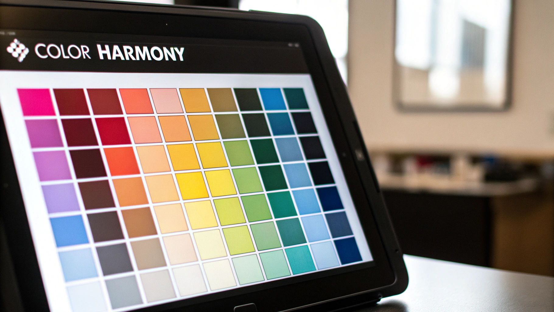
This whole idea of breaking color down into measurable parts isn't new. Around 1905, an American painter named Albert Henry Munsell came up with his Munsell Color System. He was one of the first to create a logical, three-dimensional space for color based on what people actually see, using hue, value, and chroma as his guideposts.
Hue: The Pure Color Family
Hue is the easiest one to get your head around. It’s simply the pure color itself—what you'd call it right out of the box. When we talk about red, yellow, green, or blue, we're talking about their hue.
Think of hue as a color's first name. It's its fundamental identity. On the color wheel, each slice of the pie, like orange or violet, represents a different hue. It's our starting point before we start tweaking and refining.
Value: Lightness and Darkness
Next up is value, which is all about how light or dark a color is. Here’s a simple way to think about it: if you took a photo of your color palette and switched it to black and white, the range of grays you'd see is the value.
Value is a powerhouse for creating contrast and depth in your work. A high-value color feels light and airy, while a low-value color feels heavy and grounded. Artists use this trick all the time to create the illusion of light and shadow, which is what makes a flat canvas feel like it has real dimension.
Key Takeaway: Value does the real work in a composition. You can have a wild mix of hues, but if your values are right, the image will still feel cohesive and make sense. It’s the secret sauce for creating visual structure.
By adding a little white or black to any hue, you instantly change its value. This is a basic but essential skill in painting. To see this in action, you might want to explore our guide on acrylic painting techniques for beginners.
Chroma: Purity and Intensity
Chroma, which you’ll often hear called saturation, is the third and maybe most subtle dimension. It describes how pure or intense a color is. Think of it like a volume knob for color.
A high-chroma color is loud, vibrant, and in-your-face—like a fire-engine red. A low-chroma color is muted, subtle, and quieter, like a dusty brick red.
Every pure hue from the color wheel starts at its maximum chroma. The moment you mix it with white, black, or gray, you start turning that volume down. Getting a feel for chroma is what separates a beginner's palette from a sophisticated one. A common mistake is to use too many loud, high-chroma colors at once, which can easily overwhelm the eye.
- Vibrant (High Chroma): Think energetic, attention-grabbing, and bold.
- Muted (Low Chroma): Think subdued, sophisticated, and calming.
By balancing vibrant accents against more muted tones, you can skillfully guide where a person looks, creating a far more professional and harmonious piece.
Creating Tints, Tones, and Shades
Okay, let's put it all together. Once you know how to adjust a hue's value and chroma, you can create a nearly endless spectrum of new colors. This is where you graduate from just picking colors to actually designing them.
Here are the three basic recipes:
- Tints: Add white to a pure hue. This makes the color lighter and often softer. Pink is just a tint of red.
- Shades: Add black to a pure hue. This makes it darker and deeper. For example, maroon is a shade of red.
- Tones: Add gray to a pure hue. This is how you create more complex, subtle colors by lowering the saturation. Dusty rose is a great example of a tone of red.
Mastering these three simple adjustments is like unlocking a superpower. It gives you the precision you need to add depth, mood, and nuance to any paint-by-number project.
Creating Harmony with Color Schemes
Alright, you've got the color wheel down, you understand temperature, and you know the difference between hue, saturation, and value. Now comes the really fun part—learning how to make those colors sing together. This is where color harmony schemes come in.
Think of these less like hard-and-fast rules and more like time-tested recipes for creating color palettes that just work. They’re all based on a color’s position on the wheel, giving you a simple roadmap for picking hues that feel balanced and intentional. For anyone just starting their journey with color theory for beginners, learning a few of these is a total game-changer. It's the secret to moving beyond just picking colors you like and starting to build palettes with purpose.
Complementary Colors: The Power of Opposites
One of the most dynamic and eye-catching color schemes is the complementary one. It’s also one of the easiest to create. All you have to do is pick a color on the wheel and pair it with the color sitting directly across from it.
- Red and Green
- Blue and Orange
- Yellow and Violet
Because these colors are polar opposites, they create the strongest possible contrast. When you put them next to each other, they make one another look brighter and more intense. This visual pop is perfect for drawing attention to a specific spot. Think about a bright orange "Buy Now" button on a blue background—your eye goes right to it. A word of caution, though: this scheme is powerful, so a little goes a long way. Using one color as the star and the other as an accent is usually the best approach to avoid overwhelming the eye.
Analogous Colors: The Harmonious Neighbors
If complementary colors are all about high-energy contrast, analogous schemes are their calm, peaceful cousin. This approach involves choosing three colors that are right next to each other on the color wheel, like blue, blue-green, and green.
Since these hues share a common parent color, they blend together beautifully. The result is a serene, cohesive palette that feels incredibly natural, almost like the gentle shift of colors you’d see in a sunset or a lush forest. This harmony is fantastic for any project where you want to create a soothing, unified mood—perfect for bedroom decor or the background of a calming paint-by-number landscape.
Triadic Colors: Vibrant and Balanced
Looking for a palette that’s full of life but still feels balanced? The triadic scheme is your go-to. To create one, you simply pick three colors that are evenly spaced around the color wheel, forming a perfect triangle. The most classic example is the primary trio: red, yellow, and blue.
Triadic schemes give you strong visual contrast, but they feel more stable and less intense than a complementary pair. They're cheerful and energetic, making them a great choice for designs that need to feel lively without being jarring. The key to success here is to let one of the three colors dominate and use the other two as supporting accents.
This simple visual breaks down the emotional feel of different color families.
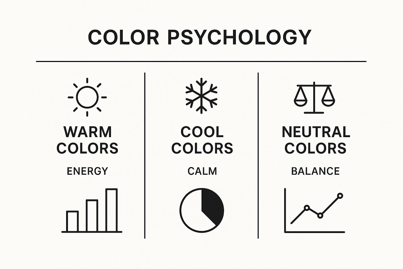
As you can see, warm, cool, and neutral color groups are closely tied to specific moods, giving you a quick cheat sheet for setting the right tone in your work.
To make these concepts even clearer, here’s a quick-reference guide to the most common color harmonies.
Common Color Harmony Schemes Explained
| Harmony Scheme | Description | Best For |
|---|---|---|
| Complementary | Two colors directly opposite each other on the color wheel. | Creating high-contrast, attention-grabbing designs. Ideal for focal points. |
| Analogous | Three colors that sit side-by-side on the color wheel. | Building serene, harmonious, and unified palettes with a natural feel. |
| Triadic | Three colors evenly spaced around the color wheel, forming a triangle. | Creating vibrant, dynamic, and balanced palettes that feel energetic. |
| Split-Complementary | A base color plus the two colors adjacent to its opposite. | Achieving strong contrast that's softer and less jarring than a direct complementary scheme. |
| Tetradic (Rectangle) | Four colors arranged in two complementary pairs. | Developing rich, complex palettes. Works best when one color is dominant. |
| Monochromatic | Using tints, tones, and shades of a single base hue. | Crafting elegant, sophisticated, and minimalist designs with inherent unity. |
These schemes provide a fantastic starting point, taking the guesswork out of color selection and giving you a solid foundation to build upon.
Key Insight: Color harmony isn't about restricting your creativity—it's about giving it a framework. Once you get the hang of these schemes, you can start bending the "rules" to create palettes that are truly unique to you.
The best way to learn is by doing. Try creating a small analogous palette for a peaceful landscape or use a bold complementary pair to make a flower in your painting pop. The more you experiment, the more intuitive it will all become.
Putting Color Theory into Practice
It’s one thing to look at a color wheel on a screen, but how do you actually use all this information when you’re staring at a blank canvas or a new design project? This is where the magic happens, turning abstract rules into a powerful, practical tool. Professionals in every creative field you can imagine lean on these principles every single day.
Take a graphic designer, for instance. They use color theory to build a brand’s entire personality. A bold, triadic scheme can give a tech startup an energetic, modern vibe, while a subtle monochromatic palette might be used for a luxury brand to convey sophistication and elegance. The colors they choose become an instant shorthand for what the brand is all about.
For artists, these concepts are just as crucial. A painter might use a complementary color scheme—like placing a fiery orange subject against a deep blue background—to create a stunning focal point that grabs your attention immediately. This is how artists guide your emotions and tell a story, turning a simple canvas into a world you can step into. Even if you're just starting, getting the right tools can make a huge difference. Check out our guide on essential art supplies for beginners to get set up for success.
From Screen to Print: The RGB and CMYK Divide
As you start creating, you’ll quickly run into a major technical hurdle: the colors on your screen don't always look the same when you print them out. Getting your head around this is key to making sure your vision comes to life exactly as you intended.
-
RGB (Red, Green, Blue): This is the additive color model for everything digital—your phone, your laptop, your TV. It works by mixing red, green, and blue light. The more light you add, the brighter it gets, until all three at full blast create pure white.
-
CMYK (Cyan, Magenta, Yellow, Key/Black): This is the subtractive color model used in the world of printing. It works by layering ink to absorb, or subtract, light from white paper. The more ink you add, the darker the color becomes.
This isn't just a modern digital quirk; it has deep roots. Color theory’s impact on technology was cemented with the development of color photography. The groundwork for additive color, which mixes red, green, and blue light, was established by James Clerk Maxwell in the 1860s, forming the basis for every digital screen we use today.
Why This Matters for Your Projects
So, why the big deal? The main reason this matters is that the range of colors (or "gamut") that RGB can create is way bigger than what CMYK can manage. Those super-bright, electric blues and glowing greens that look incredible on your screen often look dull or totally different when printed.
Imagine you've designed a logo with a stunning neon green. If you send that RGB file straight to a printer, you might be shocked to see it come back as a much more subdued, muddy green. It's not the printer's fault; the CMYK inks simply can't physically mix to create that specific light-based color.
To avoid this disaster, pros always work in the right color mode for the job. If a project is only ever going to be seen online, they use RGB. But if it’s destined for a business card, a poster, or even one of our custom paint-by-number canvases, they design in CMYK right from the start. It's the secret to making sure what you create digitally looks just as good in the real world.
Common Color Theory Questions Answered
When you're just starting out with color theory, a few questions tend to pop up again and again. Let’s walk through the most common ones to clear things up and get you painting with confidence.
What Is the Most Important First Step?
Get to know the color wheel. Seriously, this is your home base. Before you worry about anything else, just focus on understanding the relationship between the primary, secondary, and complementary colors.
Once you can spot complementary pairs like red and green, or blue and orange, everything else about color harmony will start to click into place. It’s the foundation that all the other rules are built on.
How Many Colors Should I Use?
A fantastic rule of thumb is the 60-30-10 rule. It's a simple trick that artists and designers use all the time to create a sense of balance.
Here’s how it works:
- Pick a dominant color and use it for about 60% of your painting (think backgrounds or large areas).
- Choose a secondary color for about 30% to support the main color (for key subjects or elements).
- Finally, add an accent color for the last 10% to make small details pop.
This formula is a surefire way to avoid a chaotic-looking piece and create something that feels cohesive and visually pleasing.
Remember, color theory provides powerful guidelines, not unbreakable laws. The goal is to understand why certain combinations work so you can make deliberate, creative choices in your own projects.
If you're eager to put this knowledge into practice, you can find plenty of fun and simple beginning painting ideas to get started with.
Ready to transform your favorite photo into a work of art? With Custom Paint By Numbers, you can create a personalized paint-by-number kit from any image. Turn your memories into masterpieces today by visiting https://paint-by-number.com.


