

Diving into acrylic painting feels a lot more approachable once you realize you don't need a professional studio's worth of gear. Honestly, success in the beginning has less to do with fancy techniques and more to do with having the right basic tools at your fingertips. Getting a simple, solid setup is the best way to build the confidence to just start painting.
Your Essential Toolkit for Getting Started
Before a single drop of paint hits the canvas, the very first step is carving out a good space to work. It doesn't have to be anything grand—a corner of a room with decent light will do just fine. Just make sure to cover your work surface with some old newspaper or a plastic sheet. The goal is to create a spot where you can get a little messy without stressing, so you can lose yourself in the art.
Choosing Your Core Supplies
Walking into an art supply store for the first time can be overwhelming. The walls are lined with endless options, but you really only need a handful of items to get started. Keeping it simple saves you from decision fatigue and is much easier on your wallet.
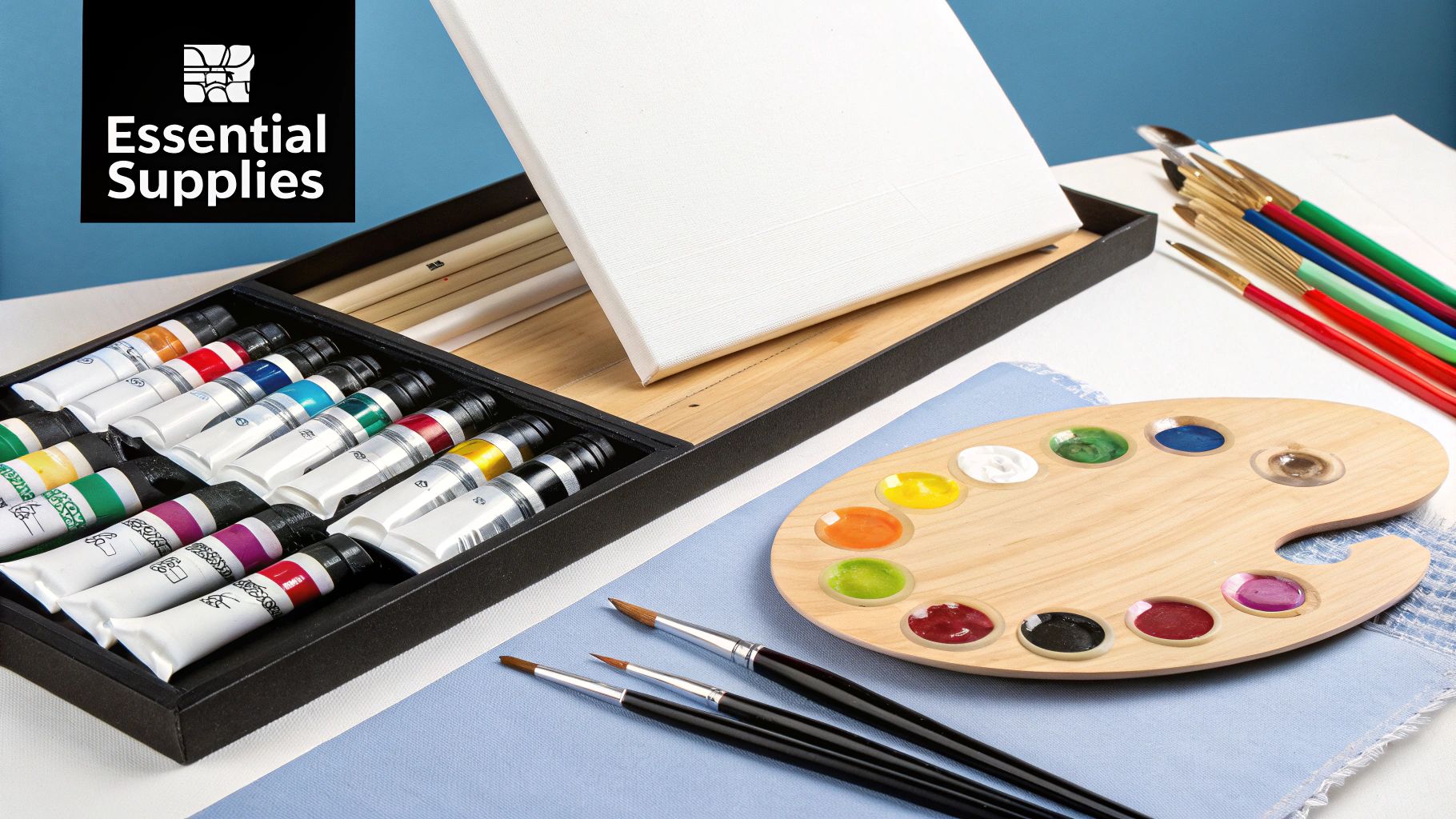
For your first foray into acrylics, you don't need to break the bank. A well-chosen set of student-grade supplies will serve you perfectly as you learn the ropes.
Here's a quick rundown of the absolute essentials you'll want to grab:
Must-Have Acrylic Supplies for Your First Painting
| Supply Item | Why It's Essential | Pro Tip for Beginners |
|---|---|---|
| Acrylic Paints | Student-grade sets are affordable and give you the core colors needed to mix almost any hue you can imagine. | Look for a starter set with primary colors (red, yellow, blue), plus black and white. It's all you need! |
| Brushes | Different shapes and sizes allow for different effects, from tiny details to broad washes of color. | A small variety pack is perfect. Aim for one with a small round, a medium flat, and a large flat brush. |
| Painting Surface | Pre-primed canvas boards are inexpensive, sturdy, and ready to go right out of the package. | Start with an 8x10 or 9x12 inch canvas. They're a manageable size and won't feel intimidating. |
| Palette | You need a non-porous surface to squeeze your paints onto and mix your colors. | A simple ceramic plate or even a sheet of wax paper taped to your table works great. No need for anything fancy. |
| Water Containers | You'll need one for rinsing brushes between colors and one for clean water to thin your paints. | Two old jars are perfect. This keeps your thinning water from getting muddy too quickly. |
With these items, you have a complete, functional setup ready for your first masterpiece.
Getting Your Canvas Ready for Paint
Most canvases you buy will already have a layer of primer called gesso on them. That said, I've found that adding one more thin coat yourself can make a world of difference. It creates a beautifully smooth surface that the paint just glides over, making your colors look richer and more vibrant. It’s a quick step, but it really elevates the whole experience.
The Big Idea: Your first setup doesn't need to be expensive or complicated. A minimalist toolkit gives you everything you need to practice the fundamentals without a huge investment. For a more detailed checklist, check out our full guide on art supplies for beginners.
There's a reason so many people start with acrylics. In fact, some estimates show that over 70% of beginners choose them because they dry fast and are incredibly forgiving. It's no surprise there are so many great resources out there to help new painters find their footing, from setting up a palette to mixing that perfect shade of green.
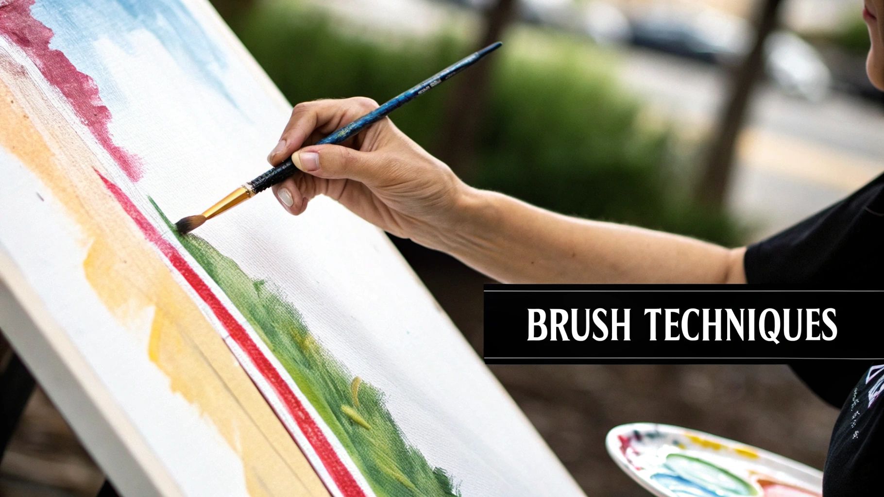
Mastering Your First Brushstrokes
The real magic of painting begins the moment your brush hits the canvas. It's not just about slapping on some color; it’s about learning how the slightest change in pressure or the angle of your brush can completely transform a line or shape. These first few strokes are the building blocks for everything that comes next.
Think of your brushes as more than just tools—they're extensions of your hand, each designed for a specific job. A flat brush, for instance, is perfect for creating the crisp, clean edge of a building. But turn it on its side, and you get a razor-thin line. A round brush, on the other hand, gives you those delicate, curving lines you need for a flower petal.
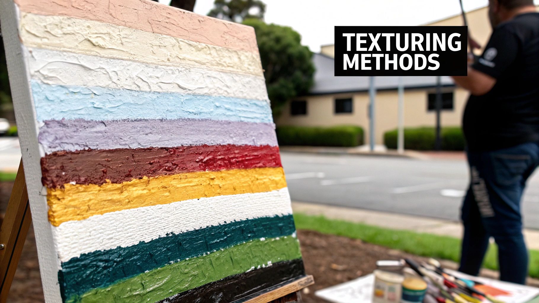
Creating Texture with Simple Strokes
One of the most satisfying things about acrylics is how easily you can build up texture and add a sense of depth to your work. You don't need any fancy tools or complicated methods to get started. A few foundational techniques are all it takes.
Here are a few essential strokes I always recommend beginners practice:
- Scumbling: Grab a stiff brush, get a tiny bit of paint on it, and wipe most of it off. Then, lightly scrub or drag it over a dry layer of paint. The canvas texture will show through, creating this beautiful, hazy effect. It's my go-to for soft clouds or distant, misty mountains.
- Stippling: This is less of a stroke and more of a dot-making exercise. Using the tip of a stiff brush, you just tap, tap, tap to create a pattern of tiny dots. It’s fantastic for giving texture to things like sandy beaches, leaves on a tree, or even the bumpy skin of an orange. The closer you place the dots, the darker the area will look.
- Dabbing: Using a sponge or even a crumpled paper towel, you can gently press paint onto the canvas. This is less about precision and more about building up soft, organic shapes—think fluffy clouds or bushy trees.
The simplicity of these techniques is a big reason why acrylics took off so quickly. Even though they're much newer than oils or watercolors, artists in the mid-20th century fell in love with their bold, vibrant potential. You can learn more about the fascinating history of acrylics on RiseArt.com.
Understanding Paint Consistency
How you load your brush is just as critical as the stroke you make. The amount of paint and water you mix in will completely change the final look.
If you load up your brush with thick paint straight from the tube, you'll create textured, visible brushstrokes. This is a classic technique called impasto, and it adds a cool, three-dimensional feel to your painting.
On the other hand, if you thin your acrylics with a little water, you create a "wash." This thin, almost transparent layer is perfect for laying down a background color or building up color in subtle layers.
Key Takeaway: The relationship between your brush, the paint's consistency, and the canvas is where your unique style really begins to emerge. Don't be afraid to just play around with different amounts of paint and water to see what happens.
This little chart is a great reminder of how all colors start from the same three primaries.
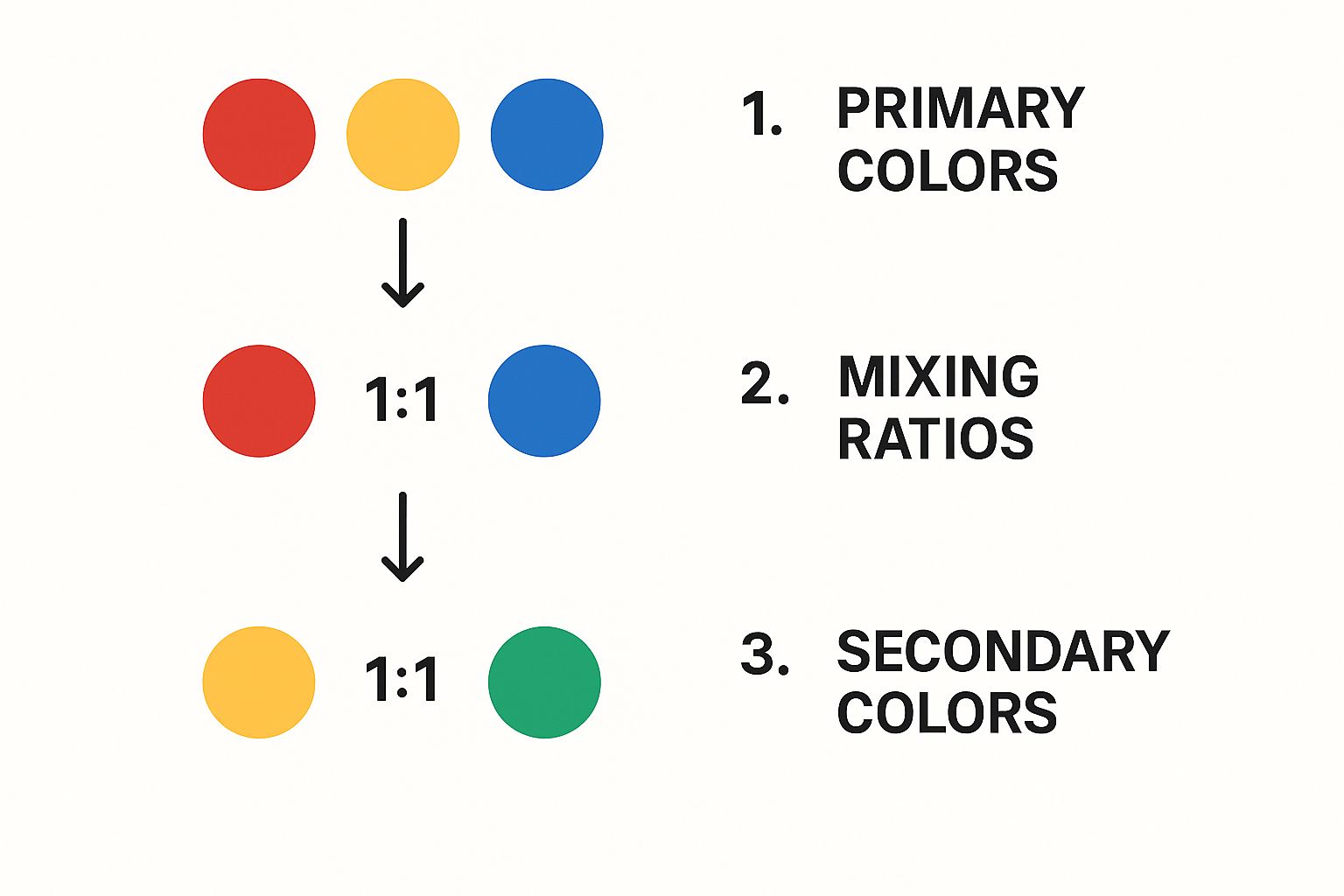
It really clarifies how just by mixing red, yellow, and blue, you unlock a whole world of vibrant greens, purples, and oranges. It's the foundation of all color mixing.
4. Bringing Your Canvas to Life with Color
This is where the magic really happens. Color is what gives your painting its voice, its mood, and its personality. While the world of color theory can feel a bit like a science class, the practical side of mixing and blending is a hands-on skill that will completely transform your work. It's the difference between a flat, cartoonish green and a believable grassy field.
The secret to realistic color is all in the nuance. For instance, a natural-looking green is rarely just a simple mix of yellow and blue straight from the tube. To make it feel real, you might need to add just a tiny dab of red or brown to knock back the intensity. The same idea applies to something complex like skin tones—they're never just a simple brown, but a rich mix of reds, yellows, a touch of blue, and some white.
Blending Acrylics for Seamless Transitions
Let's be honest: because acrylics dry so fast, blending can feel like a race against the clock. But don't worry, a couple of foundational acrylic painting techniques for beginners make it far less intimidating. The two methods you'll use most are wet-on-wet and wet-on-dry.
-
Wet-on-Wet Blending: This is exactly what it sounds like. You lay down a fresh layer of paint right next to or on top of another layer that's still wet. It’s the perfect technique for creating those soft, smooth gradients you see in a sunset sky. You just have to work fairly quickly, using your brush to gently feather the edges where the two colors meet until they merge together.
-
Wet-on-Dry Blending: With this approach, you apply wet paint next to a color that has already dried completely. This is your go-to for creating crisp, defined edges—think of the sharp shadow cast by a building or the clean lines defining a flower petal. It gives you incredible control and stops colors from accidentally bleeding into each other.
A little heads-up from experience: acrylics almost always dry a shade darker than they look when they're wet. It’s called a "color shift." To get the final color you're aiming for, it's a good habit to mix your paints just a little lighter than you think you need.
Once you get a feel for these two blending methods, you’ll be able to create both soft, atmospheric effects and sharp, graphic details all in the same piece.
Adding Depth with Tints and Shades
One of the most common hurdles for new painters is over-relying on pure black and white paint. They're powerful tools, but they can easily flatten your colors if you're not careful. Instead of just thinking "black and white," think of them as tools for adjusting value—which is just the art-speak term for the lightness or darkness of a color.
When you mix white into a color, you create a tint. Tints are perfect for painting highlights or making an area seem softer and more distant. A great example is adding little bits of white to your blue to create the lighter shades of a sky as it recedes toward the horizon.
On the flip side, adding a small amount of black creates a shade. This is how you get those deep, dramatic shadows that give an object a sense of weight or drama. A word of warning, though: a little black goes a long way. Adding too much can quickly turn your vibrant colors into a muddy mess.
Here’s a pro tip: instead of pure black, try mixing in a dark complementary color to create a more natural-looking shadow. For example, mixing a bit of dark blue into an orange will often look much more realistic than just adding black. This control over tints and shades is what lets you sculpt three-dimensional forms on your two-dimensional canvas.
How to Build Depth with Layering and Glazing
If you want to know the real secret to paintings that pop with richness and dimension, it’s not about some complex brushwork you have to spend years mastering. It’s all about building your painting in stages. This is called layering, a core technique where you simply apply colors one on top of the other, making sure to let each coat dry in between. This simple process gives you amazing control and adds a really professional touch to your final piece.
Think of it like telling a story. Your first layer sets the scene—maybe a thin wash of color to establish the mood. From there, your next layers add the characters and all the little details that bring everything to life. What’s great about this method is how forgiving it is. Made a mistake? Don't like a color? No problem. Just let it dry and paint right over it. It's one of the best acrylic painting techniques for beginners to get comfortable with.
The Power of Initial Washes
When you start layering, your first move should almost always be a thin wash. Just add a little water to your acrylic paint to create a see-through layer that works as an underpainting. This first coat does wonders to tone down the bright white of the canvas and helps you establish the color harmony for the whole painting.
Let's say you're painting a landscape. You could start with a very thin wash of light blue for the sky and maybe a light brown for the ground. Don't worry about making these first layers perfect. Their only job is to map out your composition and get rid of that intimidating blank canvas, which makes building up those richer, more solid colors on top feel a whole lot easier.
Creating a Luminous Glow with Glazing
Once you've got the hang of basic layering, you're ready to try a more advanced technique called glazing. A glaze is just an extremely thin, transparent layer of paint that you brush over a completely dry section of your painting. The goal isn't to cover what’s underneath, but to gently change its color and give it a beautiful, luminous quality.
Key Takeaway: Glazing is like putting a colored filter over a photograph. It shifts the mood and tone without hiding the original image, creating a stunning, glowing effect that’s almost impossible to get with a single, flat layer of paint.
To make a glaze, you just need a tiny bit of acrylic color mixed with a good amount of water or a special glazing medium. Imagine you’ve painted a blue sky, but it looks a little flat. By adding a super-thin, transparent glaze of yellow near the horizon, you can create a gorgeous, realistic green glow, hinting at a setting sun just out of frame.
To continue building your skills, you can explore our other essential canvas painting techniques for beginners.
The versatility of acrylics is what makes these techniques so accessible. They can be thinned down to feel like watercolors or applied thick and heavy like oils, which is a massive advantage for anyone new to painting. This flexibility is a big part of why acrylics have become so popular since they first appeared on the art scene.
Common Painting Mistakes and How to Avoid Them
Every artist has moments where they want to throw their brush across the room. It’s part of the process! But here’s the secret with acrylics: most “mistakes” aren’t really mistakes at all. They’re just chances to learn something new.
Once you know what to look out for, you can sidestep the common frustrations that trip up beginners. This is where you’ll really start to feel like you’re getting the hang of things.
A classic surprise for anyone new to acrylics is the "color shift." You'll mix the most perfect, brilliant shade of red on your palette, lay it on the canvas, and then walk away. When you come back, you find it's dried into a much darker, less exciting version of itself.
This happens because the wet binder in the paint has a milky quality that disappears as it dries, which changes how the color looks. To get around this, just aim to mix your colors a touch lighter and brighter than you actually want them to be. It takes a little getting used to, but you'll develop a gut feeling for it pretty quickly.
Keeping Your Colors Workable
Acrylic paint is famous for drying fast. That’s a huge plus when you’re building up layers, but it can be a real pain when the paint on your palette turns into a plastic hockey puck before you're even halfway done. Don't let this get you down; there are easy fixes.
A couple of simple tricks can give you more time to work:
- Mist Your Palette: Keep a small spray bottle of water nearby. A light spritz over your paint blobs every 10-15 minutes is all it takes to keep them from skinning over.
- Try a Stay-Wet Palette: Honestly, these things are a game-changer. It's a special box with a damp sponge under a sheet of palette paper, and it can keep your paints usable for hours—sometimes even days.
Getting into these habits makes painting so much more relaxing. You can focus on being creative instead of constantly fighting the clock.
Avoiding Muddy Colors
Ever tried to mix a gorgeous violet and ended up with a sad, brownish-gray sludge? Painters call this "making mud," and it usually comes from mixing too many colors together or just overworking them on the palette. The main offender is often mixing all three primary colors (red, yellow, and blue) without a clear goal.
A Simple Rule of Thumb: To keep your colors bright and clean, stick to mixing just two primary colors at a time whenever possible. If you need to dull a color down, add a tiny speck of its complementary color (the one opposite it on the color wheel) instead of reaching for black.
Ultimately, the best thing about acrylics is how forgiving they are. If you paint a shape you hate or a color that's just wrong, you don’t have to start over. Just let it dry completely, and you can paint right over it. It's like having a built-in undo button for your artwork.
Once you've created a piece you love, you'll want it to last. Protecting your work is crucial, and you can learn more about how to preserve acrylic paintings to make sure they stay vibrant for years to come.
Your Acrylic Painting Questions Answered
When you're new to acrylics, you’re going to have questions. Everyone does. Getting a handle on a few common issues right from the start can save you a ton of headaches and help you build great painting habits. Let's tackle some of the big ones.
Probably the first thing you'll notice is how incredibly fast acrylics dry. It's a blessing for layering, but it can feel like you're in a constant race against the clock when you're trying to blend. So, how do you slow things down?
How Do I Keep My Acrylic Paints from Drying Too Fast
The easiest trick in the book is to keep a small spray bottle of water nearby. Just give your palette a light mist every 10-15 minutes. This simple step stops that pesky dry "skin" from forming over your colors.
If you plan on painting for a while, a stay-wet palette is an absolute lifesaver. It’s basically a special container with a damp sponge under a sheet of palette paper that keeps your paints wet and workable for hours, sometimes even days. You can also mix a drop of "retarder medium" into your paints, which is designed specifically to slow down drying time.
My Two Cents: Don't hesitate to use these tools. Seriously. Controlling your drying time is the key to feeling relaxed and in control. It gives you the freedom to blend colors smoothly and just enjoy the process without the stress.
What Is the Best Surface for a Beginner to Paint On
The surface you choose to paint on really matters when you're just starting out. For your first few projects, I always recommend canvas boards. They’re inexpensive, sturdy, and already pre-primed with gesso, so you can jump right into painting without any extra prep.
Stretched canvas is another great option that gives you that classic "artist" feel. I'd steer clear of plain paper or raw wood at first. They can soak up the paint in weird ways and are just trickier to handle until you get a feel for the medium.
How Do I Properly Clean and Care for My Brushes
This one is non-negotiable. If you want your brushes to last, you have to treat them right. The golden rule is simple: never let acrylic paint dry in the bristles. Once it’s dry, it’s basically plastic, and you’ll never get it all out.
While you're painting, make a habit of resting any brushes you aren't using in a jar of water. When you’re done for the day, rinse them well under lukewarm water and gently wash them with a mild soap until the water runs clear. Reshape the bristles with your fingers and lay them flat to dry. This little step prevents water from getting into the metal ferrule and swelling the wooden handle, which will ruin a brush in a heartbeat.
Ready to turn your favorite photos into a relaxing, creative project? Custom Paint By Numbers provides everything you need to create a personal masterpiece, delivered right to your door. Start your artistic journey today at https://paint-by-number.com.


