

Welcome to the vibrant world of paint by number, where creativity meets simplicity. Whether you're a seasoned artist or holding a brush for the first time, this relaxing hobby transforms a numbered canvas into a stunning work of art. But achieving that gallery-worthy finish requires more than just filling in the lines. It’s about technique, preparation, and a few insider secrets that can make all the difference. This is where having a solid set of paint by number tips becomes essential for taking your project to the next level.
This guide moves beyond the basic instructions included in your kit. We will provide actionable advice designed to elevate your craft and refine your process from start to finish. You'll learn specific strategies for achieving the perfect paint consistency, mastering a strategic color application order, and executing flawless blending techniques for smooth transitions. We will also cover practical aspects like setting up your workspace, maintaining your brushes, and correcting common mistakes with ease. Prepare to unlock your artistic potential and transform your next project from a simple pastime into a masterpiece you will be proud to display. These tips will give you the confidence to tackle any design.
1. Proper Paint Consistency and Thinning
One of the most overlooked yet critical paint by number tips is achieving the perfect paint consistency. The acrylic paints included in most kits can sometimes be too thick, leading to a clumpy application, visible brush strokes, and difficulty filling small, detailed areas. Conversely, paint that is too thin will appear transparent and may bleed outside the lines. The goal is a smooth, creamy consistency that flows effortlessly from your brush.
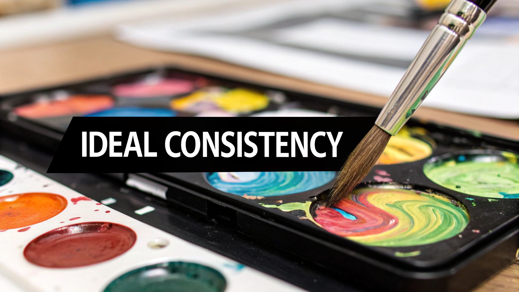
This simple step dramatically improves your painting experience. Properly thinned paint provides better coverage, makes blending colors easier, and results in a more professional-looking finished piece. Think of the ideal texture as similar to melted ice cream or warm honey, not watery like juice or thick like paste.
How to Achieve the Right Consistency
Getting your paint just right is a matter of careful mixing. While you can use regular tap water, distilled water is recommended to avoid introducing any minerals or impurities that could affect the paint's color or longevity over time.
- Start Small: Begin by adding just one drop of water to the paint pot.
- Mix Thoroughly: Use a toothpick or the back end of a small brush to stir the water into the paint completely.
- Test and Adjust: Dab a small amount of the mixed paint onto a piece of scrap paper or a corner of the canvas margin. If it’s still too thick, add another single drop of water and repeat the process until it glides on smoothly.
Pro Tip: For larger areas or advanced blending, consider using an acrylic flow improver (also called a flow aid). This medium thins the paint without breaking down the acrylic binder, maintaining the paint's vibrancy and integrity more effectively than water alone.
By taking a few moments to adjust your paint’s consistency before you begin, you set yourself up for a smoother, more enjoyable, and ultimately more successful painting session. This foundational tip makes all subsequent techniques, from fine-line work to broad-area coverage, significantly easier to master.
2. Strategic Color Application Order
One of the most effective paint by number tips involves applying your colors in a strategic order. The sequence you choose can dramatically affect the final look, prevent colors from becoming muddy, and make the entire process cleaner and more manageable. By planning your approach, you can build layers logically, ensuring that each color remains crisp and vibrant.
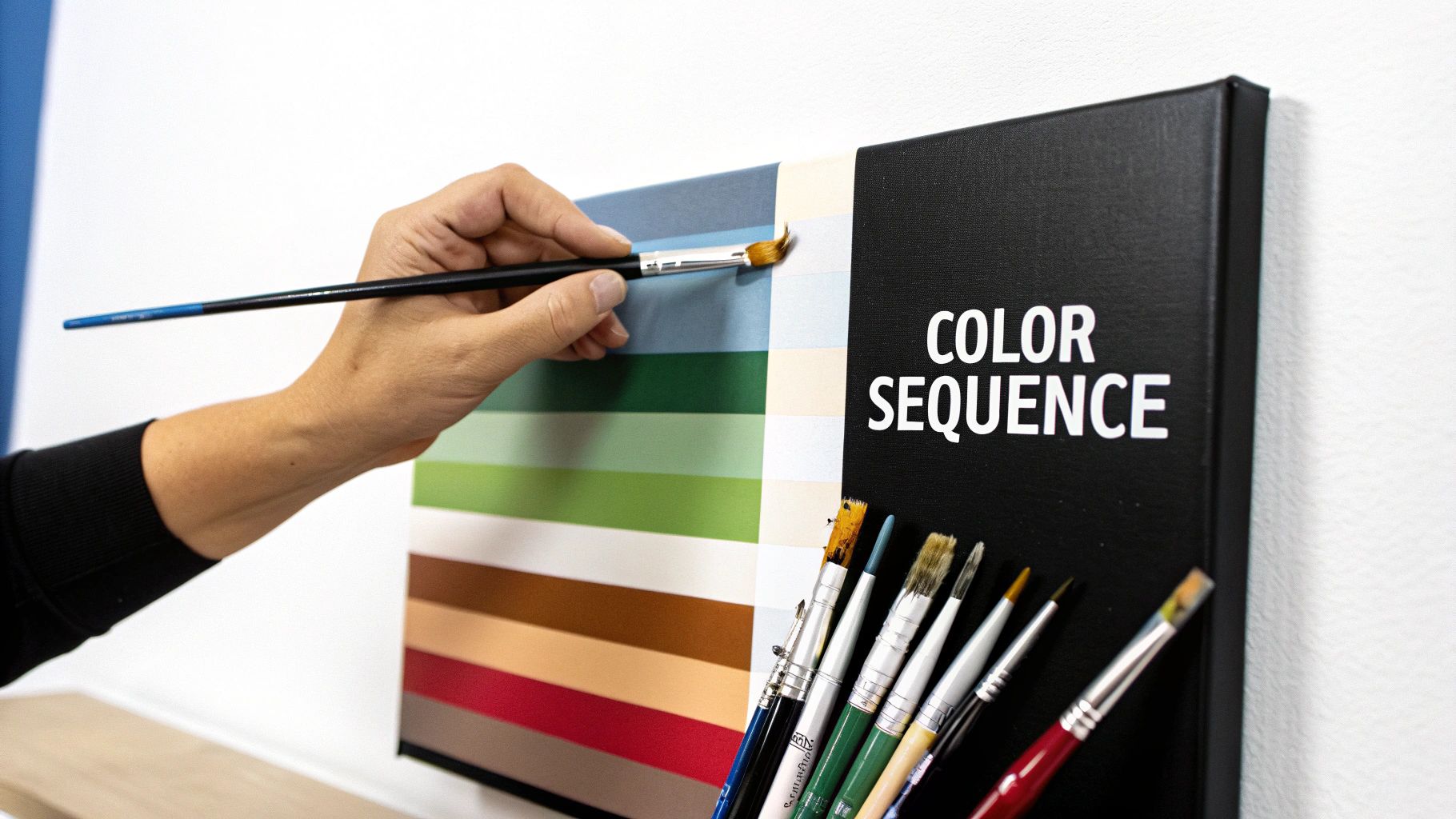
This methodical approach simplifies the painting process and gives you greater control over the outcome. Common strategies include painting from the top down to avoid smudging wet paint, or moving from background elements to foreground details. The most popular method, however, is to work from the lightest colors to the darkest.
How to Plan Your Color Sequence
Applying colors from light to dark is a classic artistic technique that makes correcting mistakes much easier. It is far simpler to paint a dark color over a light one than the other way around. This approach helps maintain clean lines and prevents lighter shades from being tainted by adjacent darker pigments.
- Start with Lights: Begin by filling in all the areas for your lightest colors, like whites, yellows, and pale blues.
- Move to Darks: Once the light areas are complete and dry, proceed to the progressively darker shades. This ensures your bright spots stay brilliant.
- Work in Batches: To maintain a good rhythm and avoid constantly switching colors, paint all the sections of one color before opening the next pot. For instance, complete all the #7 areas before moving on to the #8s.
Pro Tip: For complex paintings like landscapes, consider working from the background to the foreground. Paint the sky first, then distant mountains, followed by mid-ground trees, and finally the detailed flowers or objects in the foreground. This builds a natural sense of depth.
Adopting a strategic order for color application transforms your paint by number from a random coloring exercise into a more disciplined and artistic endeavor. This simple plan helps you avoid common frustrations and leads to a more polished, professional-looking piece of art.
3. Brush Selection and Maintenance
While most paint by number kits come with a basic set of brushes, strategically choosing the right brush for each area can drastically elevate your finished artwork. Using the wrong size brush is a common pitfall; a large brush in a tiny space leads to messy edges, while a small brush in a large area creates streaks and takes forever. Mastering brush selection and proper care is a fundamental tip for a clean, professional result.
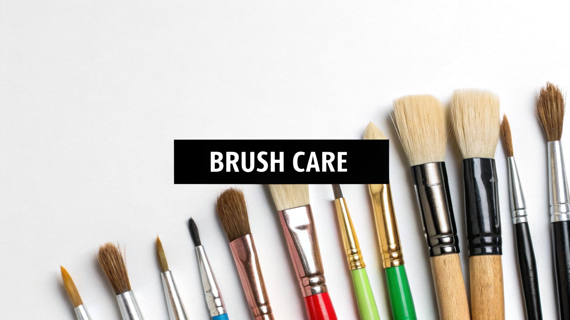
This practice is not about buying expensive tools but about using the correct tool for the job. A well-maintained brush holds its shape, allowing for precise control, which is crucial for staying within the lines. Properly caring for your brushes also ensures they last for many projects, preventing stray, splayed bristles from ruining your careful work. Investing in a few extra brushes can be one of the most effective upgrades to your painting experience.
How to Select and Care for Your Brushes
Matching your brush to the section size is key. Think of your brushes as specialized tools, each designed for a different task on the canvas. Proper maintenance then protects these tools for future use.
- Assign Brush Sizes: Use a very fine-tipped brush (like a size 0, 1, or 2) for the smallest, most intricate sections. A medium round brush (size 4-6) is perfect for most mid-sized areas. For large background sections, a flat brush will provide smooth, even coverage much more efficiently.
- Clean Between Colors: Immediately rinse your brush thoroughly in a cup of water when switching colors. Gently wipe it on a paper towel until no color remains to prevent muddying your next paint pot.
- Deep Clean After Painting: After your session, clean brushes with a mild soap or a specialized brush soap. Work the soap into the bristles, rinse with lukewarm water, and gently reshape the tip with your fingers.
- Store Brushes Properly: Always store brushes with the bristles pointing up. Resting them on their tips will cause the bristles to bend and splay, ruining their shape. You can explore a variety of tools in our guide to art supplies for beginners on paint-by-number.com.
Pro Tip: Keep two separate water cups on your desk. Use one for initial, dirty rinsing of dark or strong colors and the second for a final, clean rinse. This prevents leftover pigment from contaminating lighter colors and keeps your paints vibrant.
By selecting the right brush for each task and keeping your tools in excellent condition, you gain greater control and precision. This simple habit is one of the most impactful paint by number tips for achieving crisp lines and a polished, impressive final piece.
4. Lighting and Workspace Setup
Creating a dedicated and well-organized workspace is one of the most effective paint by number tips for enhancing both your enjoyment and the final result. Proper lighting and a comfortable setup prevent common frustrations like eye strain, messy spills, and inaccurate color perception. Treating your painting space like a mini-studio transforms the activity from a simple craft into a relaxing, immersive artistic experience.
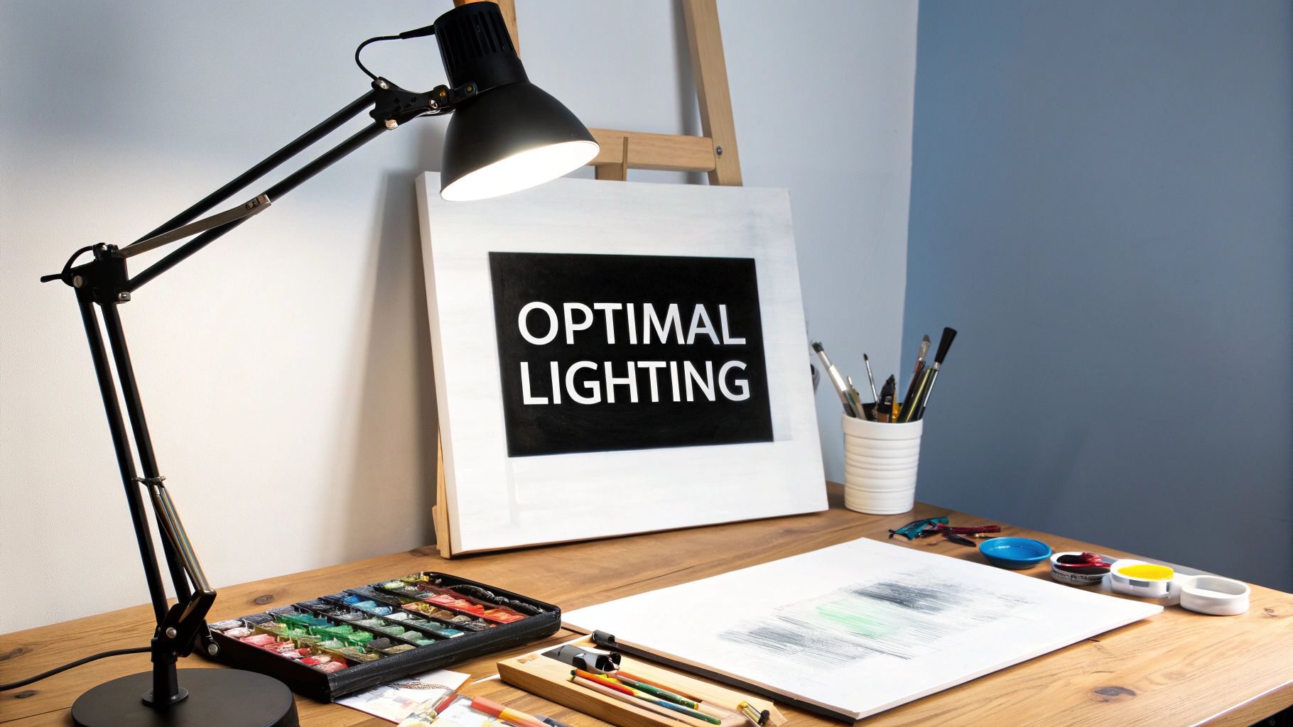
A well-lit, ergonomic environment allows you to work for longer periods without discomfort, leading to more precise brushwork and better overall quality. It ensures that the colors you see and paint are true to their intended hue, preventing surprises when you view your finished masterpiece in different lighting conditions.
How to Create an Optimal Workspace
Setting up your area for success involves focusing on three key elements: lighting, organization, and ergonomics. A few simple adjustments can make a world of difference.
- Prioritize Lighting: Natural daylight is ideal. If that isn't possible, use a daylight LED lamp (5000K-6500K) positioned to eliminate shadows on your canvas. For fine details, setting up essential task lighting is crucial to reduce eye strain and ensure precision.
- Organize Your Supplies: Keep everything within easy reach. Arrange your paint pots in numerical order, have two water cups (one for rinsing, one for clean water), and keep paper towels handy for blotting excess paint or water from your brush.
- Consider Your Posture: Use an adjustable tabletop easel to angle your canvas, which prevents neck and back strain. For extremely detailed sections, a magnifying lamp can be a game-changer, allowing you to see and paint the smallest areas with ease.
Pro Tip: Place a sheet of white paper or a neutral-colored mat under your canvas. This neutral background helps your eyes perceive colors more accurately and protects your table surface from any accidental paint drips.
By investing a little time in setting up your painting environment, you eliminate distractions and physical discomfort. This allows you to fully engage with the creative process, making your painting sessions more meditative, productive, and ultimately more rewarding.
5. Number Coverage and Section Completion
A key skill that elevates a paint by number from a simple craft to a polished piece of art is achieving complete coverage of the printed numbers and lines. The goal is to make the underlying guide invisible, creating clean, defined sections that result in a seamless final image. This requires a focus on paint opacity, careful application techniques, and precise brush control to ensure no numbers peek through the finished coat.
Mastering this technique is fundamental because it directly impacts the professional quality of your painting. Visible numbers can distract the viewer's eye and break the illusion of the artwork. By ensuring each section is opaquely filled and its borders are crisp, you create a more vibrant and cohesive piece that looks hand-painted from scratch.
How to Achieve Flawless Coverage
Effective number coverage is a blend of patience and technique. For lighter colors like white, yellow, or pink, you will likely need more than one coat to completely hide the black ink of the numbers and lines.
- Apply in Layers: Start with a thin, even first coat. Let it dry completely before assessing if the number is still visible. If it is, apply a second thin layer directly over it. This layering method provides better coverage than one thick, clumpy coat.
- Work from the Center Out: Begin painting in the middle of a section and gently push the paint toward the edges. This gives you maximum control as you approach the boundary lines, reducing the risk of painting into an adjacent area.
- Use a Gesso Pen or White Paint: Before applying a very light color, you can use a white gesso pen or a dab of white acrylic paint to cover the number first. Let this "primer" coat dry, and the light color will have a much easier time covering the area.
Pro Tip: If you accidentally paint over a line, act quickly. While the paint is still wet, use a clean, dampened toothpick or the tip of a fine liner brush to carefully wipe away the mistake. This is much easier than trying to paint over it later.
This methodical approach to one of the most basic paint by number tips ensures a clean, professional finish. Paying attention to complete number coverage and crisp edges is a small effort that yields a significant improvement in the overall quality of your artwork.
6. Blending and Color Transition Techniques
One of the best paint by number tips to elevate your art from a segmented puzzle to a flowing, cohesive painting is mastering blending. This technique involves softening the hard edges between two adjacent color sections, creating a gradual and natural transition. Instead of seeing distinct lines where colors meet, you create a soft gradient that adds depth, realism, and a professional touch to your work.
This advanced method is particularly effective for creating smooth sky gradients, blending skin tones in portraits, or softening harsh shadow lines. It transforms the often-rigid nature of a paint by number canvas into a more dynamic and painterly piece, giving you more creative control over the final appearance.
How to Blend Your Colors
Successful blending relies on working quickly while the acrylic paint is still wet. Because acrylics dry fast, you need to be intentional and prepared before you start. This is one of the more advanced acrylic painting techniques for beginners, but it's well worth the practice.
- Work Wet-on-Wet: Paint two adjacent sections, then immediately use a clean, slightly damp brush to gently feather the edge where the two colors meet. Use light, back-and-forth or circular motions to pull one color into the other.
- Go Section by Section: Don't try to blend the entire canvas at once. Focus on small, manageable areas where two or three colors converge to ensure your paint stays wet enough to work with.
- Use a Dry Brush: Another method is to paint one section, then use a clean, completely dry brush to "scumble" or lightly scrub the wet edge, pulling the paint over the line into the empty adjacent area to create a soft, faded effect before you fill it in.
- Practice First: Before applying this to your main canvas, practice on a piece of paper or cardboard to get a feel for how the paint moves and how much pressure to apply.
Pro Tip: If your paints are drying too quickly, add a drop of an "acrylic retarder" or "slow-dry medium." This extends the paint's open time, giving you a wider window to blend the colors on the canvas for a smoother, more forgiving experience.
By incorporating blending, you break free from the strict confines of the numbered areas. This technique is a crucial step in making the artwork truly your own and is a fundamental skill for anyone looking to advance their painting abilities.
7. Mistake Correction and Touch-up Methods
Even the most careful painter makes a mistake now and then. One of the most freeing paint by number tips to learn is that errors are not permanent. Knowing how to effectively correct mistakes, from a simple slip of the brush to painting a section with the wrong color, ensures your final artwork looks polished and professional. The key is to act quickly for wet paint and be patient with dried paint.
Having a small "mistake correction kit" on hand can save you from a lot of frustration. Keeping a cup of clean water, cotton swabs, and a fine-tipped brush nearby allows you to address errors immediately. This proactive approach prevents small smudges from becoming glaring issues, helping you maintain momentum and enjoy the creative process without fear.
How to Correct Common Mistakes
Whether the paint is wet or dry, there's almost always a simple solution. The right technique depends on the state of the paint and the size of the error.
- For Wet Paint: If you act fast, this is the easiest fix. Immediately dip a clean cotton swab or the corner of a paper towel in clean water, squeeze out the excess, and gently dab or wipe away the stray paint. Use a clean, dry swab to absorb any remaining moisture.
- For Dried Paint: If a mistake has already dried, the best method is to simply paint over it. Apply a thin layer of the correct color directly on top of the error. You may need two or three thin coats to achieve full opacity, but be sure to let each layer dry completely before adding the next.
- For Lumps or Bumps: If dried paint has created an unwanted texture, you can gently scrape it off. Use the edge of a craft knife or a toothpick to carefully lift the dried paint bump. Once the surface is smooth, you can repaint the area with the correct color.
Pro Tip: For major corrections, such as painting a large area with the wrong color, apply a thin layer of white or a light neutral color over the mistake first. This acts like a primer, making it much easier to cover the incorrect hue with the intended color without it showing through.
Mastering these simple touch-up methods builds confidence and ensures your finished piece is something you can be proud of. Proper care during and after the painting process contributes significantly to the final look. To learn more about protecting your artwork long-term, you can read about how to preserve acrylic paintings on paint-by-number.com.
7 Key Paint by Number Tips Comparison
| Technique | Implementation Complexity 🔄 | Resource Requirements ⚡ | Expected Outcomes 📊 | Ideal Use Cases 💡 | Key Advantages ⭐ |
|---|---|---|---|---|---|
| Proper Paint Consistency and Thinning | Medium - requires practice to find right consistency | Low - basic acrylic paints and thinning medium/water | Smooth application, better coverage, easier blending | All paint-by-number projects for professional finish | Prevents cracking, extends paint working time |
| Strategic Color Application Order | Medium - needs advance planning and sequencing | Low - no extra materials needed | Clean, vibrant colors, natural depth | Projects needing color clarity and layering control | Prevents color contamination, easier corrections |
| Brush Selection and Maintenance | Medium - multiple brushes and upkeep required | Medium - investment in various brushes | Precise coverage, cleaner lines | Detailed and large-area sections in any project | Improved control, longer brush life |
| Lighting and Workspace Setup | Low to Medium - setup and equipment needed | Medium - lighting and ergonomic gear | Reduced eye strain, better color matching | Long sessions, complex/color-sensitive paintings | Increases efficiency, reduces errors |
| Number Coverage and Section Completion | Medium - requires patience and precision | Low - standard paints and brushes | Clean, professional finish, no visible numbers | All paint-by-number artworks | Clear section definition, improved composition |
| Blending and Color Transition Techniques | High - advanced skill and timing critical | Medium - possible use of mediums/retarders | Realistic, smooth color transitions | Experienced painters seeking professional results | Adds depth and realism, eliminates harsh lines |
| Mistake Correction and Touch-up Methods | Medium - requires quick, careful action | Low - common tools like cotton swabs, brushes | Clean, seamless corrections | Any project, especially beginners | Maintains confidence, allows experimentation |
Your Artistic Journey Starts Now
You've just navigated a comprehensive guide filled with actionable paint by number tips designed to elevate your artistic experience from a simple craft to a fulfilling creative practice. The journey from a blank, numbered canvas to a vibrant, finished masterpiece is now demystified. You are no longer just filling in spaces; you are consciously creating, equipped with the knowledge to transform a simple kit into a piece of art you can be truly proud of.
Think of the tips we've covered not as rigid rules, but as tools in your creative toolkit. Each one serves a distinct purpose, helping you overcome common hurdles and unlock a higher level of polish and professionalism in your work.
From Novice to Confident Creator
Let's quickly revisit the cornerstones of your new expertise:
- Paint & Brush Mastery: You now understand how to achieve the perfect paint consistency and why maintaining your brushes is non-negotiable for clean lines and smooth application.
- Strategic Approach: By planning your color application order and setting up an optimal workspace, you've learned to work smarter, not harder, preventing smudges and ensuring accuracy.
- Artistic Finesse: Techniques for covering numbers completely, blending colors for soft transitions, and correcting mistakes give you the power to add depth and a personal touch to your paintings.
The real value in mastering these concepts is the confidence they instill. No more frustration over streaky paint, visible numbers, or awkward color transitions. Instead, you can fully immerse yourself in the mindful, relaxing process of painting, knowing you have a solution for any challenge that arises. This newfound confidence allows your creativity to flow, turning a structured activity into a genuine form of self-expression.
Remember: The goal isn't just to complete a painting. It's to enjoy the process, learn new skills, and create something that brings you joy every time you look at it.
Embrace the journey. Each canvas is a new opportunity to practice these skills, experiment with a new technique, and watch your abilities grow. Whether you're seeking a relaxing hobby, a way to de-stress, or a unique way to create personalized decor, these paint by number tips provide the foundation for success. The canvas is waiting, your paints are ready, and your artistic journey is officially underway.
Ready to apply these tips to a project that's truly meaningful? Transform your favorite photo-a beloved pet, a family portrait, or a cherished vacation spot-into a unique work of art with a custom kit from Custom Paint By Numbers. Visit Custom Paint By Numbers to upload your image and start creating a masterpiece that is entirely your own.


