

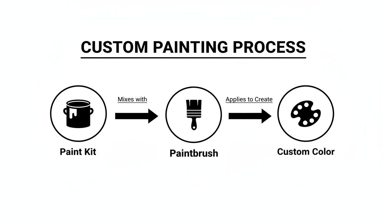
Mixing colors is where the real magic of painting begins. It’s how you break free from the colors in the box and start creating any shade you can dream up. By just combining a few basic paints—your primary reds, yellows, and blues—you can unlock a whole new world of secondary and tertiary colors. This one skill can elevate your paint-by-numbers hobby into a truly personal creative practice.
Go Beyond The Kit With Custom Paint Colors
Have you ever felt hemmed in by the little paint pots that come with your kit? Maybe you wished for a slightly richer green for a forest scene or a softer, duskier blue for a twilight sky. That's the perfect reason to learn how to mix your own colors. It’s your ticket to turning a structured hobby into a genuine artistic outlet with infinite possibilities.
Once you know how to mix, you have the power to fix a mistake with a perfectly matched shade, add a unique personal touch to a landscape, or even paint a custom project from a photo. We're going to walk through some simple, practical techniques that anyone can pick up. You don't need a deep dive into complex art school theory—just the hands-on skills to make every painting truly your own.
Why Mixing Your Own Colors Matters
Getting comfortable with creating custom colors brings some immediate, game-changing benefits to your paint-by-number projects:
- Personalization: You can completely change the mood of a piece just by tweaking the colors. Think about warming up a sunset with a touch more red or cooling down a winter landscape with a hint of blue. It makes the final artwork feel like it's yours.
- Problem-Solving: Running out of a specific color or making a small mistake no longer feels like a disaster. You can confidently mix a new batch to match it perfectly, instead of trying to make a different shade work.
- Enhanced Realism: Let's face it, nature is never just one flat color. Mixing subtle variations for things like leaves, water, or skin tones adds a surprising amount of depth and makes your painting look much more realistic.
The simple joy of swirling red and yellow together to make a vibrant orange has captivated artists and hobbyists for ages. It's a timeless craft. Today, that passion for color is a huge part of the global paints and coatings market. For those of us doing DIY kits, this usually means we're working with waterborne paints, which have easy-to-mix acrylic bases—perfect for layering colors in your numbered sections without them turning to mud.
The real magic happens when you realize you're no longer just filling in numbers. You're actively part of the artistic process, deciding the exact hue and tone that feels right to you.
To really push beyond the kit, artists often pull inspiration from everywhere, even from things like the patterns in custom made tile designs. It's all about that mindset of customization, and that's exactly what color mixing brings to your canvas. As you get started, remember that every new color you create is another step toward finding your own artistic voice.
If you're ready to get your hands dirty, check out our guide on the fundamentals of mixing acrylic paint to jump in with confidence.
Understand The Building Blocks Of Color
Before you dive in and start mixing paints like a pro, it helps to get a feel for the basic rules of the road. Think of red, yellow, and blue as your foundational ingredients. These are your primary colors, and with just these three, you can pretty much create any color you'll ever need for your painting.
They're called "primary" because you can't create them by mixing other colors—they're the source. From these three, every other shade is born. Grasping this simple idea is the first real step toward taking control of your palette and going beyond the colors that came in your paint-by-number kit.
This is where the fun really begins. You start with your basic paints, a brush, and a little curiosity, and you end up with a world of custom colors at your fingertips.
Your First Color Mixing Recipes
To get you started, let's mix up some basic colors. All you need are your primary paints. The following recipes will give you your secondary colors—green, orange, and purple—which are the next building blocks for your palette. From there, you can create even more nuanced shades.
| Primary Color 1 | Primary Color 2 | Resulting Secondary Color | Example Recipe |
|---|---|---|---|
| Yellow | Blue | Green | Start with equal parts; add more yellow for a |
| lime green or more blue for a deep forest green. | |||
| Red | Yellow | Orange | Equal parts make a classic orange. More red |
| creates a fiery red-orange; more yellow makes it | |||
| golden. | |||
| Red | Blue | Purple | This one can be tricky! Begin with more red than |
| blue to avoid a muddy color. Adjust slowly to get | |||
| the perfect violet or plum. |
Don't be afraid to experiment with the ratios. This is how you discover those unique shades that will make your painting truly one-of-a-kind.
The Color Wheel: Your Creative Map
The color wheel might seem like something you left behind in art class, but it's an incredibly practical map for any painter. It visually lays out how colors relate to one another. Once you have your primary colors, you can start creating new color families.
- Secondary Colors: As we just practiced, you get these by mixing two primary colors. Yellow and blue make green, red and yellow make orange, and blue and red make purple. Easy.
- Tertiary Colors: This is the next level. You make these by mixing a primary color with a neighboring secondary color. Think of shades like a vibrant yellow-orange or a cool blue-green.
Beyond Hue: Adding Depth And Realism
To really make your paintings pop, you need to understand three little concepts that give color its character: hue, value, and saturation. They might sound a bit technical, but they're super simple once you get the hang of them.
Hue is just the purest version of a color. Think "red," "blue," or "yellow." It's the color's basic name on the wheel.
Value is all about how light or dark a color is. This is where you start adding real depth and realism to your work. You can easily tweak a color's value by creating tints, shades, and tones.
- Tint: To lighten a color, you add white. A little white added to red gives you pink.
- Shade: To darken a color, you add black. Mixing a touch of black into red creates a rich burgundy.
- Tone: To make a color less intense, you add grey (a mix of black and white). This is an artist's secret weapon for creating natural, realistic colors that aren't too cartoony.
Finally, saturation refers to how intense or pure a color is. A fully saturated color is bright and in-your-face, while a desaturated color is more muted and subtle. A great trick to lower a color's saturation without making it muddy is to add a tiny dab of its complementary color (the one directly opposite it on the color wheel).
By playing around with tints, shades, and tones, you're not just creating different colors—you're creating different moods. If you're ready to explore these ideas further, our guide on color theory for beginners is the perfect next step.
Getting Your Hands Dirty: Practical Paint Mixing
Alright, enough with the theory. It's time to actually mix some paint. This is where the magic really happens, moving from abstract color wheels to creating the exact shades you need to bring your painting to life. Forget the complex artist jargon; we're focused on simple, repeatable actions that get you great results every time.
We’ll go over how to handle your paints, the simple tools you’ll need, and the best ways to get that perfect color from your palette to your canvas without any fuss. Let's start with the one rule to rule them all.
The Golden Rule: Light to Dark
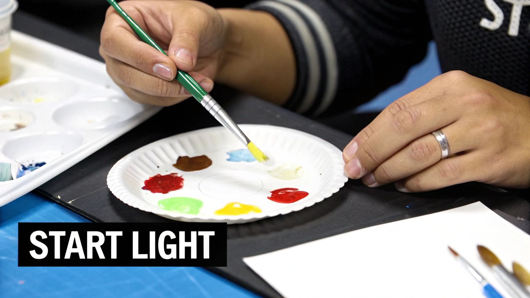
If you take only one piece of advice from this guide, let it be this: always start with your lighter color and gradually add the darker color to it. I can't stress this enough. It's the single best trick for saving paint and avoiding a world of frustration.
Think of it like adding hot sauce to your food. You can always add another drop, but you can’t take it out once it’s in there. A tiny speck of a dark, powerful color like blue or black will completely overpower a large amount of a lighter color like white or yellow.
On the flip side, you’d have to use a mountain of white paint to lighten a dark blue that you accidentally made a shade too dark. By starting with your white or yellow base and adding just a pinprick of the darker shade, you stay in complete control. It's way more efficient and gives you a much better feel for how the pigments play together.
Why Small Batches Are Your Best Friend
When you're looking at your paint-by-number canvas, with all its tiny numbered sections, it's tempting to mix a giant batch of a color you think you'll need a lot of. Trust me, this is usually a mistake. Working in small, manageable batches is a much smarter strategy.
- Better Consistency: It's so much easier to get a smooth, uniform color in a small puddle. Big batches often end up with unmixed streaks hiding in them.
- Less Waste: Acrylic paints dry fast. If you mix a huge amount of a color you only need for a few tiny spots, most of it will turn into a plastic puck on your palette before you can use it.
- Easier to Recreate: A small batch is like a simple recipe. If you know you used a pea-sized dot of white and a pin-drop of red to get that perfect pink, it’s a breeze to mix it again if you run out.
The alchemy of mixing paints feels modern, but it actually traces back 40,000 years to cave artists grinding ochre. Today, that ancient practice is refined for us with waterborne coatings—the non-toxic acrylics in your kit. They're so popular they dominate the market, and your kit's numbered pots create a foolproof system that can slash waste by up to 90% compared to painting from scratch.
Your Mixing Station and a Simple Workflow
You don't need a fancy studio. A simple and effective setup is all it takes to start mixing like a pro.
Your palette is your main workspace. This can be anything from a plastic artist's palette to a ceramic plate, a sheet of wax paper, or even a sturdy paper plate in a pinch. You just need a non-absorbent surface.
Here’s a straightforward process to follow:
- Lay Down Your Base: Squeeze out a small amount of your lightest color onto the palette. A dime-sized dollop is a good starting point.
- Add the Darker Color: With a clean brush or palette knife, scoop up a tiny bit of the darker color. Place it next to the light color, not right on top of it.
- Mix It In Slowly: Now, start pulling a tiny fraction of that dark paint into the light paint. Mix it completely until the color is totally uniform.
- Do a Quick Test: Before you commit it to the canvas, paint a small swatch on some scrap paper or in the margin of your canvas. Let it dry for a minute—acrylics almost always dry a little bit darker.
- Adjust and Perfect: Is the color still too light? Pull in another tiny bit of the dark paint. If you accidentally went too dark, it’s honestly better to start a new batch than to try and save it by adding heaps of white.
Getting the Paint Consistency Just Right
Sometimes, your mixed paint might feel a little thick or sticky, especially after it's been sitting on your palette for a minute. You can easily tweak its consistency for a smoother application.
Just dip the very tip of your brush in water and stir it into your paint. The key here is to use only one drop of water at a time. Adding too much will make the paint watery and transparent, weakening its ability to stick to the canvas properly. The goal is a smooth, creamy texture, kind of like melted ice cream. This tiny adjustment ensures your custom color goes on just as beautifully as the paints straight from the pot. For those looking to really master texture, we have more tips on how to blend paint effectively.
Your Go-To Recipes for Mixing Essential Colors
Alright, let's get our hands dirty and start mixing. Think of these as your starter recipes—the essential colors you’ll turn to again and again. We’ll cover everything from believable skin tones to the greens of a lush forest and the blues of a wide-open sky.
Don't treat these as rigid rules. They're jumping-off points. The real magic happens when you start tweaking them to match exactly what you see in your mind's eye.
Crafting a Spectrum of Natural Skin Tones
Mixing a realistic skin tone can feel like a huge hurdle, but it's far more approachable than it seems. The secret is that skin is never just one flat color. It’s a beautiful, complex blend of hues that you can build layer by layer.
Step away from that single "flesh-colored" tube of paint; it almost always looks artificial. Instead, your core palette for most skin tones will be red, yellow, white, and a touch of brown. A tiny dab of blue or green can also work wonders for creating realistic undertones and shadows.
Here are a few starting points:
- Fair Skin Base: Start with a good amount of white. Now, add a very small dot of yellow and an even smaller dot of red. Mix it all together until you get a soft, creamy peach or pinkish tone.
- Medium or Olive Skin Base: Begin with a base of brown, like burnt sienna. Lighten it up with yellow and add a hint of red for warmth. If it looks a little too warm, a pinprick of green will neutralize the red and create a gorgeous olive hue.
- Dark Skin Base: Use a rich brown like burnt umber as your starting point. Add a small bit of red to bring warmth and life to the color. For deeper, cooler variations, you can carefully mix in the tiniest amount of ultramarine blue.
A key takeaway: These are just the beginning. Look closely at a real face and notice the subtle color shifts—the pink in the cheeks, the slightly cooler tones around the mouth. Recreating those little variations is what will make your portraits feel truly alive.
Mixing Lush and Lifelike Greens
Nothing screams "beginner painting" quite like a flat, neon green taken straight from the tube. The greens you see in nature are almost never that vibrant. Mixing your own is the single best thing you can do to make your landscapes feel authentic and deep.
The basic formula is simple: yellow + blue. The real artistry, though, comes from playing with the ratios and adding other colors to get that natural look.
- Bright, Sunny Green: For leaves catching direct sunlight, start with a vibrant yellow and slowly add a little blue. This will give you a bright, zesty lime green.
- Deep Forest Green: To paint the shadows in a dense forest, start with blue and gradually add yellow until you have a deep, rich green. A tiny touch of black or dark brown will push it even further into a believable shadow color.
- The "Dirty" Trick: This is the most important tip for natural greens. Once you've mixed your blue and yellow, add a tiny speck of red (its complement) or a dab of brown. This instantly knocks back the artificial brightness and creates a much more organic, earthy green.
Creating Skies and Earthy Browns
Beyond people and plants, you'll constantly find yourself needing colors for skies, water, soil, and rocks. These are the foundational colors that set the entire mood of your painting.
For Skies and Water: A sky is almost never just a flat blue. For a calm, clear day, start with white and slowly mix in a bit of ultramarine or cerulean blue. If you're painting a moodier, overcast sky, try starting with a light grey (white plus a touch of black) and then adding your blue.
For Rich, Earthy Browns: Your kit might have a brown, but you can create a much wider and more beautiful range of tones by mixing your own. The easiest way is by mixing a primary color with its secondary complement.
- Red + Green = Brown
- Blue + Orange = Brown
- Yellow + Purple = Brown
Play around with the ratios here. You can create everything from a warm, reddish clay to a deep, dark soil. Adding a bit of white will give you opaque, earthy tans and beiges that are perfect for sandy shores or sun-bleached wood.
Here are some of those common recipes collected in one place for quick reference.
Common Color Mixing Recipes
This table offers some reliable starting points for popular colors you'll need in your paint-by-number projects.
| Target Color | Base Colors Required | Mixing Tip |
|---|---|---|
| Warm Pink | White + a small amount of Red | Start with white and add tiny bits of red until you reach the desired shade. A speck of yellow adds warmth. |
| Lavender | White + a touch of Purple (or Red + Blue) | For a softer lavender, use more white. For a deeper shade, add more blue to your purple mix. |
| Teal | Blue + a small amount of Green + a touch of White | Adjust the blue-to-green ratio to lean more aquatic or more emerald. White controls the brightness. |
| Burnt Orange | Orange + a tiny dot of Black or Brown | A very small amount of black or brown will instantly deepen the orange into a more rustic, earthy tone. |
| Olive Green | Yellow + Blue + a tiny speck of Red | Mix your green first, then add a tiny bit of red to "dirty it up" and make it look more natural. |
| Charcoal Gray | Black + White | Start with white and slowly add black. It’s much easier to darken a light color than to lighten a dark one. |
Think of this table as your cheat sheet. As you get more comfortable, you'll start to develop your own favorite recipes and learn to mix any color you can imagine. Mastering these simple formulas is a huge step in your painting journey, giving you the confidence to bring any scene to life.
Fixing Common Color Mixing Problems
Even the most seasoned artists end up with a puddle of a disappointing color from time to time. Mixing the perfect shade doesn't always happen on the first go, and that’s completely okay! Think of these moments as learning opportunities, not failures. They’re how you get a real feel for how your paints behave.
Let’s walk through some of the most common hiccups you'll run into and, more importantly, how to fix them. With a few simple tricks up your sleeve, you can save a color that’s gone wrong and build the confidence to mix fearlessly.
Why Your Colors Turn to Mud
It’s the number one frustration in color mixing: you’re aiming for a vibrant purple or a lush green, but you end up with a dull, muddy brown. This happens for a very specific reason, and once you get it, you can easily avoid it.
"Mud" is what you get when you mix too many colors together, especially complementary colors (the ones directly opposite each other on the color wheel). When you mix red and green or blue and orange in roughly equal amounts, they essentially cancel each other out, leaving you with a neutralized, brownish-gray.
Here’s how to keep your colors clean and bright:
- Keep Your Brush Spotless. This is the golden rule. A tiny bit of leftover yellow on your brush will instantly dull a beautiful purple. You need to rinse your brush thoroughly and wipe it on a paper towel between every single color you dip into. No exceptions!
- Stick to a Limited Palette. Try to create your new color using just two or three paints. The more pigments you add to the mix, the greater the risk of it turning into a muddy mess.
- Use Complements on Purpose. The only time you should mix complements is when you actually want a more muted, natural tone. For example, adding a tiny speck of red to a bright green is a fantastic way to make it look less artificial and more like real foliage.
Rescuing a Mix That Is Too Dark or Too Light
You’re so close to the perfect color, but it’s just a hair too dark or a touch too light. It’s a common and frustrating spot to be in, but this is one of the easiest problems to fix if you’re methodical about it.
If your color is too dark, don’t just dump a big glob of white paint in there. You’ll almost certainly overshoot your target and end up wasting a lot of paint. Instead, pull a small amount of your dark mix over to a clean spot on your palette. Then, add a tiny dab of white (or a lighter color) to that new, smaller puddle.
If your color is too light, the fix is simpler. Just keep adding minuscule amounts of your darker color, mixing completely after each addition, until you hit that perfect shade. Just remember: it’s always easier to darken a light color than to lighten a dark one.
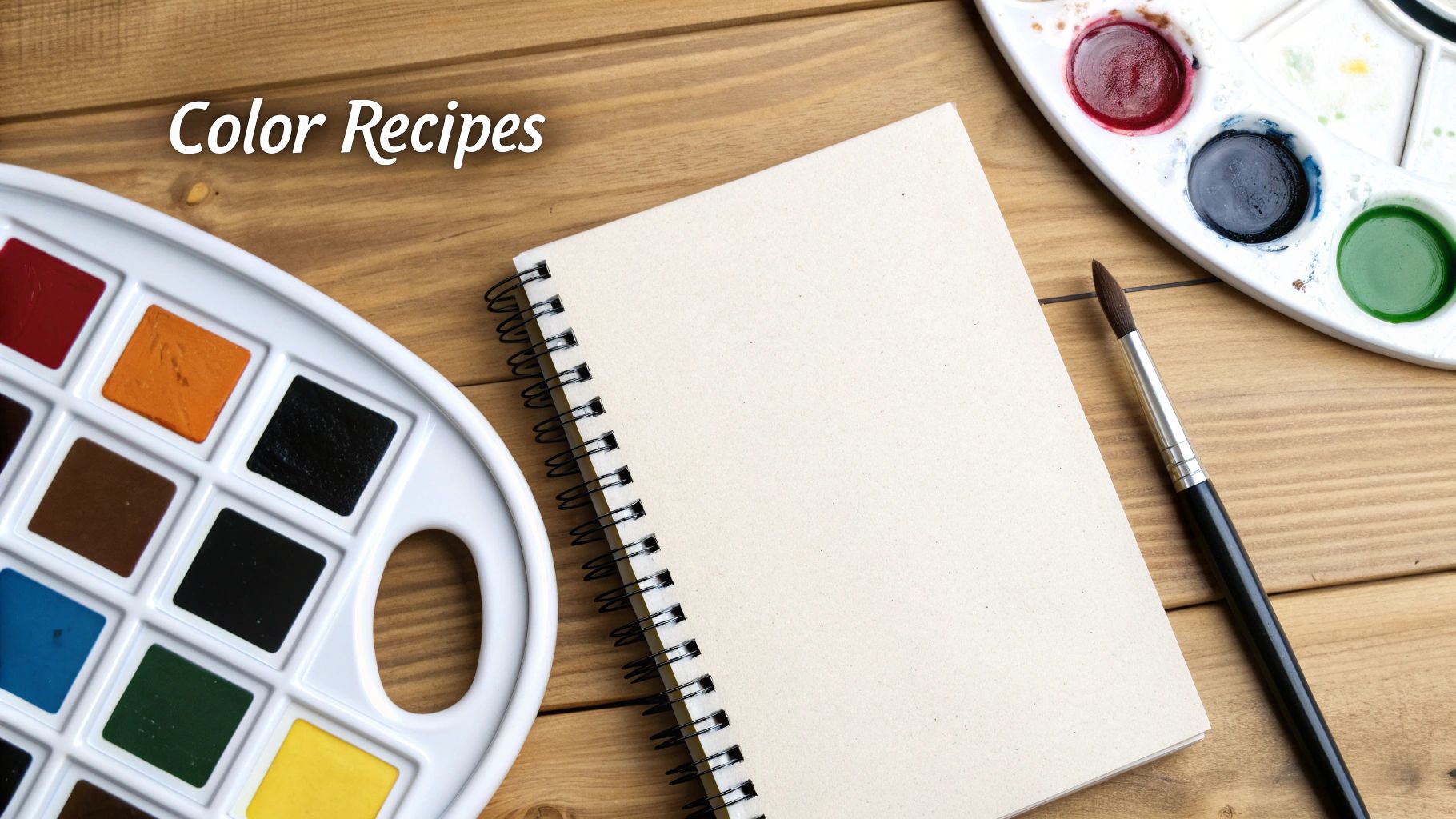
Pro Tip: When you finally mix the perfect color, make a quick "recipe card." On a scrap of paper, paint a small swatch and jot down the rough ratio you used, like "pea-sized white + pin-drop of blue + tiny speck of brown." This little note will be a lifesaver if you run out and need to recreate that exact color later.
Dealing with Fast-Drying Acrylics
One of the quirks of acrylics is how quickly they dry. You mix a beautiful batch of sky blue, turn to your canvas, and when you go back for more, it’s already getting that rubbery skin on top. It’s a classic acrylic painter’s headache, but it’s manageable.
- Get a Fine Water Mister. A simple spray bottle filled with water is your best friend. Give your palette a light spritz every few minutes. This keeps the paint workable without thinning it down into a watercolor-like consistency.
- Mix in Small Batches. As we’ve mentioned before, only mix what you think you'll need for the next 15-20 minutes. It’s far better to mix a fresh, small puddle than to try and bring dried-out paint back to life (which you can't, really).
- Try a "Stay-Wet" Palette. If you’re planning a longer painting session, a stay-wet palette is a game-changer. It's basically a container with a damp sponge inside that keeps your paints moist for hours, or even days. You can buy one or easily make your own.
Once you learn to anticipate these common issues, you'll spend less time wrestling with your paints and more time enjoying the creative flow of your project.
Common Questions & Quick Fixes for Mixing Paint
Even when you feel like you've got the hang of it, questions are bound to pop up. Let's be honest, mixing colors can feel a bit like a science experiment gone wrong at times. But don't worry, a few quick answers can clear up the most common hurdles you'll face.
Think of this as your go-to cheat sheet for those little "what do I do now?" moments. From saving that perfect custom green to figuring out why your paint looks different on the canvas, I've got you covered.
How Much Paint Should I Mix at Once?
I know it’s tempting to mix up a huge batch of a color you'll need for a big section, but trust me on this one: start small. It’s so much easier to whip up another small, perfect batch than it is to stare at a giant glob of the wrong color, knowing it’s all going to waste.
Aim for a dollop about the size of a quarter on your palette. That's usually more than enough for several numbered areas and, more importantly, it keeps your custom mix from drying out before you can use it all. If you need more, you can just follow your "recipe" to make another batch. For those tiny, intricate details? A single pea-sized drop is all you need.
What If I Run Out of a Kit Color?
First off, don't panic! Running out of a specific color isn't a disaster; it's a great chance to put your new mixing skills to the test. This is where knowing how to mix colors with paint really comes in handy.
Start by grabbing the closest colors you have. For example, if you're out of a light green, begin with a yellow base and add the tiniest specks of blue until you nail the hue. Once you've got the general color right, start adding small dabs of white to lighten it up until it matches.
The best way to check your match is to paint a little swatch on scrap paper and hold it right next to a painted section on your canvas. Give it a minute to dry, because colors can change slightly. Keep tweaking your mix until you can’t tell the difference.
Can I Save My Mixed Paint for Later?
Absolutely, but you have to store it properly. Acrylics dry notoriously fast, so an airtight container is a must.
- Airtight is Everything: Those little empty paint pots with snap-on lids or tiny craft containers are perfect for this.
- Palette Hack: If you don't have containers handy, you can stretch plastic wrap tightly over your palette to seal out the air.
- A Little Pro Tip: Before sealing the container, add a single drop of water on top of the paint. It creates a humid little micro-environment that helps keep the paint workable.
Even with the best storage, try to use your custom mixes within a day or two for the best consistency and color.
Why Does My Mixed Color Look Different on the Canvas?
This happens to everyone, so don't think you've done something wrong. It’s called a color shift, and it’s just a natural part of how acrylic paint works. The simple truth is that most acrylics dry a little bit darker than they look when they're wet on your palette.
The trick is to compensate for it. Always aim to mix your color just a hair lighter than what you're actually aiming for. The most reliable way to get it right is to do a quick test swatch. Paint a small dab on the edge of your canvas or a piece of paper and let it dry completely. This shows you the true final color before you commit to painting a big, noticeable area.
At Custom Paint By Numbers, we believe art is for everyone. Whether you've been painting for years or are just picking up a brush, our high-quality kits provide the perfect canvas to bring your vision to life. You can transform your favorite photos into a masterpiece or choose from hundreds of beautiful designs. Explore our collection and start your creative journey today.


