

So, what exactly are complementary colors in art?
At its core, the idea is pretty simple. Complementary colors are pairs of colors that sit directly opposite each other on the color wheel. This opposition creates the most intense visual contrast you can get.
The three classic duos that every artist learns are: red and green, blue and orange, and yellow and purple.
Diving Into the Color Wheel
Think of complementary colors like a visual tug-of-war. When you place them right next to each other, they don't fight—they actually make each other pop. Each color makes its partner look brighter and more intense.
This dynamic relationship is the secret sauce behind some of the most striking and memorable paintings in history. It's a cornerstone of color theory that helps artists create a sense of balance, tension, and pure visual excitement.
But this isn't just a concept for the old masters! Understanding how these pairs work can totally change the game for your own art, whether you're sketching in a notebook or tackling a new paint-by-number kit. The real trick is learning how to use their power intentionally.
- To Make Something Stand Out: A small dash of a complementary color will instantly pull the viewer's eye right where you want it.
- To Pack an Emotional Punch: That high contrast can scream energy and drama or create a feeling of lively celebration.
- To Get Realistic Shadows: Mixing complementary colors is a fantastic way to create deep, natural-looking shadows and neutral grays or browns, far better than just using black.
This infographic lays out the three main complementary pairs and shows you exactly where they live on the color wheel.
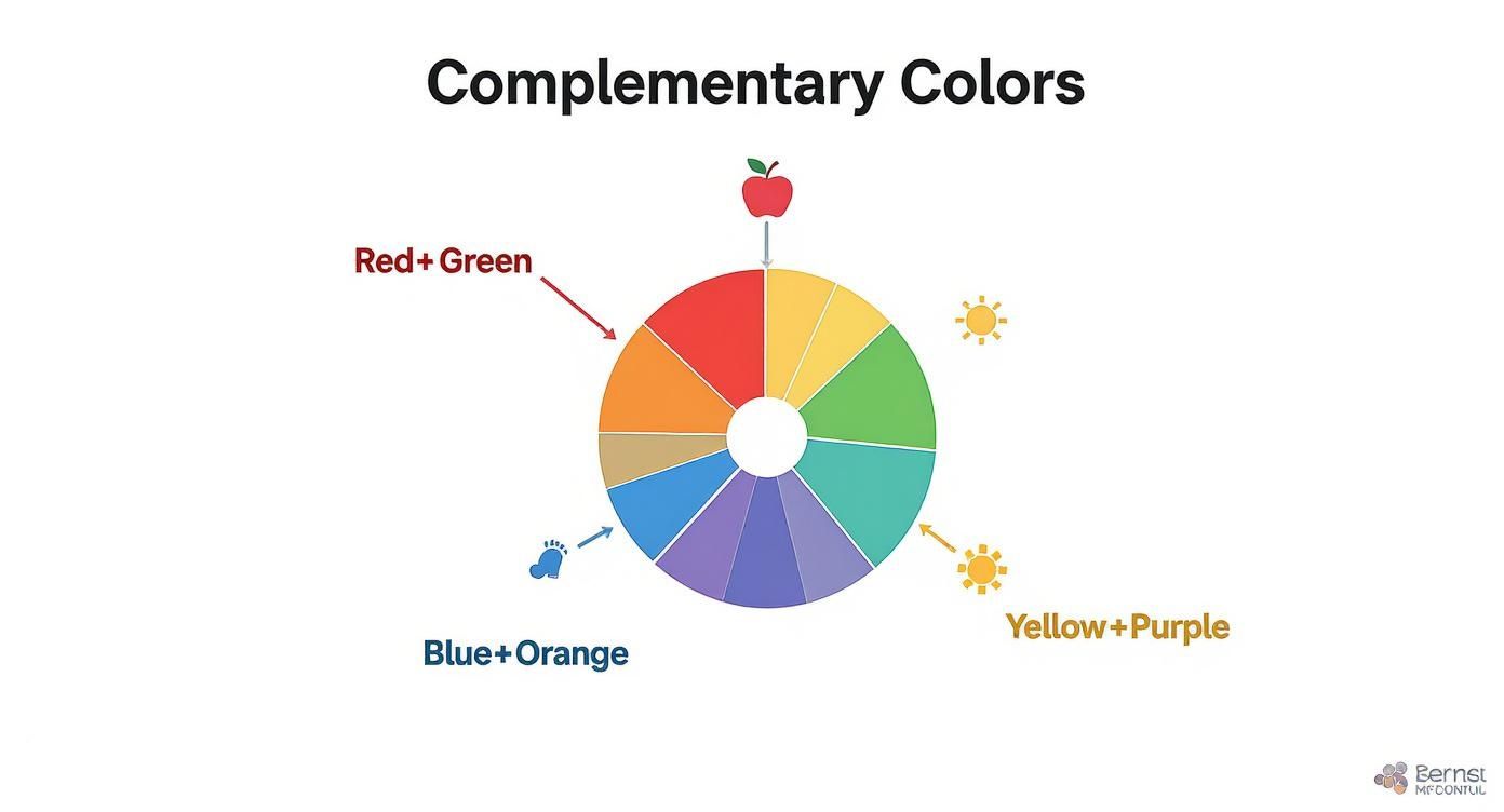
As you can see, it's that direct face-off on the wheel that gives these colors their unique zing.
To help you remember these key pairings, here's a quick cheat sheet.
The Three Primary Complementary Color Pairs
| Color Pair | Colors | Visual Effect |
|---|---|---|
| 1. | Red & Green | Creates a vibrant, often festive or natural, high-energy look. |
| 2. | Blue & Orange | Evokes a powerful contrast, seen in sunsets and cinematic scenes. |
| 3. | Yellow & Purple | A regal and striking pair that feels both luxurious and exciting. |
These three pairs are your foundation for using high-contrast color effectively.
While these powerful duos are essential, they're just one piece of the puzzle. You can also explore different color relationships by learning about painting analogous colors, which sit next to each other on the wheel and create a much more calm and harmonious feeling.
The Science Behind Why These Colors Work
Ever wondered why complementary colors seem to almost vibrate when placed next to each other? It's not just a happy accident artists stumble upon; it's pure science, rooted in the way our eyes and brain work together. What feels like artistic magic is actually a predictable biological response.
The effect is called simultaneous contrast, and it's what gives these color duos their knockout punch. When you stare at a color, say bright green, the cone cells in your eyes that register green get a little tired. To find balance, your brain steps in and automatically generates the opposite color—in this case, red.
So, when a red object is right next to that green one, your brain’s reaction makes the red look even more vivid and intense. It’s a fascinating optical illusion that artists have been using to their advantage for centuries.
The Weaver Who Unlocked the Secret
Interestingly, the person who first put a name to this phenomenon wasn't a painter. He was a 19th-century French chemist named Michel Eugène Chevreul. While working at the Gobelin tapestry factory in 1828, he was tasked with figuring out why some of the dyes looked disappointingly dull.
Chevreul quickly realized the dyes weren't the problem at all. It was the colors they were woven next to! He demonstrated that placing complementary colors side-by-side made both appear dramatically brighter. In fact, his research showed that weavers could make their textiles pop by as much as 20–30% simply through clever color pairing.
In his groundbreaking 1839 book, Chevreul wrote that "the eye 'simultaneously' induces the complementary color of an adjacent color." This single observation gave artists a scientific explanation for what they had always felt intuitively.
His discovery gave everyone a clear, logical reason for why certain color combinations create such a stunning visual pop. It proves that the power of complementary colors is as much about human perception as it is about the paint itself.
To explore these foundational ideas further, check out our beginner's guide to color theory for painting. It’s a great way to see how you can apply these principles to your own art.
How the Masters Put Complementary Colors to Work
Knowing the rules of color theory is one thing, but seeing how the masters wielded it is where the magic really happens. The world’s greatest artists weren’t just painting objects; they were using color to tell stories, stir up feelings, and guide your eyes exactly where they wanted them to go.
This isn’t some new-age trick. If you look at iconic paintings from the 19th and 20th centuries, you'll find that over 75% of them deliberately use complementary colors to build jaw-dropping contrast.
A perfect case study is Vincent van Gogh’s 1888 masterpiece, Café Terrace at Night. He flooded the canvas with intense yellows and oranges right up against deep, velvety blues. It’s an emotional gut punch. In fact, analysis shows he used these complementary hues across an incredible 60% of the painting's surface. You can dive deeper into this technique over on the Tate website.
Van Gogh: The King of Emotional Contrast
There's a reason Van Gogh is a legend in the art world. He just got color. He knew that putting a fiery orange right next to a cool blue would make the entire scene feel electric, almost buzzing with energy.
In Café Terrace at Night, that glowing yellow-orange light from the café doesn't just light up the street. It actively pushes back against the inky blues of the night sky. The result is a feeling of warmth and life spilling out into the quiet darkness. It was more than just a technique; it was how he painted his own intense emotions onto the canvas.
Monet: Capturing the Impression of Light
Claude Monet, one of the fathers of Impressionism, also had a deep appreciation for complementary colors, but he often used them with a softer, more subtle approach. His obsession was capturing the fleeting, shimmering effects of light, and these color pairings were essential to his mission.
Take his famous work, Impression, Sunrise. The whole painting is a wash of hazy blues and muted grays, creating a moody, atmospheric scene. But then, he adds a small, blazing orange sun.
That single pop of orange—the direct opposite of the surrounding blue—instantly becomes the star of the show. It almost vibrates, perfectly capturing that feeling of the sun piercing through the morning mist and reflecting on the water.
By looking at how these giants of art used color, we see that complementary pairs are so much more than a rule in a textbook. They’re a secret weapon for breathing life, drama, and pure emotion into your art.
Practical Techniques For Your Own Artwork
Alright, now that we've covered the theory behind complementary colors, let's get our hands dirty. It's time to put that knowledge to work on the canvas.
Using these color pairs is a lot easier than you might think. Honestly, just a couple of core techniques can completely transform your art, whether you're starting from scratch or working on a paint-by-number kit. The two main approaches are placing colors side-by-side or mixing them together.
Each method gives you a totally different result, so let's break them down. One creates energy and makes things pop, while the other builds depth and realism.
Creating Vibrant Focal Points
The most straightforward way to use complementary colors is to place them right next to each other. This is called juxtaposition, and it’s your secret weapon for creating an area of high contrast that instantly grabs attention. Think of a bright red poppy in a field of green—your eyes go right to it, don't they?
But here's a pro tip: a little goes a long way. To keep the effect powerful without being overwhelming, try using the 80/20 rule. Let one color dominate the space (about 80%) and use its complement as a small, punchy accent (the other 20%). This gives you a clear focal point without making the whole piece feel chaotic.
Mixing For Rich Neutrals
The second technique is where the real magic happens: mixing complementary colors. It sounds counterintuitive, I know. You'd think mixing red and green would just give you a murky brown, right?
Well, yes and no. You actually create incredibly sophisticated, rich neutral tones. Mixing a bit of blue into orange, for example, can give you a whole range of earthy browns and complex grays that feel much more alive than a simple black or gray from a tube.
This is how professional artists create believable shadows. A shadow isn't just black—it's a darker, less saturated version of the original color. Adding a touch of its complement is the perfect way to achieve that natural, realistic look.
To truly understand the difference between these two powerful techniques, here's a quick comparison of what happens when you place colors next to each other versus when you mix them.
Using Complementary Colors Placing vs Mixing
| Technique | Primary Goal | Resulting Visual Effect |
|---|---|---|
| Placing side-by-side | To create high contrast and a focal point | Vibrant, energetic, makes colors appear brighter |
| Mixing together | To neutralize or desaturate colors | Creates realistic shadows, rich browns, and complex grays |
As you can see, the outcome depends entirely on your goal. One approach adds excitement, while the other adds depth and subtlety.
Learning to control these mixtures is a game-changer. For a deeper dive, our guide on how to blend paint colors is packed with step-by-step instructions. And if you ever plan to take your art from the canvas to a print, mastering color management in printing is a crucial skill to ensure your colors look just as good on paper as they do on your palette.
Seeing Complementary Colors in Daily Life

Once you understand what are complementary colors in art, a funny thing happens—you start seeing them everywhere. This isn't just some high-minded concept for painters; it's a powerful tool used by designers, advertisers, and filmmakers to capture our attention every single day.
That electric contrast that makes a painting pop off the canvas is the very same principle that makes a logo stick in your mind or a movie poster feel exciting.
Think about the last blockbuster movie poster you saw. There's a good chance it used a dramatic blue and orange color scheme. This is no accident. This classic high-impact pairing makes the poster leap out from a crowded theater lobby, hinting at action and drama that pulls you right in.
Branding and Design
Top brands also lean on complementary colors to carve out a strong, memorable identity. A smart color duo can make a logo instantly recognizable and evoke a specific feeling about the company.
You've probably seen these a million times:
- Firefox: The iconic fiery orange fox wrapping around a deep blue globe gives off a feeling of energy and motion.
- FedEx: The classic purple and orange logo is a perfect complementary pair that feels both trustworthy and fast.
- Los Angeles Lakers: The legendary purple and gold (yellow) uniforms are a prime example of a complementary scheme that feels both royal and thrilling.
These same ideas apply far beyond the art world, influencing everything around us. For a deeper look at how these concepts shape our living spaces, you can find great insights by Mastering Home Design Color.
The takeaway is clear: designers use complementary colors for the exact same reason artists do. They create maximum visual impact, making things memorable and guiding our focus exactly where they want it to go.
And this isn't just a gut feeling; the data backs it up. An analysis of Hollywood movie posters revealed that over 65% use a blue and orange combination. In the digital world, a study of top websites found that 55% use complementary colors in their branding, which was tied to a 15–20% increase in user engagement. You can find more details on this by exploring the research on color contrast.
Answering Your Questions About Complementary Colors
To wrap things up, let's tackle a few common questions that always come up when people start playing with complementary colors. Think of this as a quick FAQ to clear up any lingering confusion so you can get back to painting with confidence.
What Happens If I Mix Two Complementary Colors?
When you mix two complementary colors, they basically neutralize each other. Instead of getting another vibrant hue, you end up with a muted color like a sophisticated gray, a rich brown, or even a soft black.
This isn't a mistake—it's actually a powerful trick used by artists all the time! It's how they create beautifully realistic shadows. For instance, mixing a touch of red into your green paint creates a deep, earthy shadow green that looks far more natural than just adding plain black.
The real magic is in the ratio. Just a little bit of one color will tone down its partner, but a perfect 50/50 mix will get you closer to a true neutral. The best way to learn is to just experiment and see what shades you can create.
Can I Use More Than One Pair of Complements?
You absolutely can, but you need a game plan to keep your painting from feeling chaotic. Throwing too many high-contrast pairs together can make them fight for attention, and the viewer won't know where to look.
Here’s a good way to approach it:
- Pick a Star Player: Let one complementary pair, like blue and orange, take the lead in your painting. Make it the main event.
- Use Others as Accents: Bring in a second pair, maybe red and green, but only in small, subtle doses. This adds a little pop of interest without overwhelming your main color story.
Another great technique is the split-complementary color scheme. To do this, you pick a base color (say, blue) and then, instead of using its direct opposite, you use the two colors next to its opposite (in this case, yellow-orange and red-orange). This gives you that eye-catching contrast but with a bit more harmony.
Are There Different Color Wheels With Different Complements?
That's a fantastic question, and the answer is yes! The complements you're working with change depending on the color system you're using.
As a painter, you’ll almost always be using the RYB (Red, Yellow, Blue) color wheel. This is the traditional artist's wheel where we get our classic pairs like red/green and blue/orange.
But other fields have their own systems:
- RGB (Red, Green, Blue): This is the color model for anything on a screen, from your TV to your phone. In the RGB world, red's complement is actually cyan.
- CMYK (Cyan, Magenta, Yellow, Key/Black): This is the system used for printing magazines and posters.
For anyone holding a paintbrush, the good old RYB wheel is the one you need to know.
Feeling inspired to see these colors in action? At Custom Paint By Numbers, you can turn your favorite photos into a personalized art project or browse hundreds of gorgeous designs. Start creating your masterpiece today!


