
Tertiary colors are the six shades you get by mixing a primary color with the secondary color right next to it on the color wheel. Think of them as the next generation in the color family—the beautiful, nuanced shades like red-orange, yellow-green, and blue-violet that add so much depth to a painting.
Your Quick Guide to Tertiary Colors
Ever looked at a painting of a fiery sunset and wondered how the artist nailed that perfect, glowing shade somewhere between orange and red? Or admired the subtle, earthy green of a leaf that wasn’t quite yellow or pure green? The secret is in the tertiary colors. They’re the "in-between" shades that bridge the gaps between the basic hues we all know.
To really get a feel for them, it helps to first understand their "parents." You can learn all about the foundational building blocks in our guide on primary and secondary colors. Once you’ve got that down, you’ll see that tertiary colors are just the natural next step, connecting everything into a full, harmonious spectrum.
The Six Essential Tertiary Colors
If you look at a classic 12-part artist’s color wheel, you'll see it’s made of three primary colors, three secondary colors, and six tertiary colors. That means a full 50% of the wheel's main divisions are these subtle, in-between shades! It really shows you just how crucial they are for creating realistic and balanced art. You can dive deeper into the color wheel's history and structure on the Wikipedia page for the color wheel.
This handy table breaks down exactly how to mix each one.
The Six Tertiary Colors and How to Mix Them
Here’s a quick reference guide showing the six main tertiary colors and their simple mixing formulas.
| Tertiary Color Name | Primary Color | Secondary Color | Mixing Formula |
|---|---|---|---|
| Red-Orange | Red | Orange | 1 Part Red + 1 Part Orange |
| Yellow-Orange | Yellow | Orange | 1 Part Yellow + 1 Part Orange |
| Yellow-Green | Yellow | Green | 1 Part Yellow + 1 Part Green |
| Blue-Green | Blue | Green | 1 Part Blue + 1 Part Green |
| Blue-Violet | Blue | Violet | 1 Part Blue + 1 Part Violet |
| Red-Violet | Red | Violet | 1 Part Red + 1 Part Violet |
As you can see, the formulas are pretty straightforward. Keep this table in mind when you’re at your easel, and you’ll be mixing these essential shades like a pro in no time.
Building the Complete 12-Part Color Wheel
To really get a feel for tertiary colors, it helps to see where they fit in the grand scheme of things. I like to think of building a 12-part color wheel like creating a family tree. You start with the grandparents and work your way down, and you can visually see how everyone is related.
Everything starts with the three primary colors: red, yellow, and blue. These are the ancestors of our color family—the pure pigments you can't create by mixing anything else. They form a nice, stable triangle on the wheel, laying the groundwork for all the colors to come.
Creating the Secondary Colors
Next up, we introduce the second generation. By mixing equal parts of two primary colors, we get our three secondary colors. Think of these as the children in the color family, each born from a primary pair:
- Red + Yellow = Orange
- Yellow + Blue = Green
- Blue + Red = Violet
Once you place orange, green, and violet into the gaps between their "parent" primaries, the wheel starts taking shape. We're now at six colors, but you can still see some pretty big jumps between them. The spectrum isn't quite smooth yet.
Introducing the Tertiary Colors
This is where the magic happens. Finally, we bring in the grandchildren—the six tertiary colors. These are the hues that bridge the gaps and make the color wheel feel complete, creating a seamless flow from one color to the next.
A tertiary color is simply what you get when you mix a primary color with one of its next-door neighbors, a secondary color. That’s it. This simple formula is what gives them their unique, in-between character.
This mixing recipe is also why they have those hyphenated names. The primary color always gets listed first, followed by the secondary. So, it’s Blue-Green, not Green-Blue. This little rule is handy because the name itself tells you exactly how to make it.
This chart breaks it down visually, showing how a primary and secondary color come together.
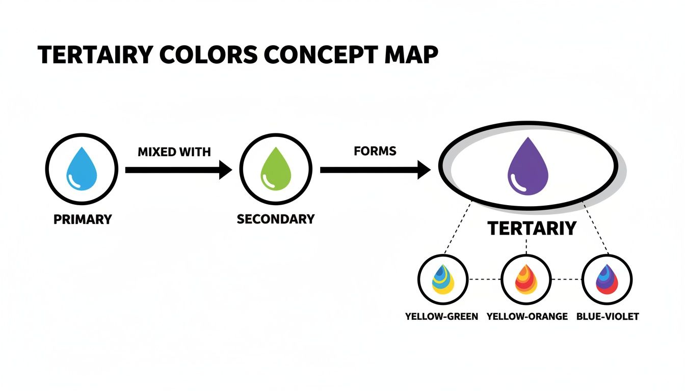
As you can see, tertiary colors are the essential connectors, the glue holding the primary and secondary hues together.
Once you mix and place all six tertiary colors—red-orange, yellow-orange, yellow-green, blue-green, blue-violet, and red-violet—in their proper spots, your 12-part wheel is finished. It’s no longer just a handful of distinct colors, but a full, harmonious spectrum ready for you to use in your art.
Why Tertiary Colors Are Your Secret to Realistic Art
If you want to paint something that looks real, you need to look beyond the basic colors.
Primary and secondary colors are fantastic—they're bold, direct, and the building blocks of everything. But when you look at the world around you, how often do you see a pure, screaming fire-engine red or a perfect grass green? Not very often.
Instead, nature is full of subtle, complex hues. Think about the muted teal of a distant mountain, the warm amber glow of a sunset, or the rich chartreuse of new spring leaves. Those are the shades that make a scene feel authentic, and nearly all of them are tertiary colors. They are your most powerful tool for capturing the real world because they represent the nuances our eyes see every single day.
Moving Beyond the Basics
Imagine an artist's palette. A bright, pure red is essential, but on its own, it can look a little flat or even cartoonish. By mixing that red with a neighboring secondary color, like orange or violet, you unlock a whole new world of sophisticated variations that feel more natural and grounded.
This is where you find the colors that add depth, create mood, and give your artwork a believable atmosphere. A portrait's skin tone isn't just one flat color, right? It's a complex blend of countless subtle shifts, and many of those are tertiary.
The greatest artists have always understood this. Their masterpieces aren't splashed with pure primary colors. Instead, they’re built on a foundation of complex, intermediate shades that guide the eye and stir emotion.
This isn't just a feeling; it's a fact. A statistical analysis of over 1,000 paintings from the Renaissance to Impressionism showed that artists overwhelmingly favor these in-between hues. When mapped out, the color usage in these works forms broad, blended bands on the color wheel—not sharp peaks at the primary points. You can even dig into the data behind these findings in this detailed academic survey.pdf).
The Language of Nuance and Depth
Learning to use tertiary colors well is like learning a new language. It allows you to communicate more with your art, from depicting the subtle play of light and shadow to creating gentle, seamless transitions. To see this in action, it's worth exploring how these shades are used across various realistic art styles.
Here’s how they bring that sense of realism to life:
- Creating Natural Shadows: A common mistake is using black to darken a color, which often just makes it look dull and flat. A much better way is to mix in a related tertiary color. Adding a touch of red-violet to a red object, for example, creates a far more believable shadow than simply adding black.
- Simulating Atmospheric Perspective: Have you ever noticed how objects in the distance look less vibrant and a bit bluish? That’s the atmosphere at work. Tertiary colors like blue-violet and blue-green are perfect for painting those distant hills or foggy landscapes.
- Achieving Rich, Earthy Tones: The beautiful browns, olives, and ochres found all over nature are rarely simple. They are often complex tertiary mixes, sometimes toned down with their complements, resulting in an organic and cohesive palette.
By mastering these shades, you stop just coloring things in and start truly painting them.
Mixing Perfect Tertiary Colors on Your Palette
Reading about color theory is one thing, but getting your hands dirty with paint is where the real fun—and learning—begins. Mixing tertiary colors is a practical skill that can feel like a bit of magic, but it all starts with a simple formula to keep you from accidentally creating a muddy mess.
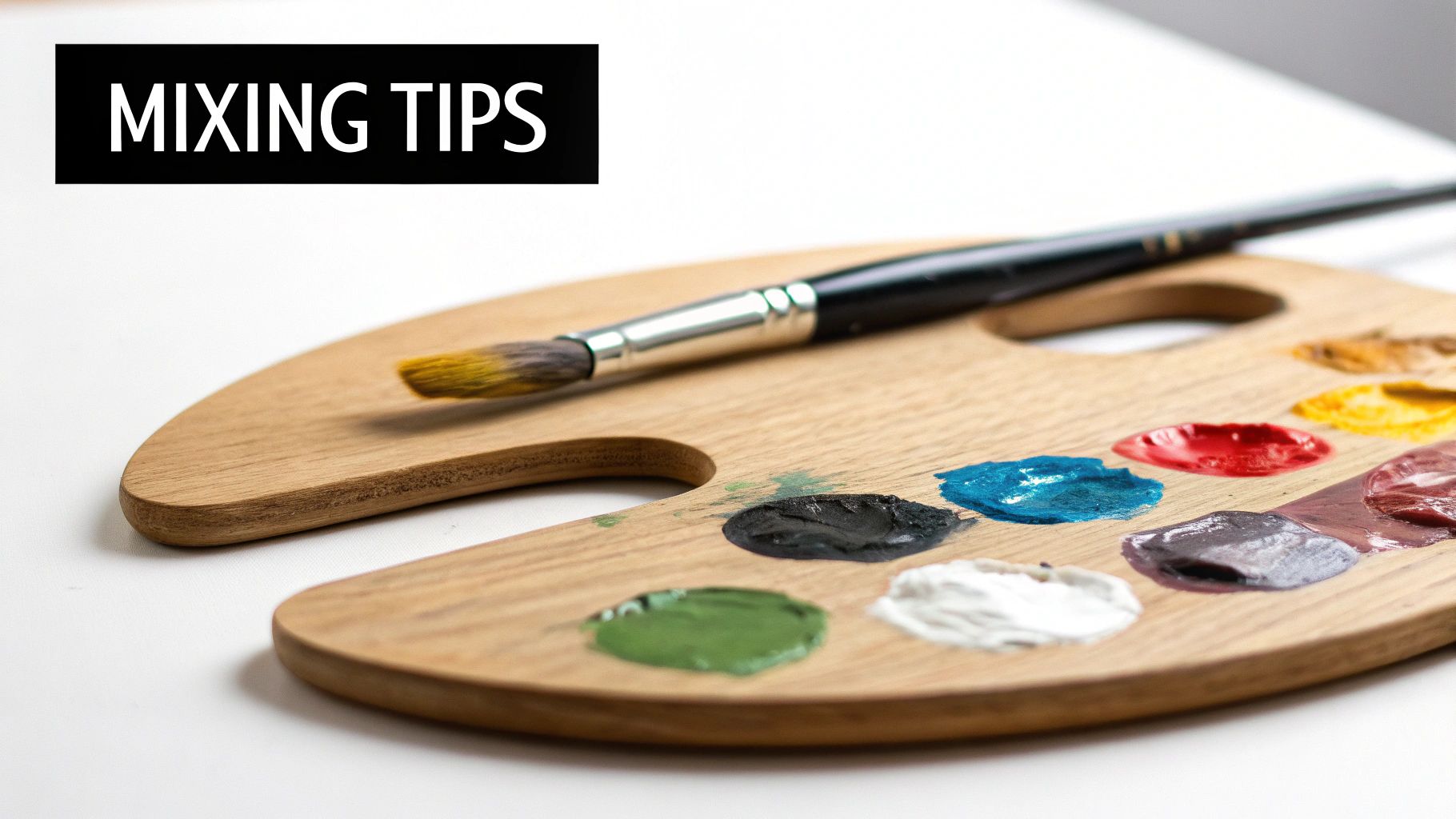
Think of it like a recipe. The best starting point is a 2:1 ratio—that’s two parts of your primary color to one part of the neighboring secondary color. This simple ratio makes sure the primary color stays dominant, which is the whole point of a tertiary hue. So, if you want to mix a red-orange, you'd start with two dollops of red paint and mix in one dollop of orange.
This gives you a perfect baseline—a vibrant, clean tertiary shade. Once you have that, you can start experimenting. Add a little more of the secondary color for a softer tone, or a touch more of the primary to make it bolder.
Pro Tips for Clean and Controlled Mixing
Getting a clean mix isn’t just about the ratios; it's also about your technique. A few good habits will make a huge difference in your results, saving you paint, time, and a lot of frustration. If you want to dive deeper, check out our full guide on mixing acrylic paint.
For now, here are the essentials for better control:
- Always Add Dark to Light: This is the golden rule of mixing. Add the darker color to the lighter one in tiny amounts. It takes a huge amount of light paint to change a dark color, but only a pinprick of dark paint to transform a light one. This one trick gives you total control.
- Mix More Than You Need: Trust me on this—it’s nearly impossible to perfectly recreate a custom color later. Always mix a slightly bigger batch than you think you’ll need for the area you're painting.
- Use a Clean Tool: Don't muddy your colors before you even start! Always use a clean palette knife or a fresh brush to scoop out each new color from its tube or pot.
The goal isn't just to make a new color, but to make the right color. Patience and a methodical approach will always get you better results than just winging it and hoping for the best.
A Practical Recipe Chart for Tertiary Colors
To make things even easier, here’s a cheat sheet for mixing the six tertiary colors using common artist paint names. These recipes are fantastic starting points, whether you're painting from scratch or just need to blend a custom shade for your Paint By Numbers kit.
| Target Tertiary Color | Primary Paint | Secondary Paint | Practical Mixing Recipe |
|---|---|---|---|
| Red-Orange | Cadmium Red | Cadmium Orange | Start with 2 parts Cadmium Red and slowly mix in 1 part Cadmium Orange. |
| Yellow-Orange | Cadmium Yellow | Cadmium Orange | Begin with 2 parts Cadmium Yellow and blend in 1 part Cadmium Orange. |
| Yellow-Green | Lemon Yellow | Viridian Green | Use 2 parts Lemon Yellow and carefully add 1 part Viridian Green. |
| Blue-Green | Ultramarine Blue | Viridian Green | Mix 2 parts Ultramarine Blue with 1 part Viridian Green for a deep teal. |
| Blue-Violet | Ultramarine Blue | Dioxazine Purple | Start with 2 parts Ultramarine Blue and gently mix in 1 part Dioxazine Purple. |
| Red-Violet | Quinacridone Red | Dioxazine Purple | Blend 2 parts Quinacridone Red with 1 part Dioxazine Purple for a rich magenta. |
Think of these recipes as your roadmaps, not rigid rules. Feel free to experiment by tweaking the ratios or swapping out a primary (like using Pyrrol Scarlet instead of Cadmium Red) to see what happens. This hands-on practice is truly the fastest way to build an intuition for color.
Finding Tertiary Colors in Your Paint by Numbers Kit
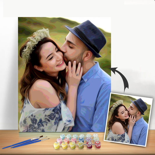
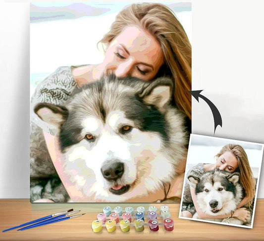
Have you ever looked at two paint by numbers kits and wondered why one looks so much more realistic and professional? The secret isn't just the design; it's often the subtle power of tertiary colors. While a basic kit might give you just the primaries and secondaries, the more advanced sets are absolutely packed with these sophisticated, in-between hues.
This is especially true for kits with higher paint counts, like the ones with 24, 36, or even 48 different pots. When you open one of these, you’re not just getting more colors—you’re getting more nuance. A huge chunk of those extra paints is dedicated to the tertiary shades that really bring a painting to life.
These are the colors that build a soft, believable gradient in a sunset or capture the delicate shifts in a portrait. They’re what gives a forest scene genuine depth, turning a flat, poster-like image into something with real dimension.
Why a High-Color-Count Kit is Worth It
When we design a detailed paint by numbers kit here at Custom Paint By Numbers, we know that realism comes from subtlety. Offering 24, 36, or 48 numbered paints isn't about throwing in random colors; it's about carefully allocating those slots to finely-tuned tertiary hues. In fact, more than half of all paint pots in a complex kit are often dedicated to these shades. This ensures skies, skin tones, and foliage don't look blocky or artificial.
If you want to dive deeper into how colors are structured for artists, it's fascinating to explore the history of color theory.
Think about painting a sky at dusk. You can't just slap down some blue and orange and call it a day. To make it look real, you need every shade in between: muted blue-violets, dusty red-oranges, and soft yellow-oranges. A high-color-count kit gives you these pre-mixed, taking the guesswork out of the equation so you can just enjoy the meditative flow of painting.
How to Spot Tertiary Colors on Your Canvas
So, where are these crucial colors hiding in your kit? Just take a look at your numbered canvas and the paint pots that came with it. You'll probably notice several shades that look like slight variations of one another, almost like a color swatch slowly shifting from one hue to the next.
For instance, in a landscape scene, you might find:
- A whole series of greens, from a bright yellow-green for sun-drenched leaves to a deep blue-green for the shadows.
- For a portrait, you’ll see several subtle red-oranges and yellow-oranges that work together to create authentic, glowing skin tones.
Each of those numbered paints represents a deliberate artistic choice. The kit designer has already done the heavy lifting on the color theory, breaking down a complex image into simple, manageable steps for you.
When you start to recognize this, your painting session becomes more than just a relaxing hobby—it's a hands-on art lesson. As you fill in the numbered areas, you’re not just coloring. You're seeing firsthand how tertiary colors build form, light, and shadow. It’s what makes a well-designed kit so special, giving you the tools to create a masterpiece that looks truly nuanced and professional.
Creating Harmony with Tertiary Color Palettes
Knowing what tertiary colors are is one thing, but the real magic happens when you start using them to build a palette that feels cohesive and creates a specific mood. These subtle, in-between shades are the secret sauce in so many professional color schemes. They’re what separates a random assortment of colors from true visual harmony.
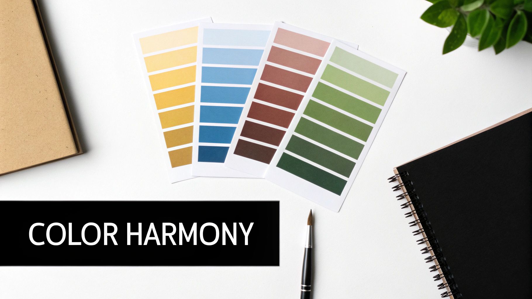
Take an analogous color scheme, for example. This approach uses colors that sit right next to each other on the color wheel, creating a wonderfully serene and unified feeling. Think about a palette of yellow-green, green, and blue-green—it instantly brings to mind the quiet tranquility of a dense forest. If you're curious to learn more, our guide can help you define analogous color in greater detail.
This idea of using related hues is exactly why tertiary colors are so critical for achieving realism and balance in art. Our eyes naturally gravitate toward images with rich, subtle color shifts because that’s how the real world looks. It’s no surprise, then, that an artist's color wheel dedicates a full 50% of its core segments to these tertiary shades. They act as the perfect bridge, smoothing the transitions between primary and secondary colors and making any palette feel more natural and balanced.
Evoking Mood with Tertiary Palettes
The real fun begins when you realize that different combinations of tertiary colors can stir up completely different feelings in your artwork. Once you get a feel for these connections, you can make powerful, intentional choices as an artist.
- Warm & Inviting: A palette that leans into red-orange, yellow-orange, and similar neighbors practically radiates energy and warmth. It’s the perfect choice for painting a cozy room with a fireplace or a brilliant sunset.
- Calm & Tranquil: On the other hand, palettes built around blue-violet and blue-green create a peaceful, calming atmosphere. These are ideal for serene ocean landscapes or thoughtful, quiet portraits.
- Earthy & Grounded: By toning down shades like yellow-green and red-orange, you can build beautifully natural, earthy palettes that feel stable, organic, and connected to the ground.
By intentionally choosing a family of tertiary colors, you guide the viewer's emotional journey. Your palette becomes more than just decoration—it becomes a storytelling tool.
Developing this skill of building harmonious palettes is essential for any creative pursuit, whether it’s painting a canvas or practicing beautiful hand lettering art. Learning to see how these colors work together will not only give you confidence in your own projects but also a deeper appreciation for the artwork you love.
Common Questions About Tertiary Colors
As you start working more with tertiary colors, you'll naturally run into a few questions. It happens to every artist. Let's tackle some of the most common ones so you can feel more confident at your easel.
What’s the Difference Between Tertiary and Intermediate Colors?
Honestly, for a painter, there’s no real difference. The terms tertiary and intermediate are pretty much used interchangeably to describe the same six colors.
Both refer to the beautiful hues you get when you mix a primary color with a secondary color right next to it. While some hyper-technical color theories might split hairs, in the studio, they’re one and the same.
Are Brown and Grey Considered Tertiary Colors?
That’s a great question, but no, they aren't. Brown is what we call a composite color. You usually make it by mixing complementary colors (like red and green) or even all three primaries together. Grey is a neutral, which you get by mixing black and white.
Tertiary colors are those specific six hues—like red-orange and blue-green—that live between the primary and secondary colors on the traditional 12-part artist's wheel. Think of them as vibrant, not muted like composites or neutrals.
How Do I Make My Tertiary Colors Less Bright?
If your tertiary color is a little too loud, you can easily tone it down. The secret is to add a tiny, tiny amount of its complementary color—the one directly opposite it on the color wheel.
For example, to dial back a bright yellow-green, you’d mix in just a touch of red-violet. This technique is fantastic because it neutralizes the intensity without turning your color into mud.
Ready to see how a rich palette of tertiary colors can bring your favorite photos to life? With Custom Paint By Numbers, you can easily turn any picture into a personal masterpiece, complete with all the subtle shades you need.