

Ready to step into the vibrant, swirling world of Vincent van Gogh? A paint-by-numbers kit is a fantastic way to do just that. It gives you a chance to recreate masterpieces like 'Starry Night' or 'Sunflowers' without the pressure of a blank canvas. This guide is your starting point for turning a numbered outline into your very own piece of art.
Your Journey Into Van Gogh's Vibrant World
This is so much more than just filling in numbered shapes with color. It’s a chance to connect with one of the most passionate and influential artists in history. Van Gogh’s expressive, textured style translates surprisingly well to this format, making his often complex works feel approachable for anyone, no matter their artistic background. You really don't need any formal training to feel the energy he put into every brushstroke.
What I love about this process is how it blends mindfulness with creativity. The numbers give you a clear roadmap, which takes away that common fear of where to even begin. It lets you relax and focus entirely on the simple, meditative act of applying paint, a rhythm many people find incredibly calming.
Why This Method Works So Well
Van Gogh’s art is all about emotion and bold, unapologetic color. A paint-by-numbers kit takes his intricate compositions and breaks them down into small, manageable pieces. You get a front-row seat to see how he layered different shades to build such incredible depth and movement. That famous swirling sky in 'Starry Night,' for example, becomes a fascinating puzzle of blues, yellows, and whites that you get to assemble one section at a time.
It's no surprise that Van Gogh is a favorite among paint-by-numbers fans worldwide. Kits based on his paintings typically come with anywhere from 24 to 48 different paint colors to get as close as possible to his expressive palette. The sheer popularity of 'Starry Night' has made it one of the most requested paint-by-numbers images on the planet, which just speaks to the timeless power of his work. You can dig into some more details on the popularity of these art kits on Accio.com.
The real magic here is that you're deconstructing a masterpiece. As you paint each numbered section, you start to see the genius behind the original. It gives you a much deeper appreciation for Van Gogh's vision and technique.
If you find that this sparks a real passion for painting, you might even consider exploring some formal art courses for creative minds down the line. But for now, let’s get you ready to dive into the beautiful, emotional world of Vincent van Gogh.
How to Choose the Right Van Gogh Kit
Picking the right Van Gogh paint-by-number kit is easily the most important part of the whole process. It's the difference between an afternoon of creative flow and a frustrating, unfinished project sitting in the corner. With so many options out there, it can feel a bit daunting, but if you know what to look for, you'll find the perfect match for your skill level and what you want to get out of the experience.
First things first, think about the complexity. It’s tempting to jump straight to The Starry Night or Café Terrace at Night, but those masterpieces are famously packed with tiny, intricate sections. They demand a ton of patience and a really steady hand.
On the other hand, something like Sunflowers or Almond Blossom generally has larger, more forgiving shapes. They’re fantastic entry points if you’re just starting out and want to build your confidence.
What to Look for in a Kit
Let's be honest: not all kits are made the same. The quality of the components can make or break your painting session, so it pays to be a little picky.
Start with the canvas. This is your foundation, after all.
- Cotton Canvas: Most kits come with this. It's affordable, reliable, and perfectly fine for beginners and most painters.
- Linen Canvas: This is the premium option. It's more durable and has a smoother texture, which really helps when you're working on those tiny, detailed spots.
Next, check out the brushes. The ones that come in the box are usually pretty basic. For a Van Gogh piece, which is all about texture and detail, you might want to grab a separate set of fine-detail brushes. It makes a world of difference.
This little flowchart can help you decide where to begin.

As you can see, starting with a simpler design lets you get the hang of things before you dive into a more challenging piece. It's all about enjoying the journey.
Comparing Van Gogh Paint by Number Kits
Use this quick comparison to find the perfect kit for your artistic goals and skill level.
| Feature | Beginner Recommendation | Advanced Recommendation | Why It Matters |
|---|---|---|---|
| Artwork Complexity | Sunflowers, Almond Blossom | The Starry Night, Café Terrace at Night | Larger, simpler sections are less intimidating and faster to complete for newcomers. |
| Canvas Quality | Standard Cotton Canvas | Premium Linen Canvas | Linen's smooth texture allows for finer brush control and better paint application. |
| Number of Paints | Fewer than 24 colors | 24 to 36+ colors | More colors mean more intricate shading and detail, but also a longer project time. |
| Included Brushes | The basic set is fine to start. | Supplement with a set of fine-detail brushes. | Better brushes give you more precision, especially for emulating Van Gogh’s style. |
| Project Time | Look for kits estimated at under 10 hours. | Kits estimated at 15+ hours. | Matching the time commitment to your schedule prevents the project from feeling rushed. |
Ultimately, the goal is to find a kit that excites you without overwhelming you.
Matching Ambition With Reality
It's so easy to fall in love with the most dramatic, iconic painting and click "buy" without a second thought. But take a moment to be realistic about how much time you actually have. Check the product details for the number of paint pots—more pots almost always means a more time-intensive painting.
The demand for these kits is no small thing. The entire market for painting tools is projected to grow by approximately USD 2.7 billion between 2025 and 2029, and you can bet Van Gogh kits are a huge part of that. It’s all part of a bigger trend of people looking for hands-on, creative hobbies.
Key Takeaway: The best kit for you is one that balances the beauty of the artwork with a complexity that fits your patience and skill. Start simple, enjoy the process, and you'll end up with something you're genuinely proud of.
If you want to get really granular on what makes a high-quality kit, take a look at our complete guide on finding the best paint by number kits. It covers everything from paint consistency to the clarity of the printed numbers, so you can make a great choice every time.
Setting the Stage for Your Masterpiece
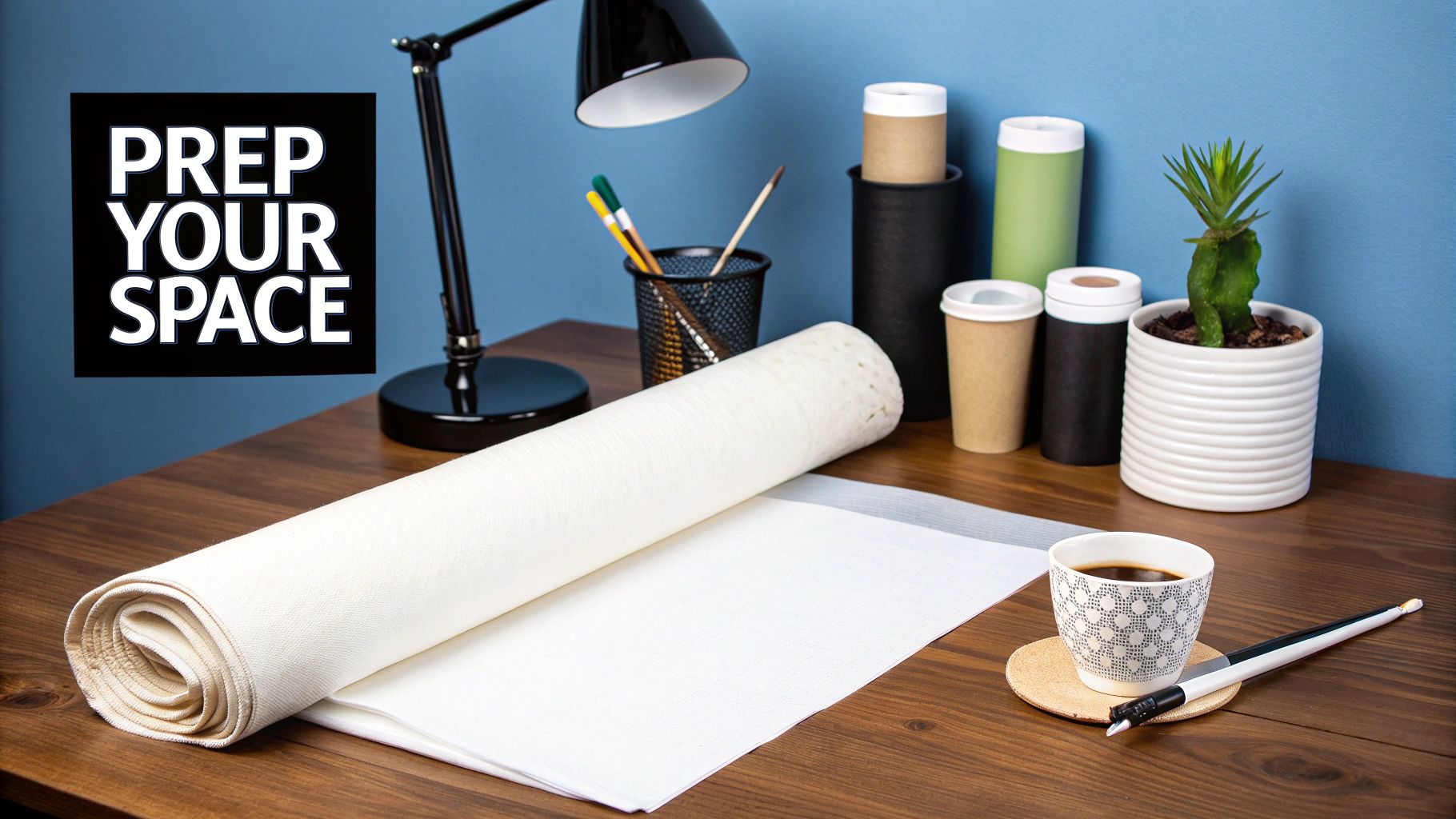
Before you even dip a brush into paint, a little prep work can make all the difference. You don't need a fancy art studio—just a quiet corner of a table. The goal is to create a calm, organized space where you can lose yourself in the process.
Most paint-by-number canvases arrive rolled up, which can be a real pain to work with. There's an easy fix for those frustrating curls. Just lay your canvas face down on an ironing board, cover it with a thin towel, and give it a quick pass with an iron on a low to medium setting. The gentle heat will smooth it out perfectly, giving you a flat, ready-to-paint surface.
Getting Your Gear in Order
With your canvas flat and ready, it's time to lay out your tools. Having everything you need within arm's reach helps you stay in the creative flow.
Your kit provides the basics, but a few simple household items will make your life a lot easier:
- A cup of water: For rinsing brushes. An old, heavy mug or a glass jar is ideal because it won't tip over easily.
- Paper towels: Essential for dabbing excess water off your brush after rinsing and for quickly cleaning up any small smudges.
- Good lighting: This is a big one. The numbers and lines can be tiny, so a bright desk lamp you can angle over your canvas is a lifesaver, especially if you're painting at night.
A good setup isn't just about being tidy. It's about getting rid of anything that might pull you out of the zone. When everything has its place, your focus stays right where it should be: on bringing a Van Gogh to life.
Prepping the Paints
Now for the fun part—the colors. Your kit comes with a set of small, numbered acrylic paint pots. Take a minute to pop them all open and arrange them in numerical order. It sounds simple, but trust me, you'll be glad you did this when you're not frantically searching for color #14.
Sometimes, acrylic paint can get a little thick, especially if it's been sitting for a while. No big deal. Just add one single drop of water to the pot and stir it gently with a toothpick. You’re aiming for a smooth, creamy texture that glides off the brush. This consistency is perfect for covering the numbers and lines completely without being runny.
Mastering Brush Techniques to Paint Like Van Gogh
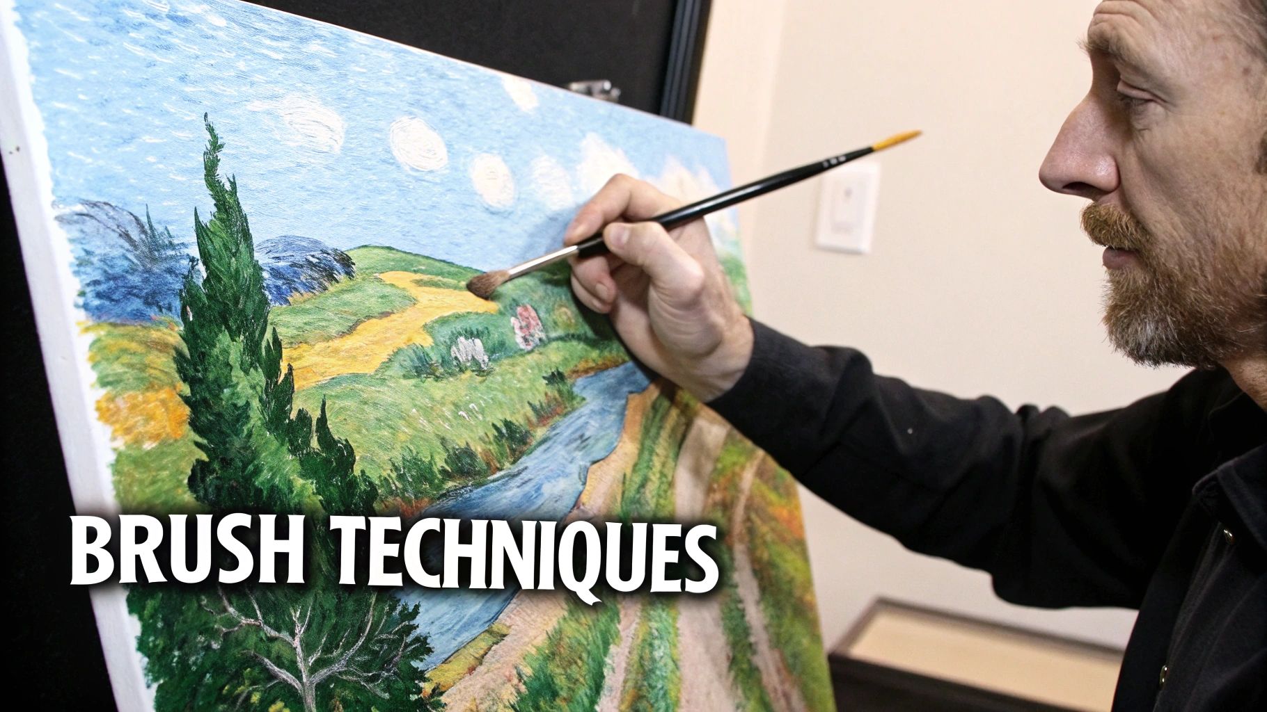
Alright, this is where the real fun begins. A painting by numbers Van Gogh kit gives you the map, but your brushwork is what injects that raw, emotional energy into the canvas. If you want to move beyond simply coloring inside the lines, you can turn a guided project into a piece of art that feels genuinely yours—and authentically Van Gogh.
His most iconic technique is impasto, which is just a fancy word for applying paint so thickly that the brushstrokes stand up from the canvas. You can mimic this easily. Don't be shy with the paint! Load up your brush with a good amount of color and lay it on the canvas with a confident dab or a short, decisive stroke. Then—and this is the important part—leave it alone. Let those little peaks and ridges stay put. They catch the light beautifully and create that dynamic, three-dimensional texture that makes his work so powerful.
Creating Movement With Directional Strokes
Van Gogh was an absolute master at using the direction of his brushstrokes to create a sense of frantic energy and movement. Take a close look at The Starry Night. The sky isn't just a flat blue; it’s a swirling vortex of short, deliberate marks that guide your eye. You can capture this same effect by being intentional with your own strokes.
- Skies and water: Try using curved, flowing strokes that follow the imaginary contours of clouds or waves. Let them overlap a bit to build up that feeling of roiling motion.
- Fields and trees: Switch to short, sharp strokes—either vertical or diagonal. This approach is perfect for capturing the upward reach of a cypress tree or the rustle of wheat in a field.
This simple shift in how you apply the paint can make a huge difference, adding a layer of sophistication to your work. If you feel your kit's brushes aren't quite up to the task, you might want to check out our guide on the best paint by number brushes for more detailed work.
Don't be afraid to paint over the printed lines. Van Gogh’s style was expressive and fluid, never rigid. Letting your textured strokes cross the boundaries just a little will blur that "paint-by-numbers" look and result in a much more organic, painterly finish.
Adding Texture and Blending Colors
A couple of other techniques, stippling and scumbling, are perfect for adding nuance and depth to your painting.
Stippling is just creating an image with tiny dots of paint. It's fantastic for adding a fuzzy texture to the center of a sunflower or creating that shimmering, twinkling effect in a night sky. All you have to do is use the very tip of your brush to apply small, distinct dabs of color.
Scumbling is a wonderful trick for blending and softening colors. You'll want an almost-dry brush with very little paint on it. Lightly drag it over a previously painted (and fully dried) area. This leaves behind a thin, broken layer of color that creates subtle transitions and a hazy, atmospheric vibe—perfect for distant hills or a misty morning.
Getting a feel for color helps a lot here. It's fascinating to see how Vincent van Gogh’s own palette changed over time. Back in 1885, gray was his most-used color. By 1890, his work was exploding with brighter hues, though he still used black for shadows. Kits that reflect this color journey often give a more satisfying result. You can dive deeper into Van Gogh's color evolution on CS Washington.
By playing with these simple but effective methods, you can elevate your artwork and give it the depth and character worthy of the master himself.
Finishing and Framing Your Van Gogh Artwork
https://www.youtube.com/embed/7YefJEGvYtY
You did it. You’ve painted the very last numbered section, and your incredible Van Gogh masterpiece is finally complete. Now comes the fun part: turning your project into a true piece of art that you'll be proud to hang on your wall. This final stage is all about protecting your hard work and giving it the presentation it deserves.
The first, and most crucial, step is to seal the painting.
A lot of beginners skip applying a clear varnish, but trust me, it makes a world of difference. It creates a protective shield against dust, moisture, and fading from UV light, keeping those vibrant colors you worked so hard on looking fresh for years to come. It also evens out the finish of the acrylic paints, giving your artwork a much more consistent and professional look.
Applying the Perfect Varnish Coat
Before you even think about opening a bottle of varnish, make sure your painting is 100% dry. This isn't something to rush. Depending on how thickly you applied the paint, this could take anywhere from 24 to 72 hours. Be patient—varnishing a tacky painting will only lead to smudges and heartbreak.
You’ll want to pick up a clear acrylic varnish, and you'll notice a few different options on the shelf. Each one gives a completely different feel to the finished piece:
- Matte: This gives you a flat, non-reflective finish that’s great for reducing glare.
- Satin: A nice middle-of-the-road option, offering a subtle, low-lustre sheen.
- Gloss: Creates a very shiny, reflective surface that really makes the colors pop.
Grab a wide, soft-bristled brush for the application. Start in one of the top corners and brush the varnish across the canvas in long, even strokes. Once you've covered the whole thing going one way, do a second pass in the opposite direction (top to bottom, then left to right) to get full, streak-free coverage. Then, leave it to dry somewhere it won't attract dust.
A single, thin, even coat is far better than a thick, gloopy one. Laying it on too thick can cause the varnish to look cloudy or even turn yellow over time. Remember, the goal is to protect the art, not bury it.
Choosing the Right Frame
With your painting sealed and ready, it's time for the final touch—the frame. The trick is to find a frame that complements your painting by numbers Van Gogh without competing with it. A common mistake is picking a frame that’s so ornate it completely steals the show.
Think about the vibe of both the painting and the room where it will hang. For something with the wild energy of Starry Night, a simple, modern black or dark wood frame often works beautifully by creating a stark, elegant contrast. On the other hand, for the warm, golden tones of Sunflowers or Café Terrace at Night, a more ornate, gold-leafed frame can feel perfect, giving it that classic museum quality.
Framing can be a really rewarding DIY project in itself. If you're looking for a detailed guide, our article on how to frame canvas paintings walks you through the entire process. This last step is what truly elevates your project from a fun craft into a beautiful, lasting piece of home decor.
Got Questions? We've Got Answers
Even with the numbers to guide you, you're bound to run into a few head-scratchers while recreating a Van Gogh. That's completely normal—it’s just part of the painting process. This section is all about tackling those common issues with practical, no-fuss solutions to keep your brush moving.
Think of this as the friendly advice you wish came tucked inside the box. From a simple slip of the hand to making those iconic colors truly pop, here’s how to navigate the little bumps in the road.
"Oops! How Do I Fix a Mistake?"
It happens to all of us. You're carefully filling in a patch of bright yellow, your hand slips, and suddenly there's a blob of dark blue right in the middle of it. Don't panic. The best thing about the acrylic paint in these kits is that it’s incredibly forgiving.
The trick is to act before the paint has a chance to set.
- If the paint is still wet: Grab a clean, slightly damp cotton swab or the corner of a paper towel. Gently lift the misplaced paint off the canvas. Just be careful not to smear it around.
- If the paint is already dry: This is even easier—just leave it. Once the wrong color is completely dry, you can paint right over it with the correct one. It might take two or even three thin coats to fully hide a dark color with a light one, but you'll get there. Patience is key; let each layer dry before adding the next.
My Go-To Trick: When covering a dark mistake with a very light color, I'll dab a little bit of white paint over the error first. Once that dries, it acts like a primer, making it much easier for the correct light color to cover it up without looking muddy.
"Why Is My Paint So Thick (or Thin)?"
Paint consistency can be a real pain, but it’s almost always a quick fix. If your paint feels goopy or thick, it’s probably just a little dehydrated. Use an eyedropper or a clean brush to add a single drop of water, then stir it well with a toothpick. Only add another drop if you absolutely need it—it’s way easier to thin the paint than to thicken it back up.
What if it's the opposite problem? If your paint is watery and see-through, you likely added a bit too much water. The simple solution is to just leave the paint pot open for 30 minutes or so. This lets some of the extra water evaporate, and the paint will naturally return to a better, more workable consistency.
"Can I Blend the Colors to Hide the Lines?"
Yes, you absolutely should! This is one of the best ways to elevate your painting by numbers Van Gogh from a fun project into something that looks more like a genuine piece of art. Van Gogh was a master of blurring lines and creating energy with his brushstrokes, so you’re really just channeling his technique.
Here are a couple of easy methods to try:
- Wet-on-Wet Blending: While two neighboring colors are still wet on the canvas, use a clean, dry brush to gently feather the edge where they meet. Use light, back-and-forth strokes to blur that hard line into a softer transition.
- Scumbling (or Dry Brushing): Let one color dry completely. Then, get a tiny amount of the neighboring color on a mostly dry brush. Lightly drag the bristles over the edge of the dried paint to create a textured, hazy effect.
This is the perfect approach for the swirling skies in The Starry Night or the delicate petals in Almond Blossom. It helps break up that classic "paint-by-numbers" look and gives the final piece a much more fluid, professional feel.
"How Do I Make My Colors More Vibrant?"
Feeling like your finished painting is a bit dull compared to the original? There are a couple of things you can do to get that signature Van Gogh intensity. First, don't hesitate to add a second coat of paint, especially for lighter colors like yellows, oranges, and whites. This ensures you get a solid, opaque finish that completely covers the printed numbers and lines.
But the real game-changer is varnish. Once your painting is bone-dry (give it at least 24 hours), apply a thin coat of gloss or satin varnish. This not only protects your hard work from dust and fading but also deepens the colors, making them look richer and far more saturated. It's the final touch that gives your art a polished, gallery-ready look.
Ready to create your own masterpiece? At Custom Paint By Numbers, we offer high-quality kits that can turn your favorite photos or iconic artworks into an unforgettable painting experience. Explore our full collection and find the perfect project to get you started.


