

Think of a focal point as the star of your painting. It's the single most important element designed to grab the viewer's eye the second they look at your work. It’s the main character in your visual story, the place where the eye lands first and keeps coming back to.
What Is a Focal Point and Why It Matters
Imagine walking into a crowded party. Amid all the chatter, one person's laugh cuts through the noise and makes you turn your head. That’s exactly what a focal point does in a painting. It gives the viewer a place to start, a clear entry point into the world you've created on the canvas.
Without that anchor, a piece can feel confusing or scattered. The eye just wanders around aimlessly, unsure of where to settle. A strong focal point turns a collection of shapes and colors into a deliberate, engaging story.
This "center of interest" isn't always literally in the center. In fact, some of the most powerful compositions place it off-center to create a more dynamic, interesting feel. The real power of a focal point lies in how it creates a visual hierarchy—telling the viewer what’s most important and guiding their journey through the rest of the artwork.
The Purpose of a Focal Point
So, what's the big deal? Why is this one spot so crucial? A well-planned focal point does a few key jobs that take an artwork from "nice" to "wow."
To put it simply, a focal point gives your artwork a purpose and a voice. It organizes the visual information for the viewer, making the experience more enjoyable and impactful.
Let's break down its main roles in a simple table.
Key Functions of a Focal Point in Your Art
| Function | What It Does for Your Artwork |
|---|---|
| Creates Emphasis | It shines a spotlight on the most critical part of your piece, like the intense gaze in a portrait or the single sun-drenched peak in a mountain range. |
| Tells a Story | The focal point is your protagonist. Everything else—the background, the shadows, the colors—acts as the supporting cast. |
| Provides Balance | By giving the eye a specific spot to land, it anchors the entire scene, preventing it from feeling visually cluttered or unstable. |
Ultimately, a focal point directs the entire viewing experience, giving your artwork a clear purpose and ensuring its story is told.
A focal point is more than just the center of attention; it’s the starting line for visual exploration. It gives your artwork a clear voice and ensures its message is heard.
Mastering the focal point is really about learning to guide the viewer's gaze with confidence. It’s a core skill that works hand-in-hand with other design principles. To see how it connects with another key element, check out our guide on how color and composition work together to create truly stunning art. By understanding this concept, you can make every piece you create more powerful.
Six Essential Techniques to Create a Focal Point
Knowing what a focal point is is one thing, but actually creating one is where the real fun begins. Artists have a whole bag of tricks for guiding the viewer’s eye, turning a blank canvas into a compelling visual story. Think of these techniques less as rigid rules and more as powerful ingredients you can mix and match to direct attention right where you want it.
Once you get a feel for these six core principles, you can tell a story, create a mood, and build a composition that feels truly intentional. Let’s break them down one by one.
1. Use Contrast to Your Advantage
Contrast is probably the most powerful tool an artist has for creating emphasis. When we hear "contrast," we usually think of light against dark (value contrast), but it's so much more than that. A single, brightly lit object in a dark, moody scene will obviously grab your attention, but so will other kinds of opposition.
Think about these types of contrast:
- Color Contrast: A pop of warm red or orange against a backdrop of cool blues and greens? Instant magnet for the eyes. The eye is naturally drawn to that jolt of chromatic energy.
- Textural Contrast: Imagine a small, rough, highly detailed patch in an otherwise smooth and simple painting. It just begs to be looked at. You can learn more about how to create texture in paintings to really make your focal point stand out.
- Edge Contrast: A razor-sharp, clearly defined edge next to soft, blurry ones will pull the gaze in. That clarity signals to the viewer that this part is important.
2. Strategic Placement and Composition
Where you put something is just as important as what it is. Sticking your main subject smack-dab in the center can feel a bit static and, frankly, a little boring. A much more dynamic approach is to use the Rule of Thirds.
The Rule of Thirds is a classic compositional guideline. Imagine your canvas is split into nine equal squares by two horizontal and two vertical lines. Placing your key element on one of the four spots where those lines intersect creates a far more balanced and engaging image.
This simple off-center placement feels more natural and gets the viewer's eye moving around the canvas, making the entire piece more interesting. It’s a tiny shift that can make a huge difference in the flow of your artwork.
The diagram below shows how a focal point is the anchor for balance, storytelling, and guiding the viewer's eye.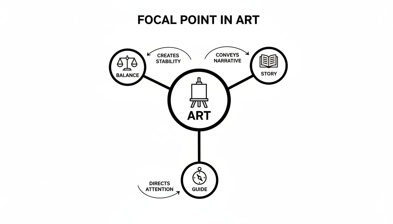
As you can see, the focal point isn't just an isolated gimmick; it's a core piece of the puzzle that stabilizes the composition and gives it a clear narrative direction.
3. Isolate with Color and Saturation
Color is pure emotion, and you can use it to create a powerful focal point. Try using a single, vibrant color in a scene that's otherwise muted or even monochromatic. The classic example is a bright red umbrella in a black-and-white photograph—your eye goes right to it, no questions asked.
This works because that isolated splash of color breaks the established visual pattern, telling your brain, "Hey, look here! This part is special." You can do this by making your focal point highly saturated (intense) while dialing down the saturation of the colors in the background.
4. Implement Leading Lines
Leading lines are like visual highways that guide the viewer’s eye right through your composition, leading them directly to the focal point. These lines can be obvious things, like a road, a fence, or a river.
But they can also be subtle—the line of a person's gaze, the arrangement of furniture, or the direction of tree branches. By arranging these lines strategically, you're essentially drawing a map for the viewer. Their eyes will naturally follow the path you’ve created, arriving exactly where you want them: at the heart of your artwork.
5. Vary the Scale and Size
Another really effective method is to make your focal point dramatically larger or smaller than everything else in the piece. An object that is huge compared to its surroundings will naturally command attention simply because it dominates the space.
On the flip side, a tiny, isolated element in a vast, empty area can be just as powerful. It creates a feeling of importance or loneliness, drawing the viewer in closer to inspect that one small detail.
6. Focus with Detail and Sharpness
Our eyes are naturally drawn to what's sharp and detailed. You can take advantage of this by rendering one part of your painting with crisp, intricate detail while leaving the rest of the canvas softer, blurrier, or more loosely painted. This mimics how our eyes actually see the world—we focus on one thing, and our periphery is less clear.
This technique is a go-to for portraits. Artists will often paint the eyes with incredible sharpness while the rest of the face and the background are subtly softened. If you're looking for inspiration, checking out some amazing things to draw can give you great ideas for practicing these techniques.
Focal Points in Action Across Different Art Styles
It’s one thing to know the theory behind creating a focal point, but seeing those techniques in the hands of a master is where the lightbulb really goes on. These principles of emphasis aren't locked into one specific genre; they're universal tools that artists use to bring their vision to life. From classical portraits to wild, chaotic abstract pieces, a clear center of interest is what elevates a simple picture into a powerful story.
So, let's put on our art detective hats and see how these ideas play out in the real world. This quick tour will train your eye to spot the clever choices artists make to direct your gaze.
Portraits: The Art of the Gaze
In portraiture, the focal point is almost always the eyes. Just think of Leonardo da Vinci's Mona Lisa. Her whole face is rendered with a soft, gentle touch, but the sharpest details and strongest contrast are saved for her eyes and the corners of that famous smile. It’s a trick that pulls you right into her mysterious expression, creating an immediate, personal connection.
This isn't just about making things look real; it's about telling a story. By putting the most detail and sharpness right on the eyes, the artist is telling us that the subject's inner world—their thoughts, their feelings—is the whole point.
"A focal point really just boils down to a collection of shapes and colors that the eye will tend to go to first."
Portrait artists become masters of subtle focus. They know that by slightly softening the details of the hair or clothing, they guarantee nothing will compete with the power of their subject’s gaze. These same principles are just as vital in other visual storytelling mediums, like in the compelling compositions of graphic novels, which skillfully guide the reader’s eye across the page.
Landscapes: Finding a Hero in Nature
A massive, sweeping landscape can feel a bit chaotic without something to anchor your attention. Landscape painters use focal points to give the scene a sense of scale, depth, and a place for your eye to land and rest for a moment. This "hero" of the scene is usually created with a clever mix of techniques.
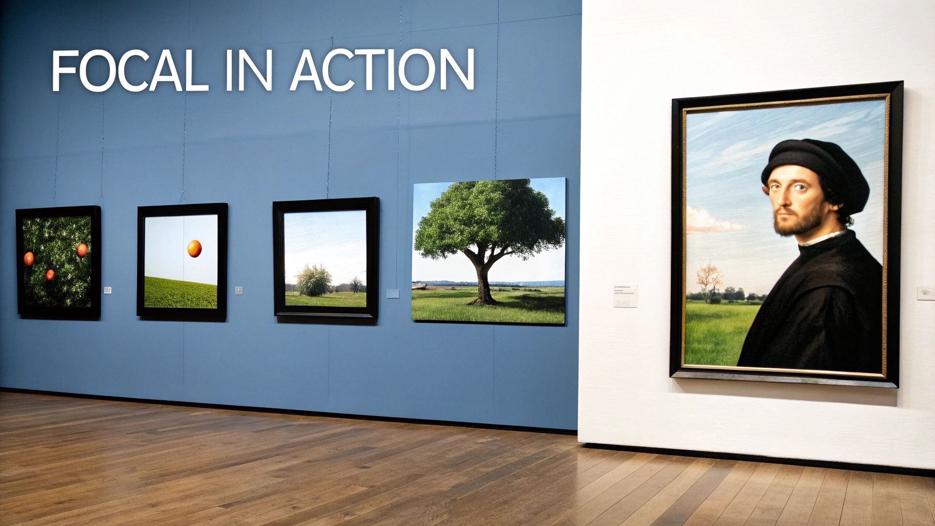
Imagine a painting of a wide-open field. If the artist places a single, gnarled tree just off-center, it instantly grabs your attention and becomes the focal point. That one tree gives the whole scene a story and a sense of scale.
Artists also use what’s called atmospheric perspective. They’ll paint distant mountains with soft edges and cool, hazy colors, while a closer element—like a sun-drenched cottage—is painted with warm, bright colors and crisp details. The strong contrast in both color and detail pulls your eye forward, making that cottage the star of the show.
Still Life and Abstract Art
When it comes to still life, the artist has total control over the scene. They might arrange a bowl of fruit so that one bright yellow lemon is nestled among darker plums and grapes. That pop of intense color contrast makes the lemon the undeniable focal point, injecting energy into an otherwise quiet arrangement.
Even abstract art, which seems to throw all the rules out the window, still relies on a center of interest. An artist might fill a canvas with soft, blended colors but then add a single, sharp geometric shape. Because it’s so different from everything else, that shape becomes the focal point, creating a sense of order and giving you a starting point to explore the piece. It's a technique that's incredibly useful when painting abstract portraits, where a single focal point can set the entire emotional tone.
Bringing Your Own Masterpiece to Life
Alright, let's take all this theory and put it to work on your own canvas. Knowing what a focal point is in art is one thing, but using that knowledge to turn your favorite photo into a stunning custom paint-by-numbers kit? That’s where the real fun begins. Think of yourself as the director of your painting, making a few key decisions upfront to guarantee a powerful result.
It all starts with picking the right photo. Sure, any picture can become a painting, but some images just have better bones. Look through your camera roll for photos with an obvious subject and interesting light. A picture where your main subject is bathed in light and clearly separate from the background is a fantastic starting point.
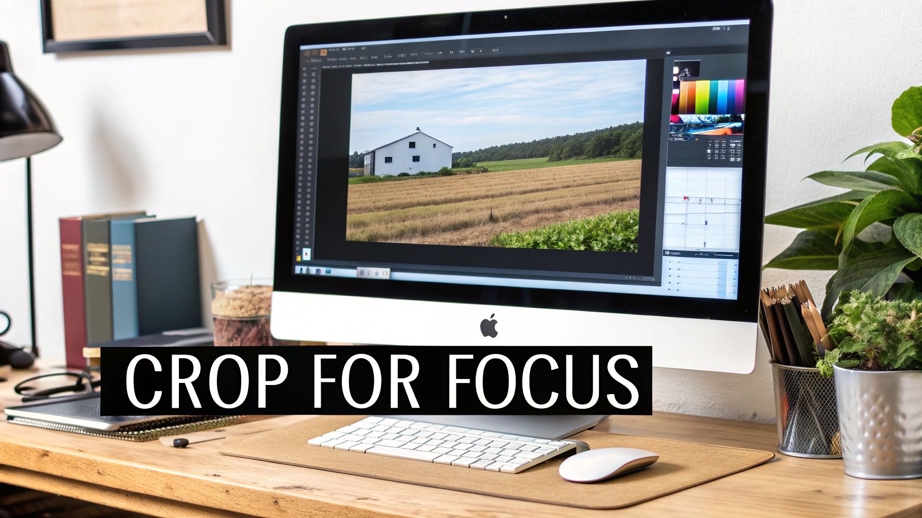
A Quick Crop Can Make a Huge Difference
One of the easiest and most powerful tools you have is cropping. Before you even think about uploading your photo, a thoughtful crop can completely rebalance the composition and lock in your focal point. This is the perfect time to bring back the Rule of Thirds.
Don't just stick your subject smack-dab in the middle. Try cropping the image so they fall on one of the intersecting lines of that invisible tic-tac-toe grid. It’s a simple shift, but it creates a much more dynamic and pleasing composition that pulls the viewer's eye right where you want it.
- For Portraits: Try to position the person’s dominant eye on or very close to an intersection point.
- For Landscapes: Place the horizon on the top or bottom third-line, not cutting the image in half.
- For Group Shots: Arrange the crop so the most important person lands on one of these "power points."
This little edit is a game-changer and literally takes seconds.
Choosing Your Paint Count Wisely
When you order a custom kit, you'll need to select a paint count—usually somewhere between 24 and 48 colors. This isn't just a random choice; it has a direct effect on the detail and contrast in your finished piece, especially around your focal point. There’s no right or wrong answer, just different artistic effects.
A higher paint count creates subtle, realistic detail that makes a focal point feel sharp and lifelike. A lower paint count creates bold, graphic shapes and high contrast that can make a focal point jump off the canvas.
So, what’s your goal?
- High Paint Count (like 48 colors): This is your best bet when the focal point is all about the little things—the fine details in a person's face, the texture of a flower petal, or the intricate patterns on a building. More colors mean you can capture those tiny shifts in light and shadow for a stunning, realistic effect.
- Low Paint Count (like 24 colors): Go this route if you want a punchier, more stylized result. The limited palette simplifies the image into stronger color blocks, which amps up the contrast and makes your focal point pop. It’s perfect for creating a bold pet portrait or a vibrant, graphic travel scene.
By being intentional—choosing the right photo, cropping it with purpose, and picking a paint count that aligns with your vision—you’re doing more than just painting by numbers. You’re actively designing a composition with a powerful focal point, telling a story, and making a piece of art that’s truly your own.
Common Focal Point Mistakes and How to Fix Them
Ever have that feeling where a painting is almost there, but something just feels off? You can’t quite put your finger on it, but it’s not grabbing you. A lot of the time, the problem is a weak or confusing focal point.
Don't worry, even seasoned artists stumble into these traps. The good news is they’re all easy to spot and fix. Once you know what to look for, you can start making small tweaks that make a huge difference in how people see your work. Let's break down the most common missteps and how to get them right.
Mistake 1: The Bullseye Effect
It’s a natural instinct to stick your main subject right in the dead center of the canvas. It seems like the most obvious place, right? But this "bullseye" approach can make a composition feel really static and, frankly, a little boring. The viewer’s eye just lands there and stops, never exploring the rest of the scene.
- The Fix: Try the Rule of Thirds. Imagine a tic-tac-toe grid over your canvas. Now, just nudge your subject so it lands on or near one of those four intersecting points. It's a simple shift, but it immediately creates a more dynamic path for the eye to follow, making the whole piece feel more balanced and interesting.
Mistake 2: Too Many Stars in the Show
This is another classic. You have so many cool things you want to show off that everything ends up screaming for attention at once—bright colors here, sharp details there, high contrast everywhere! When you have too many competing elements, the viewer gets overwhelmed and doesn't know where to look first. The result is visual chaos.
A focal point works best when it has a strong supporting cast, not a stage full of rivals. Decide what your main story is and let everything else play a secondary role.
- The Fix: Pick one hero for your painting. Seriously, just one. Once you’ve decided on your star, your job is to intentionally tone down everything else. You can do this by muting the colors of the background elements, softening their edges, or just painting them with less detail. This creates a clear visual hierarchy and lets your main subject truly shine.
Mistake 3: The Hidden Focal Point
On the flip side, sometimes the focal point is just too shy. It blends into the background so well that it never gets a chance to grab the viewer's attention. This usually happens when there isn't enough contrast—in color, value, or sharpness—between your subject and its surroundings.
Your main point of interest needs to stand out with confidence.
- The Fix: You need to amplify the contrast. It’s all about making that one spot pop. If your focal point is light, surround it with darker values. If it’s a burst of color, set it against a more neutral, muted background. Another great trick is to pack all your sharpest details into that one area while letting the rest of the painting be just a little softer. That magnetic pull is exactly what you're after.
Your Questions About Focal Points, Answered
As you start to really get a handle on composition, a few common questions always seem to pop up. Let's tackle some of those finer points so you can move forward and create with confidence.
Can a Painting Have More Than One Focal Point?
Absolutely, but you have to handle it carefully. The key to making multiple points of interest work is creating a clear visual hierarchy. You need one star of the show—a primary focal point that's the most dominant.
Think of it like a lead actor with a great supporting cast. Any other points of interest should be more subtle, giving the viewer’s eye interesting places to visit as it explores the canvas, but never competing for the main spotlight. You don't want a stage full of actors all shouting their lines at once.
Does Every Single Artwork Need a Focal Point?
Not necessarily. While a strong focal point is a huge asset in most traditional and representational art, it isn't a non-negotiable rule for every style. In fact, some artists deliberately leave one out to create a specific feeling.
Take pattern-based art, for example, like you might see in textiles or certain abstract pieces. The goal there is often an "all-over" composition, where your eye is encouraged to wander continuously without settling in one spot. In that case, the entire surface becomes the point of interest.
Here's a classic artist's trick called the "squint test." Take a few steps back from your artwork and squint your eyes until everything gets blurry. The part of the image that still stands out—the area with the strongest contrast or clearest shape—is your real focal point. It’s a wonderfully simple way to see if your composition is truly working.
Ready to transform a favorite photo into a masterpiece with its own perfectly placed focal point? At Custom Paint By Numbers, we help you create a personalized kit that brings your vision to life. Upload your image and start designing your unique artwork today!


