

Have you ever stood in front of a breathtaking sunset or a quiet mountain range and wished you could capture that feeling on canvas? It's a common dream, and getting started with landscape painting for beginners is much easier than you might imagine. This guide is your roadmap, cutting through the confusing jargon to give you the core skills needed to turn a blank canvas into a scene you'll be proud to hang on your wall.
Let's Start Your Landscape Painting Journey
So many people think you need some kind of innate, magical talent to be a painter. That’s a myth, and it stops countless would-be artists from ever picking up a brush. The truth is, making beautiful art is a skill. It’s built on a foundation of solid techniques and a bit of practice—not something you're just born with.
This guide is here to tear down that wall of intimidation. We'll walk you through everything, from picking the right paints to making simple but effective brushstrokes. My goal is to make art feel like something you can do, not something you have to be a genius to attempt. You'll be surprised at how quickly a few key principles can lead to amazing results.
What We'll Cover
As we go, you'll build both confidence and real-world skills. Think of this as your personal workshop, focused on the essentials every beginner landscape painter needs.
- Your Starter Kit: We'll pinpoint exactly what you need to begin, so you won't feel lost wandering the aisles of the art supply store.
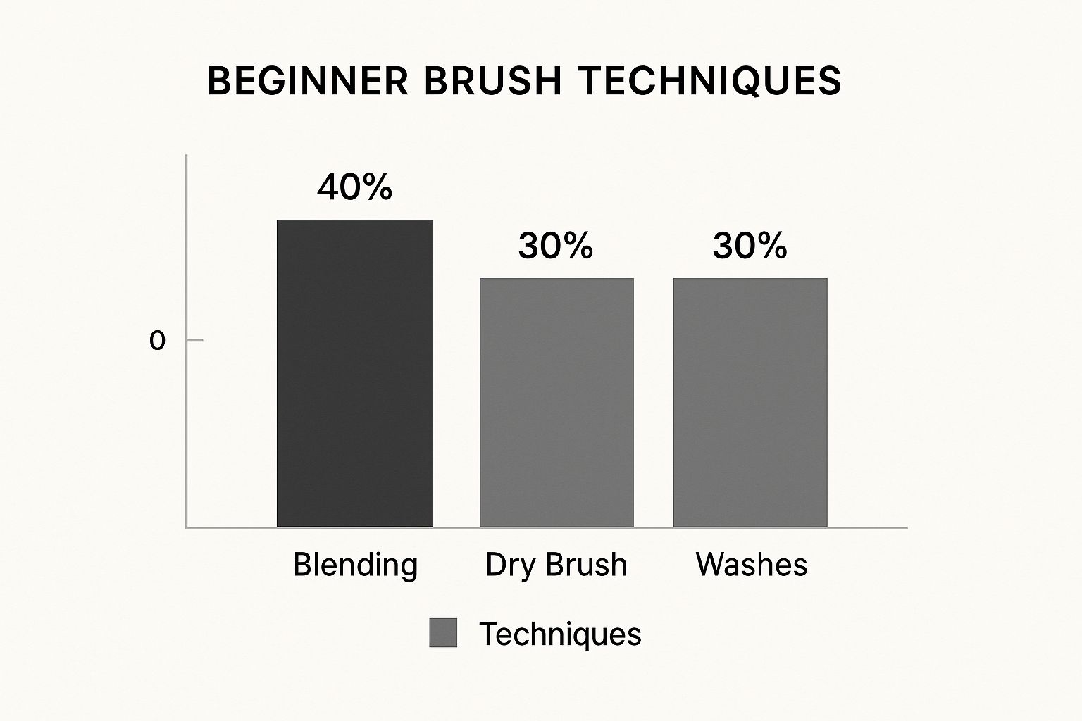
- Essential Brush Skills: You'll learn how to blend colors to get a soft, realistic sky, layer your paints to create a sense of depth, and use different brushstrokes to suggest the texture of grass, leaves, and trees.
- Composition & Color: We’ll break down simple guidelines like the "Rule of Thirds" to help you create balanced, eye-catching scenes. Plus, you'll learn how to mix natural-looking colors from just a few basic tubes of paint.
You're joining a long line of artists who have been drawn to the beauty of the natural world. Landscape painting has a fascinating history, starting as mere backdrops in the 15th century and exploding into a celebrated art form during the 17th-century Dutch Golden Age. It's as popular as ever today; in fact, surveys show that over 40% of new painters choose landscapes as their first subject. It’s the perfect playground for mastering your brushwork and learning composition. You can find more details on the lasting appeal of wall art at fortunebusinessinsights.com.
The biggest hurdle for beginners isn't a lack of talent—it's the fear that talent is a prerequisite. The reality is that landscape painting is about learning to see the world in shapes, colors, and light, then using simple, repeatable techniques to translate that vision to your canvas.
By the time you finish this guide, you won't just know the theory behind a good painting; you'll have the practical skills to actually create one. The whole point is to give you the confidence, tools, and techniques to finally bring your favorite landscapes to life.
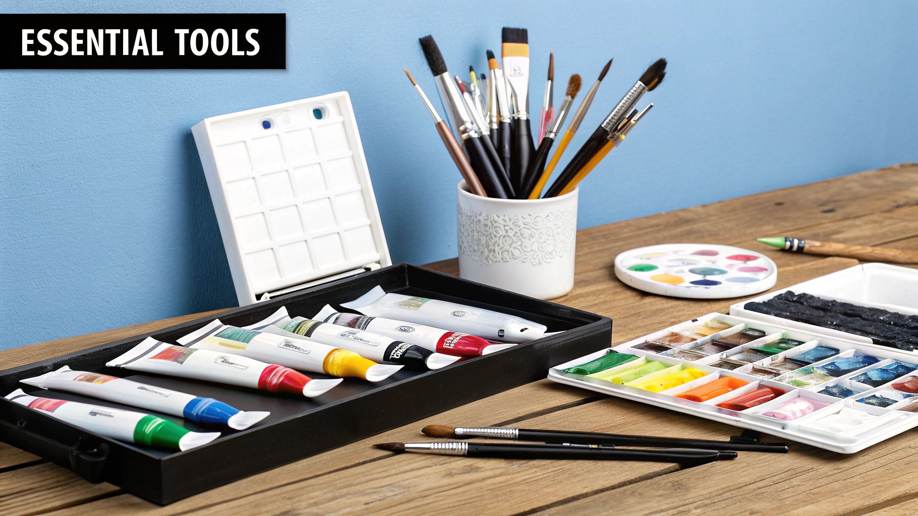
Choosing Your First Painting Toolkit
Walking into an art supply store for the first time can be completely overwhelming. Walls of paints, dozens of brushes, and surfaces you've never heard of—it's easy to see why so many people get stuck before they even start.
Let's cut through that noise. The goal here is to get you painting, not just collecting supplies. You really don't need a mountain of gear. In fact, starting with a handful of high-quality basics will help you learn much faster and save a bit of money, too.
Selecting the Right Paint
The biggest choice you'll make right out of the gate is your paint. The three main options are acrylics, oils, and watercolors, and each behaves in its own unique way. For landscapes, the decision often boils down to how you want to handle drying time and blending.
- Acrylics: These are a beginner's best friend. They dry fast, clean up with soap and water, and are incredibly forgiving. That quick drying time is a huge plus when you want to layer colors for a sky or distant mountains without waiting for days.
- Oils: Famous for their rich, buttery feel and slow drying time. That extra time lets you create beautifully soft blends, which is perfect for misty horizons or fluffy clouds. The cleanup is a bit more involved since it requires solvents, but many artists feel the stunning results are worth the effort.
- Watercolors: Transparent, luminous, and a bit of a wild card. Watercolors are less forgiving than the others because mistakes are tough to cover up. But for creating light, airy, and atmospheric scenes, they are second to none.
My advice for your very first landscape? Start with acrylics. They give you the freedom to experiment and layer without the long waits or chemical cleanup of oils.
Traditional mediums are more popular than ever. The oil painting market was valued at USD 2.8 billion globally in 2023 and is expected to grow to USD 4.9 billion by 2032. With an estimated 12.4 million amateur painters in the United States alone, it's clear that classic landscape painting isn't going anywhere.
To make things even clearer, let's break down how these paints stack up for a beginner focused on landscapes.
Beginner Paint Comparison for Landscapes
| Feature | Acrylic Paint | Oil Paint | Watercolor |
|---|---|---|---|
| Drying Time | Fast (minutes to an hour) | Slow (days to weeks) | Fast (minutes) |
| Ease of Use | Very beginner-friendly | Moderate learning curve | Difficult to control at first |
| Cleanup | Simple; soap and water | Requires solvents | Simple; just water |
| Cost | Most affordable option | More expensive initially | Mid-range; good paper is key |
| Flexibility | Highly versatile; can be thinned or used thickly | Excellent for blending and texture | Best for transparent, luminous effects |
Ultimately, the "best" paint is the one that gets you excited to start. But for ease and getting quick results, acrylics are tough to beat.
Must-Have Brushes and Surfaces
Don't fall for those giant 20-piece brush sets. You only need a few solid workhorses to get started. A small, curated selection will teach you more about brush control than a dozen specialty brushes you'll never touch.
Your Essential Brush Trio
- A 1-inch Flat Brush: This is your go-to for big areas. Think skies, fields, and water. It's perfect for laying down smooth washes of color and blocking in your main shapes quickly.
- A #6 Round Brush: A true multi-tasker. This mid-sized brush is great for painting tree trunks, rocks, and adding definition to clouds or hills. The pointed tip gives you a surprising amount of control for details.
- A #1 Rigger or Liner Brush: This is your secret weapon for all the fine details. The long, thin bristles are designed for painting distant tree branches, individual blades of grass, or even signing your finished piece.
When it comes to what you'll paint on, keep it simple. Stretched canvas or canvas panels are your best bet. They come pre-primed and ready for action with either acrylics or oils. I'd suggest starting with smaller sizes, like an 8x10 or 9x12 inch canvas. They're far less intimidating and make it easier to finish a painting in one sitting.
Other Essential Gear
Beyond paint and brushes, a few other items will make your life a whole lot easier. You don't need to break the bank here; functional is the name of the game.
- Palette: You can buy a fancy wooden palette, but honestly, a simple ceramic plate from your kitchen or a pad of disposable paper palettes works perfectly.
- Easel: You don't need one right away—a tabletop is fine. But even a small tabletop easel can do wonders for your posture and give you a better angle on your work.
- Palette Knife: A small metal palette knife is great for mixing colors without getting your brushes muddy. You can even use it to apply thick, textural paint for things like rocks or tree bark.
Building your first art kit should be fun, not stressful. By focusing on these core essentials, you'll have everything you need to start bringing beautiful landscapes to life. For a deeper dive into supplies, check out our guide on essential art supplies for beginners.
Learning Foundational Painting Techniques
Alright, this is where the real fun begins—where your vision starts to come alive on the canvas. The core techniques that professional artists rely on aren't complicated secrets. They're actually simple, repeatable actions that you can get the hang of with just a bit of practice.
Think of these skills as your essential building blocks for creating depth, texture, and atmosphere in your work. We're moving beyond just smearing paint around and learning how to control it to get the effects you want. It’s a lot like learning chords on a guitar; once you know a few, you can start to play actual songs. These techniques are the fundamental chords of landscape painting.
Creating Soft Skies with Blending
One of the first hurdles for anyone new to landscape painting is getting the sky to look right. A flat, single-color blue just doesn't feel natural. The key is blending, a technique that creates a soft, gradual shift between colors.
For a classic sunny day, you might start with a light blue at the top of your canvas and a much paler, almost white-blue near the horizon. While the paint is still wet, take a clean, dry, flat brush and gently sweep it back and forth where the two colors meet. This softens the hard edge and creates a much more realistic gradient.
Pro Tip: When you're blending, use a super light touch. You’re just trying to coax the colors together, not scrub them into a brand new shade. Less pressure almost always works better.
Building Depth with Layering and Washes
Landscapes are all about creating a sense of space and distance. A fantastic way to do this is with layering, which just means applying thin layers of paint, called washes, on top of each other. This works especially well with acrylics because they dry so fast.
Imagine you're painting a mountain range. The mountains way off in the distance will look lighter and hazier because of atmospheric perspective. You can nail this effect by mixing a tiny bit of your mountain color with a lot of water (for watercolors) or a glazing medium (for acrylics) to make a transparent wash.
Paint that light, thin layer first. For the mountain that's a bit closer to the viewer, use a slightly darker and less transparent mix. By building up these layers from the background to the foreground, you create a totally convincing illusion of deep space.
Adding Texture for Realism
Texture is what makes a painting feel like you can almost touch it. It’s what turns a green blob into a grassy field or a gray mass into a craggy cliff. A few simple tricks can add a ton of textural detail to your work.
- Dry Brushing: This technique is perfect for creating the look of rough grass, tree bark, or the sparkle on choppy water. Just dip your brush in a little paint, then wipe most of it off on a paper towel. When you lightly skim the almost-dry brush over your canvas, it leaves behind scratchy, broken lines of color.
- Palette Knife Painting (Impasto): For really bold, thick texture, nothing beats a palette knife. Use it to scoop up thick paint and apply it directly to the canvas, almost like spreading butter on toast. This is amazing for building up the rugged face of a sunlit rock.
- Scumbling: This is a bit like dry brushing. You use a stiff brush and a circular motion to scrub a thin, broken layer of opaque paint over another dried layer. It creates a soft, mottled effect that's ideal for foliage or moody clouds.
These methods are foundational skills for any new artist. If you're curious and want to broaden your toolkit, you can explore a whole range of other canvas painting techniques that you can adapt for your landscapes.
Putting It All Together in Practice
The best way to get comfortable with these techniques is to use them with a goal in mind. Don’t just practice blending for the sake of it; try to create an actual sunset. Don't just dab with a dry brush; try to render a field of tall, sun-bleached grass in your foreground.
Here’s a quick look at how you might combine these techniques in a simple scene:
- Start with the sky. Blend your blues from dark to light to set the mood.
- Add distant elements. Use thin washes to paint far-off hills or mountains. Let them dry between layers to build up that sense of depth.
- Block in the mid-ground. Use more solid colors for closer objects like trees and fields.
- Introduce some texture. Use a palette knife for any rocky areas and try some dry brushing to add grassy details up front.
By mixing blending, layering, and texture work, you’ll move beyond just coloring in shapes. You’ll be truly painting a scene with dimension and life. Each technique has a purpose, helping you translate the beautiful world around you onto your canvas.
Composing Your Scene and Mixing Colors
https://www.youtube.com/embed/vaP2tistbgY
A powerful painting isn't just about copying what you see. It’s about making smart choices with your design and colors to turn a simple view into something that really grabs a person's attention. This is where the magic happens.
We're going to dig into two of the most important skills you can develop: composition and color mixing. Honestly, getting a handle on these will do more for your art than any fancy brush ever will. Think of composition as the skeleton holding your painting together and color as its soul.
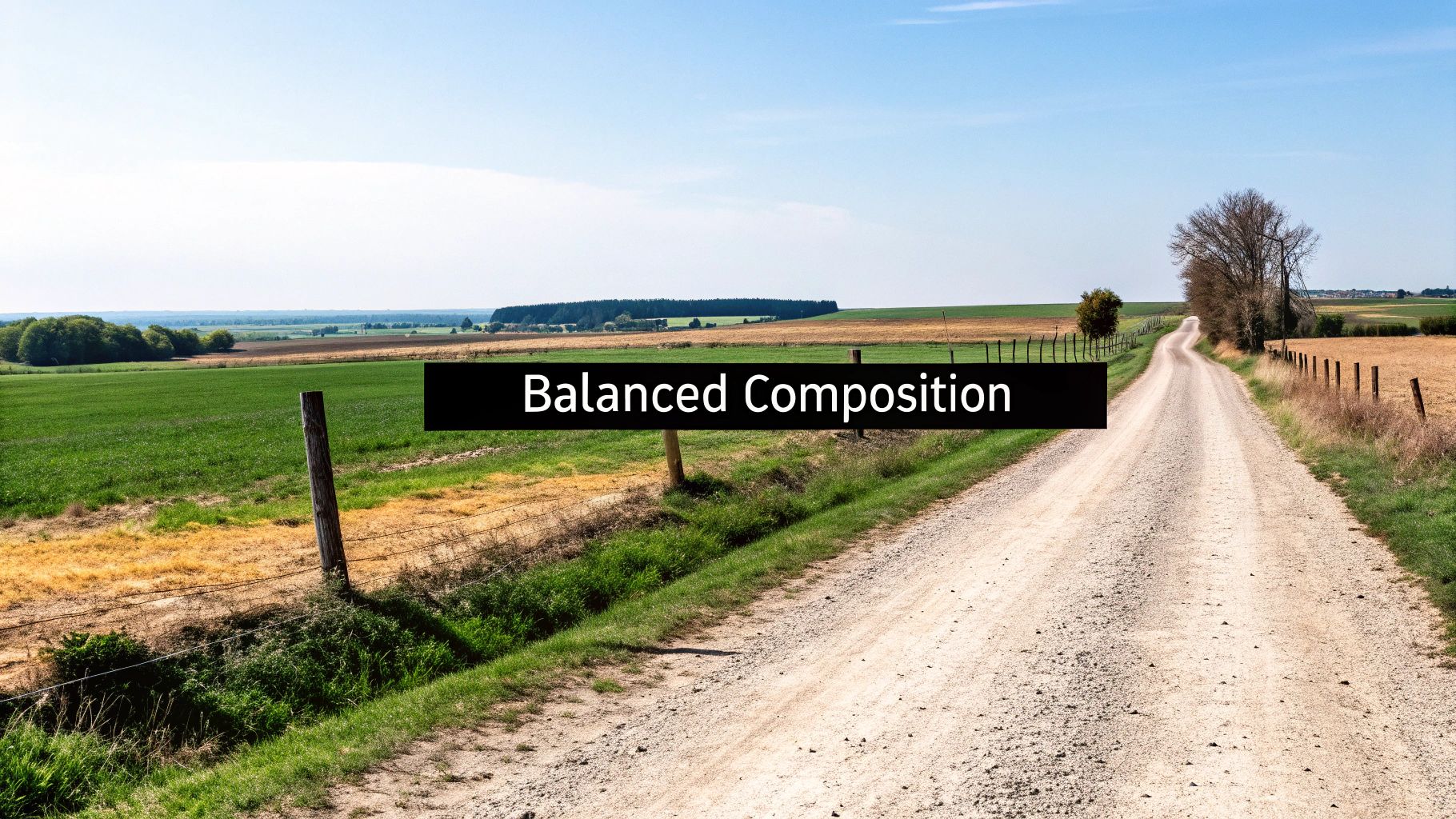
Creating a Balanced and Dynamic Composition
So, what is composition? It’s simply how you arrange everything in your painting. A strong composition leads the viewer's eye on a journey through the scene and just feels right. The easiest way to get started with this is the Rule of Thirds.
It's a classic for a reason. Imagine a tic-tac-toe grid over your canvas. Instead of sticking your main subject—that big, dramatic tree or a mountain peak—right in the dead center, try placing it along one of the lines or where the lines cross.
This one little trick instantly makes your painting feel more alive and interesting. A horizon line plopped right in the middle can feel static, literally cutting your painting in half. But if you move it up to the top third or down to the bottom third, you're making a choice to emphasize either the sky or the land. That's how you start creating a more engaging story.
Using Atmospheric Perspective to Create Depth
Here’s another tool that every landscape painter needs: atmospheric perspective. It's the natural effect where things far away look lighter, less detailed, and bluer. You see it every time you look at a distant mountain range. It’s an optical illusion, and you can use it to create a real sense of deep space in your work.
Here’s a simple way to think about it as you paint:
- Foreground: This is where you put your darkest darks, brightest lights, warmest colors, and sharpest details. Think of the crisp leaves on a tree right in front of you.
- Mid-ground: Things start to soften up. The colors get a bit more muted, and the details aren't as sharp.
- Background: Colors are at their lightest and coolest. You'll see almost no detail back here.
For example, a distant mountain range is never a solid, dark gray. You’ll want to mix a light, soft blue-gray instead. The trees closest to you might be a rich, warm green, while those on a hill further back would be a duller, cooler version. This subtle shift is what makes a landscape feel vast instead of flat.
It's skills like these that are driving demand. The global wall art market, where landscapes are a huge deal, was valued at USD 63.61 billion in 2024 and is projected to hit USD 118.79 billion by 2032. A big part of that growth comes from new artists—people just like you—exploring landscape painting, which has a massive appeal. You can get more insights on the leading art markets at stronddo.art.
Mixing Natural Colors from a Limited Palette
Okay, let's talk about mixing color. This is often what trips up beginners the most. The secret to realistic, harmonious landscapes isn't buying 50 different tubes of paint. It's about learning to mix your own colors from a very small handful of primaries. This approach not only saves you a ton of money but also guarantees your colors will naturally look good together.
The biggest mistake I see beginners make is squeezing out a bright green right from the tube. Nature's greens are way more complex—they're full of yellows, blues, browns, and even reds. Mixing your own is the only way to get it right.
Start with a simple palette: Ultramarine Blue, Cadmium Yellow, Cadmium Red, Burnt Sienna, and Titanium White. With just these five tubes, you can mix almost any color you'll ever need for a landscape.
Essential Landscape Color Mixing Recipes
This little chart is your cheat sheet for mixing believable colors. Remember the golden rule: always start with your lighter color and slowly mix in the darker one. It’s much easier to darken a light color than it is to lighten a dark one.
| Target Color | Primary Colors to Mix | Mixing Tip |
|---|---|---|
| Summer Grass | Cadmium Yellow + a tiny touch of Ultramarine Blue + a speck of Burnt Sienna | The Burnt Sienna "knocks back" the bright green, making it look much more natural and less like something from a cartoon. |
| Distant Mountains | Ultramarine Blue + Titanium White + a very small touch of Cadmium Red | Adding that hint of red (the complement of blue/green) creates a subtle gray-violet that perfectly mimics atmospheric haze. |
| Clear Sky Blue | Titanium White + a small amount of Ultramarine Blue | For the lighter blue near the horizon, just add more white. You can create a beautiful, smooth gradient on your canvas this way. |
| Earthy Brown | Burnt Sienna + a touch of Ultramarine Blue | This mix creates a rich, dark neutral. Add more blue for a cooler tone or more sienna for a warmer, reddish-brown. |
By learning to arrange your scene with intention and mix your own vibrant, natural colors, you're taking true control of your art. You’re moving beyond just copying a photograph and starting to interpret the world around you. This is where the real fun in landscape painting for beginners begins.
A Guided Walkthrough of Your First Painting
Alright, this is where the rubber meets the road. We've covered the tools, the techniques, and the color theory. Now it’s time to pull it all together and create a painting from start to finish. Don't worry about making a masterpiece—the real goal here is just to complete a painting. Getting that first one under your belt is a huge confidence booster!
For this first project, we’ll tackle a classic, beginner-friendly scene: a bright sky over distant mountains with a simple field in the foreground. It’s a perfect subject because it lets you practice all the core skills we've talked about without getting overwhelmed by tricky details. We'll follow a professional workflow, which always means starting from the back and moving forward.
First, Sketch Your Main Shapes
Before you even think about grabbing your paints, take a minute to plan your layout. Using a pencil or some thinned-down, light-colored paint (a light gray or yellow ochre works great), loosely sketch in your big compositional shapes. This isn't about detailed drawing—it's just about placing the key elements so they feel balanced.
Remember the Rule of Thirds? Try placing your horizon line along the bottom third of the canvas, which gives that big, beautiful sky plenty of room to shine. Next, sketch in the basic outline of your mountains, but make sure the main peak isn't smack in the middle.
This quick planning stage is a game-changer. It gives you a roadmap and helps you avoid that "what do I do now?" feeling once you get going.
Next, Block In the Sky and Distant Mountains
The number one rule in landscape painting is to work from back to front. That means we start with the sky. Mix a light blue for the area closer to the horizon and a slightly darker, richer blue for the very top of the canvas.
Using your large flat brush, apply the paint and then gently blend the two blues together where they meet. The trick is to do this while the paint is still wet. Just a few soft, horizontal strokes are all you need for a smooth gradient—don't overdo it! If you're tackling a sunset, you'd bring in your warm oranges and yellows here. For a deeper dive, check out our tutorial on how to paint a sunset.
Once the sky is in, let's move to the mountains. Mix up a muted, cool blue-gray. You want them to look hazy and far away, so avoid any sharp edges or strong colors for now. Fill in the entire mountain shape with this one flat color. This simple move immediately creates a wonderful sense of depth.
A common mistake is to jump right to the interesting details in the foreground. By painting the sky first, you can easily paint the mountains right over it later, giving you clean, crisp edges without any fuss.
Now, Develop the Mid-ground and Foreground
With your sky and mountains blocked in and dry, it's time to bring the scene closer to the viewer. Let's paint the field. Mix a believable green—start with yellow, then add tiny amounts of blue and a speck of brown to keep it from looking like plastic grass.
Using your round brush, fill in the entire field. To create even more depth, we can play with color temperature. Mix a slightly lighter, cooler green for the part of the field that meets the base of the mountains. Then, for the area at the very bottom of the canvas, mix a warmer, slightly darker green.
This subtle shift from cool to warm is a powerful trick pros use all the time. It pushes the background away and pulls the foreground forward, really enhancing that illusion of distance.
Finally, Add the Details and Highlights
This is the best part—where your painting really comes alive. It's time to switch to your small rigger or liner brush for those finishing touches. The key here is restraint. Often, less is more.
Here are a few simple ideas to make your painting pop:
- Foreground Texture: Use your darker green and your small brush to flick a few quick, upward strokes at the bottom of the canvas. This is a great way to suggest individual blades of grass.
- Simple Shadows: Add a thin, dark line at the very base of the mountains where they meet the field. This little shadow helps separate the two elements and adds a touch of realism.
- Catching the Light: Mix a very light, bright yellow-green. Add just a few tiny dabs of this color to the tips of your grass in the foreground. This looks like sunlight hitting the grass and makes the whole scene feel more dynamic.
Now, step back and take a look. You did it! You’ve navigated a complete landscape painting for beginners, from the first sketch to the final highlight. You’ve used professional techniques to create depth, mix natural colors, and build a scene in logical layers. This is the exact process you'll build upon for every landscape you paint from here on out.
Got Questions? Every Beginner Painter Does.
As you start painting landscapes, you're bound to hit a few snags. It can be frustrating, but trust me, every single artist has been right where you are. Let's tackle some of the most common questions I hear so you can get back to painting with confidence.
Think of these challenges as part of your training. Pushing through them is how you'll really start to grow.
"How Do I Stop Mixing Muddy Colors?"
This is the big one. It’s probably the number one frustration for anyone just starting a landscape painting for beginners project. You mix a gorgeous, vibrant color on your palette, but the second it touches the canvas, it turns into a dull, brownish mess.
So, what’s going on? Muddy colors almost always happen for one of two reasons: you're either mixing too much on the canvas, or you're accidentally blending complementary colors. That means opposites on the color wheel, like red and green or blue and orange. When they mix, they cancel each other out and create gray or brown.
Here are a few simple habits to keep your colors clean and vibrant:
- Try a Limited Palette: This is a game-changer. Just stick to 5-7 core colors. It forces you to be more intentional with your mixing and builds natural color harmony right into your painting. It's much harder to make mud this way.
- Keep Those Brushes Clean: Get into the habit of rinsing your brush thoroughly and wiping it dry when you switch between color families. This is especially true when going from a cool color (like blue) to a warm one (like yellow).
- Mix on the Palette, Not the Canvas: Do the heavy lifting on your palette. This is where you should be creating the exact color you want. Think of the canvas as the place for small adjustments and gentle blending, not for creating brand-new colors from scratch.
And if you're using acrylics, you have a secret weapon: they dry fast. You can let one layer of paint dry completely before adding the next. This physically separates the colors and guarantees they stay brilliant.
"What’s the Best Way to Paint Realistic Trees?"
Here’s the secret: stop trying to paint individual leaves. Believable trees are all about painting large shapes of light and shadow. Realism is just an illusion created by value (how light or dark a color is), not by obsessing over tiny details.
First, block in the tree’s darkest areas with a deep, muted green. This establishes the shadows and gives the tree a solid, three-dimensional form. Once that’s down, grab a slightly lighter, warmer green and start dabbing on clusters of leaves where the light would hit.
A Pro Tip for Texture: Ditch your good brushes for this part. Grab a stiff, old, beat-up brush or even a small piece of a natural sea sponge. Dabbing the paint on with an uneven surface creates a far more natural, leafy texture than a perfect brushstroke ever will.
For the final touch, mix your brightest highlight—a light, zingy yellow-green—and add just a few small dabs to the very top and edges where the sun would be strongest. That final pop of light is what sells the illusion of form. And remember, nature isn't uniform; always mix a little yellow, blue, or even brown into your greens for a more natural look.
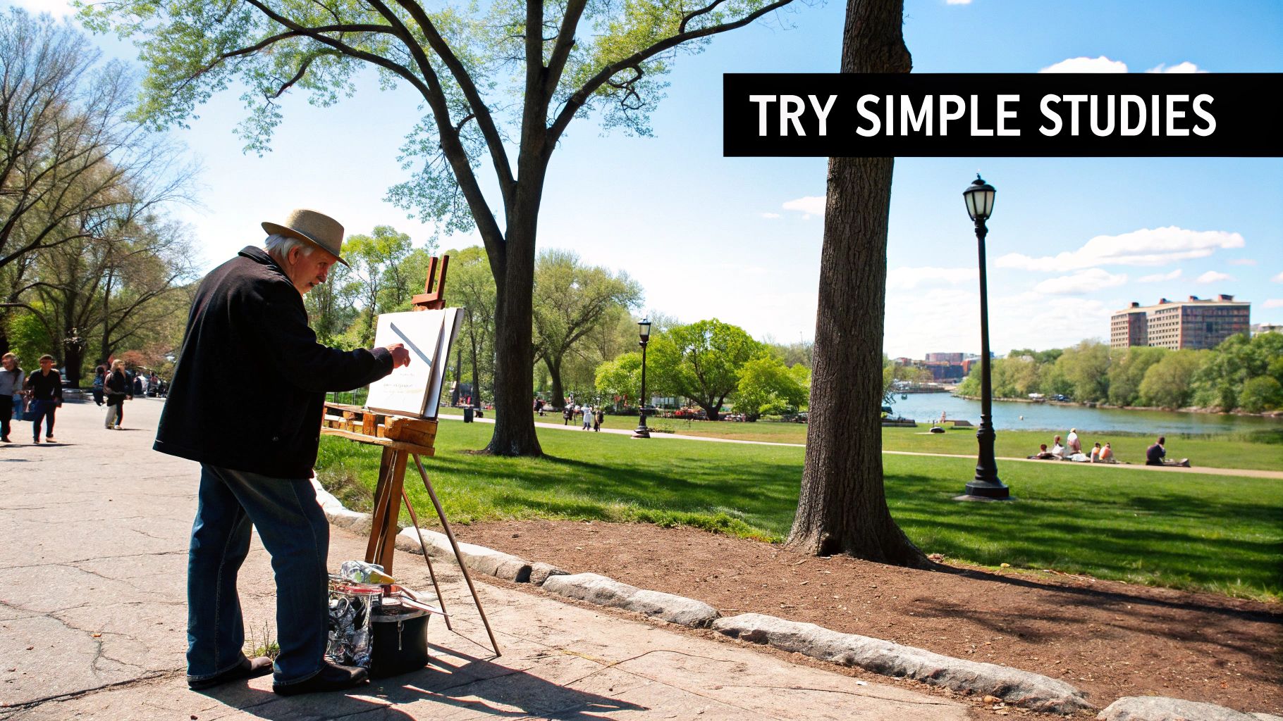
"Should I Paint from a Photo or from Life?"
For your first handful of paintings, working from a photograph is absolutely the way to go. It gives you a huge advantage as a beginner because the scene doesn't change. The light, shadows, and colors are all locked in place. This frees up your mental energy to focus on the important stuff, like your brushwork and color mixing, without feeling rushed.
Painting from life, or en plein air as it’s called, is a fantastic skill to build up to. It trains your eye to see color and value in a way a camera never can, and it forces you to work more quickly and decisively.
I like to think of it like this: photos are your controlled training ground, like hitting balls at a driving range. Painting outside is the actual game, where you have to apply all those skills in a dynamic, ever-changing world. Start with photos to build your core skills and confidence first.
Ready to turn a cherished memory into a work of art? With Custom Paint By Numbers, you can transform any photograph into a personalized, easy-to-follow painting kit. It's the perfect way to practice your newfound skills or create a truly heartfelt gift. Start your creative project today at https://paint-by-number.com.


