

Painting a sunset is one of the most rewarding things you can tackle with a brush. It's all about capturing that fleeting moment when the sky explodes with color. The secret isn't some complicated trick; it's just about layering those vibrant hues and getting your blends just right.
Getting Your Canvas Ready
Before you even think about dipping a brush in that fiery orange, a little prep work will make a world of difference. The right supplies aren't just about making things easier—they're what will give your painting that professional, polished look. This is your foundation.
Let's talk about your painting surface. For beginners, I always suggest a pre-primed, stretched canvas. Something in the 11x14 or 12x16 inch range is a great starting point. It gives you enough room to create those beautiful, sweeping gradients in the sky without feeling overwhelming. If you go too small, you'll struggle to get a smooth blend.
Picking the Right Paints and Brushes
When it comes to painting sunsets, acrylics are your best friend. The biggest reason? They dry fast. This is a huge plus because it lets you layer colors—maybe a soft pink over a pale yellow—without turning everything into a muddy brown mess. You don't need every color under the sun; a basic starter set with primary colors, black, and white will do the job perfectly.
For brushes, you really only need a few workhorses to get started:
- A large, 1-inch flat brush: This will be your go-to for laying down those big, broad areas of color for the sky. It’s perfect for smooth, even coverage.
- A medium round brush: This one is brilliant for blending the edges where colors meet and for shaping any clouds you want to add.
- A small detail brush: You’ll grab this for the final touches—the bright, glowing center of the sun or maybe the silhouette of a distant tree.
My Advice: You absolutely do not need to spend a fortune on supplies when you're starting out. Affordable acrylics and synthetic brushes from a craft store will work just fine. Honestly, your technique is what will make the painting shine, not the price tag on your tools.
Setting Up Your Painting Space
With your materials gathered, it’s time to set up your creative zone. Find a spot with good light and throw down some newspaper to protect your table. I just use a simple paper plate as a palette—squeeze your paints out, maybe arranging them from light to dark to keep things tidy.
Here’s a little trick I learned years ago: keep two jars of water handy. Use one for the initial, dirty rinse when you switch colors, and the second one as "clean" water for thinning your paints. It’s a simple step that keeps your yellows from turning a murky green.
If you want to brush up on some fundamentals first, exploring different canvas painting techniques can be a real confidence booster. Once you're all set up, you can stop worrying about the logistics and just lose yourself in the fun of painting that beautiful sky.
Mixing the Perfect Sunset Palette
A sunset painting is all about the color. It's the heart and soul of the piece. For now, let's forget the dense color theory textbooks and focus on what really matters: mixing practical, vibrant colors that capture that iconic, fiery glow. We're aiming for a sky that looks luminous and alive, not flat or muddy.
You might be surprised to learn you don't need a whole arsenal of paints. In fact, working with a limited palette is often better. It gives you more control and, believe it or not, helps create a more harmonious painting. With just a few key colors, you can mix every single shade needed to bring that dramatic, fading sky to life. If you're just starting to build your toolkit, our guide on art supplies for beginners is a great place to start.
Your Core Sunset Colors
Let's get down to brass tacks. There are a few essential players you'll want on your palette. Think of these as the building blocks for every warm orange, soft pink, and dusky purple you'll be painting.
- Cadmium Yellow Light or Medium: This is where the light comes from. It's the foundation for your brightest glows right at the horizon.
- A Vibrant Red (like Cadmium Red or Naphthol Red): This is the engine of your sunset, the powerhouse that creates those intense, fiery hues.
- Ultramarine Blue: A deep, warm blue like this is perfect for mixing rich purples and creating the darker, cooler tones of the upper atmosphere.
- Titanium White: You'll use this constantly to lighten your mixes, creating everything from soft pinks to pale, buttery yellows.
This image really drives home how these basic colors come together to create those beautiful sunset gradients right on your palette.
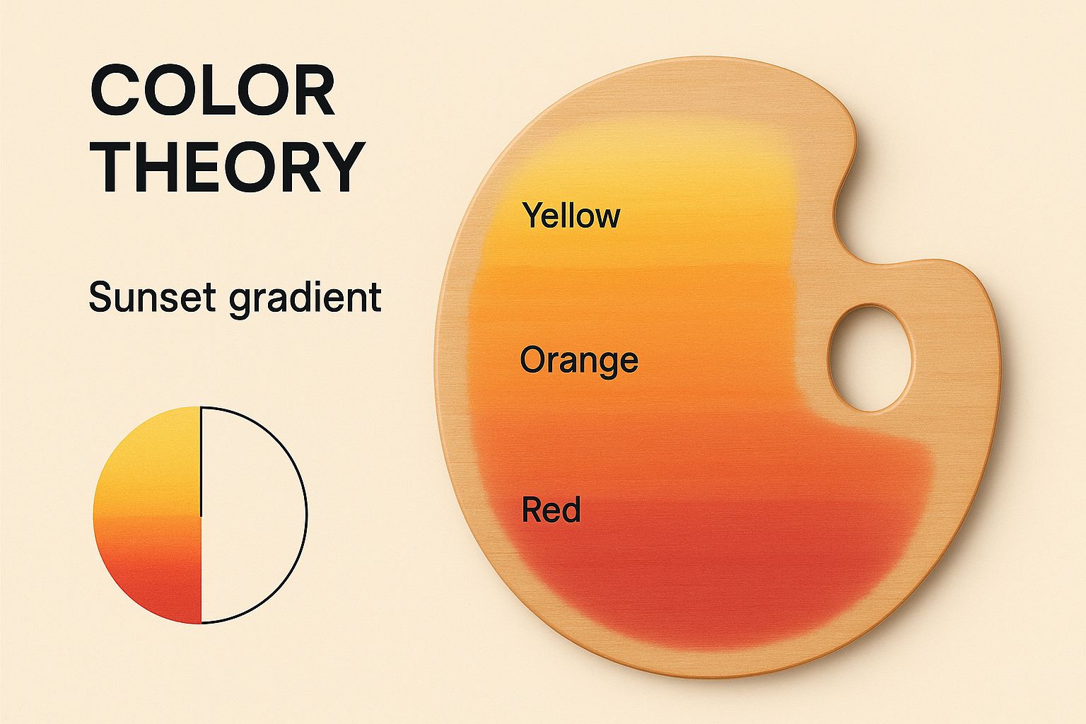
As you can see, starting with pure, strong colors lets you create a seamless transition from warm to cool. That smooth blend is the real secret to a believable sky.
Avoiding Muddy Mixes
One of the most common frustrations for any painter tackling a sunset is ending up with muddy, lifeless colors. I've been there. This almost always happens from over-blending, especially when you start mixing warm and cool colors together on the canvas without a clear plan.
The trick is to do your mixing on the palette first. Create clean batches of color and then apply them strategically.
Pro Tip: Keep your warm and cool mixes separate on your palette. Mix your oranges and yellows on one side, and your purples and blues on another. When you apply them to the canvas, only blend them gently right at the edges where they meet. This simple habit keeps each color pure and vibrant.
To help you get started, here's a quick-reference guide for mixing some essential sunset shades from that core palette we talked about.
Sunset Color Mixing Guide
| Target Color | Primary Mix Recipe | Pro Tip |
|---|---|---|
| Fiery Orange | Cadmium Red + Cadmium Yellow | Start with yellow and add tiny bits of red until you reach the desired intensity. |
| Soft Peach | Cadmium Yellow + Titanium White + a touch of Cadmium Red | Mix the yellow and white first, then add just a whisper of red to warm it up. |
| Deep Purple | Ultramarine Blue + Cadmium Red | Add the red to the blue slowly. A tiny bit of white can soften it for distant clouds. |
| Dusty Rose | Cadmium Red + Titanium White + a tiny bit of Ultramarine Blue | The blue will "gray down" the pink, making it look more natural and less like bubblegum. |
Using this chart as a starting point will save you a lot of guesswork and help you avoid making mud. With a little practice, these mixes will become second nature.
Painting Your Sunset from Sky to Horizon
https://www.youtube.com/embed/VSRLe6ewKIc
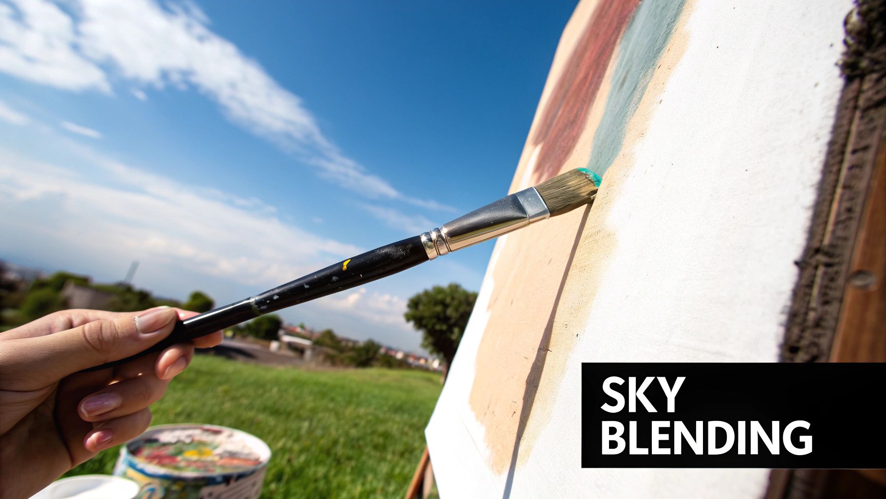
Alright, your colors are mixed and the canvas is waiting. This is the fun part, where we start to bring that sunset to life. We're going to work from the top of the canvas down to the horizon, focusing on building that big, beautiful sky first. The trick here is to work fast and trust the process, letting the colors do most of the work by blending right on the canvas.
To get that soft, seamless look, we'll use a wet-on-wet technique. It's just what it sounds like: applying wet paint onto another layer of paint that's still wet. This is the best way to get those gorgeous, smooth gradients that make sunsets so mesmerizing. Since acrylics can dry in a flash, you'll want to move with a bit of speed.
Blocking In Your Sky Gradient
Grab your biggest flat brush. When I paint a sunset sky, I always work from light to dark. This means starting with your brightest color—that pale, creamy yellow—right where you've planned your horizon line.
Go ahead and lay down a nice, thick band of that yellow across the lower part of your sky. Don't be stingy with the paint! A thicker layer stays wet longer, which buys you more time to blend everything together.
Now, give your brush a quick rinse and dip it into your peachy orange. Paint another band directly above the yellow, letting it overlap just a little bit. Without cleaning the brush this time, gently sweep it back and forth right on that line where the two colors touch. You'll immediately start to see a soft, natural transition forming.
Just keep repeating that process as you move up the canvas, introducing your darker, cooler colors:
- Paint the fiery red right above the orange.
- Follow that with your dusty rose or magenta.
- Finish with your deepest purple or blue at the very top.
Each time you add a new color, the key is to blend only at the seam where it meets the color below it. Stick to long, horizontal brushstrokes that go all the way across the canvas. This motion is what sells the effect of a smooth, expansive sky.
A Painter's Insight: Don't get hung up on creating a perfectly smooth, digital-looking gradient. Real sunsets have streaks and little imperfections. These "happy accidents" often add more realism and texture to your painting than a flawless blend ever could.
Defining the Sun and First Highlights
While that sky is still damp, it's the ideal moment to pop in the sun. This is one of those times where a little bit of paint goes a very long way.
Using a small, clean brush, pick up a dab of pure Titanium White, maybe with a tiny speck of your pale yellow mixed in. Place a single, bright dot where you want the sun to sit, which is usually pretty low near the horizon.
Now for the glow. Wipe most of the paint off that brush until it’s almost dry. Gently pull the white paint outward from the center of your sun dot with short, feathery strokes. Drag some of that bright white horizontally into the yellow horizon line. This technique creates a much more believable radiance than just painting a static circle.
And there you have it—the foundation of your painting is set. You’ve successfully mapped out the light and color for the entire sky. Step back for a second and just look at the gradient you created. It's the most crucial part of learning how to paint a sunset.
Make sure you let this layer dry completely before you even think about adding clouds. This is non-negotiable if you want to keep your colors clean and prevent them from getting muddy.
Bringing Clouds and Sun Glow to Life
The real magic in learning how to paint a sunset isn't just in the colors, but in the details. It's the clouds and the sun's brilliant glow that turn a simple gradient into a breathtaking scene. A flat sky can be pretty, sure, but it's the atmosphere—the light interacting with the clouds—that gives a painting depth and makes someone stop and stare.
To paint a truly convincing sunset, you have to think a bit like a meteorologist. The most spectacular colors often explode after the sun has already dipped below the horizon, setting high-altitude clouds ablaze. Thick, low clouds can kill the light and create a muted, moody scene, while thin, wispy clouds act like a canvas for those brilliant reds and oranges. Photographers and artists have learned to anticipate these moments, and you can get a head start by learning how to predict sunrise and sunset colors based on atmospheric conditions.
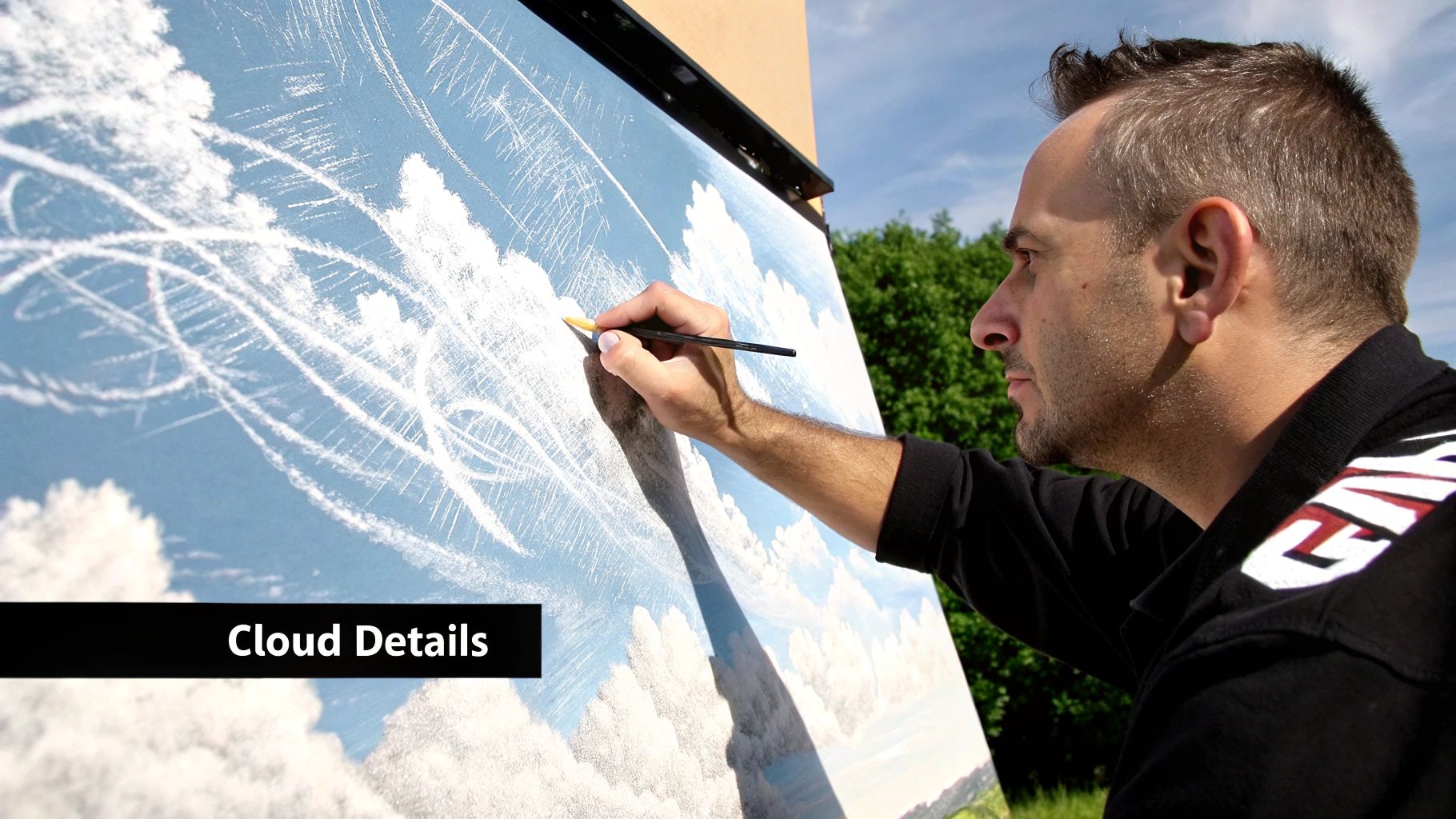
Painting Wispy and Dramatic Clouds
Different clouds need different handling. For those delicate, high-altitude cirrus clouds that just barely catch the last light, a light touch is everything.
-
For wispy clouds: Grab a soft, dry brush. Mix up a pale, warm color—think soft pink or a hint of orange—and thin it out just a touch. Now, lightly skim the brush across your dry sky. You want to use almost no pressure, letting the canvas texture grab the paint to create that broken, see-through effect.
-
For dramatic, dense clouds: These have weight and volume, so they need more structure. I always start by blocking in their undersides with a darker, cooler color—a muted purple or a gray-blue works beautifully. This immediately establishes a shadow and gives them a three-dimensional feel. After that, you can come back in and paint the sunlit tops with your warmer, brighter colors.
Think about how you move your brush. I use soft, dabbing motions to build up the fluffiness of cumulus clouds, but for those stretched-out stratus clouds, I use long, sweeping strokes. Let the brushwork follow the form.
A Quick Tip: I can't stress this enough: avoid using pure black or gray for cloud shadows. It’s a dead giveaway. Instead, mix a bit of your sky's blue or purple into your shadow color. This ties the clouds to their environment and makes them feel like part of the atmosphere, not just dark blobs stuck on the canvas.
Capturing the Sun’s Radiant Glow
Here's a part where a lot of painters get stuck: making the sun look like it’s actually glowing, not just a yellow circle on the canvas. The technique that saves the day is dry brushing.
Find a soft brush and make sure it’s completely dry. Dip just the very tip into a tiny bit of pure white or pale yellow paint, then wipe almost all of it off on a paper towel. Seriously, you want to think there's nothing left on the brush.
Now, starting from where your sun is, gently scrub the brush in a soft, circular motion, working your way outward. You’re depositing a very thin, hazy layer of pigment that creates that soft, radiant halo. The key is to build this effect slowly. It’s always easier to add more glow than it is to try and tone it down. This simple trick is what will sell the illusion of blinding light and make your sunset painting truly shine.
Bringing Your Sunset to Life with Depth and Drama
A vibrant sky on its own is stunning, but it can feel like it's just floating in space. To turn that gorgeous color blend into a true landscape, you need to ground it with foreground elements. This is where the magic really happens.
Silhouettes are my go-to for this. They create a powerful sense of depth and contrast against the bright sunset, and the best part is their simplicity. You don't need a whole new palette; one dark color is usually all it takes. I almost never use black straight from the tube—I prefer mixing my own rich, deep tone from Ultramarine Blue and a bit of Cadmium Red. The resulting color feels more alive and connects beautifully with the colors already in your sky.
Crafting Believable Silhouettes
Once you’ve mixed your dark color, think about the story you want your landscape to tell. Are there gentle, rolling hills in the distance? Or maybe the sharp, dramatic peaks of a mountain range closer to the viewer? A single, twisted tree can add a lot of character, too.
Grab a detail brush and, working on top of your completely dry sky, carefully paint the outline of your chosen shapes. You want sharp, clean edges here to create that striking contrast.
- For Mountains: Let your hand move organically, creating natural slopes and valleys. Vary the heights and shapes to avoid a boring, predictable line.
- For Trees: I always start with the main trunk and the thickest branches. Then, I’ll switch to a much finer brush to add the delicate, wispy branches at the ends. Remember, nature isn't symmetrical!
Painting Shimmering Reflections in Water
If your scene has a body of water, adding reflections will elevate it to a whole new level. The trick isn't to create a perfect mirror image of the sky, but rather to capture the impression of its light on the water's surface. Fluid, horizontal brushstrokes are key here.
First, lightly block in the reflected colors from your sky. The brightest yellows from the horizon should be nearest the shoreline, with the oranges and purples stretching out from there. Then, take a clean, slightly damp brush and gently drag it horizontally across these colors to soften and blur them together.
To finish it off, use your dark silhouette color to paint a few thin, broken horizontal lines across the water. These little "ripples" break up the reflection, suggesting movement and making the water feel much more realistic.
The goal is to capture the feeling of the light, not a perfect copy. This very idea sparked the Impressionist movement, beginning with Claude Monet’s famous painting Impression, Sunrise. Artists started focusing on atmospheric effects over minute details, using loose brushwork to convey the fleeting quality of light on water.
This is your chance to really put your personal stamp on the painting. The specific silhouettes and reflections you choose are what make the scene uniquely yours, and they're fantastic elements to practice when you're looking for beginning painting ideas.
Common Sunset Painting Questions Answered
As you start painting sunsets, you're bound to run into a few hurdles. That’s perfectly normal—it’s how we learn and get better! I’ve gathered some of the most common questions I hear from fellow artists to help you push past those tricky spots and feel more confident with every painting.
What Is the Best Paint for Beginners?
If you're just starting out, I always recommend acrylic paint. Its biggest advantage is how quickly it dries. When you’re trying to create those beautiful, distinct bands of color in a sunset, this is a lifesaver. You can lay down your yellows, let them set for a few minutes, and then layer your reds right on top without everything blending into a muddy mess.
On top of that, acrylics are water-soluble, which makes cleanup a breeze. While oil paints are fantastic for their long blending time, that slow drying process can be a real source of frustration when you're eager to see your sunset take shape.
How Do I Stop My Sunset Colors from Looking Muddy?
Ah, the dreaded muddy colors. This is probably the number one issue painters face, and it almost always comes down to over-blending complementary colors (like your sky's blue and your sun's orange) right on the canvas. The fix? Patience and clean layers.
- Start with your warm colors first—the yellows, oranges, and fiery reds.
- Give this layer a chance to dry completely, or at least become tacky to the touch.
- Then, you can gently begin blending in the cooler colors, like purples and blues, at the edges where they meet the warm tones.
The real secret here is to use a dedicated, clean, and soft brush just for the blending part. Don't try to mix everything together on the canvas at once. Focus on those soft transitions between neighboring colors.
How Can I Make the Sun Look Like It Is Actually Glowing?
Making that sun feel like it’s radiating real light is all about mastering soft edges. It’s more of a subtle effect than you might think. Start with a very small, bright spot of pure white or a pale, creamy yellow where the sun is.
Next, grab a soft, dry brush with very little paint on it and gently feather the edges of that spot outward into the sky. This is a technique called dry brushing, and it’s perfect for creating that hazy, soft halo that convinces the eye it’s looking at a light source. You can also build up the glow by applying very thin, transparent layers of a lighter color around the sun.
As you get comfortable with traditional painting, it can be fun to see how technology approaches art, too. Some artists are exploring tools for things like AI art generation to find new kinds of inspiration.
Do I Have to Paint on a White Canvas?
Absolutely not! In fact, many experienced artists prefer not to. Applying a "toned ground" or a thin base color first can work wonders. A light wash of a warm color like yellow ochre or even a cool gray can instantly unify your painting and make your final sunset colors pop with more vibrancy.
It also gets rid of that intimidating "blank white canvas" stare, which can sometimes make it easier to just dive in and start painting.
Ready to turn your favorite sunset photo into a masterpiece? With Custom Paint By Numbers, you can create a personalized kit from any image. We provide the canvas, paints, and brushes—you just bring the creativity. Transform a cherished memory into a beautiful painting today at https://paint-by-number.com.


