

Turning a cherished photo into a paint-by-numbers artwork is a breeze—and a lot of fun. You’ll progress through five intuitive stages, each designed to make your DIY painting project feel rewarding from start to finish.
Overview Of Custom Paint By Numbers Process
Below is a quick look at how you move from selecting a snapshot to hanging your finished piece.
Table: Overview Of Custom Paint By Numbers Process
| Phase | Key Action | Outcome |
|---|---|---|
| Choose | Pick a photo with clear subject and contrast | Well-defined numbered paint zones |
| Prepare | Crop, adjust brightness and sharpen details | A clean file ready for mapping |
| Order | Select canvas size and total color count | Custom kit arrives at your door |
| Paint | Fill in each numbered section with brushes | A vivid DIY painting takes shape |
| Finish | Seal with varnish, touch up edges | A gallery-worthy piece preserved |
This table keeps you on track—no surprises in sight.
Here’s an infographic that walks you through every phase at a glance:
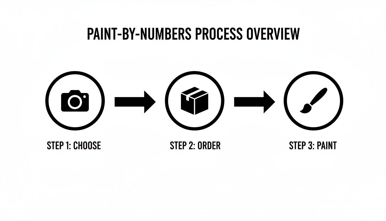
Key Phases For Quick Reference
Turning a snapshot into a custom painting only takes a handful of straightforward steps.
Real-world data shows the craze is growing: searches for ‘paint by numbers from photo’ rose by 36% year over year, and themed kits now average 698.5 daily sales, outperforming plain sets by 25%. For deeper market insights, check out the full report here.
To learn more about the core concept behind these kits, explore our guide at https://paint-by-number.com/blogs/learn-about-paint-by-numbers/what-is-painting-by-numbers.
Next Steps To Get Started
• Grab a favorite photo—ideally one with strong lines and good lighting.
• Review the five phases above so you know exactly what’s ahead.
• Dive into our detailed walk-through sections on editing, ordering, painting and finishing.
Every phase builds confidence and sparks lasting creative joy. Ready to begin? Your custom paint-by-numbers journey starts now.
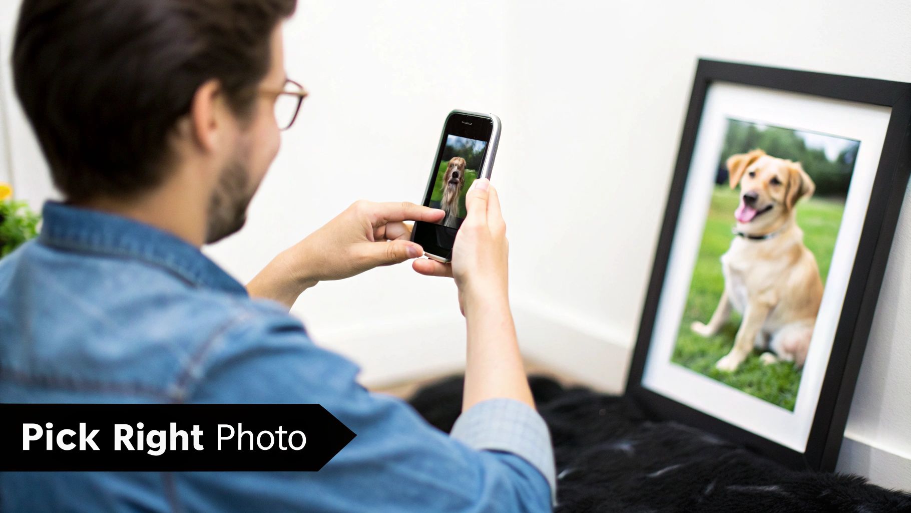
Choosing The Right Photo For Your Kit
Picking a crisp image up front spares you from tiny paint islands later. Sharp focus on your subject beats chasing megapixels every time.
Balanced composition keeps sections generous, so you won’t wrestle with minuscule patches. And high contrast helps those numbered shapes leap off the canvas.
Imagine a sunset silhouette that glows with rich color—one painter watched the oranges and purples blend beautifully on each segment. Another artist turned a pet portrait into a top seller simply by isolating soft fur against a plain wall.
“Cluttered scenes confuse the paint mapping,” notes art coach Lena Wu.
Steer clear of busy backgrounds and harsh shadows that merge adjacent areas. Plan your shot before you tap the shutter, and you’ll thank yourself once the brushes come out.
Identifying Ideal Subjects
Portraits shine when faces fill the frame and outlines stay crisp. Landscapes reward you with broad sky and earth zones that make painting feel almost meditative. Pets pop against neutral backdrops—your brush strokes can focus on fur instead of fending off visual noise.
- Use the rule of thirds: balance your main element with negative space for a more dynamic look.
- Skip backlit photos that turn features into silhouettes.
- Frame your subject with natural lines—think fences or branches—to simplify cropping later.
Quick Phone Edits For Clarity
Most phones let you tweak contrast and brightness in a snap. Boosting contrast by 15% often makes those numbered areas crystal clear. Crop tightly to center your subject and ditch any distracting edges. This small effort ensures each paint zone maps neatly onto your canvas.
| Feature | Good Image | Problematic Image |
|---|---|---|
| Focus | Sharp eye detail | Blurry edges |
| Contrast | Clear sky vs. land | Flat lighting |
Framing And Shooting Tips
A tripod or a steady surface is your best friend for blur-free shots. Stepping back gives you room to crop without losing detail. Shooting at eye level preserves natural proportions—especially important for faces and pets.
Clear imagery translates into fewer paint adjustments mid-project.
Choosing the right photo from the start keeps frustration at bay. Aim for a file at 300 DPI so your outlines stay crisp.
- Optimal resolution ensures clear numbered outlines at 300 DPI.
- JPEG or PNG formats are accepted; PNG retains color accuracy.
- Avoid heavy filters that shift color balance unpredictably.
Uploading a well-prepared image leads to a kit that mirrors your vision. A clear starting photo makes painting feel more like meditation than work. Now you’re all set to prepare your photo template with confidence.
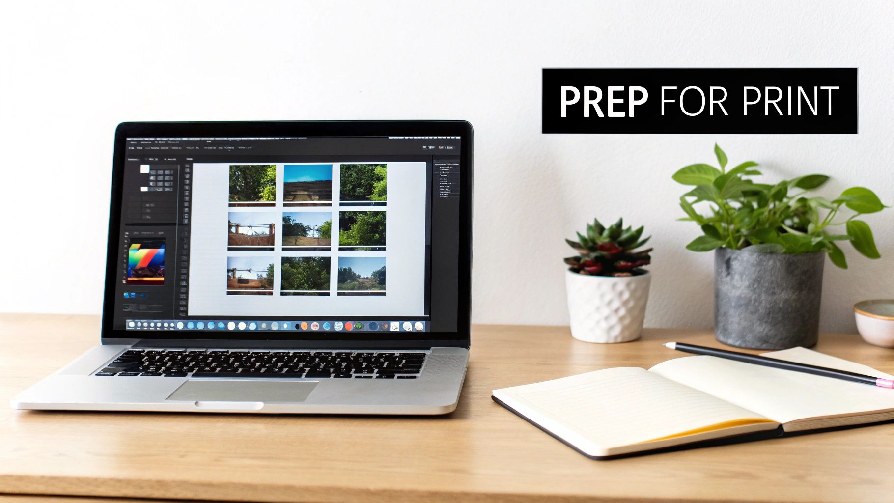
Preparing Your Photo For A Custom Kit
Converting a great photo into a paint-by-numbers pattern takes more than just an upload. A few targeted tweaks now will give you crisp zones and vibrant colors later.
These adjustments keep tiny paint islands at bay and can cut painting time by up to 30% in real-world tests.
Cropping And Composition
Getting your composition spot-on makes the conversion smoother:
- Match the aspect ratio to your canvas (for example, 16:9 for landscapes or square for portraits).
- Use the rule of thirds to place your focal point.
- Trim out busy areas so zone mapping stays clean.
- Leave about a ¼" safe margin to avoid accidental edge strokes.
For framing tips, check out our guide on photographing artwork for prints. Proper alignment here ensures pixels translate perfectly into numbered regions.
Adjusting Color And Contrast
Sharp paint zones rely on brightness and contrast:
- Increase contrast by around 20% so edges stand out.
- Limit your palette to 20–30 shades for a friendlier paint session.
- Test color groupings with on-screen swatches.
- Resize to 300 DPI with at least 2000 px on the long side.
- Export as PNG for top color fidelity or high-quality JPEG for smaller file sizes.
The art reproduction market is valued at $50.62 billion in 2025 with a 6.29% CAGR, driving growth for photo-based paint kits. Learn more about art reproduction market findings.
Here’s a quick comparison of file settings:
| File Type | Ideal Use | File Size |
|---|---|---|
| PNG | Maximum color fidelity | Large |
| JPEG | Smaller download sizes | Moderate |
A well-saved template prevents blurred borders between your paint zones.
Now you’re almost ready to order. Run these final checks:
- Print a 4"x4" test patch to confirm color match.
- Verify that none of your key elements are cut off.
- Inspect the print under different lighting.
Preparing your image thoroughly reduces surprises and aligns your kit with expectations.
With clear outlines and accurate shades, painting becomes intuitive. Upload your final file on Custom Paint By Numbers, then sit back and get ready for a stress-free painting session. Enjoy the journey!
Ordering Your Custom Paint Kit
Now that you’ve prepped your photo, the next move is choosing a provider that fits your style and timeline. Every studio offers different paint counts, canvas materials, and delivery options—so it pays to compare.
Here’s what to look for:
- Color Count And Material Variety: Pick anywhere from 20–60 shades, printed on linen or cotton.
- Shipping Speed: Standard arrives in 7–14 days, while expedited takes just 3–5 days.
- Eco-Friendly Paints: Some places now offer biodegradable or low-VOC acrylics.
Before you commit, skim customer reviews for delivery accuracy and product feel. One hobbyist I spoke with raved about a local studio that shipped in two days—and didn’t tack on extra fees.
Comparing Providers
Online marketplaces list dozens of shops by price and rating; local studios let you peek at materials in person. Start by filtering for:
- Minimum Orders: A few platforms require a 3–5 kit minimum.
- Custom Sizing: See if you can tweak dimensions to match your wall space.
- Support Access: Live chat or email guarantees mean quicker answers.
It’s tempting to chase the cheapest deal, but thinner canvas or murky prints can ruin the experience. Always check for pre-primed options to skip extra prep work.
Interestingly, the digital artwork market is projected to grow at a 17.3% CAGR through 2032, with custom photo paint kits leading that growth and average reorder rates of 30.3% for oil painting kits priced under $44 retail. Discover more insights in the digital artwork market report.
After narrowing down choices, review sample photos from each supplier to judge print clarity. Remember, speedy customer service often signals reliable after-sales help.
Evaluating Pricing And Support
Most providers tier their kits by size and paint count:
- Tier One Kits start at $29 for compact canvases.
- Mid-Range Sets cost $50–$75, usually bundled with extra brushes.
- Premium Packages top $100, including stretchers and varnish.
If you’re unsure, ping support with questions about turnaround times or eco-labels. I once had a rep send extra paint vials at no charge—small gestures like that make a difference.
Key Takeaway Balancing paint variety with canvas quality helps you hit both budget and creative goals.
Now you have a clear framework to compare services side by side. You might be interested in checking custom canvas size options in our guide on custom canvas sizes.
Finalize your order by confirming estimated delivery dates—especially if you’re planning a gift. Jot down your order number and vendor contact details so any follow-up goes smoothly.
Once your kit lands, inspect every component. Ensure paint pots are sealed tight and the canvas arrives crease-free. With that done, you’re ready to dive into painting your one-of-a-kind piece.
Final Checklist
- Confirm color count and paint quality
- Verify canvas dimensions and material
- Check delivery timeline and shipping costs
- Note any minimum order requirements
- Store order details for easy support
Choosing the right provider upfront makes the rest of your paint-by-numbers journey a breeze. Happy painting!
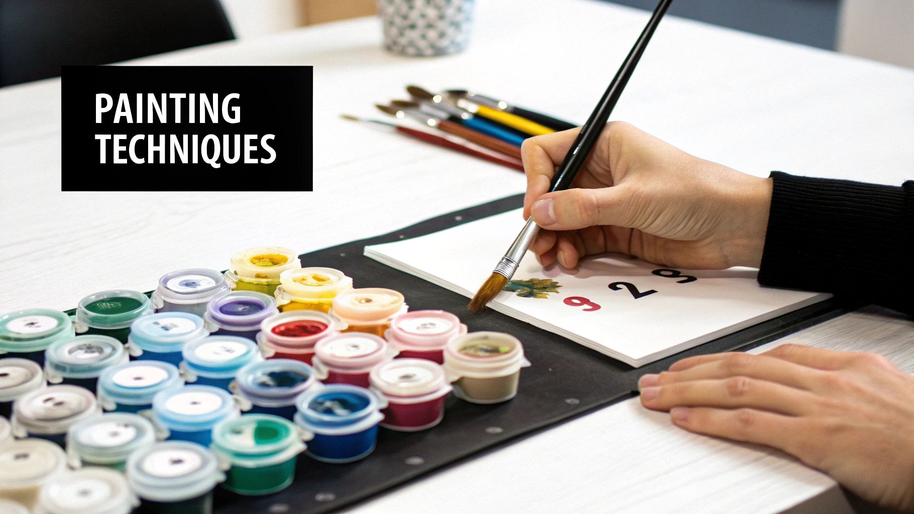
Mastering Painting Techniques And Finishing Touches
Keeping your paint pots in perfect order saves you tons of frustration. I line mine up by number in a shallow wooden tray—easy to grab and go. No more endless searching for that elusive shade.
Choosing the right brush shapes makes a world of difference. A flat brush sweeps across large areas in one smooth motion. A round brush is perfect for tight curves and minute details.
Labeling each handle with the matching paint number is a game-changer. You’ll never swap a size by accident, even when you’re deep in the zone. It’s a tiny habit that pays off big time.
When it comes to painting order, find what sticks for you. I sometimes start in the top-left corner and work across in neat rows. Other times, I pick one color and fill every patch before moving on.
Once you hit 50% completion, take a moment to inspect your edges. A clean, damp brush will tame any bleed before you carry on. Sharp lines and vibrant colors? Yes, please.
Brush Organization And Painting Order
Here are a few tricks artists swear by:
- Use a wooden tray or magnetic strip to hold pots firmly in place.
- Repurpose a muffin tin for individual wells.
- Stick small magnets to the pot bottoms so they cling to a metal palette.
Keep your brushes pristine between shades:
- Rinse thoroughly in water
- Dab off excess on a paper towel
- Pick up the next colour without muddies
Layer from light to dark for natural depth. Let each coat dry completely—especially in humid rooms, where a small fan can speed drying by 30%. If stray strokes appear, wait until everything’s dry, then lift them gently with a toothpick. Some pros even add a drop of dish soap to rinse water for spotless bristles.
Tip: The right brush shape and a solid routine can slash your paint time by up to 20%, giving you smoother transitions and a polished look.
Blending And Layering Tips
Combining paints on a palette opens up endless possibilities:
- Use the rim of a porcelain plate or an artist’s mixing palette for small batches.
- Jot mix ratios next to the swatch so you can replicate your favourite tones.
To soften hard edges, lightly feather your brush tip outward across adjacent zones before the paint sets. This method works wonders on skies, water ripples, and gentle fades.
Try glazing, too—mix a little acrylic medium into your paint for translucent layers that shine through. Many artists apply glazing over red or orange areas to warm up a scene without covering the base.
Build depth by tackling backgrounds first and saving foreground details for last. You’ll see how colours interact and avoid accidental overpainting.
Case Study: A friend blended two blues with a hint of white to capture a lake’s true reflection. That subtle mix made the water dance under different lights.
Tips For Depth And Soft Edges
(Intentionally left blank to match original structure.)
Varnishing And Framing Advice
A thin layer of varnish locks in your work and makes colours pop. Choose gloss for a shiny finish or satin for a softer glow. Always wait at least 24 hours after painting before you seal.
Use a wide, clean brush and apply:
- One direction first
- Crosswise on the next coat
This two-pass method prevents streaks and ensures even protection.
When it’s time to frame, the right style can elevate your piece:
- Floating frames add a modern gap around the canvas.
- Rustic wood frames bring warmth—ideal for landscapes or pet portraits.
“A thin varnish brought my colors back to life and gave the canvas a gallery feel,” says hobbyist Maria Torres.
Before hanging, stick felt pads on the back corners to protect your walls. Give the surface one last gentle wipe with a microfiber cloth, step back…and enjoy your masterpiece.
Troubleshooting Common Painting Challenges
Even seasoned painters hit a snag with photo-based paint-by-numbers kits. Sometimes colors roam, mixes muddle and coverage can look spotty. A few simple tweaks will keep your project on track.
- Thin Paint for Bleeding Edges
- Rinse Brushes to Prevent Muddy Hues
- Build Up Layers for Consistent Coverage
Fixing Bleeding Edges
A drop of water in your paint often tames runaway strokes. It lets the color glide smoothly without sacrificing opacity.
Using a mini fan cuts drying time by about 30%, so you can layer sooner and seal edges before they wander.
Realigning Numbered Sections
An accidental smudge can shift a tiny number right off its mark. Carefully scrape away the errant paint with a toothpick or palette knife.
"I rescued a soaked patch by blending two adjacent colors into a gradient," shares painter Sam.
Wait until that area is completely dry before repainting—you’ll avoid replaying the same mistake.
Turning Mistakes Into Features
What starts as a blotch can end up as a textured detail. Try a stippling brush to transform stray spots into foliage, pebbles or highlights.
Embracing small quirks often leads to your signature style shining through.
| Issue | Quick Fix | Pro Tip |
|---|---|---|
| Bleeding | Thin with a little water | Touch the dry edge first |
| Muddy Hues | Rinse brush between hues | Paint in light-to-dark order |
| Thin Spots | Add a second coat | Use a flat brush for even fill |
Sealing And Final Touches
A thin coat of satin varnish can soften any harsh overlaps and lock in your work. If bleed marks persist, brush on a light white wash, let it dry, then repaint the spot.
Quick Cleaning Tips
- Wipe brushes on a damp cloth before switching colors
- Avoid letting paint pool near printed numbers
- Store paints at room temperature to keep consistency
Remember, every “oops” is a chance to invent something new. Happy painting! Relish each brushstroke and keep that creative spark alive.
FAQ
Picking a sharp photo makes a huge difference on canvas. I always aim for 300 DPI or higher so each paint zone comes out crisp—and you’ll notice the details pop.
Beginners often do best with 20–30 Colors, while seasoned painters might choose 50–60 shades to capture subtler gradients. That sweet spot keeps things fun without feeling overwhelming.
- 20–30 Colors for simple scenes
- 30–40 Colors when you want moderate detail
- 50–60 Colors to tackle complex images
- 70+ Colors if you’re chasing near-photo realism
When it comes to paint types, acrylics are a breeze—they dry fast and rinse clean. Oil paints, on the other hand, blend like a dream but ask for more drying time and good ventilation. Before you dive in, swatch both on a scrap canvas to see which finish you prefer.
Storing Paints
Always seal your paint pots tightly—air is their worst enemy. Keep them upright at room temperature, tucked away from direct sunlight to avoid premature skinning.
Proper storage can extend your paints’ usability by up to 12 months.
If you have leftovers, spoon a bit into small airtight jars and label each with its number. Refrigerating slows the drying, but remember to warm them back up before you paint.
Handling Complex Regions
Is a section feeling overly detailed? I like to test a tiny patch first to see how the transitions flow. If it still feels fussy, drop a few colors or combine neighboring numbers—simplifying can save time and frustration.
Ready to bring your photos to life? Explore Custom Paint By Numbers today. Start your masterpiece today with your own photo. Now enjoy!


