

Step-by-step painting tutorials are fantastic because they take the whole, sometimes scary, process of creating art and break it down into easy, bite-sized actions. They really open up the world of painting to everyone, especially if you're just starting out and want to build some confidence without staring down a blank canvas.
Starting Your Creative Painting Journey
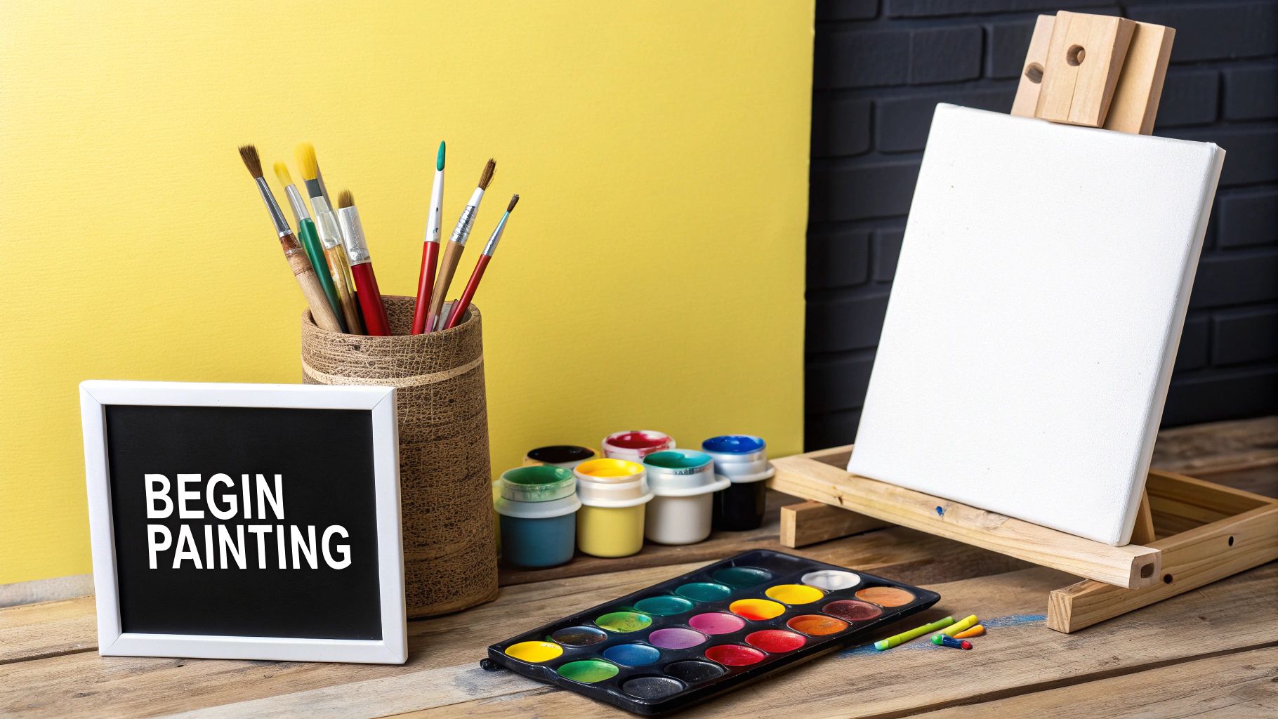
Diving into painting for the first time should feel exciting, not like a chore. Forget what you think you know about needing expensive gear or a fancy studio. The real first step is much simpler: find something that inspires you.
Seriously, look around. That favorite family photo on the shelf, a picture of a sunset from your last vacation, or even the cool pattern on a coffee mug—any of these can be the spark for your first masterpiece.
The main goal is just to begin. And the best way to do that is to keep things simple. You don't need a dedicated art studio. A quiet corner of your kitchen table or a small desk works perfectly. The important thing is to carve out a little space that feels like your own creative nook, even if it's just for an hour at a time.
Finding Your Inspiration
Inspiration is deeply personal, and honestly, it's everywhere. A lot of beginners get stuck here, thinking they need some grand, earth-shattering vision to get started. The truth is, the best subjects are often the ones you already know and love.
- Personal Photos: Why not turn a treasured memory into a tangible piece of art? A photo of a pet, a loved one, or that unforgettable landscape makes for a clear and meaningful reference point.
- Simple Designs: Look for bold shapes and colors in the objects around you. You'd be surprised how compelling a simple abstract pattern, a floral design, or even a favorite quote can be for a first project.
- Nature: The natural world is incredibly forgiving for new painters. The organic lines and colors in a single leaf, a flower, or a simple seascape are perfect subjects to practice with.
Assembling Your Essential Toolkit
Before you get lost in the overwhelming aisles of an art supply store, let me stop you. To begin, you only need a handful of core items. Focusing on just the essentials helps you avoid getting bogged down in decisions and lets you jump right into the fun part—painting.
For a more detailed look, we have a complete guide to the essential https://paint-by-number.com/blogs/learn-about-paint-by-numbers/art-supplies-for-beginners that covers everything you truly need without emptying your wallet.
This minimalist approach is great because it forces you to really learn the fundamentals of how your materials work together. As you paint more and figure out what you enjoy, you can gradually add to your collection.
A Note on Learning: To make our tutorials as easy to follow as possible, we actually borrow ideas from Cognitive Load Theory. It’s all about presenting information in a way that helps you learn and retain skills without feeling overwhelmed.
Guided art has exploded in popularity, thanks in large part to online platforms making it so accessible. It's not just a feeling; the global art and craft tools market is expected to jump from $3.61 billion in 2023 to $5.44 billion by 2030. This just shows how much people are looking for creative outlets and ways to learn new skills.
To help you get started on the right foot, here's a quick rundown of what you'll want to have on hand.
Your Essential Starter Painting Toolkit
This little guide covers the core supplies you'll want for your first painting project. The focus here is on simplicity and function—just what you need to get the paint on the canvas.
| Item | What to Look For | Pro-Tip |
|---|---|---|
| Paint Brushes | A small variety pack with a few different shapes (flat, round, and a fine detail brush) is perfect. Synthetic bristles are great for beginners. | Don't press too hard! Let the bristles do the work. Clean them gently with soap and water right after you're done to make them last. |
| Paints | Acrylics are your best friend. They dry quickly, are easy to clean up with water, and are very forgiving. A basic set of 12-24 colors is plenty. | You can mix any color you can imagine from a basic set. Start by mixing small amounts on a palette so you don't waste paint. |
| Canvas or Paper | A pre-primed canvas panel is a great, affordable start. If you prefer paper, look for heavyweight acrylic or mixed-media paper. | If your canvas feels a little loose, a light spritz of water on the back (not the front!) and letting it dry will tighten it right up. |
| Palette | A simple plastic palette, a ceramic plate, or even a piece of wax paper will work perfectly for mixing your colors. | If using acrylics on a plastic palette, you can let them dry completely and then peel them right off for easy cleanup. |
| Water Cups | You'll need two: one for rinsing brushes between colors and a second one with clean water for thinning paint. | Old yogurt containers or jam jars are perfect for this. No need to buy anything special. |
With these few items, you have everything you need to start creating. Remember, the goal isn't perfection; it's about enjoying the process and making something that is uniquely yours.
Prepping Your Canvas and Palette Like a Pro
https://www.youtube.com/embed/OdiijB0aJvs
A great painting session starts way before you dip a brush into that first numbered pot of paint. If you want to know the secret that seasoned artists swear by, it's all in the prep work. A little bit of effort upfront will make your colors pop and your brushes glide smoothly.
Think of this as setting the stage. It’s less about following rigid rules and more about creating the perfect conditions for your paint to do its thing. Taking a few minutes now saves you a lot of potential frustration down the road and is a key part of any good step by step painting tutorials.
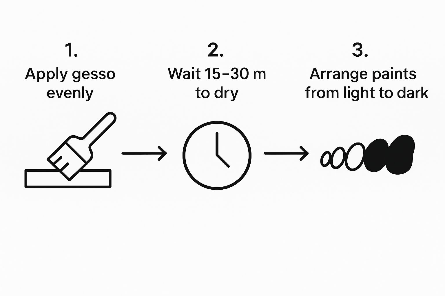
The first thing to tackle is your canvas. Most kits come with a canvas that's already primed, but adding one extra, super-thin layer of gesso can be a total game-changer. Gesso is just a primer that gives the surface a bit more tooth and makes it ready to accept paint.
So, why bother? A quick coat of gesso stops the canvas from drinking up your paint like a sponge. This means your colors stay vibrant and true. It also gives you a much smoother surface to work on, which helps with brush control and gets rid of that scratchy feeling you sometimes get on bare linen.
Applying a Gesso Primer
Putting on gesso couldn't be easier. Grab a wide, flat brush to get nice, even coverage. Just dip it in the gesso and spread a thin coat across the whole canvas with long, even strokes.
Let it dry completely, which usually takes about 15-30 minutes. If you're aiming for a really smooth, professional-grade finish, you can give it a light pass with some fine-grit sandpaper and then add a second coat, brushing in the opposite direction this time. It's a small extra step that really elevates the final piece.
A well-prepped canvas is your best friend. It makes the paint behave predictably, letting you focus on the art itself rather than fighting with your materials. This foundation is what allows for smooth blending and crisp lines down the road.
This infographic breaks down a simple workflow for getting your supplies ready to go.
As you can see, a few minutes of setup can lead to a much more organized and enjoyable painting session.
Organizing Your Paint Palette
Once your canvas is prepped and drying, it's time to get your paints in order. How you set up your palette isn't just about looking organized—it actually makes the whole process feel more natural and stops your colors from turning into a muddy mess.
A good rule of thumb is to squeeze out just a small, dime-sized dollop of each color you think you'll need for your current session. This cuts down on waste, since acrylics dry out pretty fast. Always leave plenty of empty space in the middle of your palette—that’s your mixing area.
Here's a simple approach that many artists, including myself, find really helpful:
- Group Your Colors: Put your blues next to other blues, reds with reds, and so on. It makes finding the color you're looking for so much faster.
- Go From Light to Dark: I like to arrange my colors by value. I’ll start with white at one end, then move through the yellows, oranges, reds, blues, greens, browns, and put black on the far end.
- Give White Its Own Space: You'll be reaching for white all the time to lighten colors, so make sure it's in a spot that's easy to get to.
When you arrange your palette this way every time, you start to build muscle memory. Before you know it, you'll be grabbing colors without even thinking about it, which helps you stay in that creative flow state where the real magic happens.
Getting Comfortable With Your Brushes
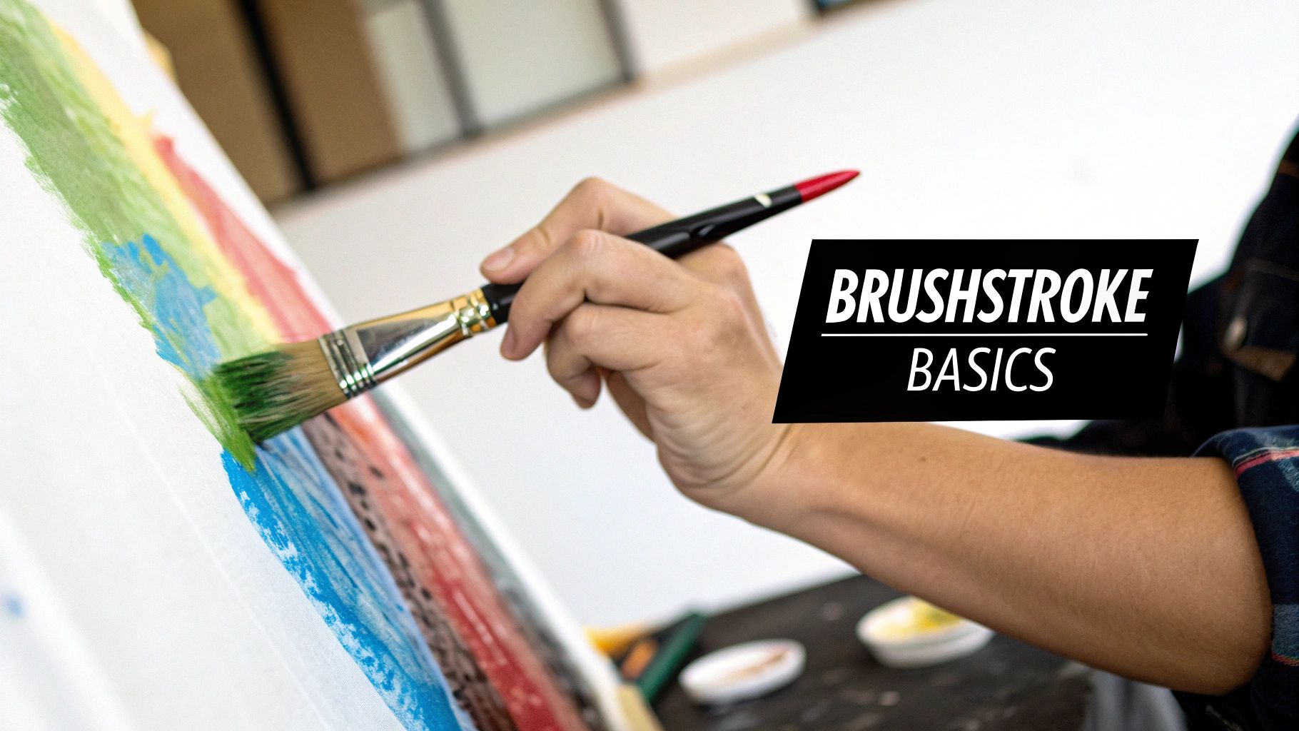
The heart of any painting is the brushstroke. It’s how you’ll create everything from a soft, sweeping sky to the sharp little glint in an eye. Don't worry about memorizing dozens of complex techniques right now. The real goal is to get a feel for a few core strokes that you'll come back to again and again.
This is where we put theory aside and just get some paint on the canvas. Think of it less like a formal lesson and more like a jam session with your brushes. You're just getting to know what they can do and how they feel in your hand.
One of the first things you'll want to master is laying down a smooth, even coat of paint. This is your go-to for backgrounds or filling in any large, solid-colored areas in your paint-by-numbers kit. It's all about getting that consistent, controlled finish.
Building Your Core Skills
For a nice, flat wash, grab a flat brush and load it with a moderate amount of paint—you don’t want it dripping, but you don’t want it dry, either. Then, use long, overlapping strokes, moving in the same direction across the canvas. The idea is to avoid visible streaks, which gives you a seamless foundation for all the fun details to come.
Next up is a technique called blocking in. This is where you use a medium-sized brush to roughly fill in the main shapes of your painting. It’s like creating a simple, color-coded map of your piece before you get lost in the finer points. Many step by step painting tutorials start this way.
For example, if you're painting a landscape, you might block in the whole sky with light blue and the ground with a solid green. It doesn’t have to be perfect. Its only job is to cover the canvas and show you how the basic colors are working together.
Pro-Tip: Don't be afraid to be a little loose when you're blocking in. The great thing about acrylics is they dry fast, so you can easily paint your detailed layers right on top once the base is ready. This is how you build up that wonderful depth and richness.
The variety in your strokes is what gives a painting its unique personality and texture.
From Bold Marks to Fine Details
Once your main shapes are blocked in, it’s time to start refining things and adding details. This is where your control over pressure and the angle of your brush really starts to matter.
- For Crisp Lines: When you need to paint something delicate, like an animal's whiskers or the rigging on a ship, switch to a detail brush. I like to thin the paint just a tiny bit with a drop of water so it flows better. Hold the brush like a pencil and use a light, steady hand, pulling the stroke toward you for more control.
- For Expressive Marks: To add texture or a bit of energy, try using the side of a flat brush. A great trick is dry brushing—using a brush with very little paint on it. It’s perfect for creating effects like wood grain, wispy clouds, or the rough texture of stone.
- For Pressure Control: Try this simple exercise: paint a single line that goes from thick to thin. Start by pressing down firmly, then gradually lift the brush as you finish the stroke. It’s a fantastic way to develop a more sensitive touch.
Getting to know your tools is a huge part of mastering these techniques. If you’re curious about which brush is best for each job, our guide on the different brushes for paint by numbers is a great resource.
The more you practice these basic strokes, the more confident and in command you’ll feel every time you sit down to paint.
Bringing Your Painting to Life With Color and Depth
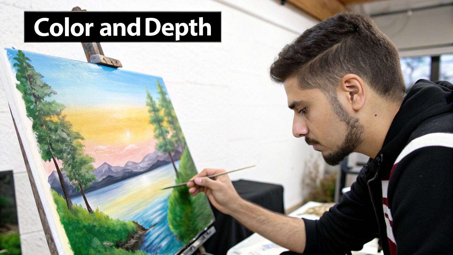
This is my favorite part of the process—where your painting really starts to breathe. We’ve laid the groundwork, and now it's time to transform that flat, numbered outline into a dynamic piece of art.
The secret to making your painting look realistic and visually interesting is all in the layers. Great art is rarely made with a single, flat coat of paint. Instead, we'll build up our colors in stages, starting with the deep, foundational tones and working our way up to the bright, eye-catching highlights. This is what gives your subject that three-dimensional feel.
Building Depth With Layers
Think of layering like you're sculpting with color. The darkest shades—the shadows deep in the folds of a flower petal or the dark corners of a forest—should almost always be your starting point. These dark tones act as an anchor for the entire piece.
Once those base tones are dry, you can start working toward your mid-tones. These are the main, "true" colors of your subject. As you apply them, let a little bit of the darker shadow peek through at the edges. This simple technique immediately creates a sense of form.
Finally, you add the highlights. These are the bright pops of light that hit the highest points of your subject. A tiny dab of near-white on the tip of a nose or the crest of a wave is what sells the illusion of light and really makes the painting pop.
By working from dark to light, you're essentially sculpting with paint. Each layer adds a new dimension, building on the one before it to create a rich, complex final image that draws the viewer in.
The incredible popularity of DIY art kits shows just how many people are falling in love with this creative process. In fact, the market for these kits, which often come with step by step painting tutorials, hit an impressive $17,520 million in 2025 and is still on the rise. It’s clear that people crave the satisfaction of creating something beautiful with their own hands. You can see more on the booming DIY art paintings market here.
Creating Soft Gradients and Blends
Smooth transitions between colors are what give a painting that professional, realistic look. Abrupt, harsh color changes can make a piece look a bit like a cartoon, but a soft gradient can beautifully mimic the way light falls across a surface.
Blending isn't as tricky as it sounds. One of the easiest methods is "wet-on-wet." While two adjacent colors are still wet on the canvas, just take a clean, slightly damp brush and gently feather the line where they meet. Use light, back-and-forth strokes to blur the edge until you have a seamless transition.
Another great technique is to pre-mix a transitional color on your palette. For example, if you're moving from a dark blue to a light blue, mix a medium blue and paint a thin strip of it right between them. Then, you can easily blend both edges for an even softer effect. For a deeper dive, check out our complete guide on how to blend paint colors.
Adding Details and Texture
The final touches are where your painting’s unique personality truly shines through. This is your chance to add fine details and interesting textures that take the whole piece to the next level.
- Dry Brushing: This is a fantastic trick for creating texture. Dip your brush in a bit of paint, then wipe most of it off on a paper towel. When you lightly drag this nearly-dry brush over the canvas, it leaves a broken, textured mark that's perfect for things like wood grain, wispy clouds, or the rough surface of a stone.
- Fine Lines: Grab your smallest detail brush for those crisp finishing touches. Think of the delicate veins on a leaf, the sparkle in an eye, or the individual strands of hair. It's these tiny details that make a painting feel complete and truly captivating.
By playing with these layering, blending, and detailing techniques, you'll find you're doing much more than just filling in the numbers. You’re starting to make conscious artistic choices that bring your unique vision to life.
The Final Touches: Finishing and Protecting Your Artwork
That moment you lift the brush for the last time—it’s a great feeling, isn't it? You’ve turned a canvas of lines and numbers into something truly special. But don't rush to hang it up just yet. A few final steps will make sure your masterpiece stays looking its best for years to come.
Let It Cure Completely
Before you do anything else, you need to let the paint fully dry, or what pros call curing. With acrylics, this is a pretty quick process. They'll likely feel dry to the touch in about an hour.
Even so, you should give the painting a full 24 to 72 hours to harden all the way through. This is super important before you move on to the next step, as it prevents smudging or damage when you apply the finishing coat.
The desire for easy-to-follow creative projects has absolutely exploded. This applies to everything from physical crafts to digital art, a market valued at a whopping $5.85 billion in 2024 and expected to hit $18.48 billion by 2032. It just goes to show how much people want to learn and create. If you're curious about this trend, you can dive deeper into the full digital painting market research.
Choosing and Applying a Varnish
Once your painting is completely cured, it's time to add a protective varnish. Think of this as a clear shield for your artwork. It protects against dust, fading from UV light, and just general wear and tear. A nice bonus is that it also evens out the finish of the paint, giving it a more professional, cohesive look.
You’ve got a few options for the finish, and it really just comes down to personal preference:
- Gloss: Want your colors to pop? Gloss varnish gives your painting a vibrant, almost wet look that makes colors feel deep and saturated. It’s fantastic for pieces with a lot of darks and lights.
- Matte: If you’re going for a more modern, non-reflective vibe, matte is your best bet. It gives the artwork a soft, subtle appearance without any glare.
- Satin: This is the happy medium and a very popular choice. It offers a gentle sheen that enhances the colors without being overly shiny.
Applying varnish isn't complicated. Grab a clean, wide, soft-bristled brush. Apply a thin, even coat using long, parallel strokes. Let that first coat dry completely, then add a second one, this time brushing in the opposite direction. That little cross-hatch technique ensures you get full, even coverage.
Sign Your Name
The very last step in any step by step painting tutorial is making it officially yours by adding a signature. This is your mark of pride.
There are no strict rules here, but most artists sign in a bottom corner so it doesn't pull focus from the painting itself. You can use a fine-tipped permanent marker or a small detail brush with a bit of contrasting paint. Some people use their full name, others just their initials, and some even have a unique symbol.
Whatever you choose, make it your own. Once your signature is on there, your painting is officially done. It's ready to be framed and shown off
Got Questions? We've Got Answers
As you get into the groove of painting, you’re bound to hit a few snags or have questions pop up. It happens to everyone, so let's walk through some of the most common issues people run into. Getting these sorted out early will make the whole process a lot more fun.
So, what happens when you accidentally paint the wrong color in a section? First, don't panic! This is probably the most common mistake, and it's an easy fix.
Just let that incorrect paint dry completely. Seriously, walk away and give it time. Once it's dry, you can go right over it with the correct color. Acrylic paint is a fantastic medium because it's opaque, which means it covers up little mistakes like this without any trouble.
Another common headache is when your colors start looking muddy. This is usually caused by one of two things: you're either blending too much on the canvas, or your brush-rinsing water has turned into a murky mess.
Pro Tip: Keep your colors crisp and clean by using two water cups. Use the first cup for the initial rinse to get the bulk of the paint off your brush. Use the second, cleaner cup for a final rinse before you dip into a new color.
This simple two-cup system is a game-changer. It stops old pigment from sneaking into your fresh paint, so your bright yellows won't turn a murky green and your whites stay pure.
How Do I Get My Colors to Really Pop?
Ever notice some colors looking a little thin or translucent? That’s perfectly normal, especially with lighter shades. The fix is simple: just add another layer. Let the first coat dry completely, then go over it again. This works wonders for whites, yellows, and other light hues that might not completely cover the printed numbers and lines on the first pass.
For a little extra opacity, you can mix a tiny speck of white paint into any color. This will help it cover better and stand out more. Just be careful—a little white goes a long way, and you don't want to accidentally change the original color too much.
Wondering what to do with your new skills once you're done? If you've been bitten by the creative bug and are thinking about how to share your art or even make your own tutorials, checking out something like a UGC Creator Course can be a great next step. It’s a fantastic way to explore where your creative journey could take you.
Ready to turn your favorite photos into a work of art? At Custom Paint By Numbers, we make it easy to create a personalized painting kit from any image. Get your custom kit today and start your next creative adventure. Visit us at https://paint-by-number.com.


