

Ever wonder what makes a painting just feel right? The kind of art that pulls you in and holds your attention? More often than not, it’s the masterful use of color in composition. Think of color as the secret language of your artwork—it sets the mood and tells your eyes where to look before you even realize what you're seeing.
How Color Shapes Your Composition
This guide is all about breaking down the role of color in composition, turning what sounds like a stuffy art school lecture into a practical tool you can use for your next paint-by-numbers project. We’ll show you how a few simple ideas about color harmony and contrast can help transform your favorite photo into a beautifully balanced and striking piece of art.
There are no gatekept secrets here. These are straightforward techniques that explain the why behind the colors in your kit. My goal is to empower you to create something you’ll be truly proud to hang on your wall.
Your journey starts with a few core concepts. These are the fundamental building blocks every artist leans on to create a sense of feeling, focus, and flow. To really get a handle on color, it’s also helpful to see how outside forces can change what we see. For instance, understanding white balance in photography shows just how much the light around us can shift colors, a key idea that applies just as much to your canvas as it does to a camera.
Core Concepts At a Glance
Before we dive into the deep end, let's get a bird's-eye view of the key principles we'll be exploring. Think of these as your artist's toolkit for turning a simple image into something truly compelling.
To make this crystal clear, here’s a quick summary of what each principle does for your painting.
Key Color Principles and Their Impact
| Color Principle | What It Does for Your Painting |
|---|---|
| Color Harmony | Creates a sense of balance and unity. It’s what makes your color palette feel cohesive and pleasing to the eye. |
| Mood and Emotion | Sets the emotional tone. Think warm, energetic reds versus cool, calming blues. |
| Visual Hierarchy | Guides the viewer’s attention to the most important parts of your painting, creating a clear focal point. |
| Value & Saturation | Controls the lightness, darkness, and intensity of colors to build depth, drama, and a sense of realism. |
By getting a feel for these concepts, you're doing so much more than just filling in the lines.
You’re becoming an active partner in the artistic process, seeing firsthand how your custom kit was designed to capture the specific mood of your original photo.
In the end, all these principles work together. Learning about the different aspects of color in composition won't just make your paint-by-numbers experience better—it’ll change how you see the world. You'll start noticing the subtle color stories playing out in every scene around you.
If you're ready to explore this further, you might also like our in-depth guide on the composition of color.
Using the Color Wheel for Perfect Harmony
Ever wonder why some color combinations just work? The secret isn't magic; it's the color wheel. Don't think of it as some stuffy, academic chart. Instead, picture it as your personal recipe book for creating beautiful art. It’s the foundational tool that helps us understand how colors talk to each other, and it's why the palettes in your painting kit feel so satisfying.
The whole thing starts with just three primary colors: red, yellow, and blue. These are the building blocks. Mix them together and you get the secondary colors: orange, green, and purple. Take it one step further, and you create the tertiary colors—think of shades like blue-green or red-orange. That simple progression is the key to unlocking balanced, eye-catching compositions.
This diagram shows how these color relationships form the pillars of a great painting: mood, visual guidance, and overall harmony.
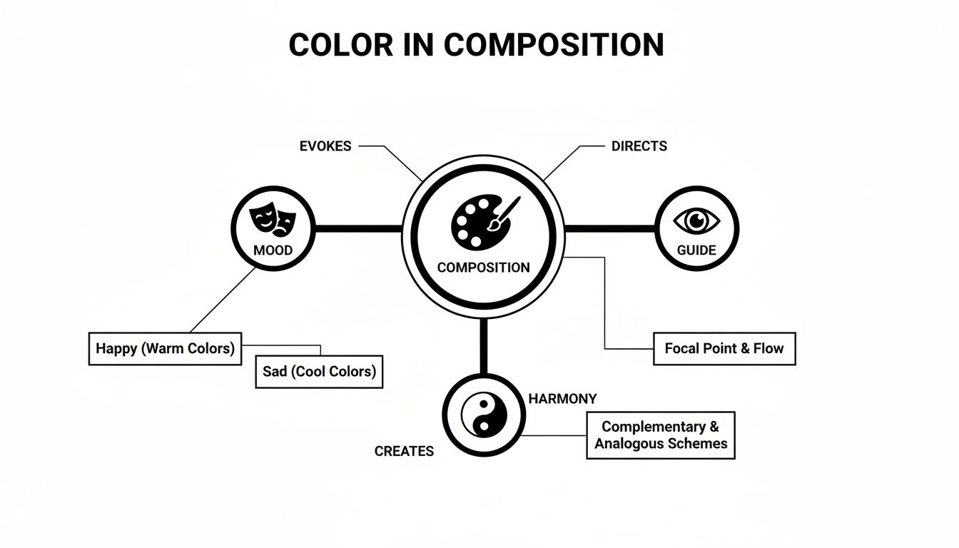
As you can see, harmony is the bedrock. It supports the emotional feel of the piece and guides the viewer’s eye exactly where you want it to go.
Finding Harmony in Color Relationships
Once you get the hang of the basic layout, you can start playing with proven "recipes" known as color harmonies. These are tried-and-true combinations that artists have used for centuries to create a specific mood. It’s how a well-designed paint-by-numbers kit can transform a busy photo into a cohesive, beautiful painting.
Here are a few of the most popular harmonies you'll encounter:
- Complementary Colors: These are total opposites on the color wheel, like red and green or blue and orange. When you put them side-by-side, they make each other pop with incredible vibrancy. It's a fantastic way to create a powerful focal point that demands attention.
- Analogous Colors: These are friendly neighbors on the color wheel—think blue, blue-green, and green. Using them together creates a serene, unified feeling that’s naturally calming. It’s perfect for capturing a peaceful forest or a tranquil ocean scene.
- Triadic Colors: This one uses three colors spaced evenly apart, like red, yellow, and blue. This combination is energetic, playful, and balanced all at once. It’s full of life without feeling chaotic.
The color wheel principles, first mapped by Isaac Newton in 1666, are now the foundation for over 80% of balanced modern designs. These concepts are especially powerful in the paint-by-numbers world, which is part of a global paints industry projected to hit $229.9 billion by 2031. We design our custom kits with these harmonies in mind, simplifying your photo into a palette that reduces choice paralysis for an estimated 85% of users.
Applying Harmony to Your Art
Understanding these relationships gives you an incredible advantage. For instance, the power of complementary colors is on full display in professional interior design. Just look at these inspiring pink and green living room design ideas to see how pros use color theory to build a specific atmosphere.
When you upload a photo for one of our custom kits, our system does something similar. It analyzes the color relationships in your image to identify the dominant harmony—whether it's the calming analogous blues of a beach scene or the vibrant complementary colors of a flower. Then, it creates a numbered palette designed to capture that exact same feeling on your canvas.
If you’re just starting your artistic journey, getting a feel for these ideas is the best first step you can take. To explore this topic further, check out our complete guide to color theory for beginners.
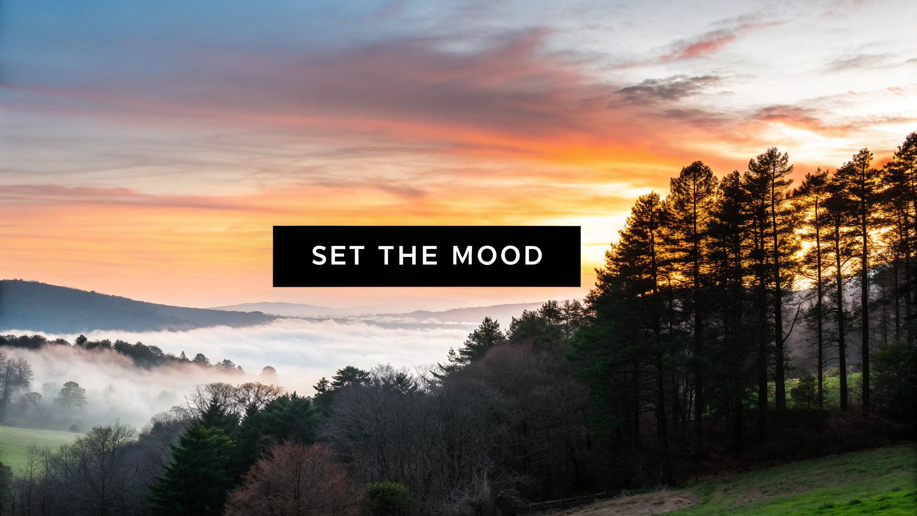
Creating Mood and Emotion with Color
Color is the emotional heartbeat of your painting. It's so much more than just filling in the lines; it whispers a story to the viewer, setting the entire mood before they even notice a single detail. Once you understand a few key principles, you'll see how the colors in your custom paint-by-numbers kit are expertly chosen to capture the unique feeling of your original photo.
Artists have known about the emotional power of color for centuries, and now it's being rediscovered through hobbies like paint-by-numbers. This isn't just a niche trend; it's part of a global art paint market expected to grow from USD 3.09 billion to USD 5.31 billion by 2035.
When you choose a kit with more colors—like the 20 to 100 options we offer—you get a much more precise emotional translation of your photo. It's a practice that's even been shown to reduce stress by up to 40%.
The Power of Color Temperature
One of the simplest yet most effective tools for setting a mood is color temperature. Think of it as the thermostat for your painting's atmosphere.
- Warm Colors: Reds, oranges, and yellows are bursting with energy. They feel passionate, exciting, and intimate. These colors tend to jump forward, grabbing your attention. A photo of a fiery sunset, for instance, will be dominated by these hues in its paint-by-numbers version to capture that vibrant, warm glow.
- Cool Colors: Blues, greens, and purples create a sense of calm, serenity, and quiet thought. They tend to recede into the background, giving a feeling of space and peace. This is why a misty forest scene will rely heavily on these colors to convey its tranquil mood.
A simple shift from a cool blue background to a warm yellow one can completely transform a portrait from contemplative to joyful. This is a core element of how color in composition tells your story.
You can learn more about warm and cool colors in our dedicated guide to see how this principle plays out in different artistic scenarios.
Using Value and Saturation for Impact
Beyond temperature, you have two other dials that control your painting's emotional volume: value and saturation.
Value is simply how light or dark a color is. A composition with high contrast—very bright areas right next to very dark ones—creates drama and excitement. On the other hand, a piece with low contrast, where the values are all similar, feels much softer and more subtle.
Saturation refers to the intensity or purity of a color. Think of it as turning up the color dial. Highly saturated, vibrant colors feel energetic and bold, perfect for a lively party scene. Desaturated or muted tones feel more nostalgic and gentle, sometimes even somber, which is why they work so well for a vintage-style portrait or a foggy landscape. Your kit is designed to balance all these elements perfectly, ensuring your final piece has the emotional depth you're looking for.
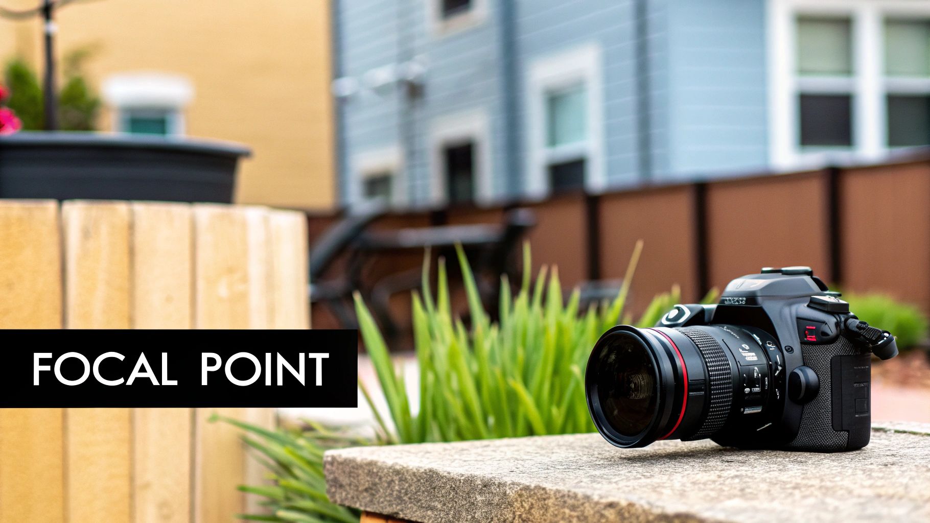
Guiding the Viewer with Focal Points
A good painting doesn't just happen. It's a carefully crafted experience, and your job as the artist is to guide the viewer's eye on a specific journey. The best way to do that? Using color in composition to create a focal point.
Imagine a spotlight hitting the main actor on a dark stage. It tells you exactly where to look. In art, we create that same effect with something called color dominance.
This is simply where one color, or a small group of related colors, steals the show. Think of a single, vibrant red poppy in a field of muted green grass. Your eye goes straight to it. That poppy is the hero of the story.
This is exactly how a busy photograph gets transformed into a powerful painting. When you upload a photo for a custom paint-by-numbers kit, the software looks for these natural focal points.
It then intelligently simplifies the colors in the background, making sure the paints for your main subject are the brightest or have the sharpest contrast. This is how the final artwork ends up having a clear, impactful focus that really draws you in.
Creating Dominance Through Contrast
One of the most powerful ways to create a focal point is with contrast. And I don't just mean light against dark. We can create contrast with color temperature and saturation, too. An artist might place a warm, fiery orange next to a cool, muted blue to make their subject leap off the canvas.
Here are a few classic techniques for using color to make a subject pop:
- Saturation Contrast: Think of a pure, intense color surrounded by duller, grayer tones. A bright yellow raincoat in a misty, gray city is a perfect example.
- Temperature Contrast: This is when a warm color like red or yellow is used to grab your attention in a scene dominated by cool colors like blues and greens.
- Value Contrast: The classic light-versus-dark. Nothing creates a stronger focal point than a bright white sailboat on a deep, dark sea.
The idea of color dominance has been central to art for centuries. Just look at Van Gogh’s 'Starry Night'—it’s a masterclass in it. The swirling blues and yellows command 65% of the canvas. Art historians have found this deliberate imbalance can heighten a painting's emotional impact by as much as 50% for viewers.
Applying Focal Points to Your Project
Once you understand how color directs the eye, you can really start to appreciate the design of your paint-by-numbers kit. When you open your box and see a pot of brilliant, bold paint, you'll know it's meant for a key element in the composition—the face in a portrait or the main flower in a bouquet.
This is a core part of the artistic process. The rich pigments of oil paints, which hold a 38.21% share of the art and craft paints market in 2024, are perfect for this. When our customers choose a kit with 40 or more paints, they unlock the ability to create compositions with incredibly bold, dominant colors—ideal for making a wedding photo or a cherished pet truly shine. You can learn more about these fascinating market trends and insights.
By following the numbers on the canvas, you're not just filling in shapes. You're actively participating in a time-honored artistic strategy, ensuring your finished piece has the professional, polished look of a well-planned composition.
Putting Color Theory to Work on Your Painting Kit
Alright, let's connect the dots between the theory and the canvas. It's one thing to understand color harmony and focal points, but the real magic happens when you apply that knowledge to your custom paint-by-numbers kit. These tips will help you turn your favorite photo into a piece of art you’ll be proud to hang up.
The whole process kicks off long before you dip a brush in paint. Choosing the right photo is probably the single most important decision you'll make. You want to find a picture with a clear, well-defined subject and good contrast. A photo where your main subject really pops against the background will always translate better into a painting.
Think of the numbers on your canvas as a direct roadmap for value and saturation. The darkest numbers? Those are your deep shadows. The lightest ones are your bright highlights. Following the guide is key because it’s been carefully designed to capture the mood and visual flow of the original image.
From Photo to Paint Palette
When you unbox your kit, you’ll see how the countless colors in your photograph have been distilled into a clean, simple palette. Each numbered paint pot is a piece of the puzzle, chosen specifically to build the overall color in composition. That vibrant red is probably for the flower at the center, while those five different shades of green are there to create a lush, deep background.
This simplification is what makes the final piece feel so balanced and intentional. It’s important to trust the process, because the palette has been put together to:
- Create a Focal Point: The boldest, most saturated colors are almost always for your main subject. This is what naturally pulls your eye right where it needs to go.
- Build Harmony: The colors are chosen to work together, often using a complementary or analogous scheme to make the final painting feel cohesive and unified.
- Establish Depth: The range of light and dark values is what gives your painting that sense of three-dimensional space and realism.
Following the numbered guide is like having an artist at your side who has already mapped out the perfect composition. Every number you paint is another step in a professionally designed color strategy.
Simple Tricks to Elevate Your Artwork
Sticking to the numbers will give you a great result, no question. But if you want to add a little something extra—a more professional touch—there are a few easy techniques you can use to make your painting feel more dynamic. One of the best is blending.
Don't be afraid to soften the lines between two different colors. While the paint is still wet on the canvas, just take a clean, slightly damp brush and gently blur the edge where two colors meet. This is perfect for creating smooth transitions in skies, water, or the soft folds of fabric.
Here’s a quick rundown on how to do it:
- Paint Both Areas: Start by filling in two neighboring numbered sections with their assigned colors.
- Clean Your Brush: Quickly wipe your brush, then get it just a little damp. You don't want it dripping wet.
- Gently Feather the Edge: Use the tip of your damp brush to lightly pull the colors back and forth into each other right along the border.
- Move Fast: Acrylic paints dry in a flash, so you need to do this while both colors are still wet.
Finally, think about adding a few finishing touches after the main painting is dry. A tiny dot of your brightest white on an eye or a shiny surface can create a stunning highlight. In the same way, adding a dab of your darkest color to a shadow area can push the contrast and make the whole painting pop. It’s these small details that can take your artwork from good to great.
Your Top Questions About Color in Painting, Answered
As you start putting these color ideas into practice, you're bound to have some questions. It’s one thing to understand a concept like color harmony, but it's another thing entirely to make it work on your canvas. Let's tackle some of the most common questions artists ask.
Think of this as your personal FAQ. We'll clear up a few things and give you some practical tips to help you get the most out of your painting experience.
What Is the Most Important Rule of Color in Composition?
If I had to boil it all down to one single rule, it would be this: create a clear focal point. The whole point of using color strategically is to tell the viewer's eye exactly where to look first. You can do this with a splash of a contrasting color or by making your subject the most vibrant, saturated part of the entire scene.
This is something your custom paint-by-numbers kit is already designed to do. We've built the software to automatically assign the boldest, most eye-catching colors to the key elements of your photo, giving you a strong composition right out of the box.
My Photo Has So Many Colors. How Will That Look as a Painting?
That's a great question and something we handle every day. When you upload your photo, our system intelligently simplifies the color palette based on whether you choose a 24, 36, or 48 paint kit. It’s smart enough to merge similar shades and boost the most important colors, preserving the mood and focus of your original picture.
This process ensures your final canvas feels cohesive and beautiful, not overwhelming or chaotic.
A higher paint count will give you smoother, more subtle transitions between colors. But even a 24-color kit is expertly calibrated to capture the true spirit of your image.
How Can I Make My Finished Painting Colors More Vibrant?
Want to make your colors really pop? First, make sure you're applying a nice, thick layer of paint—enough to completely hide the numbers and lines on the canvas. If there's a particular area you want to draw attention to, don't be shy about going back over it with a second coat for an extra jolt of intensity.
After your painting is fully dry, the secret weapon is a gloss varnish. Applying a good varnish does more than just protect your work from dust; it dramatically deepens the dark tones and makes every color look richer and more saturated. It's the final touch that gives your piece that polished, gallery-ready look.
Can I Change the Colors in My Paint-by-Numbers Kit?
Of course! The kit provides a roadmap to a great-looking painting, but you're the artist here. If you want to experiment, you absolutely should. Swapping a cool blue background for a warm, sunny yellow can completely transform the feeling of a piece from calm and serene to bright and energetic.
A fun place to start is to switch a color with its direct complement on the color wheel (the one right across from it). This will create a really bold, high-contrast look. For a more subtle change, try swapping a color with one of its neighbors (an analogous color). It's your artwork, so have fun making it uniquely yours.
Ready to turn a cherished photo into your next masterpiece? At Custom Paint By Numbers, we help you create a personalized painting kit from any image you love. Start your creative journey today at paint-by-number.com!


