
Ever wonder how the brilliant colors on your phone screen seem to glow, while the paint on a canvas feels so rich and deep? It all comes down to the composition of color—the specific recipe used to create every single hue we see.
Think of it like cooking. You have two completely different kitchens: one for light and one for pigment. The first kitchen adds ingredients to create brightness, while the second subtracts them, leading to darkness.
Understanding the Two Worlds of Color
Every color you've ever seen falls into one of these two camps. It’s either created by a source that emits light, like a screen, or by a surface that reflects it, like a painted wall or a page in a book. This is the fundamental split in the world of color.
We can thank Sir Isaac Newton for first shedding light on this, quite literally. His famous prism experiments way back in 1666 proved that what we see as pure white light is actually a beautiful mashup of all the colors in the spectrum. This discovery became the foundation for how we understand and create color today.
To really get a handle on how your paint-by-number colors work, we need to look at how these two very different models operate.
Additive vs Subtractive Color Models
The first system, called additive color, is what powers your digital life. It’s used by any source that makes its own light, from your TV and computer monitor to your smartphone screen. The primary colors here are Red, Green, and Blue (RGB). When you mix them all together at full strength, you get pure white light.
The second system is subtractive color, and this is the world of physical objects. It applies to anything that absorbs and reflects light, like paint, ink, and fabric dyes. For painters, the traditional primaries are Red, Yellow, and Blue (RYB). For printers, it's a slightly different set: Cyan, Magenta, Yellow, and Black (CMYK). This is the system that dictates how your paint-by-number colors mix and layer on the canvas.
To dig deeper into how this applies to your art, take a look at our complete color theory for beginners guide.
Key Takeaway: Mixing additive colors (light) makes things brighter, eventually leading to white. Mixing subtractive colors (pigment) makes things darker, eventually creating a murky brown or black. This one simple difference is why a design on a screen can look so different when you try to paint it.
Additive vs Subtractive Color Models at a Glance
Here’s a quick table to help you keep these two concepts straight. It’s a handy reference for understanding why the colors on your reference photo (a screen) might not be a one-to-one match with the paints in your kit (pigments).
| Attribute | Additive Color (RGB) | Subtractive Color (CMYK/RYB) |
|---|---|---|
| How it Works | Starts with black and adds light | Starts with white and subtracts light |
| Primary Colors | Red, Green, Blue | Cyan, Magenta, Yellow (Print) / Red, Yellow, Blue (Paint) |
| Result of Mixing All | White | Black or a dark brown |
| Used In | Digital screens, monitors, TVs, projectors | Painting, printing, textiles, dyes |
| Gets Brighter/Darker? | Brighter | Darker |
Understanding this core distinction is the first major step toward mastering color, whether you're adjusting a digital photo or mixing the perfect shade of green for a leafy tree in your painting.
How Light and Pigment Create Color
To really get a handle on color, you first need to understand that it’s made in two fundamentally different ways. One way involves adding light, and the other involves taking it away. It’s like the difference between turning on colored spotlights in a dark theater versus mixing paint on a bright white canvas.
This simple infographic below lays it out beautifully, showing the two separate paths for light and pigment.
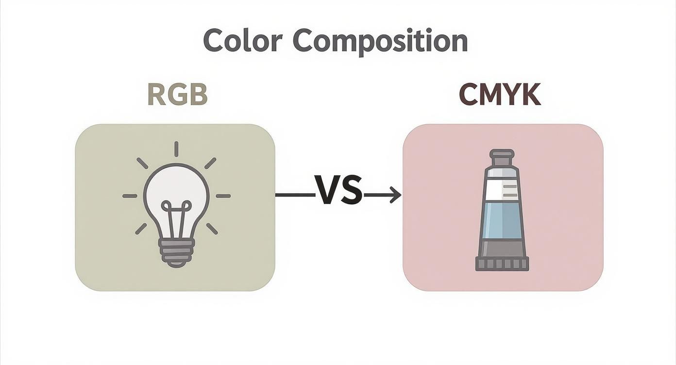
As you can see, light (RGB) builds up to pure white, while pigment (CMYK) works its way toward black. They’re complete opposites.
The Additive Model: Creating with Light
The additive color system is what brings every digital screen to life. It starts with a black background—think of a powered-off screen—and then adds colored light to build an image. The primary colors here are Red, Green, and Blue, which you’ll often see abbreviated as RGB.
Picture three spotlights, one of each primary color, pointed at a dark stage. Where the red and green beams cross, you get a vibrant yellow. If you crank all three lights up to full power and overlap them, they create pure white light. This is why colors on your phone or TV feel so brilliant; they are literally made of light.
The Subtractive Model: Creating with Pigment
On the flip side, the subtractive color system is the one that rules the physical world of paint, ink, and dye. This process starts with a white surface, like a canvas, and uses pigments that absorb—or "subtract"—certain wavelengths of light. The color you see is just the light that’s left over, bouncing back to your eye.
For painters, the traditional primary colors are Red, Yellow, and Blue (RYB). When you mix these paints, you’re creating a blend of pigments that subtracts more and more light from the spectrum. Mix red and yellow paint, for example, and the resulting orange is what’s left after the pigments have absorbed everything else. This is also why mixing all your paints together creates a muddy brown or black. You've subtracted almost all the light.
Why Can't I Paint Neon Colors? This question gets right to the heart of the matter. That glowing, electric green on your screen is made by light being directly beamed at your eyes. Paint, however, can only reflect the light that’s already in the room. It can’t generate its own glow, making it impossible to truly replicate that screen-level intensity on a canvas.
Grasping this difference is the secret to successfully turning a digital photo into a real-life painting. You aren't just matching colors—you're translating them from the language of additive light into the language of subtractive pigment. It's why a paint-by-number kit’s palette is so carefully chosen; it’s designed to bridge the gap between those two very different worlds.
Translating Digital Colors to Your Canvas
Have you ever picked out a gorgeous photo, full of vibrant colors, only to find the paint version looks a little… flat? It’s a super common problem, and it’s not your fault. It happens because you're moving a color from one world to another—from the world of light (your screen) to the world of pigment (your paint).
Think about it this way: your screen makes color by shooting light directly into your eyes. But paint works completely differently. It absorbs some light and reflects the rest back. That fundamental difference is why that glowing, electric green on your phone is physically impossible to recreate with a tube of paint. Each system has its own unique range of colors it can produce, which is a concept called a gamut.
The RGB gamut of a screen is huge, especially when it comes to those super-bright, almost fluorescent colors. The gamut for paint is naturally more limited, but it's fantastic at creating rich, deep, earthy tones. The real trick, for any artist or for the people designing a custom paint-by-number kit, is to bridge that "gamut gap."
Choosing the Right Photo for Painting
The secret to a great result starts with picking a photo that will actually look good as a painting. Not every picture is a good fit. When you're browsing your camera roll, try to think less like a photographer and more like a painter.
Here are a few things to keep in mind when picking your image:
- Look for Strong Color Blocks: Pictures with clear, defined shapes of color are much easier to map onto a numbered canvas. Photos with tons of soft, blurry gradients can end up looking messy.
- Dodge the Neons: That electric blue sky or that glowing pink sign in a photo will lose its punch when turned into paint. Look for photos with rich, natural colors that already feel like they could be paint.
- Good Contrast is Key: A strong difference between the light and dark parts of your photo will give your finished painting depth and make it pop. If a picture is too dark or looks washed out, the painting will likely feel flat.
- Watch the Detail Level: A photo with a million tiny, complicated details can be a nightmare to paint. Often, a simpler composition with bigger blocks of color makes for a much more striking—and enjoyable—painting experience.
Pro Tip: Before you finalize your photo, play with a "posterize" filter on a free photo editing app. This filter simplifies the colors in an image, which gives you a fantastic preview of how it might look as a paint-by-number canvas.
The Art of the Paint-by-Number Palette
This is where a quality Custom Paint By Numbers kit really makes a difference. The software and designers behind these kits are masters at taking your photo and translating its color information. They don't just randomly pick colors; they intelligently map the millions of pixels from your image into a handful of paint pots that will work together beautifully.
It’s less of a direct conversion and more of an artistic interpretation. The system figures out the most important colors, simplifies the tricky gradients, and builds a balanced palette that captures the true feeling of your original picture.
It’s a clever mix of technology and artistry, all designed to make sure your painting is a beautiful tribute to your memory, perfectly suited for the paint you’ll be using. This kind of careful color choice is so important. In fact, research shows that 16% of consumers notice a brand's color first, and nearly 50% have picked one product over another based on color alone. You can learn more about how color psychology impacts choices at Adobe.com.
Practical Techniques for Mixing Your Own Colors
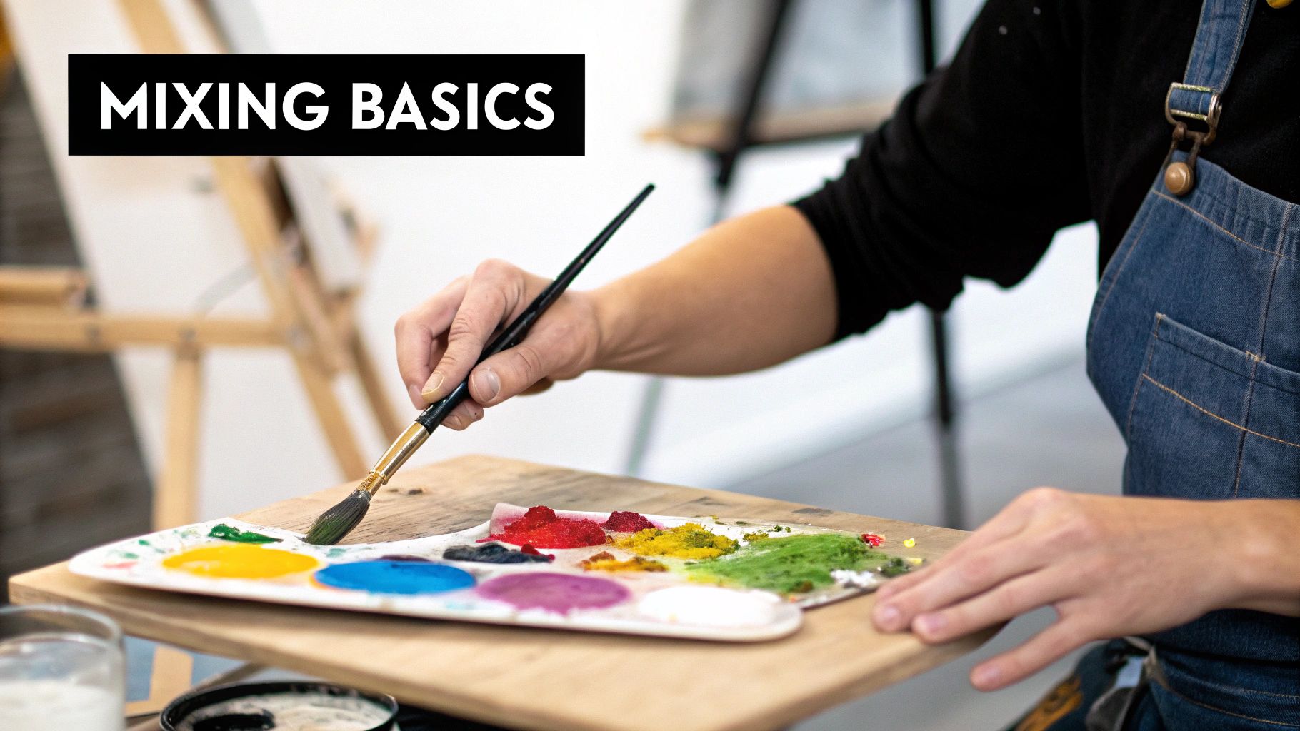
Alright, this is where the real fun begins. Moving from the "why" to the "how" is the best part of painting. It's one thing to understand color theory, but it’s a whole different feeling to create that perfect shade with your own hands.
This is your starting point for mixing beautiful, custom colors with confidence. Forget being stuck with the colors straight from the tube—this is where you open up a world of endless possibilities.
The bedrock of nearly every color you'll ever mix is the trio of subtractive primaries: red, yellow, and blue. By learning to combine these in different amounts, you unlock an incredible spectrum of hues.
Creating Secondary and Tertiary Colors
Let's start with the basics. Secondary colors are what you get when you mix two primary colors together. These are the simple recipes every artist should know by heart.
- Orange: Mix equal parts red and yellow. Want a warmer, sunnier orange? Add a bit more yellow. For a deeper, burnt orange, just add a touch more red.
- Green: Mix equal parts blue and yellow. A vibrant, leafy green needs a little extra yellow, while a deep forest green will lean more on the blue.
- Violet (Purple): Mix equal parts red and blue. Playing with the ratio here is key—you can create anything from a reddish magenta to a cool, deep indigo.
Tertiary colors are the next logical step. You make these by mixing a primary color with a secondary color right next to it on the wheel (like red + orange or blue + green). This is how you create all those wonderfully nuanced shades like teal, amber, and chartreuse. For a deeper dive, our comprehensive acrylic paint mixing guide has you covered.
The Power of Neutrals: To create realistic colors you see in nature—earthy browns, soft grays, believable skin tones—you'll need to mix all three primary colors. A great trick is to start with a base of orange and then slowly mix in a tiny amount of blue. This "neutralizes" the color, toning down its intensity for a much more natural look.
Mastering Tints and Shades
Once you’ve mixed a color you love, you can change it dramatically by adjusting its lightness or darkness. This is a crucial skill for creating depth and making your paintings pop.
- A tint is what you get when you add white to a color, making it lighter and more pastel.
- A shade is created by adding black to a color, which makes it darker.
A quick word of caution: use black very, very sparingly! Adding too much black can make your colors look flat and muddy. A better trick for creating a dark, rich shade is to mix in a tiny bit of the color's complement (the one opposite it on the color wheel). For instance, adding a touch of red to your green will create a much deeper, more natural-looking shadow than just adding black.
The Art of Glazing
One of the most powerful—and my personal favorite—techniques for working with color is glazing. This is where you apply a super thin, transparent layer of one color over another color that has already dried.
Instead of mixing paints on the palette, you're mixing them optically right on the canvas. A thin glaze of blue over a layer of yellow, for example, creates a luminous, glowing green that you simply can't get by mixing them directly. It’s a fantastic way to add incredible depth and richness to your work.
Understanding how colors interact isn't just for canvas, either. The same principles are vital when working with other materials, and you can see how they apply in areas like dyeing furniture fabric. Ultimately, these techniques empower you to truly compose with color, not just copy it.
Using Color to Create Mood and Depth
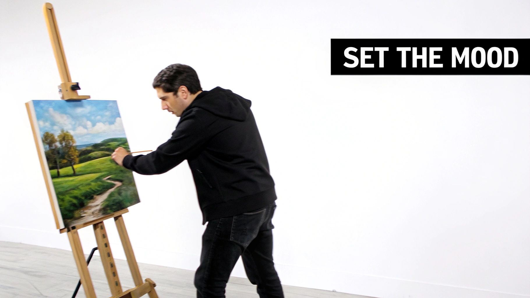
Okay, so we've covered the basics of mixing pigments. Now we get to shift from the technical 'how' to the much more exciting artistic 'why' of color. Color isn't just stuff you put on a canvas; it's one of the most powerful tools an artist has for telling a story.
Think about it: every color carries a certain emotional weight. A painting of a peaceful meadow is probably full of soft greens, gentle blues, and earthy tones. Now, picture a scene of intense action or drama—you’re likely imagining bold reds, fiery oranges, and stark blacks. That’s color psychology at work, and it's a language we all instinctively understand.
Even the paint-by-number kit sitting on your table uses a carefully chosen color palette to build a specific atmosphere. A kit for a bustling city at night will have a completely different set of paints than one for a quiet forest scene, all designed to capture the feeling of that place.
Creating Depth with Color Temperature
One of the oldest and most effective tricks in the artist’s handbook for creating a 3D feel on a flat surface is playing with color temperature. It’s a beautifully simple concept.
Warm colors—your reds, oranges, and yellows—have a lot of energy. They feel like they’re popping out of the canvas, advancing toward you. It’s why a bright yellow flower in a field seems to grab your eye first.
On the flip side, cool colors—like blues, greens, and purples—are calmer and seem to recede into the distance. This is exactly why artists paint faraway mountains in hazy shades of blue or purple. It instantly creates an illusion of space and depth.
Simple Exercise: On your next painting, try using warmer tones for things in the foreground and cooler tones for the background. You'll be amazed at how this simple tweak immediately gives your work a more realistic and immersive feel.
Harmonious Color Schemes
To keep a painting from looking chaotic, artists often rely on color harmony. This just means using colors that have a pleasing relationship to one another on the color wheel. There are dozens of schemes, but a few are perfect for getting started.
- Complementary Colors: These are colors directly opposite each other on the color wheel, like red and green or blue and orange. When you put them side-by-side, they create a powerful contrast that makes both colors pop. Learn more at https://paint-by-number.com/blogs/learn-about-paint-by-numbers/what-are-complementary-colors-in-art.
- Analogous Colors: These colors are neighbors on the color wheel—think blue, blue-green, and green. Using them together creates a very calm, comfortable feeling that you see all the time in nature.
This deliberate use of color to set a mood goes way beyond the canvas, influencing everything from fashion to interior design. The 2025 global color trends, for example, are leaning heavily into nature-inspired palettes. Pantone's pick for 2025, 'Mocha Mousse,' is a warm, grounding brown that points to a bigger shift toward earthy tones.
If you're curious about how these ideas apply to your own home, check out this simple guide on how to choose paint colors for rooms. Once you start to grasp these concepts, you'll see color not just as something to fill in the lines, but as the very soul of a painting.
A Few Common Questions About Color
Once you start putting paint on a canvas, the theory of color composition suddenly gets very real. It's totally normal to run into a few snags as you go. Think of this section as a quick troubleshoot for those common "aha!" (or "uh-oh") moments.
Getting a feel for how paint actually behaves is just as crucial as knowing the color wheel. Here are some straight-up answers to the questions we hear all the time.
Why Does My Paint Look Different When It Dries?
This is probably the number one surprise for new painters. You lay down the perfect color, come back an hour later, and it looks completely different. This is called "color shift," and it happens for a few reasons.
Acrylics, the go-to paint for most paint-by-number kits, tend to dry a bit darker. The reason is simple: the wet paint contains a milky-white binder that turns clear as the water in it evaporates. Once it's clear, you're seeing the pure, more intense pigment underneath. Watercolors do the opposite—they often dry lighter as the water evaporates, leaving the pigment more spread out and less concentrated on the paper.
The easiest way to deal with color shift? Make a small test swatch. Just brush a little paint onto a scrap piece of paper or a hidden corner of your canvas and let it dry completely. This little trick shows you the true final color before you commit, so there are no surprises.
What Are Hue, Saturation, and Value?
These three terms are the DNA of color. Once you get a handle on them, you can mix and modify any color with confidence.
- Hue: This is just the basic, pure color. Think red, yellow, or blue. It's the color's family name.
- Saturation: This is all about intensity. A highly saturated color is rich and vibrant, like a fire engine red. A desaturated color is muted and grayish, like a faded barn red.
- Value: This is simply how light or dark a color is. Imagine adding white to make it lighter (a higher value) or black to make it darker (a lower value).
Playing with these three elements is how you create depth, mood, and realism in your paintings.
Can I Mix Paints from Different Brands?
Generally, yes. If you're using artist-grade acrylics, you can usually mix different brands without a problem since they're built on a similar chemical foundation. But there are a couple of things to watch out for.
Different brands have different consistencies. One might be thick like butter, while another is fluid and inky. Mixing them can create some interesting textures, but it might not be what you were expecting. For the most predictable results, stick with artist-grade paints. Try to avoid mixing them with cheap craft paints, which have less pigment and different binders, leading to muddy, weak colors.
Ready to turn your favorite memories into a work of art? With Custom Paint By Numbers, you can transform any photo into a beautiful, easy-to-follow painting kit. Start creating your personalized masterpiece today at paint-by-number.com