
Working with analogous colors means you're painting with a family of hues that sit right next to each other on the color wheel. The result is almost always a serene and unified look. This technique is a cornerstone of color theory, really, because it copies the subtle color shifts you see in nature—think of a sunset bleeding from orange to red, or the layered greens of a forest canopy.
This natural harmony is what makes artwork using these palettes feel so cohesive and emotionally resonant.
Why Analogous Colors Are Your Secret Weapon for Harmony
Ever look at a painting and feel an immediate sense of calm and balance? It's not a coincidence. There’s a high probability the artist was using an analogous color scheme. It’s a deliberate choice based on how our eyes process color.
Because analogous colors share a common root—for instance, yellow-green, green, and blue-green all have a little bit of green in them—they just naturally flow together. You avoid any jarring contrasts, letting the viewer's eye glide smoothly across the entire painting.
This built-in unity is a fantastic tool for setting a specific mood. You can see it in the work of masters throughout art history.
- To Create Tranquility: A palette of blues, blue-greens, and purples can instantly evoke the cool quiet of a twilight sky or the depths of the ocean.
- To Radiate Warmth: Mixing red, red-orange, and orange captures the intense energy of a sunset or the cozy glow of a crackling fire.
- To Recreate Nature: Using greens, yellow-greens, and yellows is the perfect recipe for a lush landscape that feels organic and alive.
The Science Behind That "Ahhh" Feeling
The reason these schemes are so effective is simple: they're easy on the eyes. Our brains don't have to work overtime to figure out the color relationships. It just feels right.
This isn't a new trick. Analogous colors have been a staple of artistic harmony for centuries. Just look at how Georgia O’Keeffe used reds, purples, and blues to create such peaceful moments in her work 'Lake George Reflection.' To this day, it’s a foundational concept taught in art schools for its powerful emotional impact.
You can dive deeper into these core concepts in our complete guide on color theory for beginners.
To help you get started, here’s a quick-reference table that connects common analogous palettes to the feelings they often inspire.
Common Analogous Color Palettes and Moods
| Color Family (Example) | Dominant Color | Supporting Colors | Common Mood and Feeling |
|---|---|---|---|
| Warm Sunset | Orange | Red-Orange, Yellow-Orange | Energetic, Warm, Passionate, Inviting |
| Cool Forest | Green | Blue-Green, Yellow-Green | Calm, Natural, Peaceful, Grounded |
| Twilight Sky | Blue | Blue-Violet, Blue-Green | Serene, Contemplative, Mysterious, Cool |
| Autumn Hues | Red | Red-Orange, Red-Violet | Rich, Cozy, Earthy, Nostalgic |
This table is just a starting point, of course. The real fun begins when you start experimenting with your own combinations to tell your unique story.
The magic of an analogous palette is its ability to create depth and form without sacrificing unity. You can define shadows and highlights using subtle shifts in hue and value, resulting in a sophisticated composition that feels complete and intentional.
This principle isn’t just for painting, either. It’s a core concept in all visual arts. To see how these ideas play out in a different medium, learning about photo color grading can offer some fascinating insights.
By understanding why these neighboring colors feel so good together, you gain incredible control over the emotional narrative of your art.
Choosing Your Ideal Analogous Color Palette
Moving from color theory to actually putting paint on a canvas starts with making a few key decisions. Before you even think about mixing, your first job is to build a palette that tells the story you want your painting to tell. The best way to start is by picking out the main, most obvious color of your subject. This is your anchor.
Think of it as the "local color" of whatever you're painting. If it's a lemon, your dominant color is yellow. Easy. A quiet ocean scene? It’s probably a particular blue. That single hue will ground your entire piece and make all the other color choices much simpler.
Once you have your anchor, look at the color wheel and pick two to four colors sitting right next to it. The trick here is to be selective. Grabbing too many, even if they're neighbors, can dilute the harmonious effect you're going for. The goal is unity, not a chaotic rainbow.
Define the Mood and Emotion
This is where the real artistry begins. The neighboring colors you choose will set the entire emotional tone of your painting. You're not just matching colors anymore; you're painting with feeling. What do you want the viewer to feel?
- Want a cool, serene landscape? If your main color is green, pulling in blue-green and blue will give you that peaceful, shady forest vibe.
- Going for something vibrant and full of energy? Start with red as your anchor, then add red-orange and orange. You’ll get a fiery, passionate feel that’s perfect for a dramatic sunset.
- Painting a soft, gentle portrait? A peachy orange base, supported by yellow-orange and red-orange, creates a wonderfully warm and inviting glow on skin.
This infographic breaks down that simple jump from a color choice to an emotional outcome.
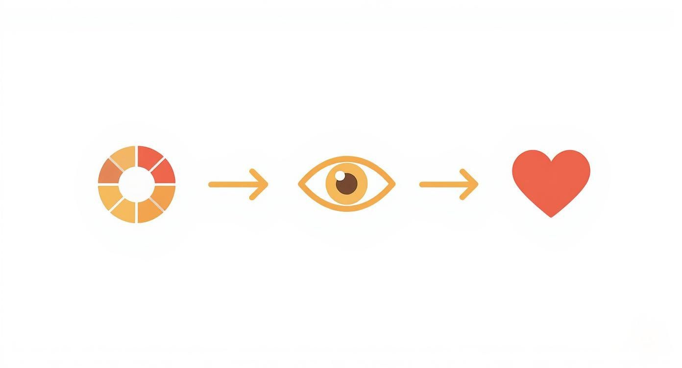
It’s a clear visual that shows how a technical choice on the color wheel directly creates a specific feeling for whoever looks at your art. It’s a surprisingly powerful way to control the narrative of your work.
Build Your Palette Intentionally
With your family of three to five colors selected, it’s time to get ready to mix. Knowing how to create subtle variations is what will give your painting real depth. You'll be making tints, tones, and shades of your chosen hues. If you feel a bit rusty on the fundamentals, our acrylic paint mixing guide is a fantastic place to brush up on those skills.
The most successful analogous paintings often come from a surprisingly limited palette: just three core colors, plus black and white to play with the values. This limitation actually sparks creativity and guarantees the final piece feels cohesive and restful to the eye.
Let's imagine a real-world example: painting autumn leaves. You might pick a rich red-orange as your dominant color. Your supporting analogous colors would naturally be red and orange. By mixing these three with different amounts of white for highlights (tints) and a bit of black or dark brown for shadows (shades), you can paint a complex, three-dimensional leaf without ever breaking that beautiful color harmony. This deliberate constraint is precisely what makes analogous schemes so powerful.
Mastering Value and Saturation for Depth
So you've picked out a beautiful analogous palette. That’s a fantastic start, but it's really only half the battle. If all your colors have the same lightness and intensity, your final painting can end up feeling disappointingly flat.
The real secret to making analogous colors come alive lies in mastering two key concepts: value and saturation.
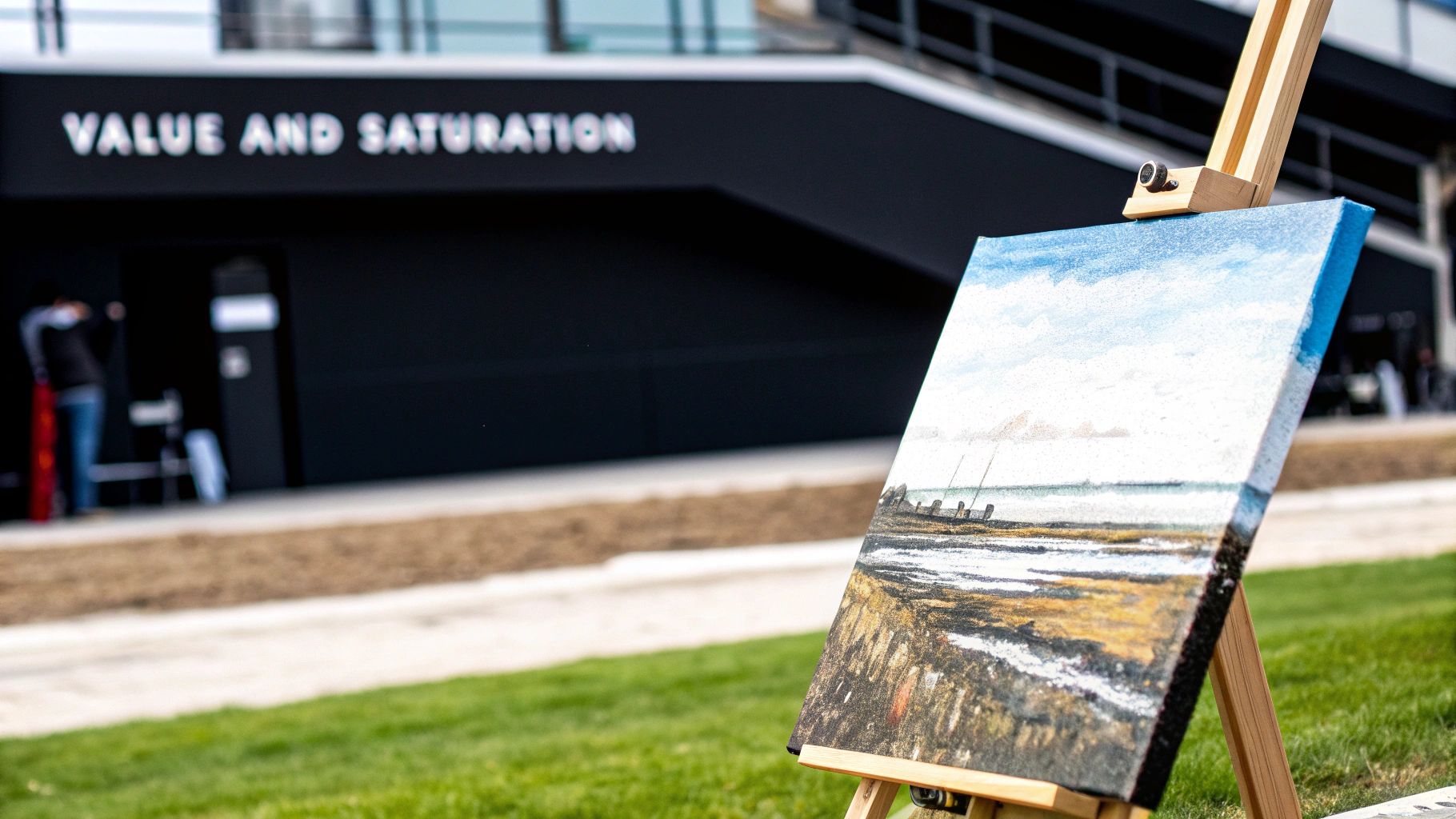
Value is simply how light or dark a color is. Saturation, on the other hand, is all about the color's intensity or purity. I like to think of value as the grayscale blueprint of a painting and saturation as the volume knob for your color. By intentionally playing with these two elements, you can guide the viewer’s eye, create a powerful sense of distance, and make your subject practically leap off the canvas.
A harmonious palette doesn't mean a boring one. In fact, those subtle shifts in value and saturation are precisely what give analogous color schemes their sophisticated and lifelike quality.
Using Saturation to Create a Focal Point
One of the most effective tricks in an artist's playbook is using saturation to direct attention. Our eyes are just naturally drawn to the most vibrant, intense colors in a scene. You can absolutely use this to your advantage.
Place your most saturated color right where you want the viewer to look first. Boom—that's your focal point.
Let's say you're painting a landscape with a yellow, yellow-green, and green palette. You could save your brightest, purest yellow for a patch of sun-drenched flowers in the foreground. The surrounding areas, like distant trees or background fields, should then be painted with more muted, desaturated versions of those greens and yellows. This contrast instantly tells the brain what’s important and what’s just supporting scenery.
Creating Depth with Value Shifts
Value does the real heavy lifting when it comes to creating the illusion of three-dimensional space. The basic rule here is that objects seem to recede as they get lighter and less detailed—a phenomenon you might have heard of called atmospheric perspective.
You can easily mimic this effect in your painting.
- For Backgrounds: Push things back by mixing your colors with a touch of white or a very light gray. This not only lightens the value but also desaturates the color, making it visually recede.
- For Midgrounds: Use your analogous colors in their mid-range values. These should be darker than the background but not as deep and rich as the foreground.
- For Foregrounds: This is where you bring out your darkest values and highest contrast. Doing this brings objects forward, giving them a real sense of weight and presence.
A powerful trick I use all the time is to take a black-and-white photo of my painting while it's in progress. It strips away the distraction of color and instantly shows you if you have enough value contrast to create that depth you're after.
How to Adjust Your Colors
Altering the value and saturation of your analogous colors is all about your mixing process. If you want to nail the fundamentals, our guide on how to blend paint colors offers some excellent tips to get you started.
The idea of systematically organizing color this way isn't new. It was formalized back in the early 1900s by Albert Henry Munsell, who created a system based on hue, value, and saturation (which he called chroma). His framework made it much easier for artists to control these variables.
Today, these skills are considered so essential that exercises in analogous colors make up 30–50% of introductory color theory modules in many art programs. You can read more about these foundational concepts in this deep dive into analogous colors at NumberArtist.com.
By thoughtfully managing both value and saturation, you can transform a simple group of neighboring hues into a dynamic tool for creating compelling, dimensional art.
Applying Your Palette to the Canvas
Okay, you’ve picked your analogous colors and you've got a handle on your values. Now for the fun part—actually getting that paint on the canvas. The real secret here isn't just slapping on color; it's about placing them strategically to build a composition that feels right and draws the eye.
A great little trick I've always leaned on is the 60-30-10 rule. It's a classic from the interior design world, but it works like a charm for painting with analogous colors. It's a simple recipe for creating balance and stopping one color from stealing the whole show.
Here’s how it breaks down:
- 60% Dominant Color: Think of this as your main character. It's the color that will cover the most ground and set the overall mood for the entire piece.
- 30% Secondary Color: This is your supporting actor. You'll use it about half as much as the dominant hue. Its job is to add a bit of interest and depth without fighting for the spotlight.
- 10% Accent Color: This is your little pop of spice. Use this color sparingly for the finishing touches and highlights that make the painting come alive.
Putting the 60-30-10 Rule into Practice
Let's make this real. Imagine you're painting a quiet coastal scene just as the sun is going down. You’ve chosen a blue, blue-violet, and violet palette.
That deep blue? That’s your dominant color. It’ll make up about 60% of your canvas, covering the expansive evening sky and the deep water. Instantly, you've established that peaceful, dusky vibe.
Next up is your secondary color, blue-violet, which will fill roughly 30% of the painting. You could work this into the shadows of distant cliffs or use it to define the deeper, cooler parts of the water. It adds dimension and helps bridge the other two colors.
Finally, your accent—that pure violet—is used for just 10% of the piece. A few dabs for the last glowing light on the horizon, or maybe some quick, energetic reflections on the water's surface. It's just enough to catch the viewer's eye.
This is a great visual example of how colors next to each other on the wheel just naturally work together.
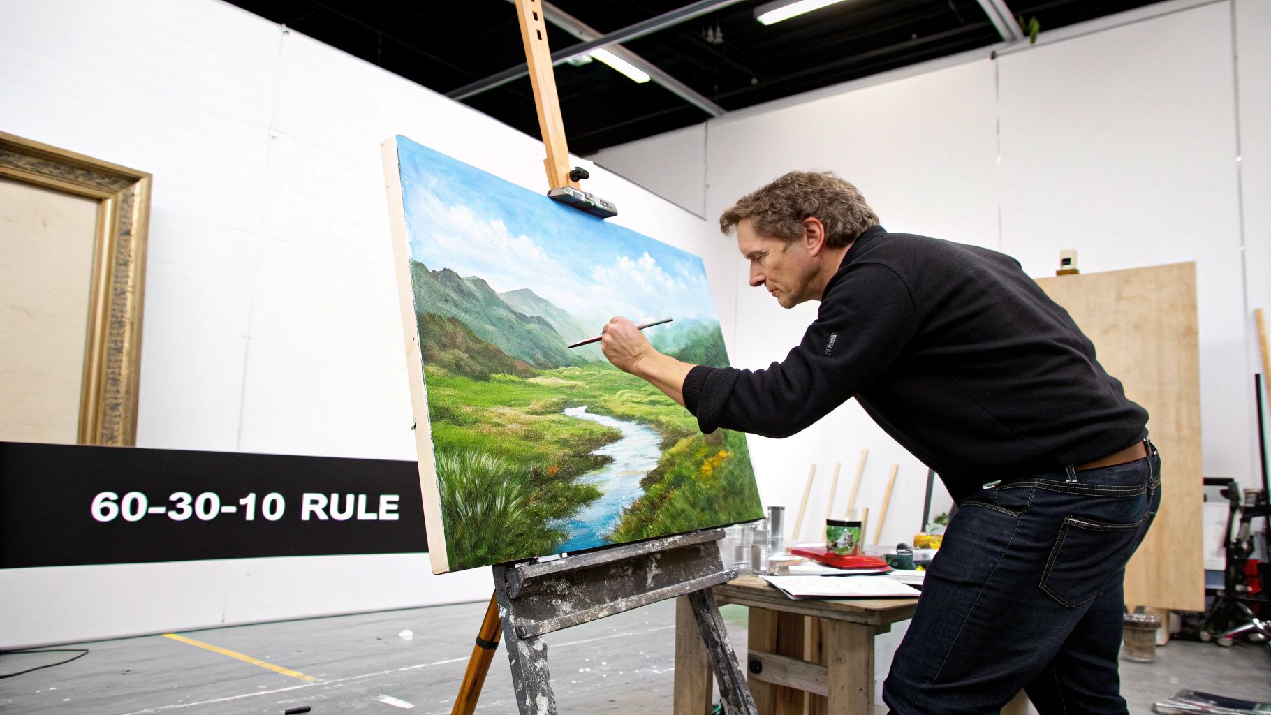
You can see how the colors flow so smoothly from one to the next. That’s the signature look of a well-executed analogous palette.
Achieving Seamless Blends and Transitions
The real magic of working with analogous colors comes from creating those soft, effortless transitions between them. Since they all share a common parent color, they blend together beautifully without turning into a muddy mess.
Try using a wet-on-wet technique. By working fresh paint into areas that are still wet, you let the colors bleed into each other naturally.
One of my favorite tricks is to pre-mix a transitional color on my palette. If I'm blending from yellow-green to green, I’ll mix a shade right in the middle. Having that intermediate step makes creating a smooth gradient on the canvas so much easier.
This little bit of prep work helps you avoid any harsh lines and really sells the unified feeling that makes these color schemes so pleasing to the eye. Even if you're not a traditional painter, you can find great, practical advice in other fields. For instance, guides on painting techniques for models often have fantastic tips on precision and detailing that can be surprisingly useful.
By balancing your colors and focusing on soft blending, you'll be able to bring your chosen palette to life in a way that feels both intentional and completely natural.
2. Avoiding Common Analogous Color Mistakes
Every artist, no matter how long they’ve been painting, runs into a few snags when trying something new. Working with analogous colors is mostly intuitive and a lot of fun, but a couple of common pitfalls can easily trip you up.
The good news? Knowing what to watch for is half the battle. Let's walk through the most frequent issues so you can keep your painting process smooth and frustration-free.
One of the biggest culprits is accidentally creating “mud.” This almost always happens from over-blending wet layers of paint right on the canvas. Since analogous colors are neighbors on the color wheel, they blend together like a dream. But mix them too much while wet, and they can merge into a dull, brownish mess, losing all their individual personality.
Another classic mistake I see all the time is a painting that just looks flat. This is a dead giveaway that there isn't enough value contrast—the range between your lightest lights and your darkest darks. A palette of blue, blue-green, and green is naturally harmonious. But if every one of those colors is a similar mid-tone, the final piece will have no depth or dimension. It just won't pop.
Keeping Your Colors Clean and Vibrant
So, how do you steer clear of that dreaded muddy palette? The honest answer is patience. You have to let your layers dry, or at least get tacky to the touch, before adding the next color. This simple discipline prevents the colors from bleeding into each other when you don't want them to. This is especially true for fast-drying acrylics, but it's just as vital for oil painters to practice.
It sounds almost too simple, but keeping your brushes clean between colors is also a game-changer. A brush that still has a little blue-violet pigment hiding in its bristles will absolutely dull a fresh, bright blue you're about to lay down.
Here’s a little trick I swear by: dedicate separate brushes to each main color in your analogous scheme. It might seem like a small thing, but this habit can dramatically improve the crispness of your final painting. It keeps each hue pure right up until the moment you decide to blend them.
Making Sure Your Painting Has Depth
To solve the flatness problem, you have to start thinking in terms of value from the very beginning. Before you even mix your first color, have a plan for where your lightest lights and darkest darks will live in the composition.
A fantastic way to check your work as you go is to pull out your phone, snap a quick photo of your painting, and turn on the black-and-white filter.
This trick strips away the distraction of color and instantly tells you if your painting has a strong value structure. If the whole thing just dissolves into a single shade of gray, you know you need to push your highlights and deepen your shadows. This is absolutely critical for giving a piece with analogous colors that compelling, three-dimensional look.
Troubleshooting Common Analogous Color Issues
Even with the best intentions, you might run into some tricky spots. Don't worry, it happens to all of us! Here’s a quick-reference table to help you diagnose and fix the most common problems when they pop up.
| Common Problem | Why It Happens | Quick Solution |
|---|---|---|
| Muddy Colors | Over-blending wet paint on the canvas, or using dirty brushes. | Let layers dry before adding more paint; use separate brushes for each color. |
| Flat Appearance | Lack of sufficient contrast between light and dark values. | Plan your values; use a black-and-white photo to check for contrast. |
| Broken Harmony | Choosing colors that are too far apart on the color wheel. | Stick to 3-5 colors that are direct neighbors; pick one as dominant. |
Think of these challenges not as mistakes, but as learning opportunities. The more you work with analogous colors, the more you'll develop an instinct for what feels right and how to sidestep these issues before they even start.
Your Top Questions About Analogous Colors, Answered
Once artists start exploring analogous colors, a few common questions always seem to pop up. Getting these details right can be the difference between a good painting and a great one. Let's clear up some of the most frequent sticking points so you can paint with more confidence.
How Many Colors Should I Use?
This is probably the most-asked question, and for good reason. It's easy to get carried away.
My advice? Stick to three to five colors that sit right next to each other on the color wheel. A simple trio like yellow, yellow-green, and green is a foolproof starting point. It gives you just enough variety to create depth without things getting messy.
Once you go past five colors, you start to lose that beautiful, unified feeling. The colors get too far apart, and the whole point of that gentle, harmonious flow can get lost.
Can I Throw in a Complementary Color for Contrast?
Absolutely! This is a fantastic trick to make your painting more dynamic. When you do this, you're creating what's called an "analogous complementary" scheme. The bulk of your painting stays calm and cohesive, but you add a tiny splash of a contrasting color to create an instant focal point.
Imagine a peaceful landscape painted with blue, blue-green, and violet. Now, picture adding a single, bright dab of orange (blue's complement) for a distant flower or a reflection on the water. That small touch of contrast immediately grabs the eye and adds a jolt of energy without overwhelming the scene.
Do Black and White Count as Part of the Scheme?
Great question. Technically, no. Black and white are considered neutrals, so they aren't part of the analogous relationship itself. Think of them as essential supporting characters rather than the main stars.
You'll use them constantly to create your lights and darks, which is what gives your painting form and dimension.
- Tints: Add white to lighten your colors for highlights.
- Shades: Add black to darken your colors for shadows.
They don't disrupt the harmony of your chosen colors; they just give you the full range of values you need to make those colors truly sing.
Ready to turn your favorite memories into a beautiful, harmonious painting? At Custom Paint By Numbers, we make it easy to create a personalized kit from your own photos. You'll get everything you need to start your artistic journey. Transform your pictures into a masterpiece today.