

Welcome to the world of art! Here, two core ingredients—color and composition—hold the secret to turning any photo into a masterpiece.
Think of it like being a chef. Color provides all the rich, delicious flavors, while composition is the artful way you arrange the food on the plate. When you get both right, you create something truly special and satisfying.
The Art of Seeing Your World Differently
You don't need a fancy art degree to create something you're proud of. All it takes is a little shift in perspective—learning to see the world with an artist's eye. This guide is here to break down the big ideas behind every great image. We'll show you how to spot powerful uses of color and composition in your own photos.
Once you know what to look for, you can turn those principles into a stunning custom paint-by-number kit that tells your story. Our goal is to make these concepts feel simple and useful. We’ll skip the dry theory and give you real-world advice for picking, cropping, and transforming your favorite pictures into paintable art.
Think of this as learning a new visual language. It’s one that helps you see the beauty that’s already in your everyday moments and capture it on canvas. To see how these ideas play out in a bold, graphic style, check out the vibrant work in various Pop Art Comic collections.
Building Your Creative Confidence
Getting a handle on the fundamentals of art isn't about memorizing strict rules. It's about building your creative intuition. As you start to notice what makes a photo feel balanced or why certain color pairings pop, you'll feel more confident making your own artistic choices.
This journey will help you:
- See with an artist’s eye: Pinpoint the strong visual elements in your photos that will make for a great painting.
- Tell a better story: Learn how to arrange elements to guide a viewer’s gaze and create a specific mood.
- Create meaningful art: Turn personal memories into handcrafted pieces that are not only beautiful but also deeply you.
Understanding the fundamentals is crucial. You can learn more about the intricate relationship between color and spatial arrangement by exploring the composition of color in art in our detailed guide.
Speaking the Language of Color
Color is so much more than just a tube of paint. It’s a language, one that speaks directly to our emotions. That color wheel you might remember from art class? Think of it less like a textbook diagram and more like a cheat sheet for understanding the relationships happening in your photos. It’s the key to figuring out why some color combinations just feel right together, while others create a powerful, exciting contrast.
Understanding these relationships is the first step in turning a beloved photo into a beautiful painting. When you look at your favorite picture, you’re seeing millions of tiny shades, but they all boil down to a few core ideas. Once you get these, you’ll see your custom paint-by-number kit in a whole new light.
This map gives a great visual of how the two big pillars of art—color and composition—work together.
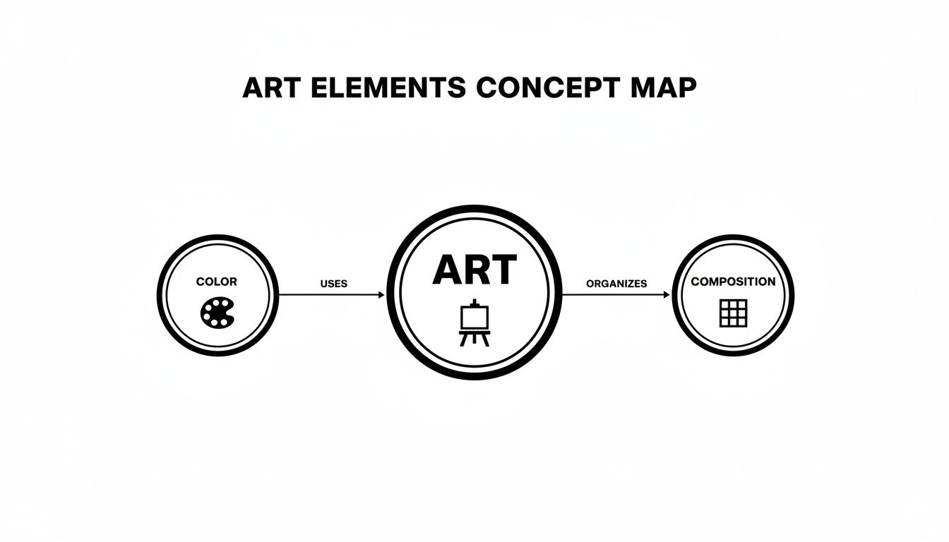
Essentially, color sets the emotional tone, while composition provides the structure. You can't have a great piece of art without both.
The Three Keys to Color
Every single color in your photo, no matter how complex it seems, can be broken down into three simple properties. Getting a feel for these will help you appreciate how your custom palette was created.
- Hue: This is just the pure color’s name—what we call red, blue, green, and so on. In your photo, this might be the dominant blues of a sky or the rich greens of a forest.
- Saturation: This is all about intensity. Think of a bright, vibrant red on a sports car versus the dull, muted red of an old brick. That’s saturation at play.
- Value: This simply means how light or dark a color is. It's like adding a little white or black to a pure hue to create all the different tints and shades you see.
These three elements work in tandem to create every color you see. Your paint-by-number kit is designed to cleverly simplify all those infinite variations into a manageable set of numbered paints, where each pot represents a specific combination of hue, saturation, and value.
Setting the Mood with Color Families
Colors also carry an emotional temperature. You have your warm colors—reds, oranges, and yellows—that feel energetic, happy, and cozy. They're perfect for capturing a warm sunset or a smiling portrait. Then you have cool colors like blues, greens, and purples, which tend to feel calm, peaceful, and even a bit mysterious. They’re ideal for serene landscapes or moody seascapes. The dominant color family in your photo really sets the entire mood for your finished painting.
This emotional connection is incredibly powerful. In fact, color psychology has a real impact on the market. Calming blue tones, for example, make up a surprising 15-20% of all paint-by-number kits. It’s no coincidence that this is happening while the Canvas Painting Kits market is booming, projected to hit $2.16 billion in 2025 as more people turn personal photos into art.
It's not just about temperature, though. Color relationships create harmony. Complementary colors, which sit opposite each other on the color wheel (like blue and orange), create a dynamic, eye-catching pop. You can dive deeper into this with our guide on what complementary colors are in art at https://paint-by-number.com/blogs/learn-about-paint-by-numbers/what-are-complementary-colors-in-art. On the flip side, analogous colors sit right next to each other, creating a much more soothing and unified feel. If you're really looking to master how colors play together, check out an expert's guide to the perfect color palette.
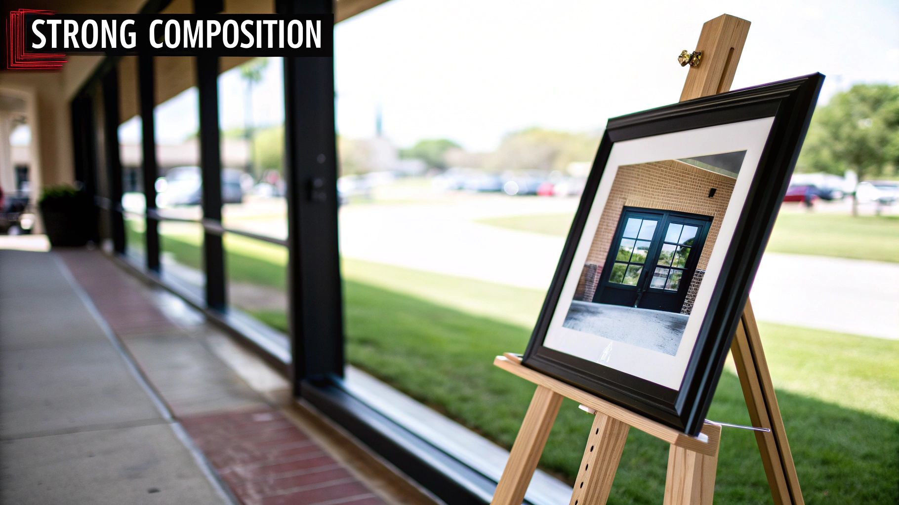
Framing Your Story with Strong Composition
If color gives your painting its mood, composition is the skeleton holding it all together. It’s the way you arrange everything in the frame to tell a clear and interesting visual story. Great composition isn't an accident; it's a deliberate choice that leads the viewer's eye and makes the whole image feel balanced and intentional.
Think of yourself as a film director framing a shot. The director doesn't just point and shoot; they carefully place people and objects to pull your focus and create a specific feeling. You can do the exact same thing when choosing and cropping your photo. This is how a simple snapshot becomes a canvas that feels thoughtfully designed.
This careful arrangement is the secret ingredient in photos that just feel right. It’s what turns a picture into a piece of art.
Finding Your Focal Point
Every great painting needs a main character. In art, we call this the focal point—it's the single most important part of the image, the spot where you want someone’s eyes to land first. This could be a person's smiling face, a single bright flower in a field, or a boat on the water.
Before settling on a photo, ask yourself: what’s the story here? A clear focal point acts as an anchor, keeping your painting from feeling chaotic or confusing. Once you identify this "hero" element, you can crop away distracting background noise and let your subject really shine.
A strong focal point acts like a visual magnet. It’s the starting point for the viewer's journey through your painting, giving them a clear path to follow and a story to connect with.
Timeless Principles for Powerful Images
For centuries, artists have leaned on a few reliable principles to build compositions that are both balanced and exciting. You don't need a degree in art history, but having a handle on these concepts will train your eye to spot photos with great potential.
Here are a few classic compositional tools to look for:
- The Rule of Thirds: This one is a game-changer. Imagine your photo has a tic-tac-toe grid drawn over it. Instead of sticking your main subject right in the center box, try placing it along one of the lines or, even better, where two lines intersect. This simple shift almost always creates a more dynamic and pleasing image.
- Leading Lines: Keep an eye out for natural lines within your photo that point toward your focal point. A winding road, a fence line, a riverbank, or even the curve of an arm can act as a subtle arrow, guiding the viewer's gaze right where you want it to go.
- Natural Frames: Use things inside the picture to create a frame around your subject. A doorway, an arch of trees, or a window can create a "frame within a frame" effect. This adds a wonderful sense of depth and draws even more attention to your focal point.
Keeping these ideas in mind as you choose and crop your photo builds a solid foundation for your painting. This careful partnership between color and composition is what will elevate your project from a fun craft into a piece of art you’re truly proud of.
How to Choose the Perfect Photo for Your Kit
Alright, let's put all that theory into practice. Choosing the right photo is, without a doubt, the most critical step in creating a custom paint-by-number kit. It's the decision that sets the entire tone for your project. A great photo will lead to a painting you're proud of, while a poor choice can quickly become a source of frustration.
So, what makes a "great" photo? It really comes down to strong fundamentals. Look for images with clear, balanced lighting and good contrast. Photos taken in bright, even light work best because they naturally create distinct areas of light and shadow, which are easy to map out.
Try to steer clear of anything that's blurry, grainy, or has harsh, blown-out highlights. Those kinds of details get muddy and confusing when they're broken down into tiny numbered sections.
Matching Photo Complexity with Paint Count
The number of paints in your kit directly controls the level of detail you can achieve. Think of it like a camera's resolution—more paints mean more detail and smoother transitions. The trick is to match your photo's natural complexity with the right paint count.
A simple, graphic portrait of your pet might look incredible with just 24 colors. But a sweeping landscape with a soft, blended sunset? That’s going to need a lot more shades to look right.
-
24 Paints: This is perfect for images with bold, graphic shapes and high contrast. Think pop art, simple illustrations, or portraits with dramatic, defined lighting.
-
36 Paints: This is the sweet spot for most photos. It's our most popular and versatile option, striking a great balance for family portraits, vacation photos, and general landscapes. You get enough color variety for detail without feeling overwhelmed.
-
48 Paints: Go for this count when your photo is loaded with subtle gradients and fine details. It's the best choice for things like complex sunsets, lush flower arrangements, and detailed architectural shots where every little shift in color matters.
To make it even simpler, here's a quick guide to help you decide.
Photo Selection and Paint Count Guide
Use this table to match your photo's style with the ideal number of paints for your custom kit.
| Photo Complexity | Ideal Photo Characteristics | Recommended Paint Count | Best For |
|---|---|---|---|
| Simple | Bold shapes, high contrast, flat color areas | 24 Paints | Pop art, graphic illustrations, simple pet portraits. |
| Standard | Good lighting, clear subject, moderate detail | 36 Paints | Family portraits, travel photos, most landscapes. |
| Complex | Subtle gradients, intricate details, soft focus | 48 Paints | Sunsets, detailed floral shots, complex scenery. |
By picking the right number of paints, you're setting yourself up for a finished piece that truly captures the spirit of your original image.
The goal isn't to create a perfect photorealistic copy, but a beautiful artistic interpretation. Selecting the right paint count is how you honor the photo's unique character. Our guide on turning photos into paint-by-number canvases has even more tips on this.
Cropping for a Stronger Composition
Don't just upload your photo as-is—use the crop tool! Cropping is a powerful way to instantly improve your composition. It lets you cut out distracting background noise and zero in on the part of the image that really matters.
Zoom in on your subject's face or the most important element. This simple step can transform a busy, cluttered snapshot into a focused and impactful work of art.
It's also worth noting how much the paints themselves have improved. Today’s kits almost exclusively use acrylics, which now hold over a 50% market preference for hobbyists. This shift is a big reason for the explosive growth in the craft market, which is part of the larger US Paint Manufacturing sector—an industry valued at $34.2 billion in 2025. Brands and artists alike prefer acrylics because they're durable, vibrant, and fade-resistant, making them perfect for art you want to hang on your wall for years. You can find more data on this trend over at growthmarketreports.com.
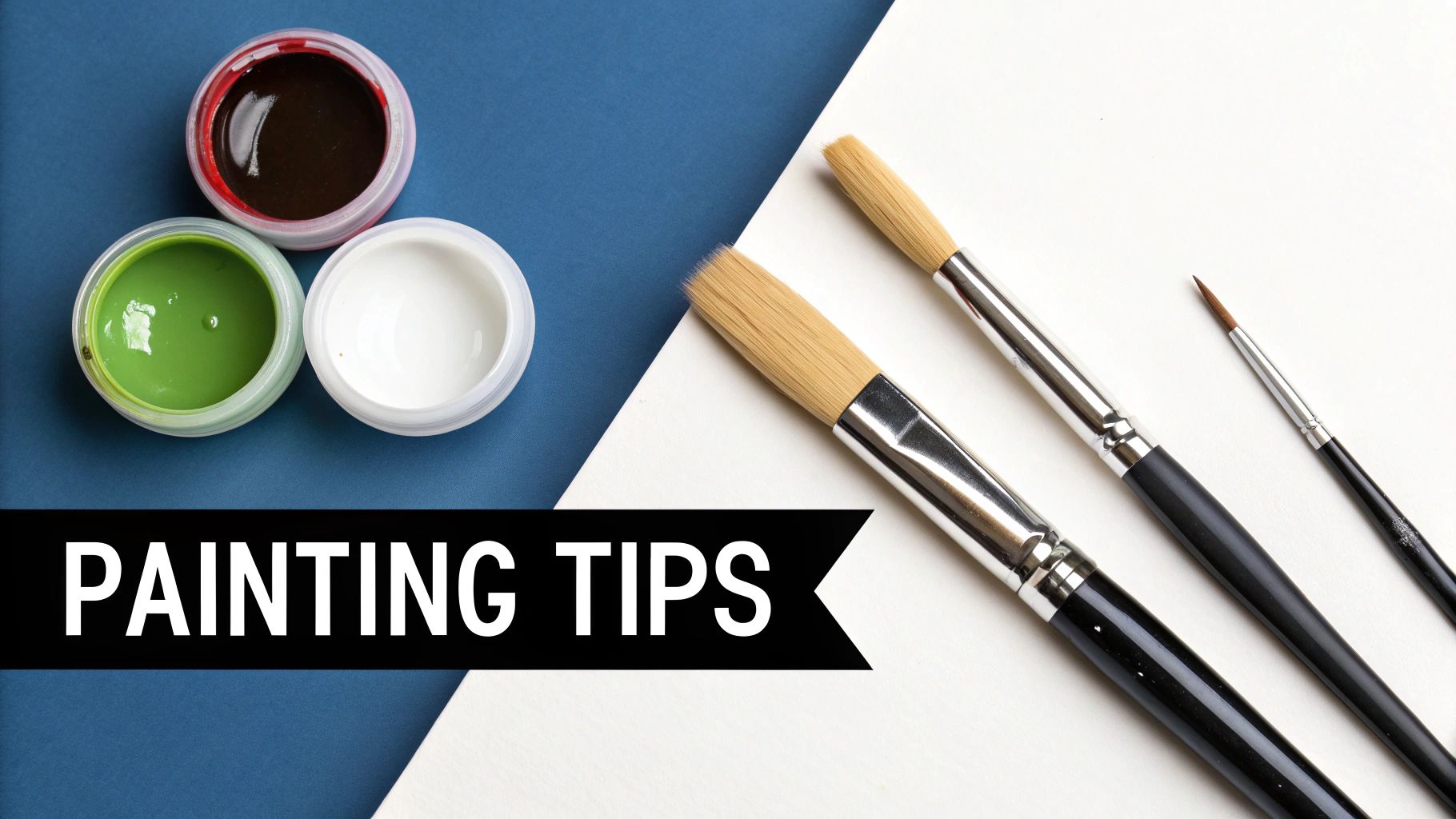
Bringing Your Painting to Life with Smart Techniques
Alright, your canvas is prepped and your paints are all lined up. Now for the best part—actually putting that brush to canvas and watching your vision come together. This is where all that careful planning around color and composition pays off. A few simple techniques will make the whole process feel less like work and more like magic.
Your kit comes with three brushes, and each one has a specific job. Think of them as your specialized crew, ready to tackle any part of the painting.
- The Detail Brush: This is your precision tool. Its fine point is perfect for getting into those tiny, intricate spots and creating crisp, clean lines.
- The Round Brush: Consider this your all-around player. It’s fantastic for general painting and filling in those medium-sized areas with nice, smooth strokes.
- The Flat Brush: When you have a lot of ground to cover, grab this one. Its wide shape lets you fill in the largest blocks of color quickly and evenly.
Getting That Polished, Professional Look
Here’s a little secret to making your colors really pop: layering. Lighter shades, especially yellows and whites, can sometimes look a bit thin on the first pass. Just let that first coat dry completely, then go over it again. You’ll be amazed at the rich, solid color you get.
This is where acrylic paint really shines. It dries quickly, which is a huge plus. You can easily add layers without worrying about the colors bleeding together and turning into a muddy mess. This fast-drying, forgiving nature is a big reason why acrylics are so popular, especially with the boom in DIY art kits. The global Art Paint Market, valued at USD 2.9 billion in 2025, is expected to hit USD 4.99 billion by 2034, and a lot of that growth is thanks to pre-numbered acrylic sets. You can learn more about the rise of acrylics in the art market.
Pro Tip: Want to soften the line between two colors? Try this simple blending trick. While both colors are still a bit wet, take a clean, dry brush and gently feather the edge where they meet. It creates a beautiful, soft gradient instead of a hard line.
Finally, always keep an eye on your paint's consistency. If a color feels a little too thick, just add a single drop of water and mix it in. This small step helps the paint glide on smoothly and gives you much better control, preventing any unwanted streaks or clumps.
With these simple habits, you'll elevate your piece from a numbered canvas to a truly polished work of art.
Got Questions About Color and Composition? We’ve Got Answers.
Stepping into the world of color and composition can feel a bit like learning a new language, especially when you're turning a cherished photo into a piece of art. It’s totally normal to have questions as you go from just looking at a picture to planning your custom paint-by-number kit. This section is here to clear up the common sticking points and give you the confidence to make great artistic choices.
Let's get practical and break down how to turn your vision into a canvas you’ll be proud of.
What if My Photo Has a Ton of Tiny Details?
Don't shy away from those intricate photos! Some of the most breathtaking paintings come from images rich with detail. Our system is smart enough to handle this complexity by grouping tiny, fiddly spots into larger, more manageable shapes. The aim isn't a pixel-for-pixel copy, but an artistic interpretation that captures the spirit of your photo.
To get the most out of a detailed picture, here are a few things to keep in mind:
- Size up your canvas: A bigger canvas gives every little numbered area more room to breathe. This helps keep details crisp and makes the whole process more relaxing and enjoyable.
- More colors, more detail: For photos with lots of subtle color changes—like the texture on a wedding dress or the leaves in a forest—opting for 36 or 48 colors is key. This wider palette allows for those gentle shifts in hue to come through.
- Crop with intention: Your cropping tool is your best friend. Use it to zoom in on what truly matters in the photo. Cutting out a busy background instantly makes your main subject the star and simplifies the entire composition.
How Do I Pick Between 24, 36, or 48 Paints?
Think of this choice like picking the right set of tools for a specific job. The number of paints you need really comes down to the color story your photo is telling. Each paint set is built to handle a different level of color complexity, so you can be sure your final painting feels true to the original.
It all boils down to the style and mood of your image:
The 24-paint set is your go-to for images with big, bold blocks of color and sharp contrast. It’s perfect for things like pop art, graphic designs, or simple portraits where strong shapes do all the talking.
Our 36-paint set is the jack-of-all-trades and our most popular choice for a reason. It hits that sweet spot between detail and simplicity, making it a fantastic all-rounder for everything from family photos to scenic landscapes.
Reach for the 48-paint set when your photo is all about those soft, delicate gradients. Think of a dreamy sunset, a close-up of a flower, or a portrait with subtle skin tones. This set ensures those smooth transitions look seamless.
Can I Fix It if I Use the Wrong Color?
Yes, you absolutely can! This is one of the best things about working with acrylic paint. It’s incredibly forgiving, which means you can relax and paint without the fear of making a permanent mistake.
If you happen to fill in a section with the wrong color, the fix is easy. Just let the mistake dry completely—which only takes a few minutes. Then, you can simply paint the correct color right over the top.
Sometimes, you might need a second coat. For instance, if you accidentally put a dark blue where a bright yellow should be, the first layer of yellow might not quite cover it. Just let that first corrective coat dry, then add another. No stress necessary.
How Can I Make My Finished Painting Look More Professional?
With just a few simple finishing touches, you can take your painting from a fun craft project to a genuinely polished piece of art. These small moves can make a world of difference in how the final piece looks and feels.
Try these simple tricks to give your painting that gallery-ready vibe:
- Sharpen Your Lines: Grab your smallest detail brush and take a moment to clean up the edges between different colors. Creating those crisp, defined lines makes the whole painting look tidy and intentional.
- Blend for a Softer Look: If you prefer a more "painterly" feel, you can soften the lines between two colors. While the paint is still a little wet, use a clean, dry brush to gently smudge the edge where they meet. This creates a beautiful, subtle gradient.
- Boost Your Brights: Lighter colors like whites, yellows, and pastels can sometimes look a bit thin on the first pass. Giving them a second coat makes them pop with rich, opaque color, helping them stand out beautifully.
- Frame It Up: The easiest trick in the book? Put a frame on it. Once your painting is fully dry, a simple frame instantly elevates it, giving it a finished, professional look that’s ready to hang.
Ready to turn your favorite memory into a work of art? At Custom Paint By Numbers, we make it easy to create a personalized kit from any photo.


