
In the art world, we often talk about primary colors and secondary colors. Put simply, primary colors are the parents of the color family—they can't be created by mixing other colors. When you mix two of them together, you get a secondary color.
This simple concept is the foundation for virtually every color you can imagine.
Understanding the Building Blocks of Color
Think of primary colors as your core ingredients. In the traditional color wheel that artists have used for centuries—what we call the RYB (Red, Yellow, Blue) model—these three are the starting point for everything. They are pure, foundational, and absolutely essential, whether you're a professional painter or just starting a paint-by-number kit.
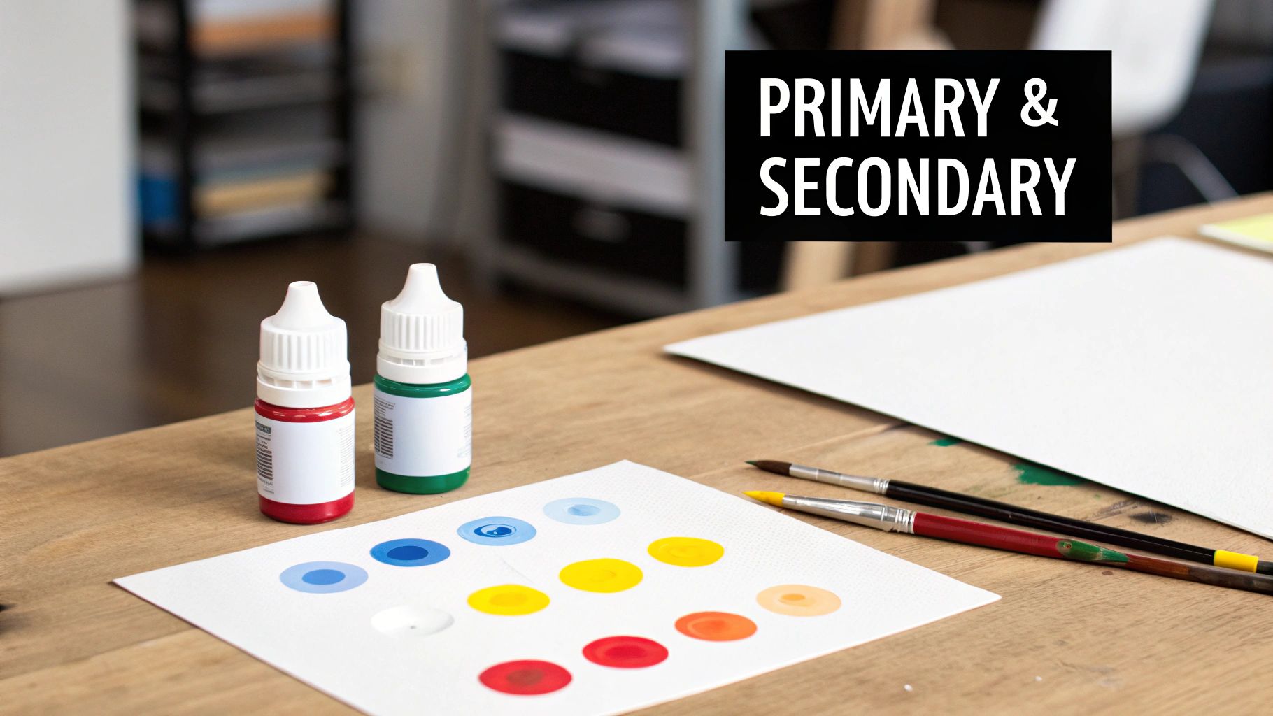
From these three primaries, the next layer of color is born: the secondary colors. You make them by mixing equal parts of any two primaries. This relationship is the first and most important step in understanding color theory, and it's key to feeling more confident with your art projects.
The magic of color mixing is rooted in its simplicity. By combining just two of the three primary colors, you unlock a whole new set of vibrant hues and instantly expand your creative toolkit.
How Primary Colors Create Secondary Colors
The process itself is wonderfully predictable. It’s like a simple formula where each secondary color is the direct result of combining two primary "parents." This straightforward interaction is what makes color mixing so much fun for beginners and such a fundamental skill for seasoned artists.
This handy chart shows you the basic combinations at a glance.
Primary and Secondary Color Mixing Chart
| Primary Color 1 | Primary Color 2 | Resulting Secondary Color |
|---|---|---|
| Red | Yellow | Orange |
| Yellow | Blue | Green |
| Blue | Red | Purple (or Violet) |
Once you get a feel for how this works, you've unlocked the secret to creating a full spectrum of colors. With just Red, Yellow, and Blue, you can easily mix Orange, Green, and Purple. That gives you the six foundational colors of the rainbow and empowers you to go beyond the colors in your kit and start customizing your artwork like a pro.
The Three Worlds of Primary Colors
When someone mentions primary colors, you probably think of red, yellow, and blue. And you’d be right! For painting, anyway. But that’s just one piece of a much bigger puzzle. It turns out there isn't just one universal set of primary colors. There are actually three main systems, and each one is built for a different job.
Think of them as different languages for color. Artists, computer screens, and printers all have their own unique way of creating a full spectrum of hues. Understanding these different "worlds" explains why the colors on your phone screen never look quite the same as the ones you mix with paint.
RYB: The Artist's Model
This is the one we all learned in school. The RYB (Red, Yellow, Blue) model is the traditional system for anyone mixing physical materials like paint or ink. It's what we call a subtractive color model. You start with a white surface—like a canvas—and as you add colors, you subtract, or absorb, light.
Mix all three primary paints together, and the pigments absorb so much light that you end up with a dark, muddy brown or black. This is the exact system you'll be using for your paint-by-number kit, where getting your hands dirty and mixing physical paints is all part of the fun. You can learn more about how to master the composition of color in our detailed guide.
RGB: The Digital Model
Now, let's talk about the screen you're looking at right now. The RGB (Red, Green, Blue) model is the engine behind every digital display, from your phone to your TV. Unlike paint, screens create color by emitting light. This makes RGB an additive color model—it starts with a black background and adds light to produce colors.
When red, green, and blue light combine at their brightest, they create pure white light. It's a fascinating flip from the RYB model we're used to and a huge leap in color theory. Today, the RGB model is used in about 99% of all digital displays. If you want to dive deeper into the science behind it, Wikipedia’s page on color theory is a great resource.
CMYK: The Printer's Model
Finally, we have the CMYK (Cyan, Magenta, Yellow, Key/Black) model, which is the language of printers. Just like the artist's RYB model, CMYK is also subtractive. It works by layering tiny dots of ink onto paper to absorb light and create images. The primary colors here are cyan, magenta, and yellow.
Why the "K" for Black? You might wonder why black gets its own ink. In theory, mixing cyan, magenta, and yellow should create black. In practice, it makes more of a murky brown. So, printers add a separate black ink—the "K" stands for "Key"—to create sharp, deep blacks and save on the other colored inks.
This visual really helps show the difference between how additive (RGB) and subtractive (RYB/CMYK) colors work.
See how adding light (RGB) leads to white, while mixing pigments (CMYK) leads to black? This fundamental difference is why that brilliant red on your screen might look a little duller when you print it. Your screen and your printer are literally speaking two different color languages.
How the Color Wheel Makes It All Make Sense
Think of a color wheel as your visual roadmap to mixing paint. It’s a simple but incredibly powerful tool that lays out colors in a logical way, showing you exactly how they relate to one another. Forget memorizing abstract rules—the wheel makes understanding primary and secondary colors feel totally intuitive.
The design is brilliantly simple. The primary colors—red, yellow, and blue—sit at three equally spaced points, forming a triangle. This shows they are the true foundation. When you mix any two of them, the new secondary color you create sits right between them on the wheel. You can literally see that orange is born from red and yellow, or that green is the child of blue and yellow.
Expanding Your Palette with Tertiary Colors
Once you get the hang of primaries and secondaries, you can take it a step further to create even more subtle, interesting shades. All you have to do is mix a primary color with the secondary color right next to it. The result is called a tertiary color.
These are the beautiful in-between hues that give artwork real depth and complexity.
Here’s a quick look at how it works:
- Red + Orange = Red-Orange
- Yellow + Green = Yellow-Green
- Blue + Purple = Blue-Violet
Following this simple formula expands your options to a full twelve-color wheel, giving you a much more sophisticated palette to play with. These subtle shades are the secret to painting more realistic scenes, from the yellow-green of new spring leaves to the fiery red-orange of a sunset.
This organized, circular diagram isn't some new-fangled invention. The idea actually goes all the way back to Sir Isaac Newton's experiments in 1666. He was the first to map colors in a circle, showing how they all connect. He basically laid the groundwork for the color theory artists still rely on today. You can learn more about Newton’s contribution to basic color theory on ColorMatters.com.
Using the Wheel for More Than Mixing
The color wheel isn’t just a mixing guide; it’s also your key to creating beautiful color combinations. For example, colors that sit directly opposite each other on the wheel are called complementary colors. When you place them next to each other in a painting, they create a stunning, vibrant contrast that makes both colors pop.
To see how these pairings can bring your art to life, check out our complete guide on what are complementary colors in art. Once you understand this visual map, you’re not just mixing paint anymore—you’re learning to speak the language of color.
Practical Paint Mixing for Beginners
Alright, enough with the theory—let's get our hands dirty! It's one thing to know what primary and secondary colors are, but the real magic happens when you start mixing them yourself. This is where you'll learn to create your own vibrant secondary colors with acrylic paint, a skill that's perfect for any paint-by-number kit or creative project you have in mind.
You don't need complex formulas or a lot of guesswork to get started. The foundation of paint mixing is surprisingly straightforward and usually begins with a simple 1:1 ratio. This just means mixing equal parts of two primary colors to get a clean, balanced secondary color. Think of it as your go-to starting point for creating classic orange, green, and purple.
This visual shows that simple relationship in action, demonstrating how the primaries combine to create secondaries on the color wheel.
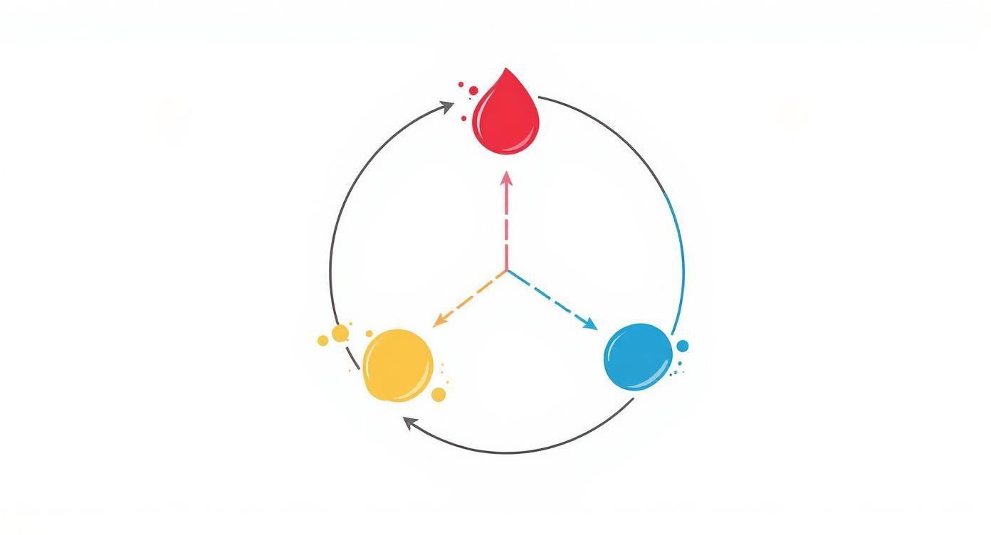
As you can see, each secondary color sits right between its two primary "parents," which makes it easy to visualize how they're related.
Starting Your First Mixes
Ready to dive in? The absolute best way to learn is by doing. Grab your red, yellow, and blue acrylics, a palette (a paper plate is perfect for this), and a brush. We’ll stick to the classic recipes first.
To get a true, vibrant secondary color, your goal is balance. It's just like following a recipe where the main ingredients need to be measured equally.
- To create Orange: Mix equal parts Red and Yellow.
- To create Green: Mix equal parts Yellow and Blue.
- To create Purple: Mix equal parts Blue and Red.
Start by squeezing out a small, pea-sized dot of each color onto your palette. Then, use your brush to slowly blend them together until the new color is smooth and consistent. That's it—you've just mixed your first secondary color from scratch!
Adjusting Ratios for Custom Shades
While the 1:1 ratio is a fantastic starting point, the real fun begins when you start to play with it. What if you want a fiery, sun-kissed orange instead of a standard one? Or a deep, mysterious forest green? This is where you can start tweaking your ratios to create custom shades.
By slightly increasing one primary color in your mix, you shift the final hue. This simple technique allows you to create an almost endless variety of shades, giving your artwork a unique and personal touch.
For instance, adding a little extra yellow to your red-and-yellow mix will give you a bright, sunny yellow-orange. Add a touch more red instead, and you’ll create a deeper, richer red-orange. The same logic applies to making a zesty lime green (more yellow) or a royal, deep violet (more blue). If you want to dive deeper into advanced techniques, you can learn more about how to mix acrylic paint colors in our dedicated guide.
This handy table gives you a great starting point for both standard mixes and custom shades.
Beginner's Paint Mixing Recipes
Here are some simple recipes to get you mixing with confidence. Think of these as a jumping-off point for your own color experiments.
| Target Color | Primary Mix | Starting Ratio | Pro Tip for Adjustment |
|---|---|---|---|
| Vibrant Orange | Red + Yellow | 1:1 | Add a tiny bit more yellow for a sunnier orange, or a touch more red for a burnt orange. |
| Classic Green | Yellow + Blue | 1:1 | For a lime green, add more yellow. For a deep forest green, add a little more blue. |
| Rich Purple | Blue + Red | 1:1 | Add more red for a warmer magenta tone. Add more blue for a cooler, deeper violet. |
The best advice? Don't be afraid to just play around! The easiest way to truly understand the relationship between primary and secondary colors is to see them interact on your palette. Mix small batches, take notes on what you like, and you’ll be creating custom colors with confidence in no time.
How to Avoid Common Color Mixing Mistakes
Let's be honest, even when you know the theory behind primary and secondary colors, things can go wrong. You aim for a brilliant orange and end up with... well, a brownish blob. Don't sweat it. Every painter has been there, and these little mishaps are actually how you get better.
The most frequent frustration is making "mud." It's that moment when your vibrant colors turn dull, grayish, or just plain blah. Think of it as a conversation where everyone's shouting at once—you can't hear anything clearly. The color gets lost.
The absolute best way to avoid this is to keep things clean. A brush with a hint of old blue on it will instantly contaminate the beautiful new orange you're trying to mix. Always give your brush a good rinse and wipe it on a paper towel before jumping to a new color.
The Problem of Muddy Colors
So, what’s the main culprit behind mud? Overmixing. It’s that simple. Especially when you start throwing too many colors into the same puddle. When you mix all three primary colors—Red, Yellow, and Blue—they start canceling each other out, which is what creates that dull brown or gray.
To keep your colors punchy and alive, just remember these simple habits:
- Stick to Two Primaries: When you’re making a secondary color, only use the two primaries you need. The second you add a third, you're on the fast track to dullsville.
- Clean Those Brushes: Keep two water jars handy. One for a first, dirty rinse, and a second one for a final, clean rinse. This little trick ensures you're not carrying old pigment into your new mix.
- Start with a Clean Slate: Make sure your palette or mixing surface is totally clean before you start. Tiny flakes of old, dried paint have a sneaky way of ruining your fresh colors.
The secret to vibrant secondary colors isn't some complex formula; it's simplicity. By limiting your mix to two primary colors and keeping your tools clean, you let each hue sing instead of getting drowned out by the noise.
Getting the Right Shade and Brightness
Another classic challenge is mixing a color that ends up way too dark or too light. It’s so tempting to just grab the black or white paint to fix it, but be careful—those pigments are incredibly strong. A little goes a very long way, and too much will either wash out your color or make it look heavy and flat.
Here's the golden rule: start with the lighter color, then add tiny amounts of the darker color to it. It’s always, always easier to make a light color darker than the other way around. If you’re mixing green, for example, begin with your yellow and slowly introduce tiny dabs of blue until you hit that perfect shade.
If you really need to use white or black:
- To Lighten: Add the smallest speck of white you can manage to your color. White paint is a powerhouse and can turn a rich, beautiful red into a chalky pink in an instant.
- To Darken: Use black sparingly. A more professional trick is to add a tiny dot of the color's complement (the one opposite it on the color wheel). This creates a much more natural-looking shadow.
Once you get the hang of these troubleshooting tips, you’ll find yourself spending way less time fixing mistakes and more time enjoying the magic of creating the exact colors you want for your painting.
Customizing Colors for Your Art Projects
Don't feel boxed in by the little paint pots that come with your paint-by-number kit. The real magic of understanding primary and secondary colors is knowing how to go beyond what's provided. This skill comes in handy more often than you'd think—especially when you run out of a specific color or just want to make your artwork uniquely yours.
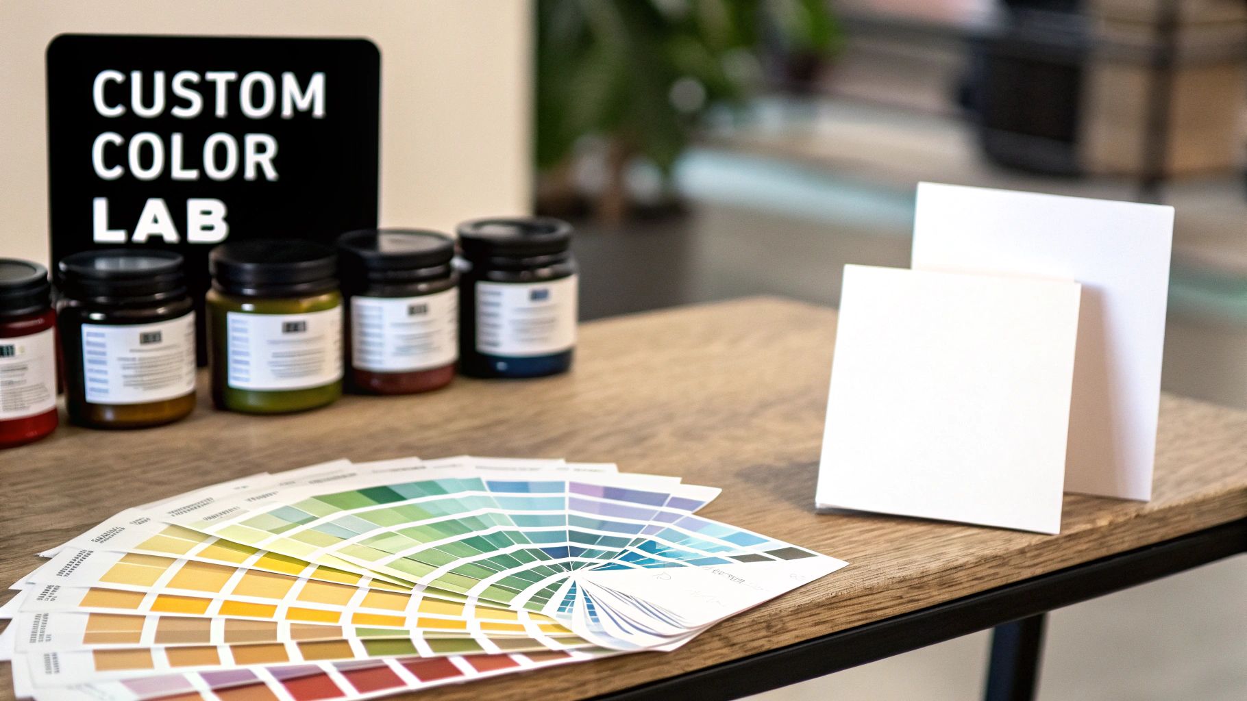
Picture this: you're halfway through a beautiful piece and realize you're out of that perfect shade of purple. Instead of grinding to a halt, you can mix your own. Suddenly, you've gone from simply following instructions to becoming a true color artist, confidently creating the exact hues you need.
Creating Your Own Custom Shades
The technique itself is pretty straightforward. Start with the closest color you already have, and then begin adding tiny amounts of a primary color to nudge it in the direction you want.
Need to match a light, spring green? Begin with the brightest green in your kit and mix in a pinprick of yellow. Want a richer, more fiery orange? Start with your standard orange and blend in a tiny dab of red.
The key is to add color slowly and in small amounts. It’s always easier to gradually darken or shift a hue than it is to fix a color that’s gone too dark. A patient approach gives you total control over the final shade.
This same principle allows you to get intentionally creative. Why should every leaf in a landscape be the exact same shade of green?
- For sunny, new leaves: Mix a little extra yellow into your green.
- For deep, shadowy trees: Add a tiny touch of blue to your green.
- For an autumn scene: Mix a touch of red into your green for a muted, earthy tone.
Knowing how to mix secondary colors isn't just an old-school art concept; it’s a practical skill used in about 95% of modern design fields. Ever since purple became the first color synthesized back in 1856, the ability to create specific hues has been absolutely essential.
As you experiment, you'll start to develop a natural, intuitive feel for how colors interact. To take your skills even further, exploring dedicated books about illustration can offer deeper insights for all kinds of art projects. Your paintings will gain a personality and depth that pre-made colors just can't match.
Got Questions About Color? Let's Clear Things Up.
As you get the hang of primary and secondary colors, a few questions almost always come up. Think of this as your cheat sheet for those head-scratching moments when theory meets the real world of paint and pixels.
Are Black and White Primary Colors?
In a word, no. In the art world, black and white aren't considered primary colors. We call them neutrals.
Their job is to adjust the value of a color. Add white to a color, and you get a lighter version called a tint. Mix in black, and you get a darker shade. They're modifiers, not the building blocks of new hues.
Why Do My Screen and Printer Use Different Primary Colors?
This all boils down to the difference between light and pigment. Your phone or computer screen works with an additive color model. It starts with a black screen and adds light—specifically Red, Green, and Blue (RGB)—to create the colors you see. When all three are at full strength, you get white light.
Printers, on the other hand, use a subtractive model. They start with a white piece of paper and use inks—Cyan, Magenta, and Yellow (CMY)—to subtract or absorb light. The more ink you add, the darker the color becomes.
It's a simple but crucial distinction: screens create light, while paper reflects it. This is exactly why that super-bright, glowing image on your monitor can sometimes look a little duller when you print it out.
What Happens If I Mix All Three Primary Paints?
If you mix the three traditional primaries—Red, Yellow, and Blue—you won’t get a bright new color. Instead, they start to neutralize each other.
You'll end up with a dark, muddy color like a deep brown, a murky gray, or something close to black. This happens because the combined pigments absorb almost all the light that hits them, reflecting very little color back for your eyes to see.
Ready to turn your favorite photos into art? Explore our collection at Custom Paint By Numbers and start creating your personalized masterpiece today. Find your perfect kit at https://paint-by-number.com.