
Think of analogous colors as close-knit family members on the color wheel. They’re the colors that sit side-by-side, like the warm, cozy group of red, red-orange, and orange. Because they're neighbors, they naturally get along, creating a look that feels instantly harmonious and put-together.
What Is An Analogous Color Scheme?
Ever watched a sunset and noticed how the sky flows seamlessly from yellow to orange to a soft red? That’s an analogous color scheme in action. It's that smooth, natural transition that makes it so pleasing to the eye.
These color groupings feel so right because they all share a common color, tying everything together. This makes them perfect for creating a calm, comfortable, or elegant atmosphere without any harsh visual noise. Their subtle power is a well-kept secret in the business world, too—in fact, analogous palettes show up in the branding of 75% of Fortune 500 companies to create a strong, memorable identity.
This simple concept is one of the most powerful tools you can have, whether you're painting, decorating, or designing.
An analogous color scheme is all about harmony. You're picking colors that are adjacent on the color wheel, creating a palette that feels as unified and balanced as a perfectly played chord in a song.
To really get a feel for how these color families work, it helps to understand the basics. A solid grasp of color theory for beginners will let you move past just knowing the definition and start using these ideas to bring your own creative projects to life.
How To Find Analogous Colors On The Wheel
Finding analogous colors is actually pretty straightforward. Picture the color wheel as a pie cut into twelve slices. All you need to do is pick one slice to start with—this will be the main, or dominant, color for your palette.
From there, just look at the colors sitting right next to it on either side. Those neighbors are your analogous colors. Together, your starting color and its two neighbors create a classic three-color analogous scheme. It’s that simple. The reason this grouping looks so good together is because they all share a common underlying color, which makes them feel naturally harmonious.
For instance, if you start with yellow, its neighbors are yellow-green and yellow-orange. This trio has a warm, sunny vibe. On the flip side, you could create a cool and calming palette with blue, blue-violet, and violet.
This handy map breaks down the core ideas behind analogous schemes, showing how harmony and unity come from these neighborly relationships on the wheel.
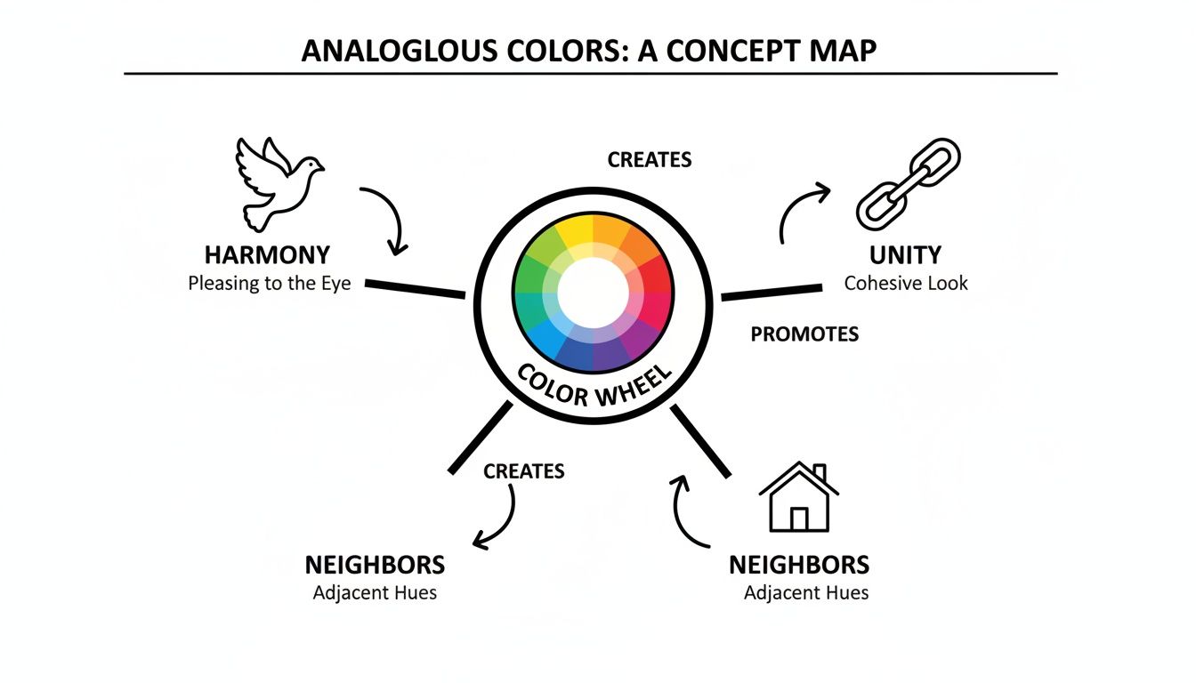
As you can see, the principles branch right off the color wheel, really driving home the point that closeness creates harmony.
A Step-by-Step Visual Guide
Let’s walk through this on a standard twelve-part color wheel to make it crystal clear. Finding these adjacent hues is the first and most important step in building your palette.
- Choose a Dominant Color: First, pick any color that will anchor your design. For this example, let's go with Red-Violet.
- Identify the Left Neighbor: Now, look immediately to the left of Red-Violet. You’ll find Violet.
- Identify the Right Neighbor: Finally, look to the right of Red-Violet. That color is Red.
And there you have it! Your analogous color scheme is Red, Red-Violet, and Violet. This combination feels rich and sophisticated because each color shares elements of red and blue, which helps create those smooth, pleasing transitions that look so great in any creative project.
Creating Depth With Tints, Shades, And Tones
Once you’ve picked your neighboring colors, the real fun begins. A truly stunning analogous palette isn't just about three colors sitting side-by-side; it's about giving them depth, dimension, and life. The secret is to take your core trio and expand it into a richer family of related colors.
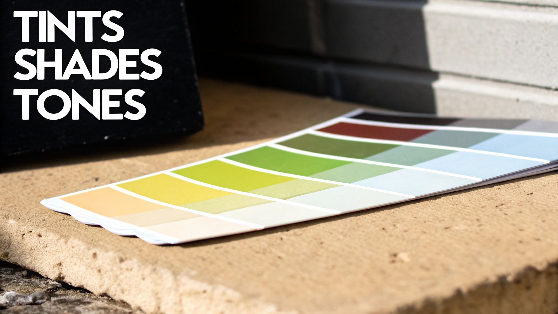
Just think about a single green leaf. It’s never just one shade of green, right? You'll see bright, almost yellow spots where the sun hits it, and deep, nearly black shadows in its creases. That natural variety is what makes it look real, and you can bring that same magic into your artwork.
Expanding Your Analogous Palette
To build this kind of richness, you'll want to get comfortable with three simple concepts. Each one tweaks your base colors in a specific way, giving you a much more versatile and interesting palette to work with.
- Tints: This is what you get when you add white to a color. Tints are lighter, softer versions of your original hue, making them perfect for highlights or creating a gentle, airy feeling.
- Shades: The opposite of tints, shades are created by adding black. This produces deeper, richer colors that are fantastic for adding shadows, contrast, and a touch of drama.
- Tones: Tones are made by adding gray to a color. The result is a more muted and subtle version of your original hue. They are brilliant for creating sophisticated, complex color schemes that feel grounded and natural.
By playing with these variations, a simple yellow, green, and blue palette becomes so much more expressive. You could use a pale, lemony yellow tint for a highlight, a deep forest green shade for a shadow, and a muted slate blue tone for a background. This is how you turn a flat design into something that feels alive and professional.
The real magic happens when you master these subtle shifts. A well-executed palette of tints, shades, and tones can elevate your artwork, making the final piece feel more cohesive and visually engaging.
For those of us working with acrylics, knowing how to mix these variations is a game-changer. If you're new to this, our detailed acrylic paint mixing guide will walk you through the basics to create the perfect tints and shades for your next project.
Analogous Colors In Art And The Real World
Color theory isn't just some stuffy academic subject—it's alive all around us. You can see it at work everywhere, from the walls of the world’s most famous museums to the view right outside your window.
Once you know what to look for, you’ll start seeing analogous color schemes creating harmony and setting the mood in both nature and art.
Take Vincent van Gogh’s famous Sunflowers series, for example. He brilliantly stuck to a narrow range of yellows, yellow-oranges, and deep ochres. The result? You can almost feel the warmth and energy radiating off the canvas. The colors flow into one another so naturally, creating a unified and powerful emotional punch.
You can see the same exact principle just by stepping outside. A sunset is a perfect example, as the sky transitions beautifully from fiery reds to soft oranges and finally to a brilliant yellow. That’s a flawless analogous palette, courtesy of Mother Nature.
Nature's Perfect Palettes
Nature is the original expert in color theory, and it gives us endless examples of how these neighboring colors create scenes that just feel right.
- A Forest Canopy: Look at the deep woods and you'll see a subtle blend of greens, yellow-greens, and even hints of blue-green, all working together to create a calm, lush atmosphere.
- Autumn Leaves: The classic fall colors are a perfect mix of reds, oranges, and yellows. This combination gives us that signature feeling of warmth and coziness.
- A Twilight Sky: Just after the sun disappears, the sky often shifts through a cool, soothing palette of blues, purples, and deep violets.
This powerful relationship between neighboring colors has shaped art history for centuries. The smooth blending was a core technique for Impressionist painters. Later, Ogden Rood’s 1879 theory on optical mixing pushed things even further, inspiring artists like Georges Seurat.
His Pointillist masterpiece, A Sunday Afternoon on the Island of La Grande Jatte, is a fantastic example. Seurat used tiny, distinct dots of blue, blue-green, and cyan that our eyes blend together to see lush, vibrant green lawns—a technique that was only possible thanks to a deeper understanding of color science. You can dive deeper into how color theory shaped the modern art era.
Paying attention to these examples trains your eye to see how analogous colors create a certain feeling. This intuition is the secret to building your own palettes that not only look good but also help tell a story.
Using Analogous Palettes In Your Creative Projects
Alright, enough with the theory—let's get our hands dirty. This is where the magic really happens, whether you're mixing actual paint or just pushing pixels around on a screen. Using an analogous palette effectively is all about giving each color a specific job to do.
For anyone working with a paint-by-number kit, these color schemes are a dream for creating smooth, realistic transitions. Imagine painting a sunset. An analogous trio of red, red-orange, and orange will blend together seamlessly, giving you that soft, natural gradient you see in the sky. No harsh lines, just beautiful, flowing color.

This same idea is what gives digital designs and branding that polished, professional feel. It all comes down to a clear strategy.
Assigning Roles to Your Colors
The secret to a balanced design is creating a clear visual hierarchy, and the 60-30-10 rule is your best friend for this. It’s a simple but powerful guideline that stops your colors from turning into a chaotic mess and instead tells the viewer’s eye exactly where to look.
Here’s how it breaks down:
- The Dominant Color (60%): Think of this as your base. It's the color that will cover the most area and set the overall mood of your piece.
- The Supporting Color (30%): This is your secondary hue. It should work well with the dominant color, adding visual interest without stealing the show. It’s perfect for highlighting secondary information.
- The Accent Color (10%): This is your pop of color! Use the most vibrant or distinct shade in your trio for the small but important details you want people to notice first, like a button or a key icon.
Following this simple structure turns a pleasant group of neighboring colors into a powerful communication tool.
By thoughtfully applying the 60-30-10 rule, you create a design that feels both cohesive and easy to navigate. The natural harmony of the colors works with the structured hierarchy to deliver a polished and professional result.
As you start planning your own projects, you might find it helpful to check out an expert's guide to the perfect color palette for more inspiration. This kind of strategic thinking is what will truly help you define analogous color in your work and take it to the next level.
Frequently Asked Questions About Analogous Colors
Diving into color theory always seems to stir up a few questions. Let's tackle some of the most common ones so you can feel totally confident using analogous colors in your own art.
What's The Difference Between Analogous And Monochromatic Colors?
This is a great question, and the distinction is simpler than you might think.
A monochromatic scheme is all about a single color. It's like taking one hue—say, blue—and exploring all its possibilities by adding white (tints), black (shades), or gray (tones). You get a range from sky blue to a deep, dark navy, but it's all still fundamentally blue.
An analogous scheme, on the other hand, is about a family of colors. It pulls together a group of hues that sit right next to each other on the color wheel, like blue, blue-green, and green. So, monochromatic is about depth, while analogous is about a harmonious blend of related but distinct colors.
How Many Colors Should I Use In An Analogous Scheme?
You can technically use anywhere from two to five neighboring colors, but honestly, the sweet spot is almost always three. This gives you enough variety to create interest without overwhelming the eye and making your artwork feel too busy.
A fantastic way to keep things balanced is to use the trusty 60-30-10 rule:
- Use your dominant color for 60% of the space to set the overall mood.
- Your supporting color gets 30% to add some nice variety.
- Your accent color takes up the final 10% to make key details pop.
This simple formula creates a natural visual hierarchy, preventing your colors from fighting for attention and giving your piece a really polished feel.
The magic of an analogous palette is in the shared undertones that create harmony. But if it feels flat, the secret isn't a new color—it's usually a lack of contrast in value and saturation.
How Do I Keep My Analogous Palette From Looking Boring?
Because analogous colors are neighbors, they're naturally low-contrast, which can sometimes come across as a little bland. The secret to making them sing is to play with value (how light or dark a color is) and saturation (its intensity).
Think about pairing a deep, moody blue with a bright, zesty green from the same color family. The difference in light and dark creates all the contrast you need.
For an extra bit of drama, you can throw in a tiny splash of a complementary color—the hue from the exact opposite side of the color wheel. This creates a powerful focal point. You can learn more about what complementary colors are in art to master this technique. Delving into understanding the psychology of color choices can also offer some fascinating insights into why certain combinations feel so right.
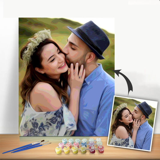
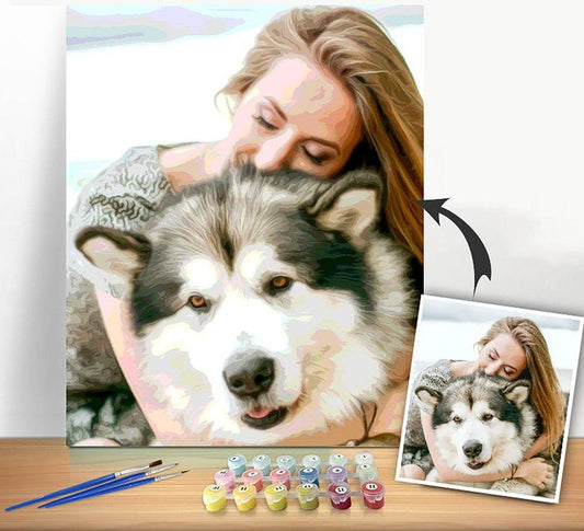
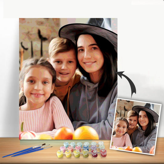
Ready to see how these harmonious colors can bring your favorite photos to life? With Custom Paint By Numbers, you can turn any image into a personalized paint-by-number kit. We’ll send you everything you need to transform a cherished memory into a beautiful masterpiece. Start creating your custom painting today!