

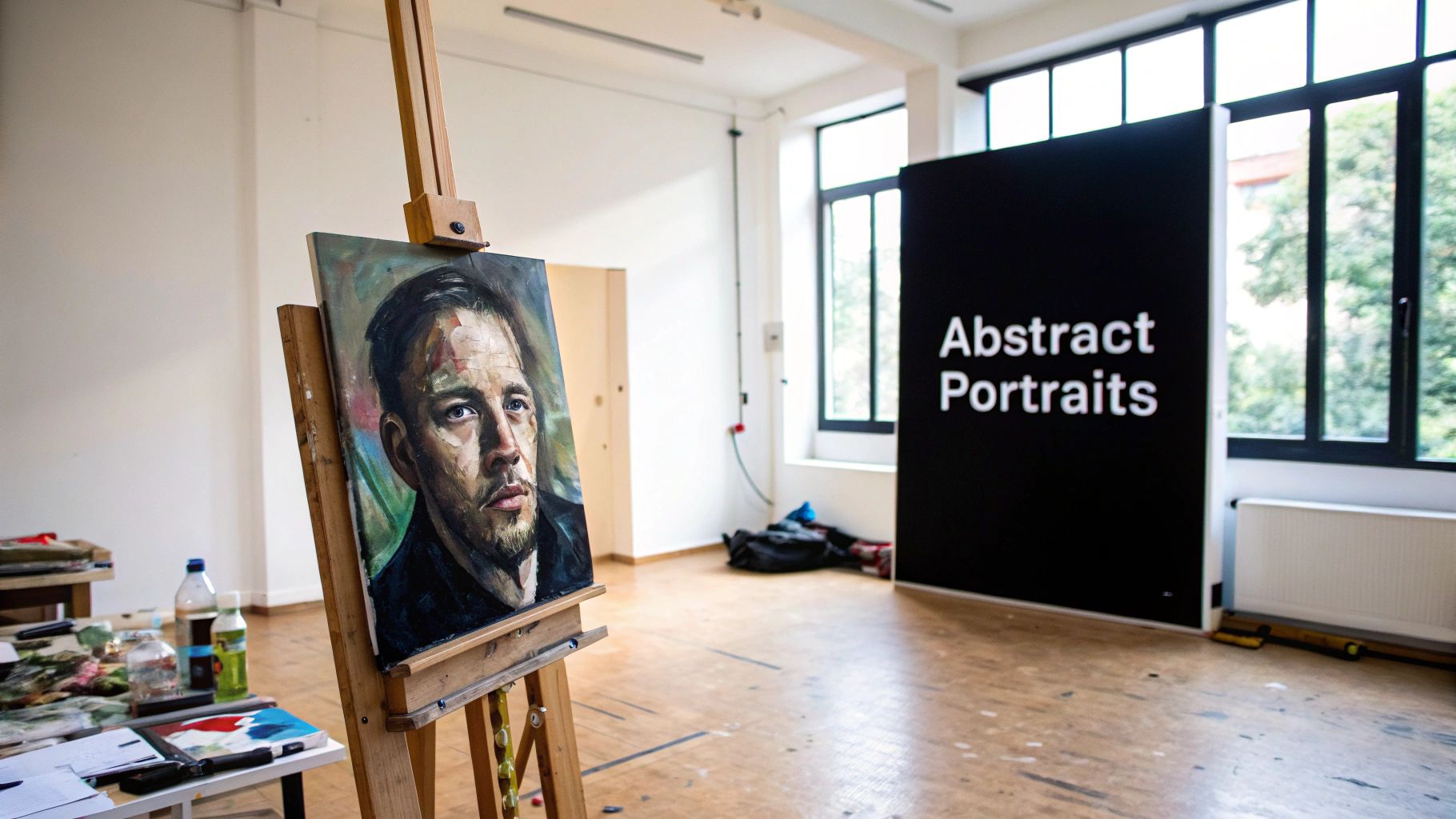
Painting an abstract portrait is less about creating a perfect copy of someone's face and more about capturing their vibe—their energy and emotion. This style of art is all about using color, shape, and texture to tell a story about who a person is on the inside. It’s a freeing way to paint, letting you step away from strict realism to create something that feels truly personal.
Your Journey into Abstract Portraits
Ready to dive into the world of abstract portraiture? Forget trying to get the nose just right or stressing over the exact shape of an eye. Here, we're chasing a feeling, not a photograph. Your goal is to translate the unseen parts of a person—their spirit, their mood—onto the canvas. It's a much more emotional and intuitive way to paint, where you can craft a compelling vision that's entirely your own.
This freedom is a huge part of why abstract portraits are so popular right now. Both artists and art lovers are drawn to work that offers more than just technical precision. It’s an open invitation to experiment, break a few rules, and find your unique artistic voice in the process.
Why Abstract Portraiture Is Gaining Momentum
There's been a real shift in the art world lately. More and more people are appreciating abstract and non-figurative art. Thanks to online galleries and a new generation of collectors, there's a huge appetite for fresh, expressive styles, creating an amazing space for artists to share their work.
The numbers back this up. A recent gallery survey found that non-figurative paintings, a category that includes abstract portraits, were ranked as the most important style by 59% of galleries. On top of that, 71% of collectors under the age of 37 are now buying art online, and abstract pieces are consistently a top choice because of how well they fit into modern spaces.
Before we get into the "how-to," let's quickly break down the fundamental shift in thinking between traditional and abstract portraits. It all comes down to what you're trying to achieve.
Core Principles of Abstract Portraiture
| Principle | Traditional Portraiture Focus | Abstract Portraiture Focus |
|---|---|---|
| Likeness | Achieving a realistic, recognizable image of the subject. | Capturing the essence or spirit rather than physical features. |
| Color | Using natural, true-to-life skin tones and colors. | Using color emotionally to represent mood, energy, or personality. |
| Form | Replicating anatomical structures accurately (eyes, nose, mouth). | Simplifying, distorting, or exaggerating forms to create impact. |
| Technique | Emphasizing controlled brushwork, blending, and precision. | Prioritizing expressive mark-making, texture, and spontaneity. |
Seeing it laid out like this makes it clear: abstract portraiture is a completely different language. It's about feeling, not just seeing.
The real beauty of an abstract portrait is its ability to communicate without words. A bold slash of red can scream passion, while a soft, blended blue might whisper introspection. Your brushstrokes become a vocabulary for emotion.
This approach is perfect whether you've been painting for years or are just picking up a brush for the first time. If you're new to all this, building a few foundational skills can make the process feel much more natural. Our guide on how to learn painting is a great place to start.
Getting Your Space Ready to Create
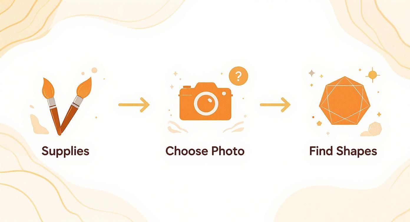
Before you even think about putting paint on a canvas, it's worth taking a few minutes to set up your workspace. This isn't just about laying out your supplies; it's about carving out a little corner where you can focus and let your creativity take over. You don't need a fancy studio—I've painted in kitchens, spare bedrooms, and even on the floor. A quiet spot with decent light is all you really need.
The idea is to have everything you need within arm's reach. You want a toolkit that lets you experiment freely without feeling overwhelmed or breaking the bank. Trust me, a few high-quality brushes and a small, curated set of paints will serve you far better than a giant, cheap kit you'll barely touch.
The Essential Toolkit
Walking into an art store can be intimidating for anyone, especially when you're just starting out. The options are endless. So, let's keep it simple. I always recommend beginners start with acrylics. They dry fast, clean up with water, and are fantastic for the kind of layering we'll be doing in our abstract work.
Here’s a basic shopping list to get you started:
- Canvases: Grab a few small or medium-sized canvases. Something like an 8x10 or 11x14 inch canvas board is perfect. Working on a smaller scale is much less daunting and great for just playing around.
- Paints: You really don't need a 24-pack of colors. Just get the primaries—a good red, blue, and yellow—plus a tube of black and a tube of white. Learning to mix your own colors is a huge part of the fun and a skill you'll use forever.
- Brushes: Look for a small variety pack. You’ll want a large flat brush for covering big areas, a medium round one for defining shapes, and a tiny detail brush for those final touches.
Don't be afraid to look beyond traditional art supplies. Some of my favorite tools are things I found around the house. Sponges, old credit cards, and palette knives can create incredible textures that you just can't get with a regular brush. This is how you start to find your own unique style.
How to Pick a Great Reference Photo
This might be the most important decision you make before you start painting. The photo you choose is your road map for shapes, light, and feeling. Remember, we’re not aiming to copy the photo—we’re using it as a launchpad for our own interpretation.
I always look for photos with strong, dramatic lighting. When you have high contrast between the bright spots and the shadows, it naturally creates interesting, simplified shapes for you to work with. A photo where someone is lit from the side, for instance, is often a goldmine for creating bold, geometric forms.
When you're sifting through photos, keep these things in mind:
- Interesting Angles: A straight-on, passport-style photo can feel a bit static. Look for a profile shot or a three-quarter view to add a bit more energy to your composition.
- A Clear Mood: Is the person in the photo thoughtful? Joyful? Intense? Your job is to capture that feeling and translate it into color and shape.
- A Strong Silhouette: A clean, clear outline of the head and shoulders gives you a solid foundation to build your painting on.
The biggest mental hurdle to overcome is the need for a perfect likeness. Let that go. Your reference photo is just the beginning of the conversation. The real magic happens when you start simplifying what you see and turning it into something that feels uniquely yours.
Finding the Shapes Within the Form
Here’s where the real magic happens. Abstract portraits aren’t about making a carbon copy of a photograph. The goal is to break down reality, find its hidden geometry, and tap into its emotional heart. You have to train your eye to see beyond the obvious—past the nose, eyes, and mouth—and start identifying the larger, simpler shapes of light and shadow that truly define the face.
An old artist's trick works wonders here: just squint at your reference photo. Seriously, try it. As your vision blurs, all the tiny, distracting details melt away. Suddenly, the face becomes a collection of broad areas of value. You might see the forehead and cheekbone merge into a single bright shape, or the shadow under the jawline pop out as a distinct, dark triangle. These are the foundational blocks for your abstract composition.
This first step is crucial for developing your artistic voice. It’s the difference between simply copying what you see and genuinely interpreting a subject.
As you can see, simplifying the form acts as the bridge between your reference photo and your final painting. It’s a conscious decision to translate complex features into a more direct and expressive visual language.
Translating Features into Abstract Forms
Once you’ve spotted the main masses of light and dark, you can start thinking about how to get them onto your canvas. Forget about perfection. This is all about exaggeration and simplification to bring personality and movement into your work.
- The Jawline: Could that soft curve become a sharp, angular line to suggest strength or determination?
- The Hair: Instead of fussing over individual strands, see the hair as one large, flowing shape. How can you simplify its silhouette to create a dynamic sense of motion?
- The Eyes: What if they were just simple circles or ovals? The slightest tilt of these basic shapes can convey a surprising amount of emotion.
For a completely different take on this idea, it can be fun to explore tools for converting photos to paintings and see how algorithms tackle this same process of simplification.
The goal isn't anatomical accuracy; it's emotional resonance. By boiling a portrait down to its essential shapes, you give yourself the freedom to rebuild it with color and texture that speaks to the subject's inner world, not just their outer appearance.
This shift toward more accessible, emotionally driven art is making waves in the market, too. While the ultra-high-end art world has cooled a bit, demand for mid-range abstract work has been growing. In fact, sales in the sub-$10 million segment for abstract portraits recently climbed by 17%, and sell-through rates hit a three-year high. This shows a real appetite from a new generation of collectors who connect with this style.
From Sketch to Canvas
Before you even touch a brush, do a few quick warm-up sketches. Grab a pencil or some charcoal and just map out these simplified shapes. Play around with different compositions, changing the scale and placement on the page. This is your no-pressure playground, a chance to experiment without consequence.
When you land on a sketch that feels right, you can lightly transfer the main lines onto your canvas. This simple roadmap will guide your first layers of paint, making sure your abstract portrait begins with a strong, intentional foundation. Now, the expressive work of adding color and texture can truly begin.
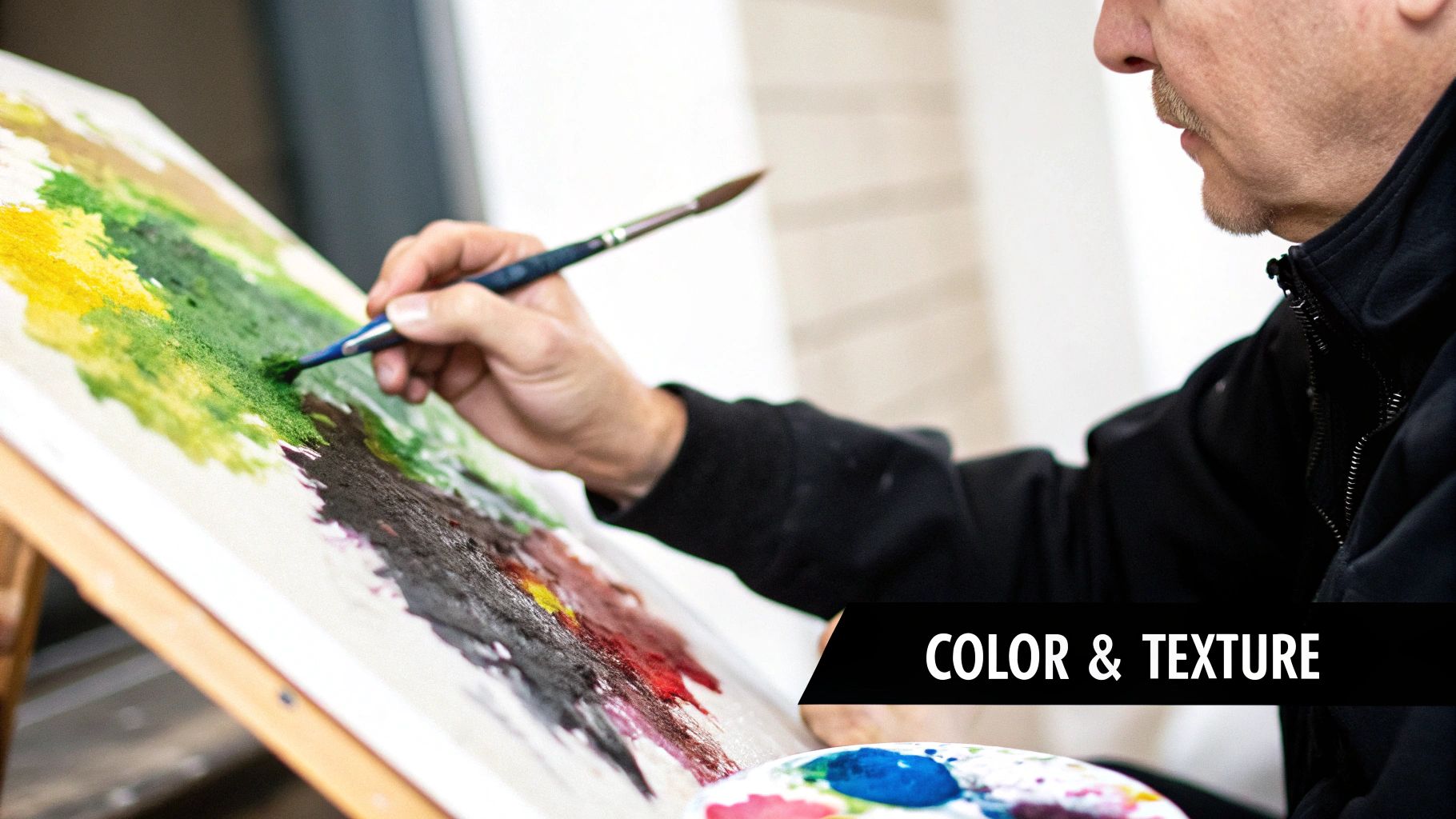
Painting Emotion with Color and Texture
Once you have your basic shapes blocked in, it's time to get to the heart of abstract art: color and texture. This is where you move beyond just capturing a likeness and start conveying real feeling. In abstract portraits, color isn't just for filling in the lines—it’s how you tell the story of who your subject is on the inside.
Think of yourself as a film director setting the mood. Want your portrait to feel fiery and full of life? A palette of rich reds, warm oranges, and vibrant yellows will bring that energy. If you're going for something more serene and thoughtful, cool blues, soft greens, and gentle purples can create a beautiful sense of calm.
Having a little color theory in your back pocket really helps here. If you're new to this, our guide on what warm and cool colors are is a great place to start understanding how they can transform the feeling of your work.
Building a Harmonious Color Palette
Believe it or not, the secret to a really powerful abstract portrait often comes down to using fewer colors. Instead of grabbing every tube of paint you own, try working with a limited, harmonious palette. This simple decision forces you to be more deliberate and gives your final painting a much more cohesive, professional look.
I always recommend starting with just three to five colors. This little constraint is actually incredibly freeing because it pushes you to discover the full potential of each hue by mixing them. A simple palette of ultramarine blue, cadmium yellow, and burnt sienna—plus a good tube of white—can produce a surprising range of tones, from deep, earthy greens to bright, glowing oranges. It’s a fantastic way to guarantee your colors will work well together.
Limiting your palette isn’t a restriction; it’s a form of creative freedom. It helps you avoid a chaotic, muddy mess and encourages you to make thoughtful, impactful decisions about every single brushstroke.
Making Your Mark with Expressive Texture
If color sets the mood, texture is what gives your painting a pulse. It’s the physical energy you can see and feel on the canvas, and it’s where you can truly let loose and have some fun with how you apply the paint.
Don't feel tied to your brushes. Honestly, some of the most compelling effects I've ever created came from using tools you wouldn't expect. Getting your hands dirty and just trying things is how you'll develop a style that’s all your own.
- Palette Knives: I love using these for scraping and dragging thick gobs of paint. You can create these amazing sharp, structural lines and bold, impasto effects that scream strength or tension.
- Sponges: A natural sea sponge is perfect for dabbing on soft, organic textures. It's my go-to for hinting at skin or creating an atmospheric, dreamy background.
- Old Credit Cards: Don't throw them out! The hard plastic edge is incredible for making clean, sharp lines or scraping away wet paint to reveal the colors hiding underneath.
A great technique is to put down a base layer of color and let it dry completely. From there, you can start building more layers on top, allowing little bits of the colors below to show through. This layering process adds so much history and depth to your portrait, turning it into something people will want to look at again and again. Every mark you make becomes part of the story.
Finishing and Presenting Your Artwork
https://www.youtube.com/embed/Y7cfW_ZEv10
Knowing when to stop is half the battle. Seriously. It’s so easy to get caught up in the flow and overwork a piece, muddying all that great energy you’ve built up. The best trick I’ve learned is to simply walk away.
Give it a day or two, then come back with fresh eyes. You’ll know almost immediately if it needs anything else. Often, a few small, thoughtful marks are all it takes to unify the entire composition. Think of it as refining, not redoing.
Stepping away from the canvas for a day or two can give you the clarity needed to see what’s working and what isn’t. When you come back, you’ll know if that final brushstroke is truly necessary or just an impulse.
Protecting and Polishing Your Portrait
Once you’re truly happy with your abstract portrait, it's time to add those final professional touches that make it last.
First, your signature. Don't just slap it on anywhere. Find a spot where it feels balanced and doesn't pull focus from the main event. The bottom right or left corner is a classic for a reason—it works.
Next, and this is a step many people skip, you need to varnish your painting. This is non-negotiable if you want your work to endure. A good varnish protects the surface from dust and UV damage, but it also does something magical to your colors—it makes them sing.
You have a few choices here. A gloss varnish will give you deep, saturated colors that really pop. A satin finish offers a nice, subtle sheen, while a matte varnish provides a more modern, non-reflective look. The choice really depends on the mood of your piece.
To help you decide, here’s a quick rundown of the essential finishing touches.
Finishing Techniques Quick Reference
| Technique | Purpose | Pro Tip |
|---|---|---|
| Signature | To claim your artwork and add a personal touch. | Use a fine-tipped permanent marker or a small brush with a contrasting paint color. |
| Varnishing | Protects from UV rays and dust; unifies the sheen. | Apply in a well-ventilated area. Use long, even strokes in one direction, then apply a second coat perpendicularly. |
| Framing | Enhances presentation and protects the edges of the canvas. | A floater frame is an excellent modern choice that makes the artwork appear to "float" within the frame. |
A well-chosen frame is the perfect final touch. For canvas work, I’m a huge fan of floater frames. They create a clean, contemporary look that lets the art itself be the hero. If you want to dive deeper into framing, check out our guide on how to frame canvas paintings.
Sharing Your Work with the World
After pouring your heart and soul into your art, it's time to show it off! But before you snap a quick picture with your phone, take a moment to get it right.
Good photography is everything. The key is finding bright, indirect natural light—think near a window on an overcast day. This prevents harsh shadows and glare, ensuring your colors look true to life. Take shots from a few different angles to capture all the beautiful texture and detail you've created.
When your abstract portraits are ready for the world, knowing how to present them can make all the difference. For some great ideas, explore these essential portfolio presentation tips to make your art stand out. This is more important than ever as the art world moves online.
Abstract art has a huge and growing audience, especially among younger collectors who discover new artists through social media and online galleries. By sharing your work online, you’re not just showing off a painting; you’re connecting with a global community that’s hungry for fresh, expressive art.
Got Questions About Abstract Portraits? Let's Talk.
Diving into abstract portraits is exciting, but let's be real—it can also feel a bit daunting. When you're stepping away from strict rules and leaning into intuition, a lot of questions pop up. It's totally normal.
I've been there, and so has every artist I know. Below, I'll tackle some of the most common hurdles and questions that come up on this journey. My goal is to clear the fog and help you trust your own creative gut.
What If It Doesn't Look Like the Person?
This is the big one, isn't it? The question I hear more than any other. And the answer is refreshingly simple: it doesn't have to. In fact, that's kind of the whole point.
An abstract portrait isn't about creating a carbon copy of someone's face. It's about capturing their essence, their energy, their emotional fingerprint. Think of it as an interpretation, not a replication. Your real job is to translate a feeling—joy, pensiveness, strength—onto the canvas using color, shape, and texture. If you’ve done that, you’ve succeeded, no matter how much it "looks" like your reference photo.
How Do I Know When It's Finished?
Ah, the age-old artist's dilemma. With realistic art, "finished" usually means you've rendered all the details. In abstract art, the finish line is much blurrier, and it’s so easy to overwork a piece.
Knowing when to put the brush down is more of a feeling than a checklist. Step back from the canvas and ask yourself a few things:
- Is it balanced? Does the whole piece feel visually cohesive? Do the colors, lines, and shapes feel like they belong together, or is one area screaming for attention?
- Does it feel right? When you look at it, do you get the emotional punch you were aiming for? Is there a sense of resolution?
- Are there any "holes"? Do any spots feel neglected, empty, or just plain awkward? If everything feels intentional, you're probably done.
Here's a little trick I swear by: turn your painting upside down. Or look at its reflection in a mirror. This forces your brain to stop seeing a "face" and start seeing pure composition, making it much easier to spot any weird imbalances you've been staring at for too long.
Do I Need to Be Good at Realistic Drawing?
Absolutely not. In fact, sometimes being a "bad" drawer can be a secret weapon in abstract art. It frees you from the pressure of getting every line perfect.
Abstract art hinges on the fundamentals: composition, color theory, and value. It's not about nailing the anatomy of an eye.
Wassily Kandinsky, one of the greats, put it this way: "Of all the arts, abstract painting is the most difficult. It demands that you know how to draw well, that you have a heightened sensitivity for composition and for colors, and that you be a true poet."
Now, don't let the "draw well" part scare you. What he really meant was understanding form and balance. Your ability to arrange shapes in a compelling way and pick colors that sing is infinitely more important than drawing a perfect nose. Plenty of beginners create incredibly powerful work by focusing on these core principles alone.
Ready to turn your own favorite photos into a masterpiece? At Custom Paint By Numbers, we make it easy to create a personalized kit from any image. Transform your cherished memories into a unique, guided painting experience. Start creating your custom paint-by-number kit today!


