
When you use analogous colors in a painting, you're essentially working with a family of hues that sit side-by-side on the color wheel. Think of a tight-knit group like greens, blues, and teals. This approach is one of the fastest ways to create a sense of harmony and visual cohesion in your work. By sticking to these related colors, you can build compositions that feel serene, unified, and naturally beautiful.
Why Analogous Colors Are Your Secret Weapon
Ever look at a painting and wonder how the artist made it feel so calm and perfectly put-together? The secret is often an analogous color scheme. Instead of a free-for-all of competing colors, this method uses a hand-picked selection of "neighboring" hues from the color wheel.
Picture a warm sunset melting from a deep red into a fiery orange and then a brilliant yellow—that's the magic of analogous colors right there. It’s less about creating jarring contrast and more about guiding the eye through a subtle, sophisticated flow of color.
The final piece feels inherently balanced and incredibly easy to look at. This is because we're hardwired to see these color relationships all the time in the natural world.
- Forest Scenes: Look closely at the subtle shifts between yellow-green, true green, and blue-green on leaves and moss.
- Autumn Landscapes: It’s all about that seamless gradient from yellow to orange to red in the fall foliage.
- Twilight Skies: The soft, dreamy blend of blues, indigos, and purples as the sun finally dips below the horizon.
Creating a Unified Mood
When you stick to a harmonious family of colors, setting a specific mood becomes almost effortless. A palette of blues, blue-violets, and violets can bring a sense of calm, mystery, or even a touch of melancholy to a piece. On the flip side, a scheme of reds, red-oranges, and oranges practically buzzes with energy, warmth, and passion.
This limited palette naturally cuts down on visual noise, helping to guide the viewer’s attention and lock in the painting’s emotional core.
This technique has been a painter's secret for creating serene, natural scenes since the Impressionist era. Just look at Claude Monet: his iconic 'Water Lilies' series features over 250 paintings, many of which use analogous schemes of cool blues, violets, and greens to create that signature tranquil atmosphere.
In fact, art historians estimate that around 70% of Monet's landscapes rely on these adjacent tones for their dreamlike unity. This approach reduces visual tension and lets the eye wander effortlessly across the canvas. You can learn more about the history of art paint trends from this GlobalGrowthInsights.com report.
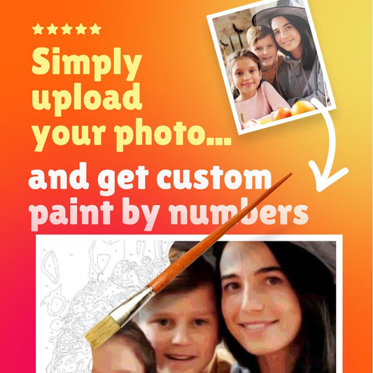
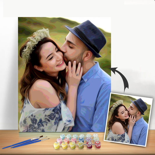
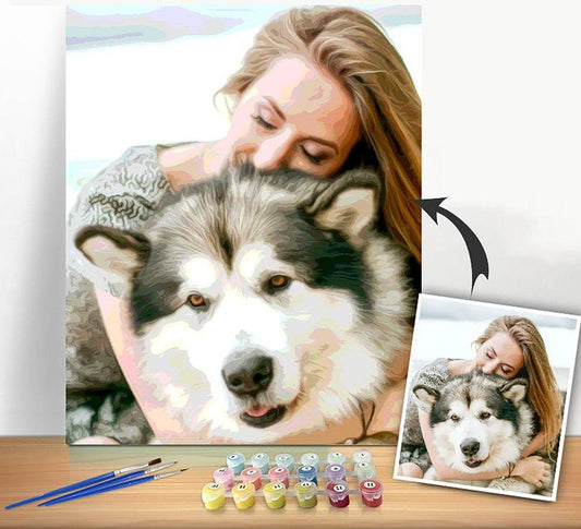
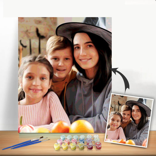
The best part? This method simplifies your color-mixing decisions, making it a fantastic foundation for any artist—even if you're working with custom paint-by-numbers kits designed to deliver a professional-looking result.
Building Your Perfect Analogous Palette
Creating a palette for an analogous painting isn't as intimidating as it sounds. The whole idea is to pick a family of colors that sit right next to each other on the color wheel. This simple choice ensures your painting feels cohesive and intentional from the very start. It all begins with one key decision.
First, you need what I call an anchor color. This is your hero, the hue that will set the overall mood and tone of your piece. If you're painting a vibrant sunset, a fiery orange might be your anchor. For a cool, misty forest scene, you might start with a deep blue-green.
Once you’ve got your anchor, the fun part begins. Just look at the colors on either side of it. Your analogous palette will be made up of that anchor color plus two to four of its immediate neighbors. This intentional limitation is what gives analogous paintings their signature, effortless harmony.
Picking Your Primary Palette
Let's put this into practice. Say you want to paint a field of lavender as the sun goes down. A rich violet would be a fantastic anchor color to capture the essence of the flowers.
From there, you’d build out your palette by picking its neighbors:
- Blue-violet: Perfect for painting in the deepening shadows or suggesting the cool evening air.
- Red-violet: A great choice for hinting at the last bits of warm light catching the flower tips.
This small family of three colors—violet, blue-violet, and red-violet—is all you need. It gives you a rich, unified palette that will blend beautifully on the canvas without turning into mud, which is often a risk when you mix colors from opposite sides of the wheel. If you want to explore this idea further, you can learn more about defining analogous color schemes in our guide.
Balancing Warm and Cool Palettes
This exact same logic works whether you’re aiming for a warm or a cool feel. A warm palette anchored by yellow could pull in yellow-green and yellow-orange—ideal for a sun-drenched beach or a crisp autumn afternoon. On the other hand, a cool palette starting with blue might use blue-green and blue-violet to render a stormy sea or a quiet, moonlit landscape.
This simple flow from color selection to a finished, focused piece is what it's all about.
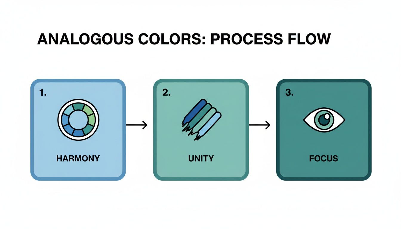
As you can see, choosing harmonious colors from the wheel naturally creates unity in your painting, which in turn gives your work a strong, clear focus that draws the viewer in.
Here’s the single most important tip: let one color dominate your painting. Choose your anchor and let it be the star of the show, covering the most area on your canvas. Your other analogous colors are the supporting cast; they're there to add depth and interest, not to steal the spotlight. This creates a powerful, balanced composition instead of one that feels muddled or flat.
Sample Analogous Color Palettes for Different Moods
Not sure where to start? Use this table to find an analogous color scheme that matches the feeling you want to convey in your painting.
| Desired Mood | Anchor Color | Analogous Palette Example | Ideal For Painting |
|---|---|---|---|
| Warm & Energetic | Red-Orange | Red, Red-Orange, Orange, Yellow-Orange | Sunsets, desert landscapes, vibrant florals |
| Serene & Natural | Green | Yellow-Green, Green, Blue-Green | Lush forests, botanical art, tranquil meadows |
| Cool & Calm | Blue-Violet | Blue, Blue-Violet, Violet | Night scenes, ocean scapes, winter landscapes |
| Playful & Bright | Yellow | Yellow-Green, Yellow, Yellow-Orange | Sunny days, cheerful still lifes, abstract art |
Think of these as starting points. You can always adjust the values by adding white or black to create an even richer, more dynamic palette from just a few core hues.
Bringing Your Colors to Life with Acrylics
Once you’ve settled on your analogous palette, the next step is the fun part: getting that beautiful harmony from your head onto the canvas. Acrylics are a brilliant choice for this. Their fast-drying, vibrant nature is why they’re a go-to for professional artists and the paint you'll find in high-quality paint-by-numbers kits.
The real secret to making an analogous painting pop isn't just the colors you choose—it's how you play with their value. A simple palette of blue, blue-green, and green can feel a bit one-dimensional if all the colors are the same brightness. To create depth and make your painting feel real, you need to work with a full spectrum of light and dark variations.
This is where your mixing skills come into play. Creating tints, tones, and shades is your most powerful technique for breathing life into the canvas.
- Tints: Add a bit of white to your main color. This lightens it up and is perfect for capturing highlights where the light would naturally fall.
- Shades: Mix in a very small amount of black. This creates darker, richer versions of your color, which are essential for painting shadows and adding dramatic contrast.
- Tones: Add a little gray (or a mix of black and white) to pull back a color’s intensity. Tones are fantastic for creating the subtle, natural mid-ranges that make a scene feel believable.
Without these shifts in value, even the most gorgeous analogous palette can end up looking flat. You can learn more about this and other foundational skills in our guide to essential acrylic painting techniques for beginners.
Mastering Smooth Blends and Transitions
One of the most captivating things about an analogous painting is that seamless, buttery flow from one color to the next. With acrylics, you can get that soft, professional-looking gradient using a technique called wet-on-wet blending. The trick is that you have to work fast, since acrylics don't wait around.
Here’s how you do it: lay down one of your colors, and while it's still wet, paint its neighboring color right next to it. Then, grab a clean, slightly damp brush and gently work the line where they meet. By pulling the colors into each other, you'll create a smooth, beautiful transition. Imagine blending a patch of yellow-orange into a pure orange to capture that gentle shift of light in a sunset sky.
Expert Tip: If you find your paint is drying too quickly, keep a small spray bottle of water nearby. A light mist over the canvas can give you a bit more blending time, helping you achieve those soft, fluid transitions that make analogous schemes so stunning.
The Therapeutic Power of Harmonious Color
There's a reason analogous colors are so popular right now—it ties into a larger movement toward art as a form of wellness. Recent surveys show that 65% of new hobbyists gravitate toward these schemes for their calming, "therapeutic flow," finding them more relaxing than working with stark contrasts.
This preference is even showing up in family activities. Kits designed with numbered analogous zones can keep children engaged twice as long, helping them build focus. This trend is part of a growing global painting tools market that's projected to hit $12 billion by 2026. For those of us looking for a way to unwind, users often report a 30% drop in anxiety after finishing an analogous piece, blending a creative hobby with genuine mental healing.
This link between color harmony and mindfulness is powerful. By working within a limited, related family of colors, you don't have to overthink every decision. Instead, you can lose yourself in the pure, relaxing joy of painting. The result isn't just a beautiful piece of art, but a calmer, more centered state of mind.
Using Analogous Colors in Your Composition
Choosing a beautiful analogous palette is a great start, but how you place those colors in your composition is what really makes a painting come alive. It’s all about strategy. Where you put each hue directs the viewer’s eye, builds depth, and sets the entire emotional tone of your work. This is the secret to turning a simple collection of colors into a piece of art that truly connects with people.
One of the most powerful ways I use analogous colors is to create atmospheric perspective, especially when painting landscapes. You can easily mimic the way distance affects our vision by placing your lighter, cooler, and less saturated colors in the background.
Imagine painting distant mountains in soft, hazy blue-violets and pale greens. As you move toward the foreground, you can gradually shift to warmer, more vibrant greens and yellows. This simple technique instantly creates a convincing illusion of depth, pulling the viewer right into the scene.
Directing the Eye in Portraits and Abstracts
These same principles work wonders for other subjects, too. When I'm painting a portrait, I often reach for a warm analogous palette of reds, oranges, and soft yellows to create a natural, radiant glow on the skin. Placing the lightest tints on the high points of the face—like the cheekbones and the bridge of the nose—while using deeper shades for the shadows gives the subject a stunningly lifelike, three-dimensional form.
In abstract art, analogous schemes are fantastic for creating a sense of flow and movement. You can arrange your colors in sweeping curves or gentle gradients that guide the eye across the canvas. Think of a swirl of deep blues blending into vibrant teals to capture the energy of an ocean wave, all while maintaining a sophisticated, unified feel. Getting a handle on these techniques is a huge part of mastering https://paint-by-number.com/blogs/learn-about-paint-by-numbers/color-in-composition.
Analogous colors aren't just pretty; they have a psychological impact. Studies in color therapy have shown they can lower stress by up to 25% more effectively than jarring complementary colors. Van Gogh was a master of this, and you can see it in his 1889 masterpiece, 'Starry Night.' The swirling analogous blues and cyans—covering nearly 80% of the canvas—convey profound emotion without feeling chaotic.
The 60-30-10 Rule for Harmony
If you’re ever unsure how to balance your colors, here’s a classic design trick I always come back to: the 60-30-10 rule. It’s a simple framework that helps you distribute your colors for a harmonious result.
- 60% Dominant Color: This is your anchor color. It will cover the largest area and set the primary mood for the painting.
- 30% Secondary Color: Use the next color in your analogous trio to add interest and support the main hue.
- 10% Accent Color: Your final color should be used sparingly for those small details that add a final pop of depth and finish the piece.
This structure prevents any single color from overpowering the others, giving your painting a polished, intentional look.
No matter what you paint with, solid composition is key. For digital artists working on a tablet, having the right tool is just as crucial. You can find the best iPad stylus for drawing to help bring your digital visions to life.
Tips for Custom Paint-By-Numbers Kits
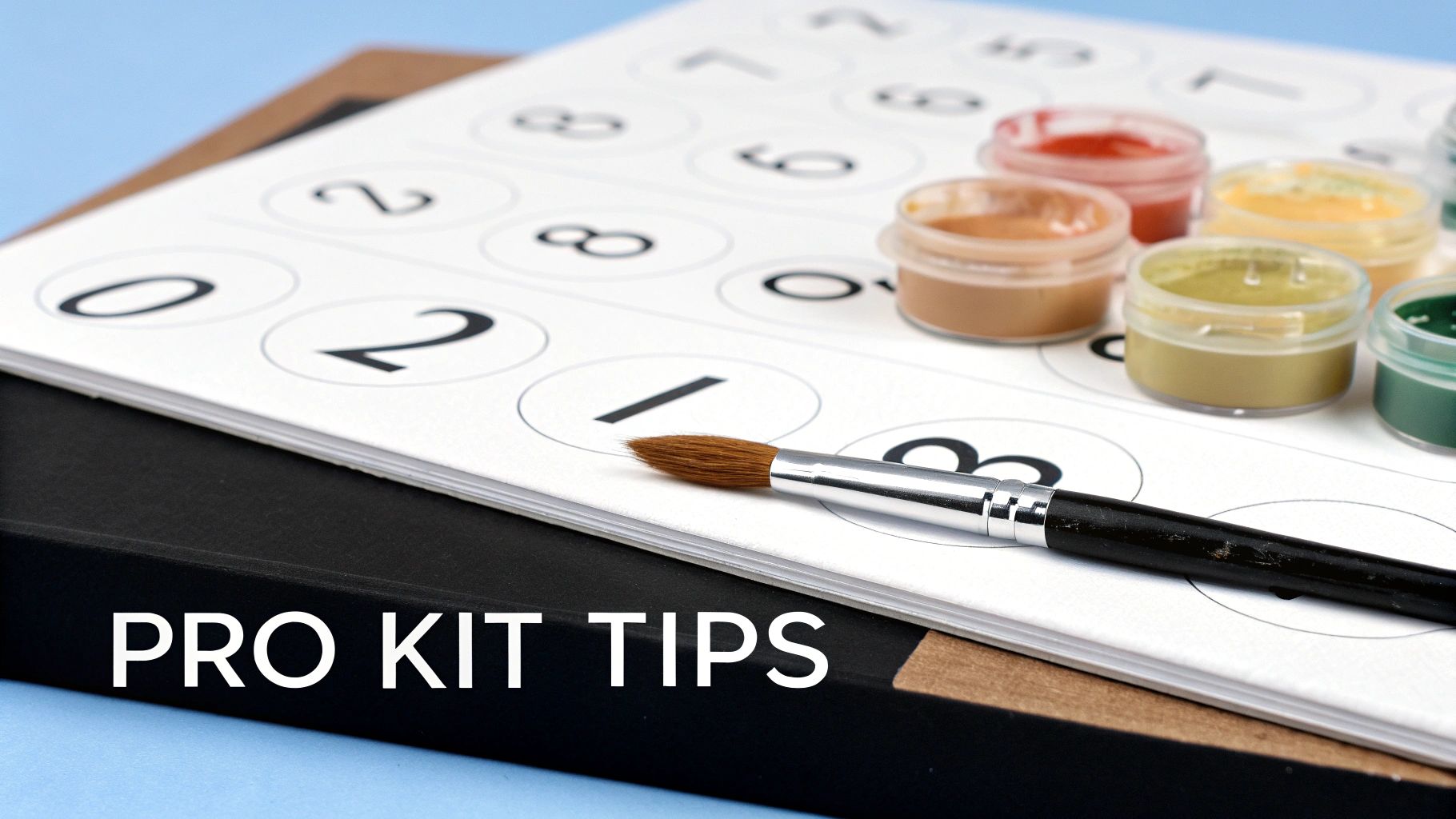
If you've ever worked with a paint-by-numbers kit, you’ve seen analogous color theory in action. Think about it: the designers break down complex images by grouping related shades together. A sunset section might move from pot #1 (yellow) to #2 (yellow-orange) and then to #3 (orange), a perfect analogous family.
They do this to ensure a harmonious, professional-looking result right out of the box. The hard work of building the palette is already done for you. But you don't have to stop at just filling in the lines. With a few simple tricks, you can elevate your kit from a relaxing hobby into a genuinely stunning piece of art.
Go Beyond the Numbers With Blending and Feathering
The most obvious giveaway of a paint-by-numbers piece is often the hard, blocky edges between colors. Softening these lines is surprisingly easy and makes a huge difference.
A great way to do this is to pre-blend your paints. Before you even touch the canvas, mix a tiny bit of paint from two adjacent pots on a separate palette. For instance, if you have a light blue and a mid-tone blue, mix them to create a new transitional shade. Then, paint this custom color right on the border where those two numbers meet.
This simple act of creating an in-between color is the secret to getting those smooth, seamless gradients you see in professional paintings. It breaks down the rigid "coloring book" feel and introduces a natural, fluid transition.
Another fantastic technique is feathering. While the paint in one section is still wet, take a clean, slightly damp brush and gently drag the edge of the color into the neighboring empty section. When you paint that adjacent color, you can work its wet edge back into the first, creating a soft, blended border instead of a sharp line.
Add Your Own Artistic Flair
Once you understand why your kit is using analogous colors, you can start making your own creative choices. Don't be afraid to experiment a little.
If a section calls for a specific green, try adding a tiny touch of the neighboring yellow-green to create subtle highlights that weren't in the original design. This instantly adds a layer of depth and personal style.
These techniques help you move beyond just following instructions and start thinking like an artist. You'll begin to see how the carefully chosen colors work together to build harmony. By blending, feathering, and adding your own subtle variations, you're not just completing a kit—you're creating a unique piece that showcases your new skills. The final result will be a polished, dynamic painting you’ll be proud to hang on your wall.
Navigating Common Analogous Color Questions
Whenever I talk to artists about using analogous colors, the same couple of questions always seem to come up. It makes sense. While everyone loves the idea of creating that seamless, harmonious look, there's often a lingering fear of making the final piece feel a bit too uniform, or worse, just plain flat.
Let's tackle these common worries head-on. A few simple shifts in your approach can transform these potential weak spots into your painting's greatest strengths, giving you the confidence to really master this technique.
Will My Painting Look Boring or Monochromatic?
This is, without a doubt, the number one concern I hear. The good news? It's completely avoidable. The secret weapon against a flat-looking analogous painting isn't adding more colors from outside your scheme—it's creating strong value contrast.
Value is simply the lightness or darkness of a color. To bring your piece to life, you need a full range of values within your chosen palette. Mix your base colors with white to create bright, airy tints for highlights. For the shadows, mix them with a tiny bit of black or their complementary color to get deep, dramatic shades.
Imagine a green-blue-violet scheme. You'll want some pale, almost-white greens for where the light hits, but you'll also need some deep, moody violets for the shadows. That dynamic push and pull between light and dark is what gives your work depth and stops it from feeling one-note.
How Do I Pick the Right Main Color?
Your dominant color is the anchor of your painting; it's what sets the whole mood. The best way to choose it is to first decide on the feeling you want to create.
- Want something warm and full of energy? Pull your anchor from the red, orange, or yellow part of the wheel.
- Going for a calm, quiet, or somber vibe? Start with a blue, green, or purple.
If you’re painting from a reference photo, squint your eyes and look at it. What’s the one color that seems to cover the most ground? That's your natural starting point. This dominant color will be the first thing a viewer’s eye registers, immediately telling the story of your piece.
Does an Analogous Painting Have to Be Strictly Analogous?
Not at all! While a purely analogous scheme is beautiful, adding a small "pop" of a complementary color (the color directly opposite your anchor on the color wheel) can create a powerful focal point.
Think about a landscape filled with lush greens and cool blues. A single, tiny splash of brilliant orange—maybe a flower or a distant rooftop—will instantly command attention.
The trick is to use it with restraint. A good rule of thumb is to keep that complementary accent to 5% of your canvas at most. It’s just enough to add a little spark and visual excitement without breaking the beautiful harmony you've worked so hard to create.
Ready to transform your favorite photos into a masterpiece? At Custom Paint By Numbers, we make it easy to create your own personalized paint-by-numbers kit. Start your artistic journey today!