
When you see a painting of a deep forest or a soft sunset, what makes it feel so peaceful? Chances are, the artist used an analogous color scheme. This just means they chose colors that are neighbors on the color wheel—like blue, blue-green, and green. This simple trick is one of the oldest in the book for creating art that feels unified, calm, and naturally cohesive.
Understanding Analogous Colors and Visual Harmony
That instant sense of peace you get from certain paintings isn't magic; it's smart color choice. Analogous palettes typically use a group of three to five colors that sit right next to each other on the color wheel. Because they all share a common base color, they just naturally work well together.
Think of it like a family of colors. A classic example would be yellow, yellow-green, and green. They all have yellow and green in them, so they blend beautifully without any harsh or jarring contrasts. This built-in relationship is what makes these palettes so good at creating a soothing, unified mood in a painting.
The Power of Cohesion in Art
This is far from a new concept. For centuries, artists have leaned on this principle to guide how a viewer feels. The Impressionists and Post-Impressionists, like Claude Monet and Vincent van Gogh, were masters at this. They would deliberately pick adjacent colors to create a specific mood, which is why their landscapes feel so serene and their interiors so calming.
So, why should you use an analogous palette in your own work?
- It creates a calm atmosphere. The low-contrast vibe is easy on the eyes, making it perfect for tranquil scenes, portraits, and still lifes.
- It simplifies color mixing. Since the colors are already related, they mix together cleanly. You’re far less likely to end up with muddy, dull tones on your canvas.
- It guides the viewer's eye. The gentle shifts in color create a natural flow, letting you direct the viewer’s attention without shouting for it.
An analogous scheme really takes the guesswork out of creating harmony. It gives you a solid framework for cohesion, so you can focus more on the fun stuff like value, composition, and texture to make your painting pop.
Analogous vs. Other Color Schemes
To really get why analogous palettes are so special, it helps to see how they stack up against other color schemes. While analogous colors are all about harmony, other relationships are built for high-energy contrast. Knowing the difference is a huge part of understanding the basics, which we cover in our guide to color theory for beginners.
Here’s a quick breakdown of how these common schemes compare.
Quick Guide to Common Color Schemes
| Color Scheme | Color Wheel Relationship | Common Mood/Effect |
|---|---|---|
| Analogous | 3-5 colors next to each other | Harmonious, calm, serene, unified |
| Complementary | Colors directly opposite each other | High-contrast, dynamic, vibrant |
| Triadic | Three colors evenly spaced | Balanced, energetic, diverse |
Each scheme serves a different purpose. One creates quiet harmony, while another creates loud, exciting energy.
Interestingly, these ideas aren't just for painters. You’ll find the same logic in other creative fields, which is why exploring the principles of home design color theory can give you an even broader perspective on how to use color effectively.
How to Choose Your Perfect Analogous Palette
Picking the right analogous colors isn't about following strict rules; it's all about capturing the specific mood you're after. The best place to start is with a good old-fashioned color wheel. Your first move? Choose a "hero" color. This is the one that will set the emotional tone for the whole painting.
Think of this hero color as your anchor. Painting a fiery autumn landscape? A deep orange might be your hero. For a calm, rolling ocean, you’d probably start with a serene blue. Once you’ve landed on that main color, the rest of your palette just falls into place by picking its closest neighbors on the wheel.
Warm vs. Cool Palettes
The feel of your painting will lean heavily on whether you go warm or cool. Warm analogous colors—think reds, oranges, and yellows—just scream energy, passion, and intimacy. They have a way of pulling the viewer in, creating a real sense of closeness.
On the flip side, cool analogous colors like blues, greens, and purples evoke a sense of calm, peace, and even distance. They're perfect for quiet landscapes, moody portraits, or peaceful interior scenes. Research actually backs this up: studies show that paintings with cool palettes are rated as calmer by 60%–75% of people, while warm palettes are seen as more energetic by 55%–70% of viewers.
Pro Tip: You don't have to stick to just three colors. An analogous palette can stretch to five neighboring hues. But from my experience, the magic number is often a trio: a dominant color, a supporting one, and a third used sparingly as an accent.
Building Your Palette
To give your artwork real depth and stop it from looking flat, it helps to give each color a job. This little trick creates a clear visual hierarchy and makes your painting much more compelling.
Think of your palette like a cast of characters:
- The Dominant Color: This is your hero, the main star of the show. It covers the most canvas and sets the overall mood.
- The Supporting Colors: These are the two colors right next to your dominant one. They add subtle shifts and dimension, backing up the main theme without stealing the spotlight.
- The Optional Accent: Sometimes, a tiny splash of a fourth analogous color—or even a neutral like gray or beige—can add that perfect little pop of interest.
Interestingly, these principles aren't just for canvas work. The same ideas about creating harmony apply in many other design fields. If you're interested in how this works in a different context, you might find some great ideas in a simple guide on how to choose paint colors for rooms.
Two Sample Palettes to Get You Started
Ready to jump in? Here are a couple of my go-to palettes that show how this works in practice.
1. Sunset Glow Palette (Warm)
- Dominant: Orange
- Supporting: Red-Orange, Yellow-Orange
- Mood: Energetic, warm, and inviting. This is your go-to for sunsets, fall foliage, or a cozy, fire-lit room.
2. Forest Calm Palette (Cool)
- Dominant: Green
- Supporting: Yellow-Green, Blue-Green
- Mood: Tranquil, peaceful, and natural. Think lush landscapes, botanical illustrations, or serene water scenes.
Starting with simple frameworks like these gives you the confidence to build your own unique palettes. And if you want to dig deeper, you can define analogous color in more detail to really master the concept.
Techniques for Mixing and Applying Your Colors
Okay, you’ve picked out your harmonious palette. Now for the really fun part: getting those colors from your palette onto the canvas. When you're working with an analogous scheme, the magic isn't in big, bold contrasts. It’s all about the subtle shifts in value and texture that bring a piece to life. This is how you create real depth and keep your painting from feeling flat.
The trick is to take your three or four core colors and expand them into a whole family of related hues. You do this by mixing up tints, tones, and shades. A tint is just your base color plus white. A tone is your base color muted with grey. And a shade is your base color darkened with black or even a dark complementary color.
This quick visual guide breaks down how to choose your starting colors before you even pick up a brush.
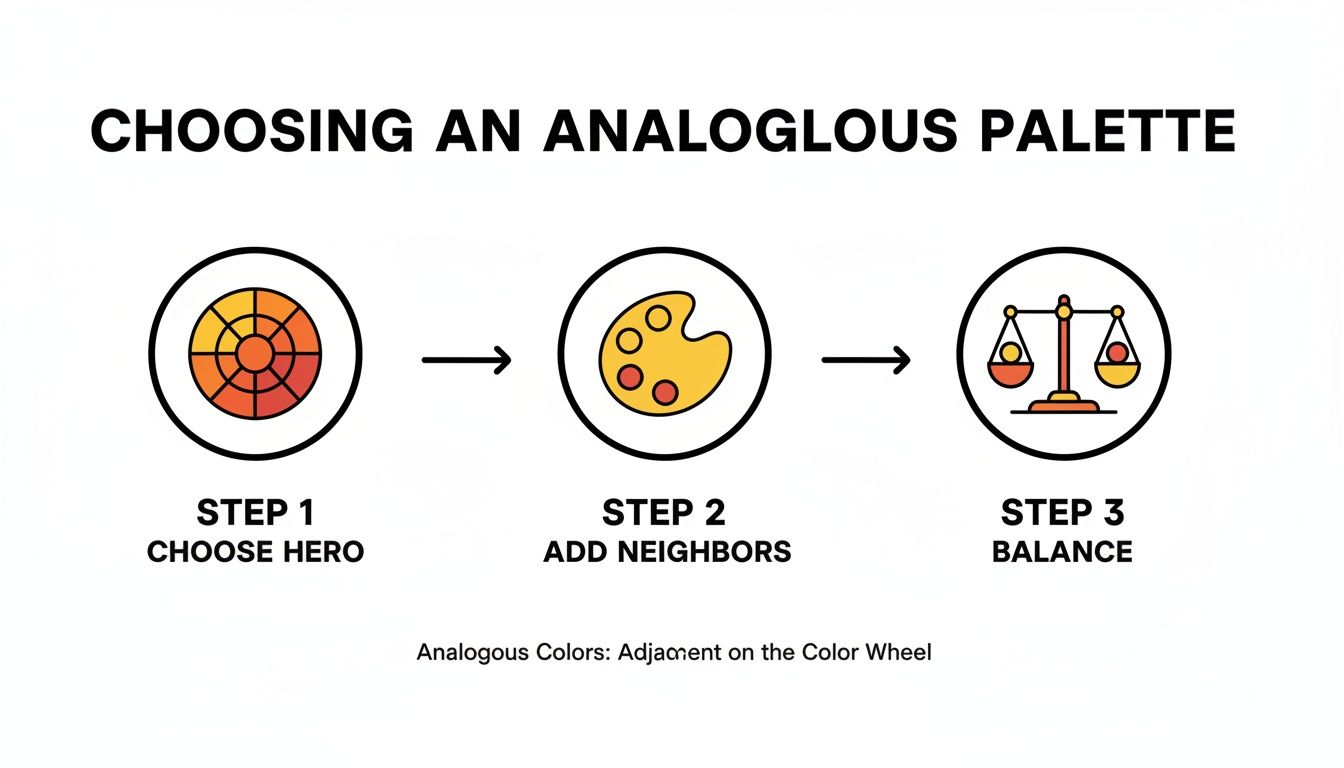
Starting with a strong "hero" color, pulling in its neighbors, and then carefully balancing their roles—that’s the secret sauce for a great analogous painting.
Creating Depth with Value and Purity
Every good painting needs a focal point, a place for the eye to land. With an analogous palette, one of the best ways to achieve this is to use the purest, most saturated version of your dominant color right where you want the most attention. Then, you can surround that spot with the various tints, tones, and shades you’ve mixed.
Imagine you're painting a lush green forest scene:
- Your focal point—maybe a patch of moss catching the sunlight—would get your brightest, most vibrant green.
- Trees in the middle ground could be painted using tones (your green mixed with a bit of grey) to make them feel a little further away.
- For the deep shadows under the canopy, you'd use shades (green mixed with black or a deep blue) to really push them back and create depth.
This method naturally creates a visual hierarchy. The pure, intense color pops forward while the less saturated versions recede, giving your painting an immediate sense of dimension. The best part? You get all that focus and depth without needing a single clashing color. For more hands-on tips, our guide on how to mix acrylic paint colors is a great resource.
Mastering Blending and Gradients
Analogous colors were practically made for creating smooth, gorgeous gradients. Because the colors are already family, they blend into one another seamlessly without turning into mud. This is a massive advantage when you're painting things like skies at dusk, calm water, or rolling hills.
Pro Tip: When blending, I like to use a slightly damp brush to gently feather the edges between two colors. It creates a soft, natural transition that really enhances the serene, unified feel of an analogous palette.
If you're using acrylics, which dry notoriously fast, it's best to work in small sections while the paint is still wet. Lay down your two neighboring colors side-by-side, then grab a clean, soft brush and gently pull one color into the other. This technique is perfect for capturing those subtle shifts in a sunset, where a fiery orange melts right into a red-orange. By mastering these gentle transitions, you can guide the viewer's eye across the canvas, reinforcing the peaceful harmony you set out to create.
Creating Depth and Focus in Your Painting
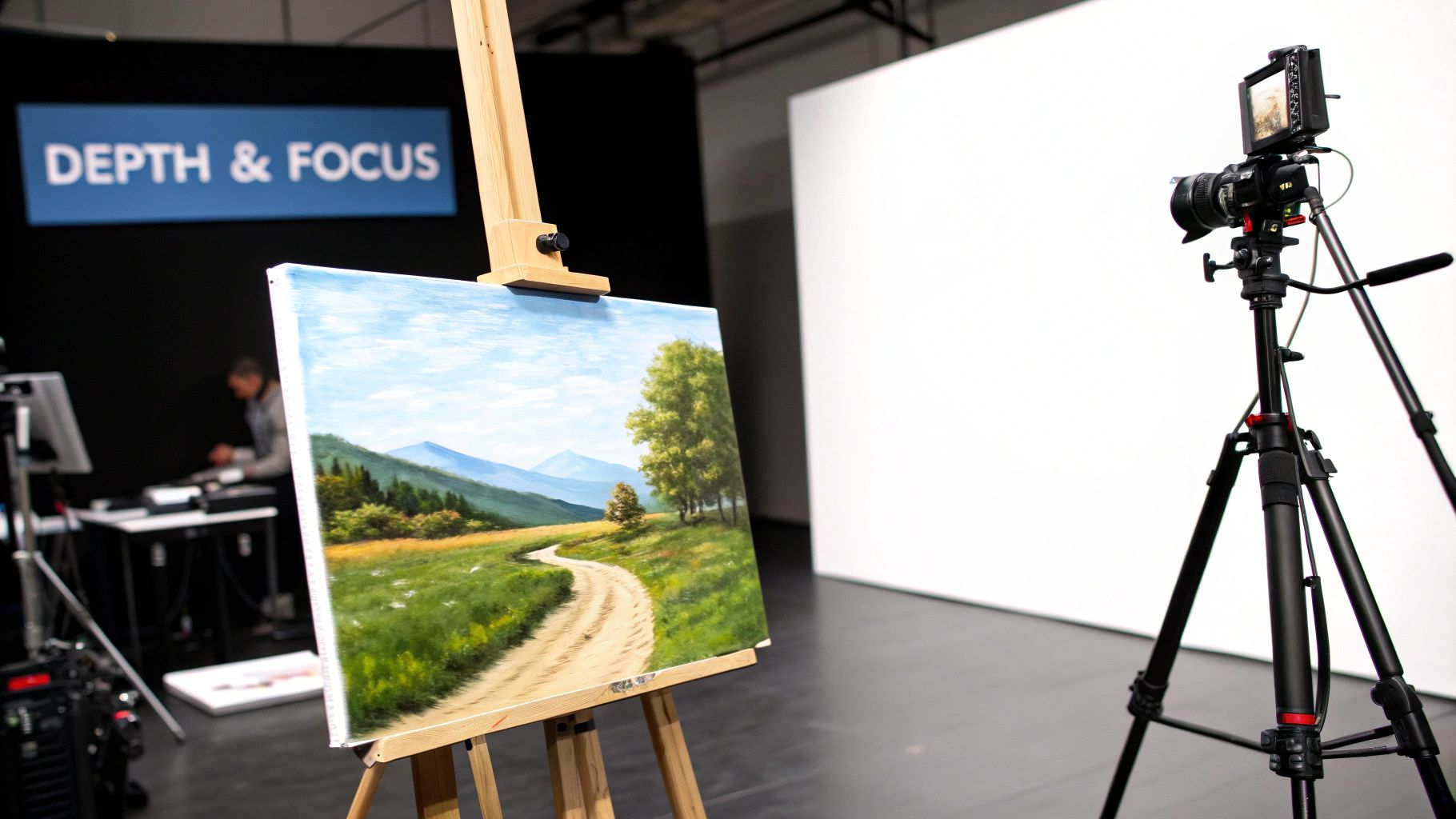
One of the biggest traps when working with an analogous palette is ending up with a painting that feels flat. Because the colors are so harmonious, they can sometimes merge into a single, monotonous wash if you're not careful.
The secret to avoiding this? It's all about creating powerful contrast with elements other than color. Once you get the hang of using value, temperature, and edges, you can build incredible depth and guide the viewer's eye exactly where you want it.
This isn't some new-age trick; it's a technique with a long history. In fact, studies of digitized art collections have shown that roughly 25%–35% of Western oil paintings from 1800–1950 used palettes consistent with analogous schemes. Those artists relied on these very methods to build harmony without sacrificing dimension. You can discover more insights about these historical color palettes and see how the masters put them to work.
Master Contrast with Value, Not Just Hue
In an analogous painting, value—how light or dark a color is—becomes your most important tool. A piece with a strong value structure will always have impact, even if the colors themselves are very close. Without it, the whole thing can feel lifeless.
There’s a simple and incredibly effective way to check if your values are working: the squint test.
- Take a few steps back from your canvas.
- Squint your eyes until all the details and colors start to blur.
- What do you see? You should be able to make out clear, distinct shapes of light, mid-tone, and dark.
If everything just blends into a single greyish blob, your values are too similar. You'll need to push your darks darker and your lights lighter to build a composition that really holds together.
The squint test is my go-to reality check. It instantly cuts through the distraction of color and shows me if the foundational light-and-dark structure of my painting is working. It’s a simple trick that makes a massive difference.
Use Temperature and Edges to Define Form
Beyond value, you can create a surprising amount of depth by playing with color temperature and the quality of your edges. Even within a narrow analogous range, you’ll find warmer and cooler versions of each color.
Let's say you're painting a green hillside—a perfect subject for a yellow-green, green, and blue-green palette. Here's how to make it look three-dimensional:
- Shadows: Reach for your coolest color, a deep blue-green, for the darkest shadows. Cool colors naturally recede, which will make those areas feel farther away.
- Mid-tones: Your true green will define the main body of the hillside, covering the areas in neutral light.
- Highlights: Use your warmest color, a bright yellow-green, for the spots where the sunlight is hitting directly. Warm colors appear to advance, making these areas pop right off the canvas.
This subtle temperature shift is all it takes to create convincing form.
Finally, think about your edges. A sharp, crisp edge around your focal point will immediately draw the viewer's attention. In contrast, softer, blurred edges in the background will make those areas recede, giving your work a professional, layered look.
Bringing It All Together: From Photos and Kits to Art
So, how do you take these concepts and apply them to a real-world project? It can feel a little intimidating when you're staring at a photo with a million different colors or a paint-by-number kit with a specific set of paints.
The secret is to simplify. Instead of getting bogged down trying to match every single shade, your real goal is to capture the overall mood of the scene with a focused, analogous palette. This mindset shift is what turns a technical exercise into an artistic one, helping you create cohesive and beautiful analogous colors paintings.
Turning a Photograph into a Palette
A photograph is your starting point, not your rulebook. A camera captures every detail without bias, but your job as an artist is to make choices—to interpret what you see. The first thing I always do is squint at my reference photo and try to identify its dominant color temperature.
Is it a warm, golden-hour scene filled with yellows and oranges? Or is it a cool, overcast morning with soft blues and violets? That single observation is your key to picking a "hero" color.
- For a warm photo: Maybe your main color is a rich orange. You can then pull in its neighbors, like red-orange and yellow, to build out the light and shadow in your painting.
- For a cool photo: If the scene feels blue, you could start there. Then, bring in blue-green and blue-violet to create depth and variation while keeping everything harmonious.
The real skill here is learning to see the color story hiding in a photo. Don't get overwhelmed by a thousand shades of green in a forest. Instead, see that the whole landscape is bathed in a cool, blue-green light and choose your colors based on that.
This approach transforms a complex photograph into a simple, manageable color plan. You're no longer just copying—you're capturing the feeling of the place.
Giving a Paint-by-Number Kit Your Own Spin
Paint-by-number kits are fantastic for practicing, but you're not locked into following them perfectly. Let's be honest, sometimes the color choices in a kit can feel a bit random or harsh. This is your chance to step in and apply what you know about analogous colors to create something more sophisticated.
I've found there are a couple of great ways to do this.
1. Go for a Limited Palette
Look at all the paints the kit provides and find a core analogous group. Maybe the kit has greens, blues, and purples. You could decide to stick only to the green, blue-green, and blue paints. This instantly unifies the composition, giving it a calm, cohesive feel.
2. Mix and Blend Strategically
Use the kit's colors as your base ingredients. If you have a bright yellow and a primary red, don't just use them straight out of the pot. Mix them! You can create a whole spectrum of beautiful yellow-oranges and warm oranges.
This technique is perfect for blurring the lines between numbered sections. By mixing adjacent colors on your palette and creating soft gradients, you can smooth out those hard edges. It's a simple change that makes the finished piece feel much more like a custom, freehand painting and less like a kit.
Questions I Hear All the Time About Analogous Paintings
When you first start exploring analogous color schemes, it’s easy to feel a bit lost. You're working with colors that are naturally close friends, but that very closeness can present some tricky challenges. I've seen artists run into the same handful of problems time and again, but thankfully, the fixes are usually just small shifts in how you think about your palette.
Let's tackle some of those common questions so you can approach your next piece with a lot more confidence.
A big one I always get is, "How do I keep my painting from looking flat or boring?" It's a valid concern. When your colors are so similar, you run a real risk of everything just mushing together into one uniform blob.
The secret isn't to start throwing in new colors. Instead, you need to get obsessed with value and temperature contrast. Before you even lay down a hue, think about your lights and darks. Squint at your subject (or your painting) until all the colors disappear. Do you still see distinct light and dark shapes?
If everything dissolves into a single gray mass, you need to push your values. Make your darks darker and your lights lighter. This is what will give your painting structure and stop it from feeling monotonous.
How Many Colors Should I Actually Use?
Another common question revolves around the "right" number of colors for an analogous palette. Should you stick to three? Can you push it to five?
The honest answer is, it depends. While a textbook analogous scheme usually features three to five colors right next to each other on the color wheel, there's no magic number. It all comes down to the mood and complexity you're aiming for.
- Three Colors: This is the perfect place to start. It keeps things simple and manageable. You can easily assign jobs: one color is the star of the show (dominant), one is the supporting actor (supporting), and the last one adds a little sparkle (accent).
- Four to Five Colors: If you're tackling something with a lot of detail, like a lush landscape or a complex portrait, a wider palette can help you create more subtle, sophisticated shifts in color. The only catch is that it gets a bit harder to control, and you risk losing that tight, harmonious feel if you're not careful.
My personal advice? Start with three main colors. Get really good at creating depth and interest with that limited set. Once you feel solid, try adding a fourth or fifth and see what happens. You'll have a much better feel for how to expand your range without making a mess.
In the end, it’s all about being intentional. Whether you pick three colors or five, make sure each one has a specific job to do in your painting. If you focus on building a strong value structure and balancing your palette, you'll sidestep the common pitfalls and create art that feels both beautifully unified and visually exciting.
Ready to see how a harmonious color scheme can transform one of your own photos? At Custom Paint By Numbers, we can help you turn a favorite memory into a stunning piece of art with a perfectly balanced palette. Start creating your own custom kit today and bring your vision to life.