
When you hear artists talk about painting with analogous colors, they're really talking about a simple but powerful technique: using colors that are next-door neighbors on the color wheel. This creates a composition that feels instantly unified and harmonious.
Forget clashing contrasts. This is about picking one main color and then pulling in its two closest friends to create a seamless, pleasing look. It's a strategy you see everywhere, especially in nature.
What Are Analogous Colors in Painting
Let's break down what makes analogous colors such a fantastic tool for painters. Instead of getting lost in complicated theories, just think of it as a go-to recipe for beautiful art.
These color "neighbors" always work well together because they share a common base hue. That shared DNA is the secret sauce behind their calm, natural harmony. For painters like us, it means less time agonizing over color choices and more time creating intuitively.
The Harmony Found in Nature
The easiest way to really get this concept is to just look outside. Nature is the original master of analogous palettes. You can spot them everywhere once you start looking.
- A sunset: Watch how the sky melts from red into red-orange, and finally into a soft orange.
- A forest canopy: See all those subtle shifts from a bright yellow-green to a deep forest green, and then to a cool blue-green in the shadows.
- Autumn leaves: Think of that gorgeous gradient from yellow to yellow-orange and then a fiery deep orange.
When you use these schemes in your own work, you're tapping into the natural world's playbook. That’s why the final piece feels so right and complete to the viewer.
This isn't some new-fangled idea. The concept of analogous colors has its roots in Sir Isaac Newton's groundbreaking work back in 1665, when he first mapped out colors in a circular diagram.
Later on, artists from the Bauhaus movement really refined this idea. They showed how placing colors like yellow, yellow-green, and green side-by-side could produce incredibly compelling tonal shifts. Today, you'll find analogous schemes featured in nearly 70% of introductory art textbooks as a core example of color harmony.
Why This Matters for Your Art
For any artist, getting comfortable with an analogous palette is a game-changer. It's one of the best ways to set a specific mood. A warm palette of reds and oranges can feel vibrant and full of energy, while a cool palette of blues and greens instantly brings a sense of peace and tranquility.
This straightforward strategy lets you build depth and dimension without creating any jarring transitions. If you're new to all this, our full guide on color theory for beginners is a great place to start building your foundation.
How To Choose Your Analogous Color Palette
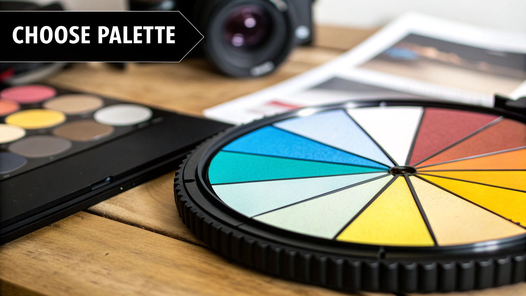
Honestly, picking the right analogous colors is less about following rigid rules and more about trusting your gut. The best way to start is by grabbing a simple color wheel. Think of it as your map for finding harmonious color families that really capture the mood you're going for.
You're essentially choosing a "parent" color and then inviting its closest relatives to the party. This main color becomes the star of your show, setting the whole tone for your painting.
Start With a Dominant Color
First things first, you need to pick one main color to be the dominant hue. This is the color that will cover the most space on your canvas and anchor the painting's emotional feel. Ask yourself: am I trying to create a warm, energetic scene or something cool and tranquil?
- For warmth and energy: Your starting point will likely be a dominant red, orange, or yellow.
- For calmness and serenity: You'll want to begin with a dominant blue, green, or purple.
This decision is everything because it grounds your entire palette. Once you've got this parent color locked in, finding its supporting cast is a piece of cake.
Build Your Color Family
With your dominant hue selected, just look at the two colors sitting right next to it on the color wheel. These are your supporting players. Together, these three hues create a natural, cohesive family that feels instantly harmonious.
For instance, if you pick orange as your dominant color, its neighbors are yellow-orange and red-orange. This trio gives you a fiery, vibrant palette that’s perfect for painting a dramatic sunset or a field of autumn flowers.
The use of analogous colors really took off with modernist artists like Henri Matisse. In many of his famous works, it’s estimated that up to 80% of his palette was made up of these closely related hues. This technique allowed him to create a powerful sense of unity without relying on harsh contrasts.
Match the Palette to the Mood
Here’s where the real magic happens. Painting with analogous colors is a fantastic way to evoke specific feelings. The color family you choose should directly support the story you want your painting to tell.
Let's walk through a couple of real-world examples:
- A Cool Forest Scene: To capture that quiet, shaded feeling of a deep forest, you might choose green as your dominant color. Its analogous partners, yellow-green and blue-green, are perfect for adding depth—think of sunlit leaves and the cool shadows between trees. The result is a peaceful, organic atmosphere.
- A Warm Beach Sunset: For the intense glow of a sunset over the water, yellow would be a great dominant hue. By adding yellow-orange and orange, you can build those rich, warm layers that make the scene feel vibrant and alive.
To give you a better feel for this, here's a quick look at some common palettes and the emotions they tend to evoke.
Sample Analogous Color Palettes and Their Moods
| Palette Example (Dominant First) | Component Colors | Associated Mood or Theme |
|---|---|---|
| Yellow-based | Yellow, Yellow-Green, Yellow-Orange | Joyful, Energetic, Optimistic, Sunny |
| Blue-based | Blue, Blue-Green, Blue-Violet | Calm, Serene, Trustworthy, Melancholic |
| Red-based | Red, Red-Orange, Red-Violet | Passionate, Intense, Romantic, Energetic |
| Green-based | Green, Yellow-Green, Blue-Green | Natural, Peaceful, Revitalizing, Balanced |
| Violet-based | Violet, Red-Violet, Blue-Violet | Mystical, Royal, Creative, Spiritual |
This table is just a starting point, of course. The real fun comes from experimenting with different combinations and seeing what speaks to you.
Once you get comfortable with analogous schemes, you can also explore various winning color combinations for creative projects to see how different palettes communicate different messages. And if you ever need a refresher on getting the perfect shades, our acrylic paint mixing guide has some great hands-on tips.
Bringing Your Analogous Palette to Life on Canvas
Alright, you've picked your analogous colors. Now for the fun part: getting that beautiful, harmonious palette onto your canvas.
One of the biggest hurdles I see painters face with analogous schemes is that everything can start to look a bit... flat. Because the colors are so close to each other on the color wheel, they have a natural tendency to blend together, and you can lose the definition that makes a painting pop.
The secret weapon here is mastering value and saturation. In simple terms, value is how light or dark a color is, and saturation is its intensity. By playing with these two elements, you can turn just a few neighboring colors into something truly dynamic and sophisticated.
Creating Depth with Tints, Shades, and Tones
So, how do you get that range? You’ll expand your three core colors by creating tints, shades, and tones. This sounds more technical than it is—all you really need are your core colors plus a tube of white and a tube of black paint.
- Tints: Add a bit of white to your original color. This lightens and softens it up. Tints are fantastic for painting highlights or creating the illusion of distance.
- Shades: Add a touch of black. This darkens the color, giving it more depth. Shades are your go-to for creating shadows and adding a sense of weight or drama to your piece.
- Tones: Mix in some grey (a bit of black and white). This mutes the color and makes it less vibrant. Tones are perfect when you’re aiming for a more subtle, sophisticated mood.
This little infographic breaks it down visually, showing how to get these crucial variations from a single color.
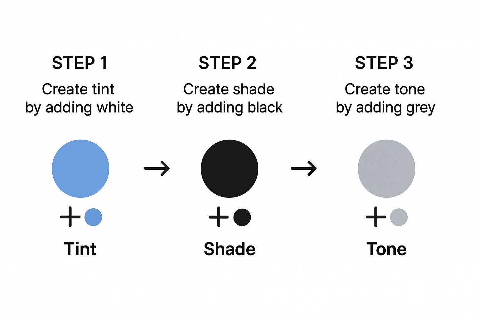
As you can see, just a little black and white paint opens up a massive range of possibilities, giving you everything you need for a rich and varied painting.
A Practical Approach to Layering
Let's get this on the canvas. The trick is to be intentional with your colors. Don't just throw them on the canvas randomly; give each one a specific job to create a balanced composition.
I always start by blocking in the largest areas of the painting with my dominant hue and its variations. Let's say you're painting a green forest scene. You might use your pure green for the mid-ground, a lighter green tint for leaves catching the sunlight, and a dark green shade for the deepest shadows.
A great rule of thumb is to think in terms of value first and color second. If your painting has a strong structure of lights and darks, it will look compelling even in a black-and-white photo.
Once your main shapes are blocked in, bring in your two supporting colors to define forms and create those lovely, smooth transitions. In our forest example, you could weave in your blue-green to add a cool feeling to the shadows or to define the edges of trees far in the distance. Then, you could use your yellow-green to highlight foliage where the light hits directly, adding a bit of warmth and life.
It's these subtle shifts that make an analogous painting feel so immersive. If you want to dive deeper into creating those seamless transitions, we have a whole guide on how to blend paint colors. By carefully layering your tints, shades, and pure hues, you'll turn a simple palette into a work of art with incredible depth.
Using a Contrast Accent to Create a Focal Point
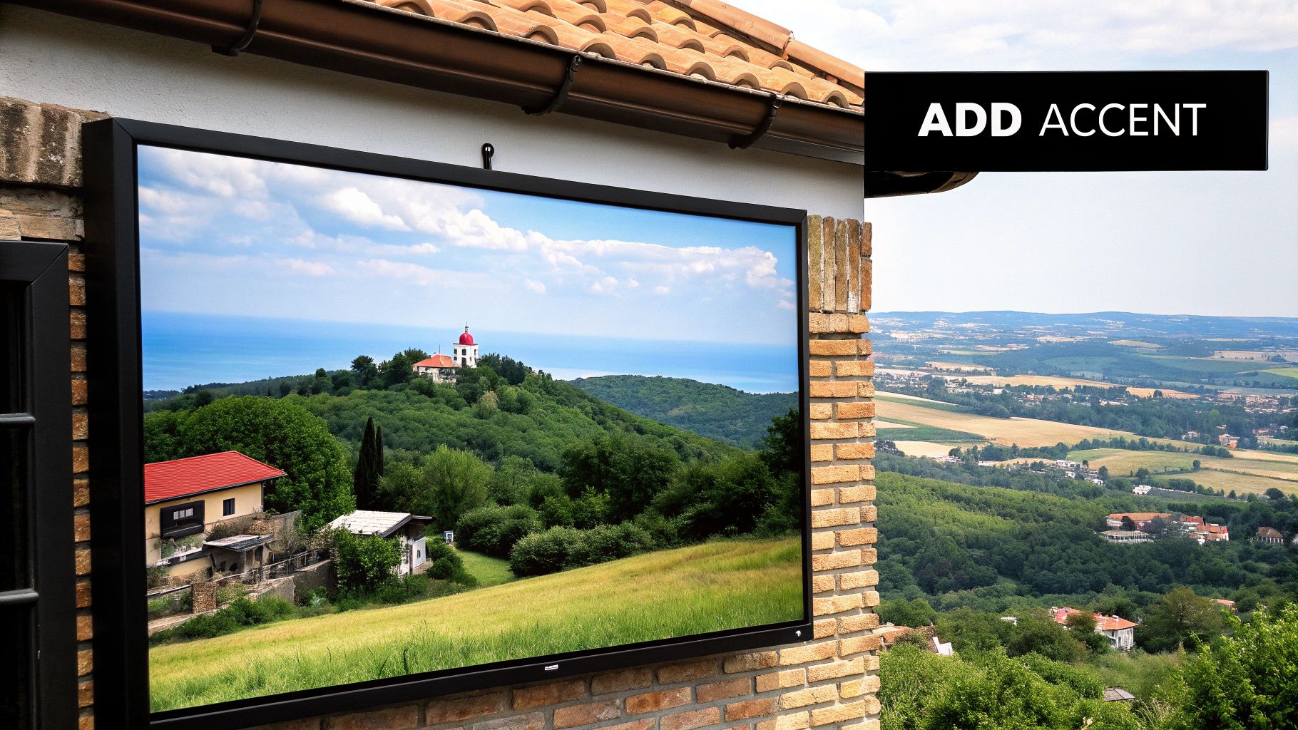
There's a beautiful, natural harmony you get when painting with analogous colors, but sometimes the final piece needs a little spark to truly come alive. This gentle, flowing color scheme can occasionally feel too quiet, leaving the viewer's eye to wander without a clear place to rest.
The secret? A small, strategic pop of a complementary color.
This accent color is the hue sitting directly across from your palette's central color on the color wheel. Its job isn't to shatter the peace but to create a dynamic focal point through pure contrast. It’s a classic technique for guiding the viewer's gaze and adding a bit of visual excitement.
Think about a serene landscape dominated by analogous blues and greens. Now, imagine a tiny splash of red-orange on a distant sailboat or a single wildflower in the foreground. It immediately draws the eye, making the entire scene more engaging without taking away from its overall calm.
Finding the Perfect Complementary Accent
First things first, you need to find the direct complement to the dominant color in your analogous scheme. Let's say your painting is built around a family of greens (yellow-green, green, and blue-green). Your central hue is green, which means the perfect accent is its direct opposite: red.
Here are a few common pairings to get you started:
- Green-Dominant Palette: A touch of red or red-orange will work wonders.
- Blue-Dominant Palette: Try incorporating a small amount of orange.
- Yellow-Dominant Palette: A hint of violet creates a stunning, eye-catching pop.
The key is to think of this accent as a whisper, not a shout. You’re using it sparingly to create a point of interest, not to compete with your main color story.
When complementary colors are placed next to each other, they create what artists and color theorists call "simultaneous contrast." This cool phenomenon makes both colors appear more vibrant and intense, which is why even a tiny accent can have such a powerful impact on your painting.
Where and How to Place Your Accent
Placement is everything. You want to strategically position your accent to guide the viewer’s eye and tell a better story. Ask yourself: what's the most important element in my painting? That's often the perfect spot for your pop of complementary color.
A great approach is to place the accent exactly where you want someone to look first. In a portrait filled with cool blue and violet tones, a touch of orange in an earring or a bow will instantly draw attention right to the subject’s face.
You can also control the saturation and value of your accent. A highly saturated, bright accent will jump forward, demanding attention. A more muted or darker version, on the other hand, will create a much subtler focal point.
Remember, a little goes a long way. As a rule of thumb, use the accent in less than 10% of your painting to maintain the harmonious feel of your analogous palette. It's a simple trick, but it's one that can elevate your art from just good to truly unforgettable.
Common Mistakes When Painting with Analogous Colors
Working with an analogous color scheme is one of the most satisfying ways to create harmony in a painting. But there are a few classic hurdles that can catch you off guard. Because these colors are neighbors on the color wheel, they can sometimes get a little too friendly, leading to a composition that feels muddy or flat.
Let’s walk through the most common slip-ups I see and, more importantly, how to sidestep them.
The number one complaint I hear is about colors blending into an indistinct, brownish mess. This almost always comes down to over-blending, especially when you’re working wet-on-wet with slower-drying paints like oils or some acrylics. The colors are so closely related that it's easy for them to just merge into one dull tone if you're not careful with your application.
The solution here is usually pretty simple: patience. Give your layers a chance to set up or dry a bit before you add the next one. This technique creates a subtle but clear separation between your hues, which keeps that vibrant yellow-green from dissolving into its neighboring blue. Another approach is to use more distinct, blocky brushstrokes instead of trying to blend every single transition smoothly.
The Problem of Flatness and Lack of Contrast
Another frequent pitfall is ending up with a painting that just looks flat. This happens because analogous colors, by their very nature, don't have a lot of built-in chromatic pop. Without a strong value structure—the underlying lights and darks—the whole piece can feel weak and lack dimension.
If all your colors are hovering around the same mid-tone value, your painting won't have the visual punch it needs.
To fix this, you have to get intentional with your lights and darks. Before you even lay down a drop of color, try squinting at your subject. This little trick helps you see it as simple shapes of light and dark, which is the foundation you need.
- Go bold with your darks. Don't be afraid to mix a really rich, deep shade for your shadows. This is what will anchor the entire painting and give it weight.
- Let your lights shine. Use your lightest tints (your color mixed with white) to really pop the highlights. This contrast is what creates a sense of light and form.
A strong value foundation is the secret weapon for any analogous painting. If your composition looks good in black and white, it’s going to sing once you add color. Your lights and darks do all the heavy lifting.
Forgetting to Assign Roles to Your Colors
The last big mistake is treating all three colors in your palette as equals. When you have yellow, yellow-green, and green all fighting for the spotlight in equal measure, the result is often chaos. The viewer’s eye doesn’t know where to go. A truly successful analogous painting has a clear hierarchy.
Before you start, decide which color will be the star of the show. A great guideline for this is the 60-30-10 rule.
- Dominant Color (60%): This is your lead actor. It will cover the most area and set the overall mood of the piece.
- Supporting Color (30%): Think of this as your secondary character. It adds interest and helps define the main forms without stealing the show.
- Accent Color (10%): This is your "pop" of color. Use it sparingly for those little details that draw the eye and add a finishing touch.
By giving each color a specific job, you’re creating a balanced and thoughtful design that guides the viewer exactly where you want them to look. It’s a simple bit of planning that makes all the difference.
Common Questions About Painting with Analogous Colors
Once you start moving from color theory to the canvas, some real-world questions always come up. It's one thing to see colors next to each other on a wheel, but it's another thing entirely to make them work in a painting. Let's walk through some of the most common hurdles I see artists run into when they first start with these beautifully unified palettes.
Getting a handle on these details is often what separates a painting that looks pretty good from one that truly captivates.
How Many Colors Should I Actually Use?
This is, without a doubt, the question I hear the most. While you could technically grab up to five colors that sit side-by-side on the wheel, the magic number for most paintings is three. A trio gives you just enough variety to build depth and keep things interesting, but not so much that you lose that beautiful, harmonious feeling.
Think of your three colors as a team with different jobs:
- The Dominant Color: This is your star player. It sets the overall mood and will be the most prominent hue in your piece.
- The Supporting Color: This is the first neighbor on the wheel. It helps define shapes and adds some initial variety.
- The Accent Color: This is the second neighbor, used more sparingly to pop in small details or guide the viewer's eye.
Keeping it to three main hues makes your palette much easier to manage. You can always create a massive range of new colors just by mixing tints (adding white), tones (adding gray), and shades (adding black) from this core group.
Does This Color Scheme Work for Any Subject?
Yes, absolutely! The versatility of analogous colors is one of their biggest strengths. Don't fall into the trap of thinking they're only for dreamy landscapes or soft abstracts. You can use them for just about any subject to create a powerful, specific mood.
Just imagine a few possibilities:
- Portraits: A palette of red, red-orange, and red-violet can give a portrait an incredible sense of warmth, passion, and intimacy.
- Still Life: Want to paint some glassware? A cool scheme of blue, blue-green, and green can create a calm, crisp, and sophisticated vibe.
- Cityscapes: Think about a city at sunset. Using yellows, yellow-oranges, and oranges can perfectly capture that vibrant, energetic glow.
It all comes down to matching the color family to the feeling you want your painting to have.
The real power of an analogous scheme is its ability to create a single, dominant emotional tone. It helps you tell a story of tranquility, energy, or warmth, making it a fantastic tool for setting the scene.
Help! My Painting Looks Flat and One-Dimensional.
This is a really common and frustrating problem. Since the colors are so closely related, it's easy for them to blend together and make the painting feel a bit... blah. If this is happening to you, the solution almost always comes down to one thing: value contrast.
Value is simply how light or dark a color is, and it's your best friend for creating depth. Your painting might be suffering because you aren't using a full range of values, from the darkest darks to the lightest lights.
Don't be shy here. Push your shadows by mixing in a little black to create deep, rich shades. And be just as bold with your highlights by adding white to get bright, crisp tints. That strong push-and-pull between light and dark is what will give your analogous painting a dynamic, three-dimensional feel, even with such a limited color family.
Ready to turn your favorite memories into a work of art? At Custom Paint By Numbers, we make it easy to create a personalized masterpiece from your own photos. Our all-in-one kits provide everything you need for a relaxing and rewarding creative experience. Start your artistic journey today at https://paint-by-number.com.