
Ever wondered how to mix the perfect shade of brown? The fastest way is to simply mix complementary colors. Think red and green, blue and orange, or yellow and purple. These are color pairs that sit directly opposite each other on the color wheel, and when you blend them, they beautifully neutralize each other into a rich, earthy brown.
Why Making Brown Is Simpler Than You Think
A lot of people think you need special, pre-mixed brown pigments to get the job done. The reality? You can create an entire spectrum of beautiful browns using just the basic colors you probably already have on your palette. It all comes down to some basic color theory, making it a skill any artist can pick up, whether you're working with paint or pixels.
Once you understand why certain combinations work, you'll be able to mix any shade you can imagine. This guide will walk you through the process, breaking down different techniques for various mediums so you can start mixing with confidence.
The Foundation of Brown in Color Theory
At its heart, brown is a tertiary color. That just means it's made by mixing primary and secondary colors together. There are really two main ways to approach it:
- Mixing Complementary Colors: This is my go-to method because it's so direct. When you blend two opposite colors on the color wheel (like red and green), you're essentially mixing all three primary colors at once in a fairly balanced way. For a deeper dive into these principles, check out our guide on color theory for beginners.
- Mixing Primary Colors: The other classic method is to mix all three primary colors: red, yellow, and blue. The final shade you get depends entirely on the proportions of each color, which gives you incredible control and endless possibilities for custom shades.
The secret to a beautiful brown isn't finding a magic formula, but rather in understanding how colors interact. A little bit of blue can cool a brown down, while a touch of red can give it a warm, terracotta feel.
Brown in Our Daily Lives
Brown is so much more than just another color on a palette; it's a fundamental part of our world, showing up everywhere from fashion and interior design to the beauty industry. Take hair color, for example. The global market for hair color hit an incredible USD 20.04 billion in 2023 and is expected to keep growing.
This massive number shows just how essential brown shades are to what people want and buy. A big part of this is driven by the 753 million people worldwide aged 65 and over, many of whom rely on hair dye to cover grays, with browns being a top choice.
To get you started, here's a quick cheat sheet with some basic recipes. Think of this as your jumping-off point before we get into the more detailed techniques for different mediums.
Quick Brown Color Mixing Recipes
| Mixing Method | Colors to Combine | Resulting Brown Tone |
|---|---|---|
| Complementary | Red + Green | A classic, balanced medium brown. |
| Complementary | Blue + Orange | A warmer, more vibrant earthen brown. |
| Complementary | Yellow + Purple | A cooler, more muted taupe or beige. |
| Primary Colors | Red + Yellow + Blue | A versatile brown; shade varies by ratio. |
This table gives you the foundational mixes. Now, let's explore how to tweak these recipes to create the exact brown you need for your project.
Mixing Brown from Primary and Secondary Colors
Let's get our hands dirty and start making brown colour. You might be tempted to just grab a tube of "Burnt Umber," but the most vibrant, lifelike browns are the ones you mix yourself. When you create your own, you have total control over every nuance of the final shade.
There are really two main ways to go about this. You can mix all three primary colors—red, yellow, and blue—together. Or, you can take a slightly more direct route by blending complementary colors, which are the pairs that sit directly opposite each other on the color wheel.
The Primary Colors Method
This approach is pure, classic color theory in action. By combining red, yellow, and blue, you're essentially neutralizing them all into a complex, earthy tone. The secret to getting the brown you want is all in the ratios.
A great starting point is to mix equal parts red and yellow to get a nice, bright orange. Now, start adding the blue, but do it slowly. A little bit at a time. You'll see the vibrant orange start to deepen and transform into a rich brown. If you go too fast with the blue, you can easily end up with a dark, muddy mess, so take your time.
Pro Tip: Not all primary colors are created equal! A fiery Cadmium Red will give you a much warmer brown than a cooler, pinkish Alizarin Crimson. An Ultramarine Blue will pull your brown in a different direction than a Pthalo Blue. The best way to learn is to just play around and see what combinations you like best.
Using Complementary Colors for Richer Browns
I'll be honest, mixing complementary colors is my go-to shortcut for beautiful browns. It just works. Why? Because each complementary pair secretly contains all three primary colors. This diagram lays out the three classic combos.
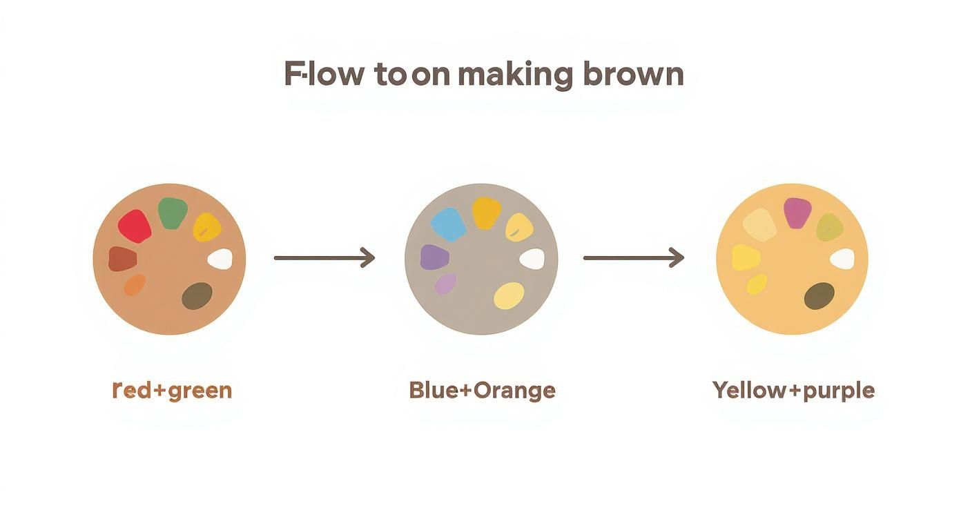
As you can see, mixing red with green, blue with orange, or yellow with purple all get you to a neutral brown. Each pairing, however, gives the resulting brown its own unique personality.
- Red + Green: This mix creates a classic, earthy brown. Think of rich soil or the deep, dark bark of an old oak tree. A Cadmium Red mixed with a Pthalo Green will give you a fantastic, deep chocolatey brown.
- Blue + Orange: This is my favorite for warmer, sun-baked browns. You get a lovely terracotta feel that’s perfect for old leather, rustic brick, or a sunlit field. I always start with the orange and slowly add bits of blue until it’s just right.
- Yellow + Purple: For a more muted, cooler brown, this is the pair to use. Depending on how much yellow you add, you can get anything from a soft, sandy tan to a desaturated, grayish-brown, often called taupe.
Once you get a feel for making brown, you'll see how the broader principles of how to mix paint colors can open up your entire palette.
Practical Tips Across Different Paint Mediums
The theory of making brown colour is universal, but how you do it changes a bit depending on what kind of paint you're using.
- Acrylics: They dry fast. Really fast. So, always mix more brown than you think you'll need. Trying to perfectly match a custom-mixed acrylic brown after it's dried is a recipe for frustration. For more on this, check out our guide on https://paint-by-number.com/blogs/learn-about-paint-by-numbers/how-to-mix-acrylic-paint-colors.
- Oils: Oil paints are a dream for color mixing because they dry so slowly. You have plenty of time to tweak your brown on the palette. You can even blend colors right on the canvas to create soft, beautiful transitions from one shade to another.
- Watercolors: Here, it’s all about transparency. You'll want to mix your browns on the palette, using less water for a more intense color. And remember the golden rule of watercolor: it always dries lighter! To get a really deep, dark brown, you'll need to build it up in thin layers, or glazes.
Getting Your Brown Shade Just Right
Mixing a basic brown is one thing, but the real magic happens when you start tweaking it. This is how you go from a generic, one-size-fits-all brown to a specific shade that brings your painting to life. Think of the difference between the warm, sun-baked earth of a Tuscan landscape and the cool, deep shadow of a forest floor. Nailing these subtle shifts is what will set your work apart.
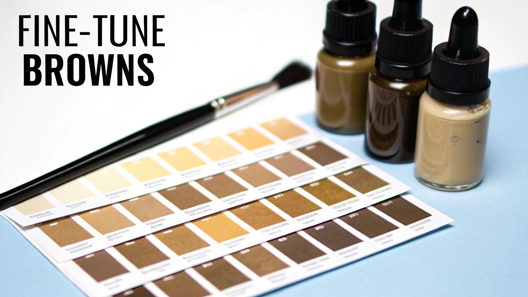
The two main things you’ll be playing with are the color’s value (its lightness or darkness) and its temperature (whether it feels warm or cool). A tiny adjustment to either can completely change the mood, turning a flat brown into something with depth and personality.
Adjusting Value the Right Way
Lightening or darkening a color seems easy, but if you’re not careful, you can end up with a dull, muddy mess. It’s about more than just grabbing your black or white paint.
- To Lighten It: Your first instinct might be to add white, but this can wash out your brown, leaving it looking chalky and lifeless. I find it’s often better to add a touch of yellow. This brightens the color and keeps it feeling rich and warm.
- To Darken It: Black is a risky choice. It can easily overpower your mixture, killing the color and turning it into a murky gray. A much better approach is to add a bit more of the darkest color you used to create the brown in the first place—usually blue or a deep red. This darkens the value without sacrificing its character.
Pro Tip: When lightening, never add white directly into your main batch of brown. Instead, pull a small amount of your brown mix over to a fresh blob of white or yellow. This gives you much better control and stops you from accidentally ruining your whole mix.
Controlling the Temperature of Your Brown
The temperature of your brown really sets the tone. A warm brown feels inviting and sunny, like terracotta or aged leather. A cool brown, on the other hand, feels more serious and grounded, like damp soil or the bark of a tree in the shade.
To get a warmer brown, mix in a little more red or orange. Even a tiny dab will push the color towards a cozy, reddish-brown hue that’s perfect for capturing rustic textures or golden hour light.
If you need a cooler brown, a small amount of blue is your best friend. This will give your brown a subtle, shadowy feel, which is great for painting shaded areas or creating a more muted, sophisticated look.
Getting these details right is key for realism. Just think about all the browns you see in the world. Brown is the most common hair color on the planet, with about 11% of people having naturally brown hair. When you include black and dark brown shades, you realize just how many variations exist. Mixing a specific tone can make a portrait feel incredibly personal and true to life. You can learn more interesting details from the global hair color statistics on zipdo.co.
Once you've mixed and applied your paints, especially if you're working digitally, you can refine your colors even further. Advanced modern photo editing techniques let you make precise adjustments to hue and value that can be tricky to get perfect with paint alone, ensuring the final image matches your vision.
Making Brown in Your Digital Art Software
Mixing brown isn’t just for traditional painters. Digital artists can conjure up the same rich, earthy tones right on their screens, whether in Procreate, Photoshop, or Illustrator. The color theory is the same, but the process is a bit different. Instead of blending pigments on a palette, you’ll be playing with light (RGB) or ink values (CMYK).

The fastest way to get started is with your program’s color picker. Find a bright, saturated orange or red to begin. From there, just drag your cursor over toward the blue or green part of the color wheel. You'll watch the color instantly neutralize and shift into a beautiful brown. It’s the digital equivalent of mixing complementary colors, but with instant results.
Translating Theory to Digital Values
Getting the hang of color models is essential for any digital artist. Here's what you need to know:
- RGB (Red, Green, Blue): This is an additive model. It’s all about mixing light, which is why it’s the standard for anything viewed on a screen—from your phone to your monitor.
- CMYK (Cyan, Magenta, Yellow, Black): This is a subtractive model designed for printing. It mimics how inks absorb light on paper.
A brown that looks perfect on your monitor might look totally different when printed if you’re not working in the right color space. For example, a solid medium brown can be created with the RGB values R:139, G:69, B:19. In CMYK, those values translate differently, so always check your project's final destination.
Your best friends in any digital program are the Hue, Saturation, and Brightness (HSB) sliders. Instead of adding more "paint," you can tweak a color's temperature by adjusting the hue, mute it with saturation, or control its lightness with brightness.
The quest for the perfect brown is surprisingly universal. The global hair color market, for instance, was valued at a massive USD 26.85 billion in 2024, with a huge slice of that dedicated to achieving just the right shade of brown. This trend shows just how vital nuanced color mixing is. If you're curious, you can learn more from this research on the hair color industry by Straits Research. A solid grasp of the composition of color is an invaluable skill for any creator.
Building Your Digital Brown Palette
Here’s a pro tip: once you mix a brown you love, don't let it disappear. Save it as a swatch in your software’s palette library. Over time, you'll build an entire custom collection of your go-to browns, from warm siennas to cool, moody taupes.
To get you started, here is a handy reference table with the codes for a few classic brown shades.
Digital Brown Color Codes
This table provides a great starting point for finding browns in any digital project, giving you reliable codes you can pop into your software.
| Brown Shade Name | RGB Values | CMYK Values | HEX Code |
|---|---|---|---|
| Saddle Brown | R: 139, G: 69, B: 19 | C: 0, M: 50, Y: 86, K: 45 | #8B4513 |
| Sienna | R: 160, G: 82, B: 45 | C: 0, M: 49, Y: 72, K: 37 | #A0522D |
| Rosy Brown | R: 188, G: 143, B: 143 | C: 0, M: 24, Y: 24, K: 26 | #BC8F8F |
These values give you a solid foundation. From here, you can use your HSB sliders to fine-tune the shade until it perfectly matches your artistic vision.
How to Fix Common Color Mixing Mistakes
We’ve all been there. You’re aiming for a beautiful, rich sienna, and somehow you end up with a puddle of dull, lifeless gray. It's one of the most common frustrations in painting, but don't worry—it happens to everyone. The good news is that these mistakes are almost always easy to fix once you understand what's going on in your mix.
Most of the time, the problem comes down to your color ratios being slightly off or an accidental clash of warm and cool tones. Let's walk through how to diagnose what went wrong and, more importantly, how to get your color back on track.
Why Does My Brown Look Too Green or Purple?
If your brown mix is skewing green, you've got too much blue (or a blue-heavy green) in the mix. It's a simple fix. Since red is the direct complement to green, adding a tiny dab of it will instantly neutralize that greenish cast and steer your color back into brown territory.
On the other hand, if your mix looks too purple, it means you've gone a bit heavy-handed with your red and blue. The antidote here is yellow, purple's complementary color. Just a touch of yellow will cut through that purplish hue and warm the whole mixture up beautifully.
My best advice is to always add your correcting color in tiny amounts. You can always add more, but it’s a real headache to try and reverse a mix you’ve pushed too far.
Why Did My Brown Turn Into Muddy Gray?
Ah, the dreaded "mud." This usually happens for one of two reasons: you've either overworked the paint by mixing too many colors together, or you've tried to darken your brown with a low-quality black pigment, which just kills its vibrancy.
To keep your colors clean, try to stick with a simple recipe—either the three primaries or a complementary pair. And if you need to darken your brown, step away from the black paint. Instead, try mixing in a bit of a dark, rich color like Ultramarine Blue or even a deep red like Alizarin Crimson. These will deepen the value without turning your beautiful brown into mud.
Medium-Specific Troubleshooting Tips
Every type of paint behaves a little differently, so the solution can change depending on what you're using.
-
Watercolors: Did your brown dry way lighter than you expected? That's just the nature of watercolor. The simple fix is to wait for it to dry completely, then apply another thin layer (a glaze) of the same brown right on top. This will deepen the color and build rich tones.
-
Oils & Acrylics: If your brown looks chalky and washed out after you’ve added white, you've probably used too much Titanium White. It's a very opaque pigment that can easily overpower a mix. To bring it back to life, mix in a little bit of yellow or orange. This will restore the warmth and saturation, rescuing your color from looking pale and flat.
Got Questions About Making Brown? I've Got Answers.
Even with a solid guide, sometimes you just get stuck in the middle of a project. It happens to all of us. Here are some quick answers to the questions I hear most often from artists trying to nail that perfect shade of brown.
What Are the Easiest Primary Colors to Start With for Mixing Brown?
If you're just starting out, grab a Cadmium Red, Ultramarine Blue, and Cadmium Yellow. These are your workhorse pigments—strong, clean, and predictable, which gives you a ton of control.
My go-to method is to first mix equal parts red and yellow to get a nice, bright orange. Then, I start adding the blue, just a little bit at a time. You'll see the orange neutralize and shift into a rich brown right before your eyes. It’s a great way to really see how the colors interact.
Can I Make Brown Without Using Red?
Absolutely. Don't feel locked into the standard red-yellow-blue formula. Remember, the core principle is mixing complementary colors.
A fantastic alternative is blending purple with its direct complement, yellow. Since purple is already a mix of blue and a cool red (like magenta), you're still covering the primary spectrum. This combo often yields a beautifully muted, earthy brown that you can't quite get with the traditional recipe.
The artists who really grow are the ones who play around. Seriously, try mixing purple and yellow. You might just stumble upon a unique shade that becomes a go-to in your paintings.
How Do I Make a Very Light Brown or a Beige?
This is a common stumbling block. The trick to making light browns like beige, tan, or taupe is to work backward.
Always start with a big scoop of white paint on your palette and then add a small amount of your pre-mixed brown to it. Never add white to your brown—you'll end up with a mountain of paint you don't need and waste a ton of white pigment.
- For a warm, sandy beige, add a tiny speck of yellow to your lightened mix.
- For a cooler, grayish taupe, stir in a minuscule touch of blue or purple.
Why Does My Digital Brown Look Different When It's Printed?
Ah, the classic RGB vs. CMYK battle. This catches everyone off guard at some point. It all comes down to how colors are created.
Your screen uses the RGB (Red, Green, Blue) model, which adds light to create color. This allows for a massive range of vibrant, glowing colors. Printers, on the other hand, use the CMYK (Cyan, Magenta, Yellow, Black) model, which works by subtracting light with ink on paper.
The CMYK color space is simply smaller than RGB, meaning some of the bright, luminous browns you create on screen just don't have a direct equivalent in ink. To avoid any nasty surprises, always set your design software to CMYK mode if you know the final piece is for print. Most programs also have a "proof colors" view that gives you a much better preview of the final printed result.
Ready to turn a cherished photo into a relaxing work of art? At Custom Paint By Numbers, we take your memories and create high-quality, easy-to-follow paint-by-number kits. Start creating your personalized masterpiece today by visiting our official website.