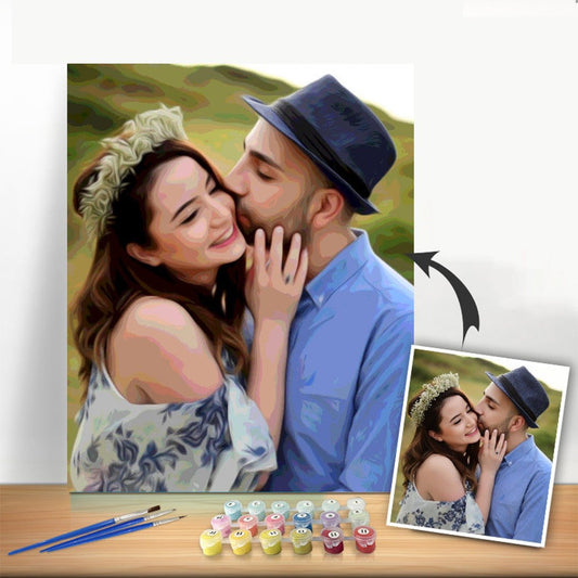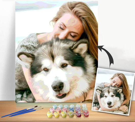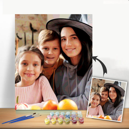

When you want to create a soft, gradual shift between two or more colors, the best place to start is with the wet-on-wet technique. It’s a pretty straightforward concept: you apply fresh, wet paint right next to another wet color on the canvas, which allows them to mingle together naturally. This is the secret sauce for getting those smooth, professional-looking gradients in your paint-by-number kit.
Your First Steps in Blending Paint Colors
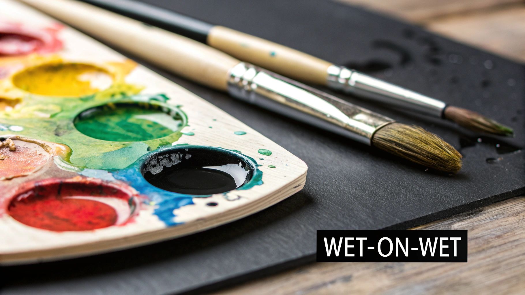
Looking at those separate pots of paint can feel a little daunting, I know. But creating beautiful, seamless blends is a lot less complicated than it seems. Blending is what breathes life into a painting, turning those flat, numbered sections into forms that feel real and three-dimensional. It's less about memorizing a color wheel and more about getting a feel for a few simple techniques that will make a huge difference in your work.
The best part? You've already got everything you need right there in your acrylic paint-by-number kit. Your palette, a couple of brushes, and the paints are all it takes to get started. We'll focus on the foundational approach that artists use every day.
Mastering the Wet-on-Wet Technique
The most popular and beginner-friendly method is definitely the wet-on-wet technique. The name gives it away—you’re simply working with wet paint next to (or on top of) other wet paint. The one thing to keep in mind is that acrylics dry fast, sometimes in just a few minutes. You have to work with a bit of purpose. This is actually a blessing in disguise, as it lets you layer colors without waiting around for ages.
Ready to give it a go? Paint a patch with your first color. Then, right away, while it’s still very wet, lay down your second color so their edges are touching. Now, take a clean, slightly damp brush and gently wiggle it back and forth where the two colors meet.
Pro Tip: Think light, feathery strokes. You’re trying to coax the colors into each other, not scrub them together. The aim is to create a new, in-between shade in the middle that makes a soft gradient instead of a harsh line.
Essential Tools and Setup
A little bit of prep work goes a long way in making the process smoother and more enjoyable. You don't need a fancy studio, just these key items:
- A Clean Palette: An organized palette is an organized mind. I like to put my pure colors on the outside and leave a dedicated space in the middle for mixing my blends.
- Two Jars of Water: This is a game-changer. Use one jar for the first, messy rinse to get the bulk of the paint off your brush. Use the second jar of clean water for the final rinse. This simple trick keeps your colors from getting muddy.
- Multiple Brushes: Keep a few brushes ready so you can quickly switch between colors without stopping to wash them every single time. It's also a great idea to have one specific brush that you designate as your "blending brush"—just keep it clean and slightly damp.
Setting yourself up like this helps avoid unnecessary frustration and keeps your colors looking crisp and vibrant. Once you get the hang of this basic wet-on-wet approach, you'll be able to create incredible depth, convincing shadows, and bright highlights. It’s the skill that will transform your paint-by-number from a simple project into a piece of art that looks authentically yours.
Understanding Color Theory for Better Blends
https://www.youtube.com/embed/YeI6Wqn4I78
Have you ever tried mixing two beautiful paint colors, only to end up with a disappointing, muddy brown? It’s a classic painter's problem, but the solution isn't about memorizing complex charts. It’s about grasping a few simple concepts that let you predict exactly how your acrylic paints will interact.
Think of the color wheel as your roadmap. It all starts with the three primary colors: red, yellow, and blue. These are your true building blocks because you can't create them by mixing anything else.
When you mix two of those primaries, you get a secondary color. For example, mix some red and yellow, and you get orange. This is the first and most fundamental step to mastering your blends.
Navigating the Color Wheel for Clean Mixes
The real trick to beautiful blending lies in knowing which colors get along. Colors that sit right next to each other on the wheel, like blue and green, are called analogous colors. Since they share a common parent color (in this case, blue), they will almost always mix into clean, vibrant new shades. Easy.
Now, let's talk about the tricky ones. Colors directly opposite each other on the wheel are complementary colors. We're talking about pairs like red and green or blue and orange. They look fantastic next to each other, creating a powerful contrast, but mixing them is a whole different ballgame.
Complementary colors cancel each other out. A tiny bit can be used to create beautifully muted tones or realistic shadows, but mix too much, and you've found the fastest way to make "mud."
This isn't just a concern for artists. The global paints and coatings market is expected to grow from USD 217.36 billion in 2024 to an incredible USD 303.97 billion by 2032, according to Fortune Business Insights. From cars to houses, getting color right is a massive industry, and it all comes back to these same core principles.
Basic Color Mixing Cheatsheet
Here's a quick reference to get you started with creating new colors from the primaries typically included in your kit.
| Color 1 | Color 2 | Resulting Color |
|---|---|---|
| Red | Yellow | Orange |
| Blue | Red | Purple |
| Yellow | Blue | Green |
| Red | Orange | Red-Orange |
| Yellow | Green | Yellow-Green |
| Blue | Purple | Blue-Violet |
This table covers the basics, but don't be afraid to experiment with your ratios to create a whole spectrum of unique shades!
A Practical Mixing Scenario
Okay, let's put this into practice. Imagine your paint-by-number kit features a dramatic sunset. You need to blend a fiery orange sky into a deep evening blue. Since orange and blue are complementary colors, mixing them directly is a surefire way to get a dull, grayish mess right in the middle of your beautiful sky.
So, what's a better approach? Create a bridge between them.
Instead of a direct mix, try blending the orange into a reddish tone first. Then, blend that red into a purple, and finally, transition that purple smoothly into the blue. You're using the colors between orange and blue on the color wheel to create a far more natural and vibrant gradient.
This is a core idea you can apply to any painting. If you'd like to dive deeper, our guide to color theory for beginners is a great next step.
How to Mix Paint Ratios for Perfect Shades
Ever wonder what makes the difference between a bright, sunny sky blue and a deep, moody navy? It all comes down to the paint ratio. Getting your color mixing ratios right is the secret that moves you from simply guessing to creating the exact shades you want, every single time. It's how you truly take control of your paint-by-number canvas.
The easiest place to begin is with a straightforward 1:1 ratio. Just mix two colors in equal parts. This is your go-to for creating a perfectly balanced mid-tone. For example, an equal dab of red and yellow gives you that classic, true orange.
Once you’ve got that down, you can create a whole spectrum of colors just by playing with that simple formula. Try a 3:1 or a 4:1 mix. Three parts yellow to one part red will give you a stunning goldenrod. Flip that ratio, and you get a fiery, intense red-orange. This is the core of learning how to blend paint colors like a pro.
Creating a Value Scale for Tints and Shades
Here's a great little exercise to really build your confidence: create a value scale. This drill is fantastic for learning how to lighten colors (create tints) with precision. You'll start with a dark color from your kit, like a deep blue, and then gradually mix in tiny amounts of white.
This visual guide breaks down how different ratios can produce a whole family of colors from just a few starting paints.
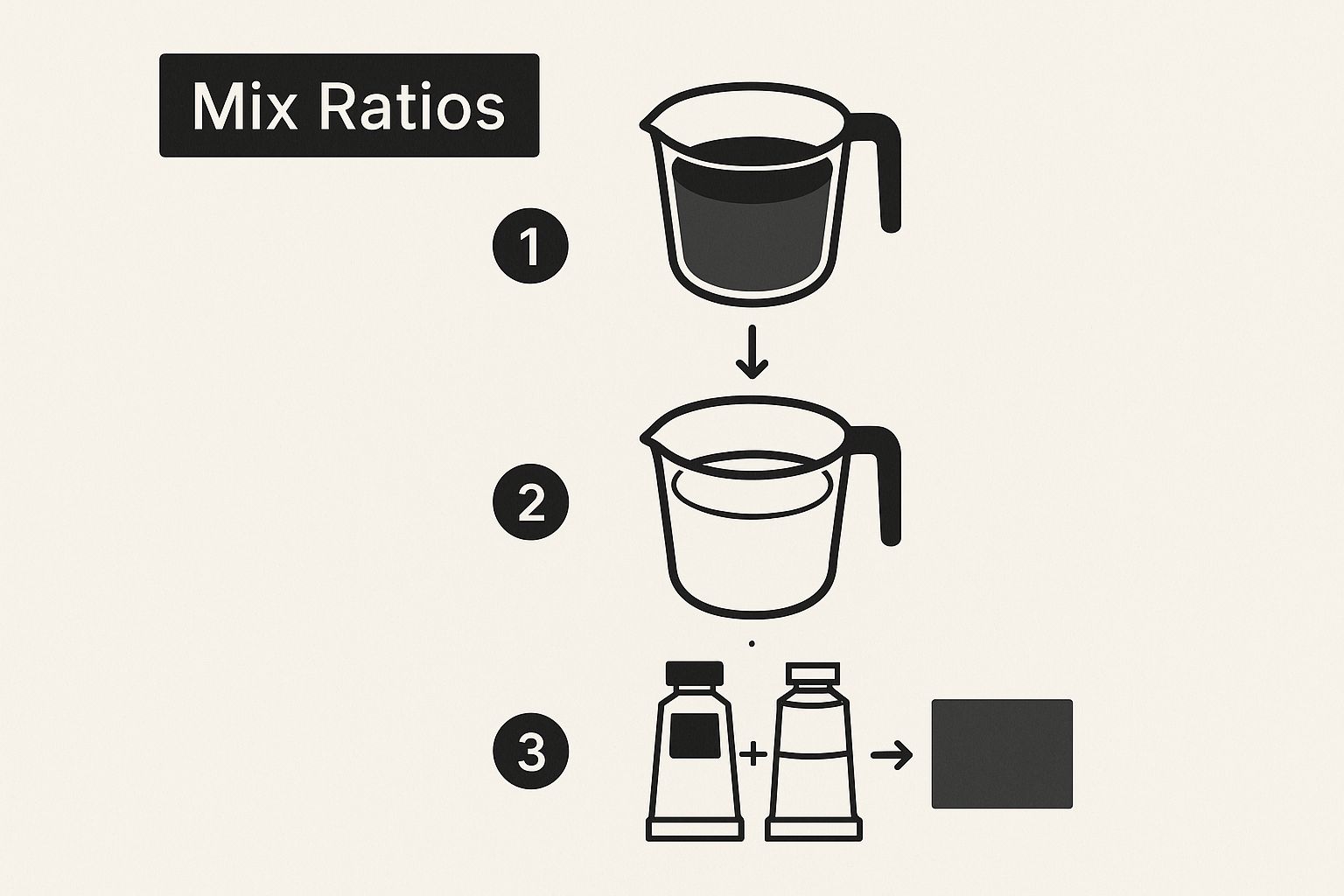
As you can see, making small, intentional adjustments to your paint ratios unlocks an incredible range of shades. This kind of control is what really elevates your painting.
My Pro Tip: Here’s a lesson I learned the hard way—always start with your lighter color and slowly add the darker one. Just a tiny speck of black or blue can completely overpower a large puddle of white or yellow. This little trick will save you from accidentally going too dark and wasting a bunch of paint.
Practical Steps for Precise Mixing
To get consistent results with your acrylics, it really pays to be methodical, especially when you're starting out. Instead of just winging it, try to be deliberate with your measurements.
- Start Small: Squeeze out small, equal-sized dabs of paint onto your palette. A pea-sized amount is usually more than enough to get started.
- Introduce Color Gradually: Use the very tip of a clean brush or palette knife to add just a fraction of the darker color into the lighter one. You can always add more!
- Mix Thoroughly: Keep blending until the color is completely uniform and streak-free. This is key to seeing the true final shade.
- Test Your Color: Before you commit it to the canvas, paint a little test swatch on some scrap paper. Don't forget that acrylics often dry a shade darker than they look when wet.
This careful approach might feel a bit slow at first, but trust me, it’s the quickest way to nail the exact color you need without the frustration. To dig even deeper, take a look at our complete acrylic paint mixing guide for more advanced techniques. By truly understanding your ratios, you’re no longer just filling in the lines—you’re making real artistic choices.
Essential Brush Techniques for Smooth Blending
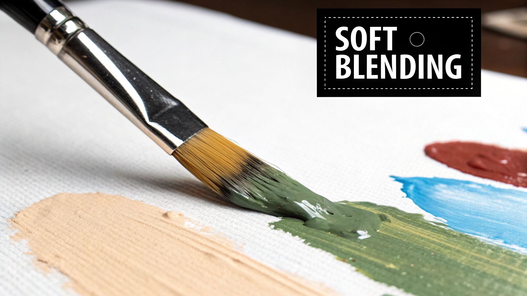
Your brush is so much more than a simple tool for slapping paint on a canvas. Think of it as your magic wand for turning harsh, numbered lines into soft, beautiful transitions. The way you hold it, the pressure you use, and the strokes you make will completely change the final look of your blended areas.
Knowing which colors to mix is half the battle, but understanding the physical motion of blending is the other half. Without the right technique, even a perfectly mixed color can look choppy and out of place.
Wet-on-Wet Blending Strokes
The go-to method for most blending is called wet-on-wet. It’s all about working with two wet colors on the canvas at the same time, using a light, feathery touch to coax them together.
Let’s say you’re painting a sky that fades from a light blue to a darker one. Once you’ve applied both colors right next to each other, grab a clean, slightly damp brush. Use it to make soft, crisscrossing "X" strokes right along the seam where they meet. This movement gently pulls the colors into one another, creating that gorgeous gradient you're after.
For an even softer effect, you can try small, gentle, circular motions. The most important thing here is to avoid overworking the area. If you brush too much, you’ll just end up with a muddy mess.
Exploring the Dry Brushing Technique
Another great tool in your arsenal is dry brushing. This technique is fantastic for adding subtle texture or blending over a section that has already dried. As you might guess from the name, you’ll use a brush with very little paint on it—almost dry.
To get started, load your brush with paint and then wipe nearly all of it off on a paper towel. You want just a tiny bit of pigment left on the tips of the bristles. Then, lightly scumble or drag the brush over the dry surface. This leaves behind a delicate, broken layer of color that creates a soft, hazy transition.
Expert Insight: I love using dry brushing for effects like clouds, distant fog, or giving fabric a soft, worn texture. It’s a very forgiving technique because it lets you build up color slowly and maintain a ton of control.
Choosing the Right Brush for the Job
The brush you choose makes a huge difference. While the brushes in your paint-by-number kit are a good start, knowing what each one is for can elevate your work.
- Filbert Brush: This is my personal favorite. Its oval shape is perfect for creating soft, rounded edges and blending organic shapes like flower petals.
- Flat Brush: This will be your best friend for creating wide, even gradients across larger areas, like open skies or fields. The straight edge is great for clean transitions.
The skill of blending colors is fundamental for any artist. It's no surprise that the global paint mixing market is projected to skyrocket to USD 31.45 billion by 2035, a trend highlighted by research from Future Market Insights. This just goes to show how essential custom color creation really is.
Once you get a feel for these brush movements, you’ll see a huge improvement in your painting. For a deeper dive into foundational skills, take a look at our guide on essential acrylic painting techniques for beginners. Combining the right brush with the right motion is the secret to creating those professional-looking blends.
What to Do When Blending Goes Wrong
Even after years of painting, I still run into blending issues. It's just part of the process. So, if your colors aren't cooperating, don't sweat it—you're not alone. Let's dig into some of the most common frustrations and how to work through them like a pro.
The biggest complaint I hear is about making "mud." You know the color—that dull, brownish-gray mess that seems to kill the life in your painting. This almost always happens for one of two reasons: you've either over-blended on the canvas or you've mixed too many different colors together.
When you aggressively mix colors that are opposites on the color wheel (think red and green, or blue and orange), they essentially cancel each other out. To keep your colors bright and clean, stick to blending just two or three pigments at a time. It’s the easiest way to avoid a muddy disaster.
My Paint Is Drying Too Fast
Ah, the classic acrylic problem. They dry incredibly fast. One moment you've got beautiful, workable paint, and the next it’s a tacky, stubborn mess that refuses to blend. This is especially tough when you're trying to tackle a large, smooth area like a sky or a sunset.
Luckily, this is a really common issue with a couple of easy fixes:
- A spray bottle is your best friend: A fine mist of water works wonders. Lightly spritz your palette to keep your paints from drying out, and you can even give your canvas a quick, light mist to buy yourself more blending time.
- Don't tackle everything at once: Instead of trying to blend a massive section in one go, break it up. Concentrate on getting a small area blended perfectly before moving on to the next section.
Here's a little trick I use: For really complex blends, I'll add a single drop of an "acrylic retarder" to my paint. It's an additive that slows the drying time down without making the paint watery. Those extra few minutes can be a total lifesaver.
Fixing Those Hard, Unwanted Edges
What if a section dries before you can soften the edge? First, don't panic. And whatever you do, don’t try to scrub it with a wet brush. That usually just lifts the paint underneath and makes a bigger mess.
The best approach here is a technique called glazing. It sounds advanced, but it’s surprisingly straightforward. You're simply going to apply a very thin, transparent layer of a transitional color right over that hard line. To create a glaze, just mix your color with a generous amount of water until it's very sheer, almost like watercolor.
Now, gently brush this thin wash over the harsh edge. It won't erase the line instantly, but it will soften it. You might need to apply a few layers, letting each one dry in between, to build up a really seamless transition. This simple trick can turn a frustrating mistake into a beautiful, soft blend.
Common Blending Issues and Solutions
Sometimes you just need a quick answer. Here’s a little cheat sheet I put together to help you diagnose and solve the most frequent blending headaches you'll run into with acrylics.
| Problem | Likely Cause | Quick Solution |
|---|---|---|
| Colors look muddy or dull | Mixing too many colors, especially complementary ones (opposites on the color wheel). | Limit your blend to 2-3 colors at a time. Work with colors next to each other on the color wheel (analogous). |
| Paint is drying too quickly | Acrylic paint's natural fast-drying property, often made worse by dry air or a warm room. | Use a fine-mist spray bottle on your palette and canvas. Work in smaller, more manageable sections. |
| Hard, visible lines between colors | The edge of one color dried before you could blend the next one into it. | Use the glazing technique: apply a thin, watery layer of a transitional color over the hard edge to soften it. |
| The blend looks streaky | Not enough paint on the brush, or the paint underneath is still slightly wet and is being lifted up. | Make sure your brush is loaded with enough paint. Allow the base layer to dry completely before adding another on top. |
| Colors are becoming weak/transparent | Adding too much water to the paint in an attempt to extend its workability. | Use an acrylic retarder or a glazing medium instead of just water to slow drying time without losing pigment strength. |
Think of this table as your go-to reference. Every painter deals with these things, but knowing why they happen and how to fix them is what separates the beginners from the pros.
Got Questions About Blending Paint? Let's Get Them Answered.
Once you start exploring color blending, a few questions always seem to pop up. Let's walk through some of the most common issues artists run into when mixing paint, so you can spend less time feeling frustrated and more time painting with confidence.
How Do I Keep My Acrylics From Drying So Fast?
Ah, the age-old battle with acrylics. Their biggest strength—drying fast—is also their biggest challenge when you're trying to blend. You put down a perfect color, reach for another, and suddenly you're fighting a tacky, stubborn mess.
Luckily, you have a few tricks up your sleeve. The simplest is a spray bottle filled with water. A light mist over your palette keeps your paints workable for much longer.
For even more control, try adding a tiny drop of acrylic retarder medium. This stuff is magic; it slows down the chemical drying process without watering down your color. Another fantastic tool is a stay-wet palette, which uses a special sponge and paper to keep your paints fresh for hours, sometimes even days.
Should I Blend on the Canvas or on My Palette?
This is a great question, and honestly, there's no single right answer. It all comes down to what you're trying to achieve. Both methods have their moments to shine.
- Blending on the Palette: This is all about control. Mixing on the palette lets you create a larger, perfectly uniform batch of a color. It’s ideal when you need consistency for filling in a big section.
- Blending on the Canvas: This is where the spontaneous "wet-on-wet" magic happens. It creates beautiful, organic transitions as the colors meet and mingle right on your painting. The catch? You have to work fast.
Most of the time, I find myself doing a bit of both. I'll pre-mix the main colors on my palette and then use the canvas for those final, soft blends to get a smooth, natural-looking transition.
The secret to vibrant, clean color mixes has less to do with the paint and more to do with your brush. Muddy colors are almost always caused by a dirty brush contaminating your fresh paint.
How Do I Stop My Colors From Turning to Mud?
So, how do you keep those brushes perfectly clean between colors? The answer is a simple but incredibly effective technique: the two-water-pot system.
Set up one container of water just for the first, dirty rinse. This is where you'll get the worst of the paint off. The second container should be filled with clean water for the final rinse. Swishing your brush in that second pot ensures you've removed any lingering pigment before dipping into a new color. Adopting this one habit will make a massive difference in how clean and crisp your blends look.
Ready to transform your favorite photos into a work of art? At Custom Paint By Numbers, we'll send you a complete kit to create a masterpiece from any picture you choose. Check out our custom kits at https://paint-by-number.com and start your next project