
Before you can mix any color under the sun, you have to get a feel for the basics of color theory. It’s the essential starting point that turns guesswork into intentional, beautiful results. Your journey to becoming a color-mixing pro starts right here, with this solid foundation.
Building Your Color Mixing Foundation
Think of it this way: you wouldn't try to write a novel without knowing the alphabet first. Color theory provides that same fundamental framework for painting. Without it, you’re just shooting in the dark, which usually leads to muddy colors and a lot of frustration.
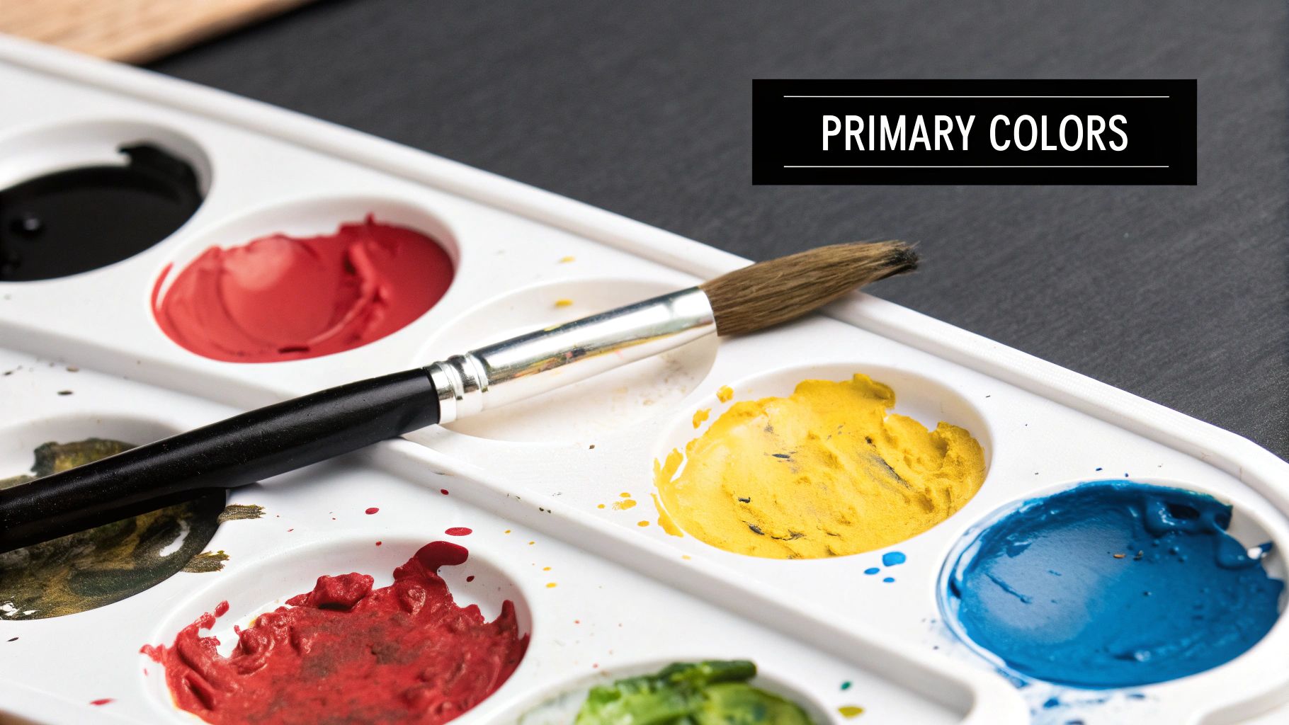
The absolute cornerstone of mixing is the color wheel. At its core, you'll find the three primary colors: red, yellow, and blue. These are the building blocks of every other color you'll ever create. You can't mix anything to get them; they are the source.
Getting to Know Secondary and Tertiary Colors
This is where the real magic begins. When you mix any two primary colors, you create a secondary color. The recipes are simple:
- Red + Yellow = Orange
- Yellow + Blue = Green
- Blue + Red = Violet
Want to get even more nuanced? Mix a primary color with the secondary color right next to it, and you get a tertiary color. These are the beautiful, in-between shades like yellow-orange, red-violet, and blue-green that give your paintings incredible depth and realism.
If you're looking to really nail these concepts, our guide on color theory for beginners is a great next step.
The Big Three: Hue, Value, and Saturation
Beyond just the names of colors, there are three properties that give you complete control over your palette. Once you get these down, you can mix anything.
To help you get a handle on these crucial concepts, here's a quick cheat sheet. Think of this table as your go-to reference whenever you're at your palette.
Key Color Theory Terms for Acrylic Artists
| Term | What It Means in Simple Terms | Practical Mixing Tip |
|---|---|---|
| Hue | The pure color itself—what you'd call it right out of the tube (e.g., "red," "blue"). | Start with your basic hue before you begin adjusting it with other colors. |
| Value | How light or dark a color is. | Add a tiny bit of white to create a lighter "tint," or a touch of black for a darker "shade." |
| Saturation | The intensity or vibrancy of a color. A fire engine red is highly saturated. | To lower saturation (make it less intense), mix in a tiny amount of its complementary color. |
Understanding these terms is what separates painters who can only use colors from the tube from those who can truly bring a scene to life with custom-mixed shades.
A common mistake I see beginners make is focusing only on the hue while completely forgetting about value and saturation. A great painting needs variety in all three to create mood, contrast, and a believable sense of light and shadow.
Setting Yourself Up for Success: Tools and Paints
You don’t need a fancy, expensive setup to get started, but having the right tools makes a world of difference. A palette knife is your best friend for mixing. It blends paints cleanly and completely, unlike a brush, which can hide old colors in its bristles and contaminate your new mixture.
For your palette, you've got a few great options. Disposable paper palettes are fantastic for easy cleanup. But if you're planning a longer session, a stay-wet palette is a game-changer—it uses a damp sponge to keep your acrylics workable for hours, sometimes even days.
Finally, let's talk paint. The quality of your paint really does matter. Professional-grade paints have a much higher pigment load, meaning the colors are richer and you need less paint to get a vibrant mix. It's much better to start with a limited palette of high-quality primary colors, plus black and white, than a huge set of cheap, chalky paints. The acrylics market is booming, with a projection to hit $613 million by 2031, which means we're seeing more amazing, high-quality options than ever before.
Practical Techniques for Mixing Any Color
With the theory in your back pocket, it's time to get your hands dirty. This is where the real fun begins—moving from understanding colors to actually creating them on your palette. My goal here is to help you build the confidence to mix any color you need on the fly, without a second thought.
The first and most important rule I teach anyone is the 'light into dark' rule. Trust me on this one. You should always add a tiny bit of the darker color to the lighter one, never the other way around. A tiny speck of a powerful color like Phthalo Blue can completely overwhelm a big pile of Titanium White. But a small dab of white will gently and predictably lighten that blue. It's a simple habit that saves paint, time, and a lot of frustration.
Starting With a Limited Palette
You really don't need dozens of paint tubes to create a universe of color. In fact, starting with fewer options forces you to become a much better, more intuitive mixer. A basic, well-chosen palette is all you need to get going.
Here's what I recommend:
- A warm and a cool version of each primary: Think Cadmium Red (warm) next to Alizarin Crimson (cool), or Ultramarine Blue (warm) next to Phthalo Blue (cool). For yellows, try Cadmium Yellow Light (cool) and Yellow Ochre (warm).
- Titanium White: This is your go-to for lightening colors and creating tints.
- Mars Black or a chromatic black: Essential for creating darker values and shades.
With just these essentials, you can mix nearly any color you can imagine. This approach doesn't just save you money; it also creates a beautiful, natural harmony in your paintings because every color shares a common DNA.
This visual guide neatly lays out the foundational mixing process.
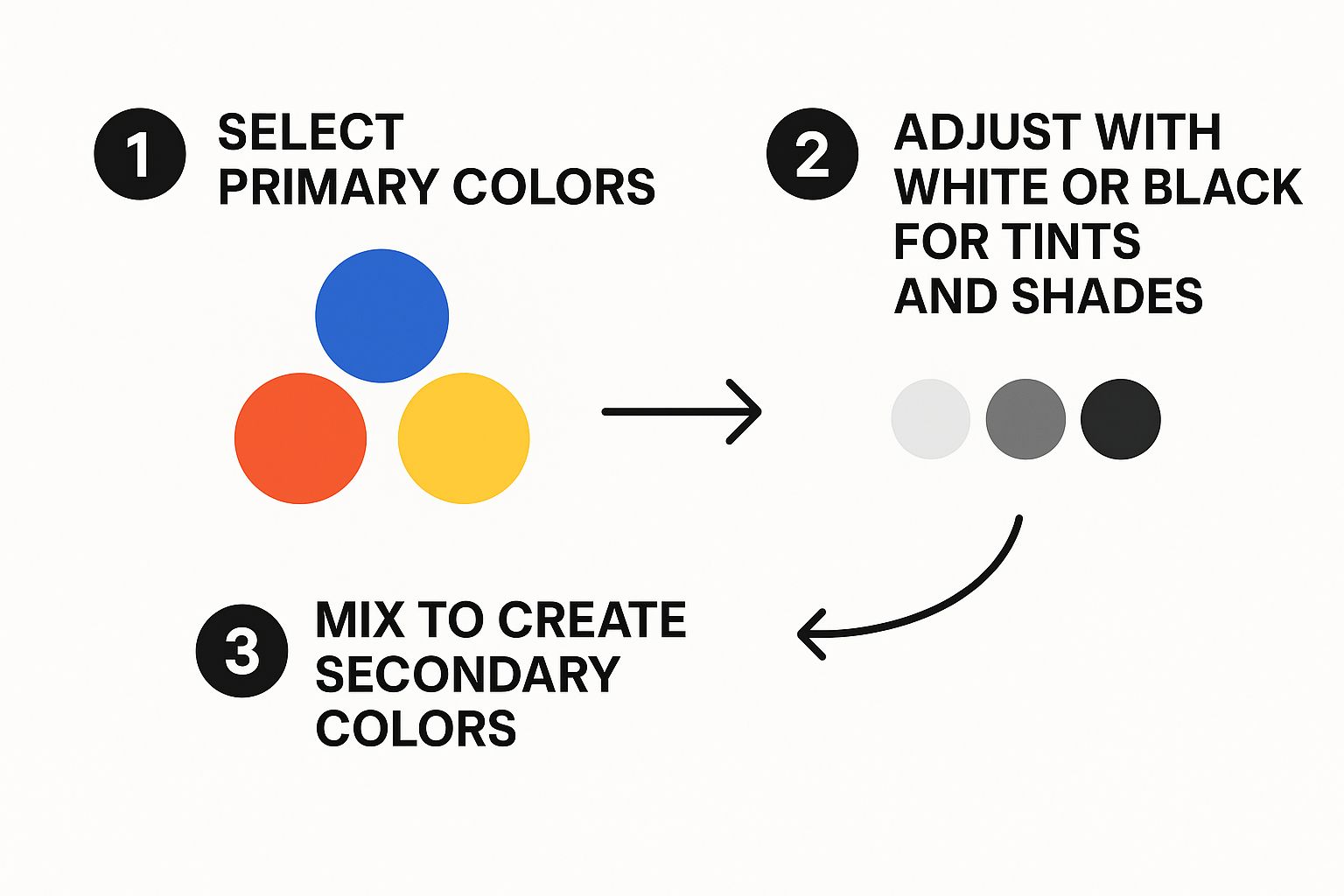
As you can see, mastering these three stages—primaries to secondaries, then tweaking the value—is the core skill that unlocks an infinite range of hues.
Creating a Value Scale
One of the most powerful exercises you can do is to create a simple value scale. All this is is a strip of graded tones from pure white to pure black, with several shades of gray in between. It sounds basic, but it’s a crucial skill for painting believable shadows, highlights, and smooth gradients.
It’s easy to do. Put some pure Titanium White on one end of your palette and Mars Black on the other. Mix them 50/50 in the middle to get a mid-tone gray.
Now, just create the in-between steps. Mix a little of your mid-tone gray into the white for a light gray, and mix a little black into the mid-tone for a dark gray. Keep going until you have a smooth transition of at least five to seven distinct values. This simple exercise trains your eye to see subtle shifts in light and dark, a skill that pays off big time in your paintings. You can find more exercises like this in our guide to acrylic painting techniques for beginners.
Practical Recipes for Tricky Colors
Okay, mixing a basic green or orange is one thing. But what about the more complex colors you see in the real world? They often require a more nuanced touch than just mashing two primaries together. Here are a few starting points I use for those challenging but essential hues.
Realistic Skin Tones
Skin is never just one color. For a great base, I often start with a combination of Yellow Ochre, Cadmium Red, and Titanium White. From there, you can fine-tune it:
- Add a tiny touch of Ultramarine Blue or a muted green to create shadows and add depth.
- Bump up the Cadmium Red for rosy cheeks or lips.
- Use more Titanium White and Yellow Ochre for bright highlights.
Rich Earth Tones
Want a beautiful, earthy brown like Burnt Sienna? Start with Cadmium Red and mix in a small amount of Mars Black. For a cooler, more transparent brown, try mixing Ultramarine Blue with a touch of Cadmium Orange. The secret to natural-looking earth tones is to avoid over-mixing. You want to see those subtle variations.
"I always tell my students to stop mixing just before they think the color is perfect. Those little streaks of unblended parent colors are what give a mixture life and prevent it from looking flat and artificial."
By practicing with these recipes and your value scale, you’re not just memorizing formulas. You're building an intuitive sense of how colors play together. This is the skill that will truly elevate your painting, allowing you to create the clean, vibrant colors that bring your vision to life.
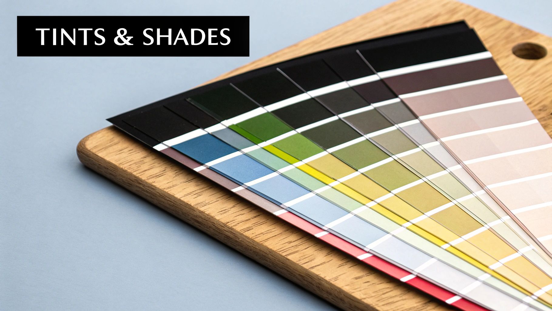
Creating Depth with Tints, Tones, and Shades
To really make your paintings pop, you’ve got to move beyond just using colors straight from the pot. The magic happens when you start playing with the subtle shifts that light creates in the real world. This is where you learn to mix tints, tones, and shades, which is the secret to turning a flat circle into a believable, three-dimensional sphere.
Think of your pure hue as the starting block. To make that color look like it exists in a real space, you need to show how light and shadow change it. It’s how you make a painted apple look round enough to pick up or a distant mountain feel miles away.
Lightening Up with Tints
A tint is just any color with white mixed into it. This is your go-to for creating highlights, soft pastels, and the bright parts of your painting. Add white to Cadmium Red, and you get pink. Mix it with Ultramarine Blue, and you have a lovely sky blue.
The trick to getting clean, vibrant tints is to add your white gradually. Start with your pure color on the palette and slowly mix in tiny dabs of Titanium White. If you dump in too much white at once, you’ll wash out the pigment and end up with a chalky, weak color. It's always easier to add more white than it is to take it away.
For warmer highlights, like the way sunshine hits a leaf, pure white can sometimes look a bit too cool or harsh. Try mixing in a tiny touch of a light yellow or an off-white instead. This little tweak creates a much more natural, sun-kissed glow.
Muting Colors with Tones
A tone is what you get when you add gray to a pure color. Tones are less saturated than their parent hue, and they are absolutely essential for achieving realism. Let’s face it, the world isn't painted in super-bright, vibrant colors; it's full of complex, muted tones that make a scene feel natural and harmonious.
You can get gray by simply mixing black and white, but for more interesting results, try creating "chromatic grays" by mixing complementary colors together.
- How to Create a Tone: Add a small amount of pre-mixed gray (black + white) to your base color.
- When to Use It: Tones are perfect for your mid-range values. They also help a single vibrant color stand out when you surround it with more muted hues.
- Real-World Example: Mixing gray with a bright green gives you a subtle, earthy olive green, which is perfect for painting the shadowed parts of leaves and trees.
By using tones strategically, you can direct the viewer's eye. A single pop of saturated red in a painting full of grayed-out tones will instantly become the star of the show.
Why You Should Avoid Using Black for Shades
Okay, let's talk about shades. A shade is technically any color with black added to it. While that's the textbook definition, just reaching for the black paint to create shadows is one of the biggest mistakes a beginner can make. Black tends to deaden a color, making it look flat and lifeless instead of naturally shadowed.
Think about the shadow on a bright yellow lemon. It isn't a dull, blackish-yellow, is it? It’s more of a deep, rich ochre, maybe with a hint of purple. You rarely see pure black in natural shadows.
Instead of grabbing that tube of black, try this pro technique: mix in the color's complement. That’s the color sitting directly opposite it on the color wheel. This method darkens your hue beautifully while keeping it rich and full of life.
Here’s how to mix much more dynamic shades:
- Find the Complement: For red, it's green. For blue, it’s orange. For yellow, it’s purple.
- Mix with Caution: Add a tiny speck of the complementary color to your base hue. A little bit goes a very long way.
- Watch the Magic: You'll see the original color become darker and less intense, creating a rich, believable shadow color.
For example, want to mix a sophisticated navy blue? Instead of adding black to your Ultramarine Blue, mix in a tiny touch of Burnt Sienna or Cadmium Orange. The result is a deep, complex blue that feels so much more authentic. This one technique can dramatically elevate the realism and depth in your paintings.
How Acrylic Mediums Can Transform Your Paint
Think of your acrylic paint as the main ingredient. The mediums? They're the secret spices that can completely change the dish. While using paint straight from the tube works just fine, learning to incorporate mediums is what gives you true command over its consistency, finish, and drying time. They really are the key to unlocking what your acrylics can do.
At its core, an acrylic medium is just the binder from your paint—the acrylic polymer emulsion—but without any of the pigment. So, when you mix it into a color, you’re changing the paint’s behavior without weakening its vibrancy, which is what happens when you thin it too much with water. This is how you can customize your paint for pretty much any technique you can dream up.
This incredible versatility is a huge reason acrylics are so popular. The global acrylic paints market is projected to climb from an estimated $122.4 million in 2024 to $165 million by 2031. Artists love that they can be tweaked with different mediums to get specific effects on almost any surface. You can dive deeper into the acrylic paint market growth trends for more details.
Changing Your Paint's Sheen and Body
One of the first things artists learn to control with mediums is the final look of their dried paint. Are you picturing a glossy, reflective surface or something totally flat and non-reflective? There’s a medium for that.
- Gloss Medium: This one makes your paint more transparent and fluid, leaving it with a brilliant, shiny finish. It’s fantastic for creating jewel-like glazes or making your colors look deeper and more saturated.
- Matte Medium: Just like the name suggests, this medium knocks back the shine, giving your paint a flat, non-reflective finish. It’s perfect when you want to avoid glare or achieve a more subdued, contemporary look.
- Gel Mediums: Gels are all about adding body and texture. They come in different thicknesses, from soft gels for subtle effects to heavy gels that can hold stiff peaks, perfect for those thick, sculptural impasto techniques.
Taking Control of Drying Time
The notoriously fast drying time of acrylics can be both a blessing and a curse. It’s great for layering quickly, but it makes smooth blending a serious challenge. This is where a retarder becomes one of the most valuable tools in your kit.
A retarder medium is designed for one job: to slow down the drying process. By mixing a little bit into your paint, you extend its workable "open" time, giving you the freedom you need to blend colors seamlessly right on the canvas. It's an absolute lifesaver for painting soft, gradual sunsets or creating smooth transitions in skin tones.
Pro Tip: Go easy on the retarder. As a rule of thumb, add no more than 15% retarder to your paint. Any more than that, and you risk creating a weak paint film that might stay tacky or never dry properly.
Improving Flow for Detail Work
Ever tried to paint a long, clean line, only for the paint to drag and skip? The fix for that is a flow improver (sometimes called a flow aid). This is a very thin, watery additive that works by breaking the surface tension of the paint.
Just a few drops of flow improver mixed into your color will make it significantly more fluid, letting it glide right off the brush. This makes it possible to paint clean, continuous lines—perfect for tiny details, lettering, or laying down smooth, even washes of color. It helps you get that beautiful ink-like consistency without having to add so much water that you lose the paint's ability to stick.
Getting Consistent Results and Sidestepping Common Mistakes
There's nothing quite like the feeling of mixing that perfect shade of sunset orange or a deep, moody forest green. But the real test? Mixing it again. Consistency is the foundation of a great painting, especially for paint-by-number projects where you need the same hue in multiple spots. A little method and foresight here can save you a world of frustration down the road.
The goal isn't just to mix a color once. It's about building a system that lets you recreate it whenever you need it. This one skill truly separates experienced painters from beginners.
Keep a Color Journal to Track Your Recipes
One of the most powerful tools you can have is a simple notebook. I can't recommend this enough: start a color mixing journal or a set of swatch cards. Think of it as your personal library of unique color recipes.
When you nail a color you love, don't just admire it—document it.
- Paint a Swatch: Brush a small, even patch of the wet color right onto the page.
- Write Down the Recipe: Get specific. Note the exact colors used (e.g., "Cadmium Yellow Light + Phthalo Blue") and the approximate ratio (e.g., "3 parts yellow to 1 part blue").
- Add Notes: Did you add water or a medium? Was the finish opaque or transparent? Any little detail that helps you remember the context is worth jotting down.
This journal quickly becomes your go-to guide. The next time you need that specific shade of lavender, you can just flip to your recipe instead of guessing your way back to it.
How to Avoid Making "Mud"
Every painter has been there. You’re tweaking a color, adding a little of this, a dash of that, and suddenly... you have a dull, lifeless brownish-gray mess. We call this "mud," and it almost always comes from one of two culprits.
First is over-mixing with too many different pigments. A good rule of thumb is to create any color with the fewest pigments possible—ideally just two or three. The more colors you throw into the mix, the more you neutralize everything into a muddy gray.
The second, and maybe more common, cause is a dirty workspace. A contaminated brush or a messy palette knife will instantly pollute your clean colors.
Keeping your tools clean isn't just about good habits; it's about color purity. A tiny speck of leftover blue on your palette knife can instantly turn a vibrant yellow into a murky green. Clean tools are non-negotiable for clean colors.
Get into the habit of wiping your palette knife completely clean between dipping into different colors. For a deeper dive, check out our expert advice on how to clean paint brushes properly to make sure old pigment never ruins a fresh mix.
Mixing paint can sometimes feel like a science experiment gone wrong. If you're running into trouble, don't worry—most issues have a straightforward fix. I've put together this quick troubleshooting table to help you identify and solve the most common frustrations.
Common Mixing Problems and Their Solutions
| The Problem | Why It's Happening | The Simple Fix |
|---|---|---|
| Colors look dull or "muddy." | You've likely mixed too many pigments together, especially complementary colors. | Stick to mixing just 2-3 colors at a time. To darken a color, try adding its complement in tiny amounts, or use a neutral like Payne's Gray. |
| The mixed color is streaky. | The paints haven't been blended thoroughly enough on the palette. | Spend a bit more time mixing with your palette knife until you see a smooth, uniform color with no streaks. |
| It dried way darker on the canvas! | This is the acrylic "color shift." The milky-white binder turns clear as it dries, making pigments look darker. | Always mix your color a shade or two lighter than your target. Do a quick test swatch on scrap paper and let it dry to see the final result. |
| I ran out and can't match the color. | You didn't mix a large enough batch upfront, and recreating an exact shade by eye is nearly impossible. | Mix more paint than you think you'll need for a specific area. If you run out, use your color journal recipe to get as close as possible. |
This table is a great starting point, but the best teacher is experience. The more you mix, the more intuitive these solutions will become.
Watch Out for the Acrylic Color Shift
Ever mixed the perfect color, put it on the canvas, and then watched in horror as it dried a full shade darker? That’s not you—it’s a known trait of acrylics called the color shift.
This happens because the acrylic polymer binder is a milky white when wet but dries completely clear. As that white disappears, the pigment becomes more concentrated, making the color appear darker and more saturated. The shift can be subtle with light colors but really noticeable in darker hues.
So, how do you work around it?
- Always Mix a Shade Lighter: The smartest move is to plan for the shift. Intentionally mix your color just a little bit lighter and less vibrant than what you're aiming for.
- Do a Test Swatch: Before you apply a big batch of color, paint a small test strip on scrap paper or canvas. Let it dry completely (a hairdryer helps speed this up) to see its true final color.
- Use High-Quality Paints: Professional-grade paints usually have more pigment and less binder, which means they tend to have a less dramatic color shift than student-grade paints.
By anticipating this shift, you can make sure the colors in your finished painting look exactly as you intended, not like a darker, unexpected surprise. It’s this kind of practical know-how that turns theory into reliable results.
Have a Question About Mixing Acrylics?
No matter how much you practice, you're bound to run into a few tricky spots along the way. That's just part of the process! I've put together answers to some of the most common questions artists ask when they're just getting the hang of mixing acrylics. Think of this as your personal troubleshooting guide.
How Do I Mix a True Black Acrylic Paint?
You might think black is just black, but artists know there's a world of difference between the flat black from a tube and a rich, "chromatic" black you mix yourself. A straight-out-of-the-tube black, like Mars Black, can sometimes make your other colors look a bit lifeless when you mix them.
A fantastic recipe for a deep, complex black involves mixing Phthalo Blue (Green Shade) with a dark, earthy red like Quinacridone Magenta. If you want to knock back the color even more, a tiny dab of a dark yellow, like Yellow Ochre, will do the trick. The beauty of this mixed black is that it has subtle undertones that play nicely with the other colors in your painting, making everything feel more connected.
Why Do My Mixed Colors Look Dull and Muddy?
Ah, the dreaded mud. It happens to everyone! Usually, this frustration stems from one of a few common culprits. The biggest one is accidentally over-mixing complementary colors—think red and green, or purple and yellow. When you blend them in roughly equal amounts, they effectively cancel each other out, leaving you with a dull brownish-gray.
Another sneakier cause is just a messy workspace. Get into the habit of wiping your palette knife completely clean after every single mix. It also helps to use two water jars: one for the first "dirty" rinse and a second for a clean one. Lastly, remember that less is more. Throwing too many different pigments into one puddle is a guaranteed recipe for mud. Try to hit your target color using just two or three paints.
The secret to vibrant mixes is often simplicity. Resisting the urge to add "just one more color" to a mixture is a discipline that pays off with cleaner, brighter results every single time.
Can I Mix Acrylic Paint from Different Brands Together?
Generally, yes! You can absolutely mix artist-grade acrylics from different brands. At their core, most use a similar acrylic polymer emulsion, so they get along just fine on a chemical level. However, you might notice some differences in how they feel and behave.
Here’s what to look out for:
- Pigment Power: Professional-level paints (like Golden) are packed with more pigment than student-grade ones, so their colors will be much more intense.
- Paint Thickness: If you mix a super thick "heavy body" paint with a runny "fluid" acrylic, the final texture will land somewhere in the middle.
- Drying and Finish: You might find that one brand dries a bit faster or has a glossier finish than another.
If you're working on an important piece, it’s always smart to mix a small test swatch first to see how they play together. Sticking to paints of a similar quality usually gives you the most predictable and reliable results.
How Can I Keep My Mixed Paints from Drying Out?
Acrylics are notorious for drying in the blink of an eye, but don't worry—you've got options to extend your working time. The quickest trick is to keep a small spray bottle handy and give your palette a light mist of water every 10-15 minutes.
For those longer painting sessions, a stay-wet palette is a total game-changer. It uses a damp sponge under a sheet of special paper to keep your paints perfectly workable for hours, sometimes even days. You can also mix a little bit of an acrylic retarder medium into your colors, which is designed specifically to slow down that drying process. And of course, the simplest habit of all: only squeeze out a little bit of paint at a time. It saves you from waste and frustration.
Ready to turn your favorite memories into a masterpiece? At Custom Paint By Numbers, we make it easy to create a personalized paint-by-number kit from your own photos. Start your artistic journey and create a unique piece of art today at paint-by-number.com.