
Everything you need to mix acrylic paint starts with just three colors in your art kit: red, yellow, and blue. These are your primaries, the foundation for every other color you'll ever need. From this simple trio, you can unlock a full spectrum of shades, giving you total control over your palette without having to buy dozens of different tubes.
Understanding Your Color Mixing Foundations
Welcome to the vibrant, and sometimes tricky, world of acrylics! Before you start whipping up custom hues for your next painting, it helps to get a feel for the simple science behind it all. Don't think of color theory as a bunch of rigid rules; it's more like a reliable map that helps you get where you want to go.
The journey into mixing your own paint always starts with the basics.
- Red: The heart of all your warm oranges, vibrant purples, and soft pinks.
- Yellow: Your key to creating bright, lively greens and sunny oranges.
- Blue: The foundation for deep purples and cool, earthy greens.
When you mix any two of these, you create what artists call secondary colors: orange (from red + yellow), green (from yellow + blue), and purple (from blue + red). Take it a step further and mix a primary with a secondary, and you get a tertiary color—think reddish-orange or a bluish-green. This is where the real richness of a custom palette starts to shine.
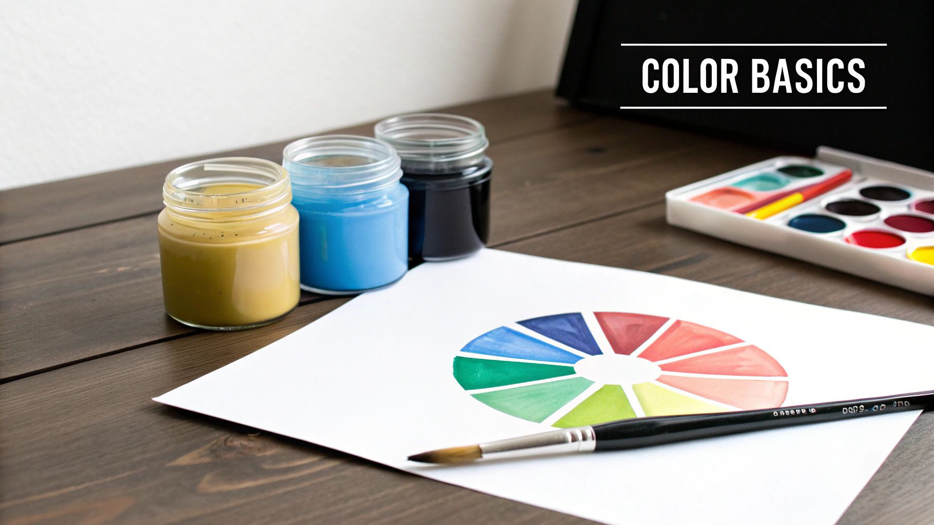
Here's a quick cheat sheet for the most basic mixes.
Essential Color Mixing Formulas
This table is a great starting point for creating your secondary colors from the three primaries you have.
| Resulting Color | Primary Color 1 | Primary Color 2 |
|---|---|---|
| Orange | Red | Yellow |
| Green | Yellow | Blue |
| Purple | Blue | Red |
Keep this nearby as you work. It’s simple, but it’s the bedrock of everything else you’ll mix.
Why a Color Wheel Is Your Best Friend
A color wheel is so much more than a pretty rainbow circle. It's a practical tool that helps you predict what will happen when you mix colors. It shows you which combinations will pop and which will tone each other down. For instance, understanding complementary colors (the ones directly opposite each other, like red and green) is the secret to creating realistic shadows and avoiding that dreaded muddy look.
If you want to go deeper, our guide on color theory for beginners is a great next step.
The goal isn’t to memorize every single combination. It's about building an intuitive feel for how colors interact. Soon enough, you'll glance at a photo and just know that a hint of blue will deepen that green, or a tiny touch of yellow will warm up that skin tone.
The Impact of Warm and Cool Colors
Here's a little pro secret: every pigment has a "color bias." This just means it leans either warm (with yellow or red undertones) or cool (with blue undertones). It's why mixing a warm, orangey-red with a cool, greenish-blue can sometimes result in a dull, disappointing purple. Having both a warm and a cool version of each primary color on your palette gives you much more control and helps you create cleaner, more vibrant mixes.
It seems more and more people are discovering the joy of hands-on creativity. In fact, the global acrylic paints market is expected to grow at a rate of 4.2% to 4.5% each year through 2031-2035, largely thanks to the boom in DIY projects. Once you get these foundational principles down, you'll move beyond just following instructions and start making confident, artistic choices of your own.
How to Create Depth with Tints, Shades, and Tones
Once you've got the hang of basic color mixing, the real magic begins. Moving beyond primary and secondary colors is where your paintings start to feel real and three-dimensional. This is the fun part—you’re not just mixing colors anymore; you're sculpting with them to create light, shadow, and mood. It all boils down to three simple ideas: tints, shades, and tones.
Imagine your starting color—a pure, vibrant Cadmium Red. That's your hue. By adding just a touch of white, black, or grey, you can completely change its personality without losing its essential "redness." Mastering this is the key to making objects on a flat canvas look like you can reach out and touch them.
Creating Tints for Highlights and Softness
A tint is just any color with white added to it. Think pastels. Tints are what you'll use to capture the way light hits an object, create soft highlights, or paint a hazy morning sky.
When you're mixing a tint, here’s a tip that will save you a lot of paint and frustration: always start with white on your palette, then add a tiny bit of your color to it. It takes way less color to change white than it does white to lighten a color. This gives you much finer control.
- For a soft sky blue: Squeeze out a good dollop of Titanium White and mix in just a speck of Ultramarine Blue.
- For a delicate pink: Start with your white and slowly blend in a touch of Alizarin Crimson until you get that perfect blush.
Using Shades to Build Dramatic Shadows
On the flip side, a shade is any color with black added. This is how you darken your hues to create shadows, build depth, and give your paintings a sense of weight or drama. When you're figuring out how to mix acrylic paint for shadows, remember that a little black goes a very long way.
Pro Tip: Straight black can sometimes deaden a color, making it look flat. For a more natural-looking shadow, try adding a tiny bit of the color’s complement first. For example, before adding black to your red, mix in a speck of green. This will create a much richer, more dynamic dark red.
Always start with your base color and add the smallest possible amount of black with the very tip of your brush or palette knife. Mix it in completely before you even think about adding more. It’s so easy to go too far with black, and it’s a real pain to try and fix.
Mixing Tones for a Natural, Realistic Look
A tone is made by adding grey (a mix of black and white) to any hue. Honestly, this might be the most powerful and overlooked technique for achieving realism in your paintings. Adding grey desaturates the color, knocking back its intensity and making it feel more subtle and natural.
Think about it—most of the colors we see in the real world are tones, not pure, screaming hues from a tube. The brilliant green of a leaf is toned down by the atmosphere, and the bright red of a brick wall is muted by sun and rain. Learning to mix tones is how you capture that beautiful subtlety.
More and more people are getting into creative projects at home, and acrylics are a huge part of that. The DIY sector is a major driver for the acrylic paints market as people look for ways to personalize their space and get hands-on. This trend explains the huge popularity of accessible art forms like paint-by-numbers, which rely on the incredible versatility of acrylics. You can actually see how this is all connected in this detailed industry report.
Ultimately, getting comfortable with tints, shades, and tones is what will elevate any project from a simple craft to a nuanced piece of art.
Mixing Common Colors for Realistic Paintings
Knowing how to lighten a color with white or darken it with black is a great start, but the real magic happens when you start mixing the specific, nuanced colors you see in the real world. This is where we move past basic theory and get into the practical "recipes" that bring landscapes, portraits, and still lifes to life.
Think of these common mixes as the building blocks for realism. Having a few of these reliable starting points in your back pocket will speed up your painting process immensely.
Crafting Believable Skin Tones
Mixing a realistic skin tone can feel daunting, but it’s really just a matter of combining a few key colors. Skin is never one flat shade; it’s a beautiful, complex blend of reds, yellows, and even blues just beneath the surface. My advice? Start with a solid base and then tweak it.
- For a fair skin base: I usually start with a good amount of Titanium White and then mix in just a tiny bit of Cadmium Red and Yellow Ochre. A little goes a long way here.
- For a mid-tone base: A great starting point is a mix of Burnt Sienna and Yellow Ochre. From there, you can add a touch of white to lighten it or a speck of red to warm it up.
- For a darker skin base: Try mixing Burnt Umber and Raw Sienna. You can add a very small amount of red for extra warmth or a hint of blue if you want a cooler, deeper tone.
Once you have your base, you can add tiny specks of blue for those subtle, cool shadows around the nose, or a bit more red for a warm blush on the cheeks.
Mixing Natural Browns and Greys
Let's be honest, the brown and grey paints you buy in a tube can often look flat and artificial. The secret to mixing rich, natural-looking neutrals is to use complementary colors instead. For example, mixing red and green gives you a stunning, earthy brown. You can explore a full guide for making brown colour to see just how versatile this mixture can be.
The same principle applies to grey. You can mix an incredible neutral grey by combining all three primary colors—red, yellow, and blue. By playing with the ratios, you can create a warm grey (by adding more red/yellow) or a cool grey (with more blue). The result is far more dynamic than what you get from simply mixing black and white.
A classic rookie mistake is over-mixing complementary colors, which is a fast track to a dull, muddy mess. The trick is to stop blending right before the colors are completely uniform. This leaves tiny, almost invisible flecks of the original hues, creating a much richer and more complex color.
Achieving Vibrant Greens and Deep Shadows
Nature is almost never just one shade of green. To mix realistic greens for trees and grass, start with your basic green (Yellow + Blue) and then start modifying it. Add more yellow for sun-kissed leaves, a touch of red to create a deep olive tone, or a bit of white for that misty, faraway treeline.
And what about shadows? They are never pure black. Look closely at a shadow in the real world—it almost always has a hint of color in it, usually a cool blue or purple. To create a believable shadow on a yellow object, for instance, try mixing a tiny bit of purple (its complement) into your yellow. It's a simple adjustment, but it will make your artwork feel so much more authentic and alive.
How to Control Paint Consistency for Better Results
Getting the color right is only half the battle. How your paint feels and flows on the brush is just as crucial. When you're mixing acrylics, you’re also deciding how that paint will behave. Do you need a thin wash that glides on like watercolor, or are you after a thick, buttery texture that holds its shape? Nailing the right consistency is a game-changer.
The quickest way to thin your paint is just to add a little water. For many situations, it works just fine. A few drops will loosen up a heavy-bodied paint, making it a breeze to spread for a quick base coat.
But you have to be careful. If you add too much water—a good rule of thumb is no more than 30% of the paint's volume—you start to break down the acrylic binder. Think of the binder as the glue that holds the pigment together and makes it stick. Over-dilute it, and you’ll end up with a weak, chalky finish that can literally flake right off your canvas later on.
Using Water vs Acrylic Mediums
So, how do you know when to use water versus a proper acrylic medium? It really comes down to what you're trying to do. If you just need to improve the flow a little bit, water is your friend. For anything more advanced, like creating see-through layers or slowing down that notorious acrylic drying time, you’ll want to grab a medium.
A medium is basically paint without any pigment. It’s made from the same acrylic polymer as your paints, so you can mix in as much as you want without worrying about damaging the paint film. Getting comfortable with mediums is often the first step to mastering more advanced acrylic painting techniques for beginners.
To make it simple, here’s a quick guide to help you choose the right tool for the job.
Choosing How to Thin Your Paint
| Feature | Using Water | Using Acrylic Medium |
|---|---|---|
| Binder Integrity | Can weaken the paint film if you add too much. | Preserves and even strengthens the paint film. |
| Transparency | Makes paint less opaque, but can look washed out. | Creates beautiful, clear glazes without killing the color vibrancy. |
| Best Use Case | Minor thinning to help the paint flow a bit better. | Glazing, extending drying time, adding texture, or changing the finish. |
| Finish | Can make the paint dry to a dull, matte, or chalky look. | Lets you choose the finish: gloss, matte, or satin. |
As you can see, mediums offer a lot more control and are a much safer bet for significant changes.
Powerful Additives for Total Control
Beyond thinning, there are a couple of other additives that give you incredible control. These are highly concentrated, so a little goes a long way.
- Flow Improver: This stuff is fantastic. It breaks the surface tension of the paint, making it flow smoothly and flatten out perfectly. It's your secret weapon for creating large, even areas of color without any distracting brushstrokes.
- Retarder: We all know acrylics dry fast. Sometimes too fast. A retarder slows everything down, giving you more time to blend colors on the canvas for those soft, seamless gradients.
When you learn to use mediums and additives, you stop being just a painter and start becoming a paint chemist. You can create the perfect paint for any effect you can dream up, from thin, inky washes to thick, sculptural peaks that pop right off the canvas.
Common Color Mixing Mistakes and How to Fix Them
Even after years of painting, there are days when the colors on my palette just don't want to cooperate. It happens to everyone. The key isn't to avoid mistakes entirely—it's knowing how to spot them and fix them without derailing your creative session.
Let's walk through some of the most common frustrations you'll run into with acrylics and how to get past them.
"I Accidentally Made Mud!"
This is hands-down the number one complaint I hear. You're trying to mix a beautiful, nuanced color, and suddenly you're left with a dull, lifeless greyish-brown blob. We've all been there. "Mud" is what happens when you over-mix colors, especially when you're blending complements like red and green.
Mixing those opposites is exactly how you create gorgeous, natural browns and deep shadows. The problem isn't the colors themselves, but how you mix them. If you blend them too aggressively, their individual characteristics get obliterated.
The Fix: Put down the brush and pick up a palette knife. Instead of stirring, use the knife to gently fold the colors into each other. Stop just before they look completely uniform. This little bit of restraint keeps the mix from going flat and creates a much richer, more interesting result.
Solving the Fast-Drying Paint Problem
Acrylics are notorious for drying in the blink of an eye. That speed is fantastic when you're building up layers, but it can be a real pain when a color you just perfected turns into a useless hockey puck on your palette.
Fortunately, you don't have to race against the clock. Here are a few tricks I use to keep my paints workable for longer.
- A simple spray bottle is your best friend. Keep a small, fine-mist spray bottle filled with water handy. A quick spritz over your palette every 10-15 minutes keeps the paint surface damp without thinning it out too much.
- Invest in a stay-wet palette. For longer painting sessions, these things are a lifesaver. It’s basically a special tray with a damp sponge under a sheet of permeable paper that keeps your paints wet for hours, sometimes even days.
- Add a retarder medium. Just a few drops of an acrylic retarder mixed into your paint will slow down the chemical drying process. This gives you a much more relaxed window for blending and mixing.
Why Your Paint Is Cracking and How to Prevent It
Have you ever laid down a thick, luscious stroke of paint, only to come back later and find it covered in tiny cracks? It’s a frustrating issue called crazing, and it’s a classic sign of applying heavy layers of acrylic without the right support.
Here’s what’s happening: as the water in the paint evaporates, the paint film shrinks. If the layer is too thick or has been thinned with too much water, the binder becomes weak. This shrinking creates stress, and the paint cracks to release that tension.
The solution is wonderfully simple: gel medium. When you want to build up heavy texture or impasto effects, mix a gloss or matte gel medium into your color. It adds body and, more importantly, flexibility. The gel ensures the paint dries into a strong, stable film that won't crack, keeping your work looking just as you intended for years to come.
Your Acrylic Paint Mixing Questions Answered
When you're first getting the hang of mixing acrylics, it's natural for questions to pop up. It happens to every artist. Instead of letting them trip you up, think of this as your go-to guide for a few of the most common hurdles.
How Can I Perfectly Match a Color From a Photo?
Trying to nail a specific color from a photo can feel like a shot in the dark, but there’s a real technique to it.
Start by mixing what you think is the closest base color on your palette. Don't go too wild, just get in the ballpark. Then, take a small dab of that mix on your palette knife and hold it right up next to the color in your reference photo.
Now, play detective. Is your mix too light? Too dark? Too warm? Too cool? Whatever the answer is, add just a tiny speck of the color you need—a bit of white to lighten, black to darken, yellow to warm it up, or blue to cool it down. The real secret here is to make tiny, gradual adjustments. It’s a lot easier to slowly nudge a color in the right direction than it is to fix a mix you've completely overshot.
A pro tip I swear by: always test your mix on a scrap piece of paper and let it dry completely before you put it on your canvas. This little step shows you the final, true color and can save you a ton of frustration later.
Why Do My Mixed Colors Dry Darker?
Ah, the classic acrylic conundrum. This phenomenon is called color shift, and it's just part of how acrylics work. The binder in the paint, which is the stuff that holds the pigment together, is a milky white color when it's wet. This white binder temporarily lightens the look of the paint.
As the paint dries, the water evaporates, and that white binder turns totally clear. When that happens, you're left seeing the pigment's true, and slightly darker, color. To get around this, a lot of painters (myself included) will intentionally mix their colors a shade or two lighter than what they're actually aiming for. With a bit of practice, you'll get a feel for just how much your brand of paint tends to shift.
What Is the Best Surface for Mixing Acrylics?
Believe it or not, your mixing surface—your palette—can make a huge difference in your painting process. Different palettes are good for different things, so it's worth knowing your options.
- Disposable Paper Palettes: These are my go-to for quick studies or short painting sessions. You get a clean, non-absorbent surface every time, and cleanup is as easy as tearing off a sheet and tossing it.
- Ceramic or Glass: A simple ceramic tile or a small pane of glass (just make sure to tape the edges!) makes for a fantastic, reusable surface. Once the paint is dry, it scrapes right off.
- Stay-Wet Palettes: If you're planning a long session or working on a complex piece, a stay-wet palette is an absolute lifesaver. It uses a damp sponge under a special sheet of paper to keep your paints from drying out for hours, sometimes even days. It's perfect for when you've mixed that perfect color and don't want to lose it.
Ready to turn your favorite photos into a work of art? At Custom Paint By Numbers, we provide everything you need to create a masterpiece, from a custom-numbered canvas to all the acrylic paints and brushes. Start your creative journey today at https://paint-by-number.com.